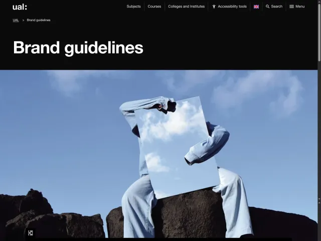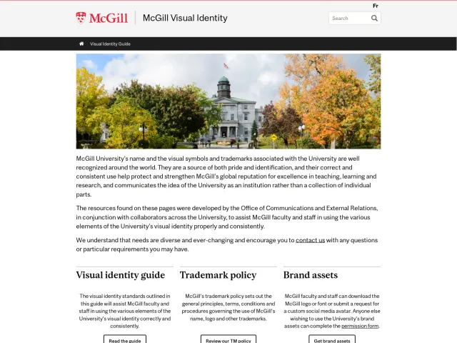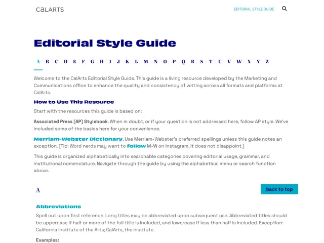
Uniarts Helsinki brand guidelines
Uniarts Helsinki's brand portal outlines visual architecture, institutional storytelling, and multilingual writing standards across Finnish and English.
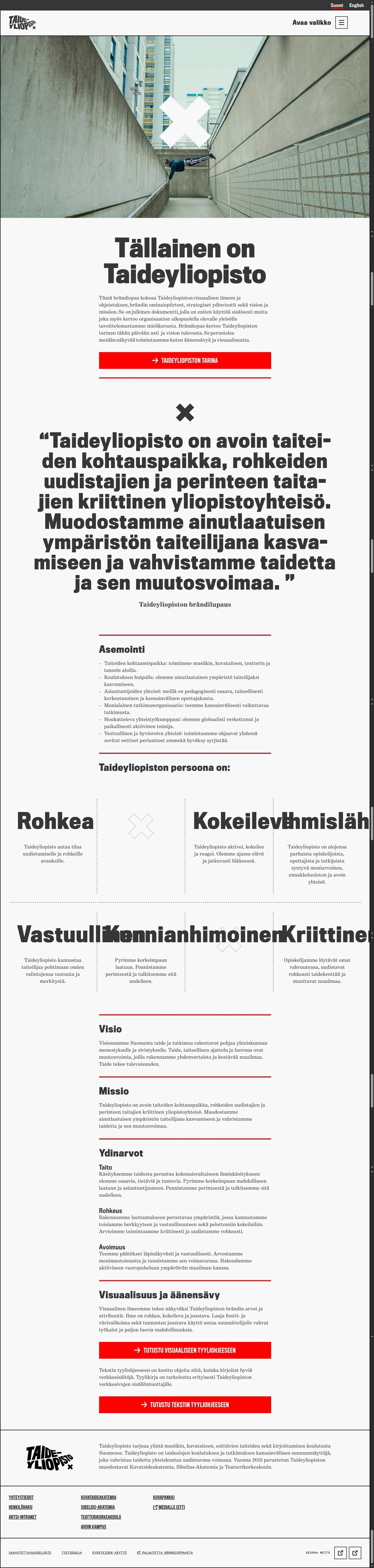
Brand portal homepage in Finnish presenting the university's story, values, brand promise, and links to visual and editorial guidelines.
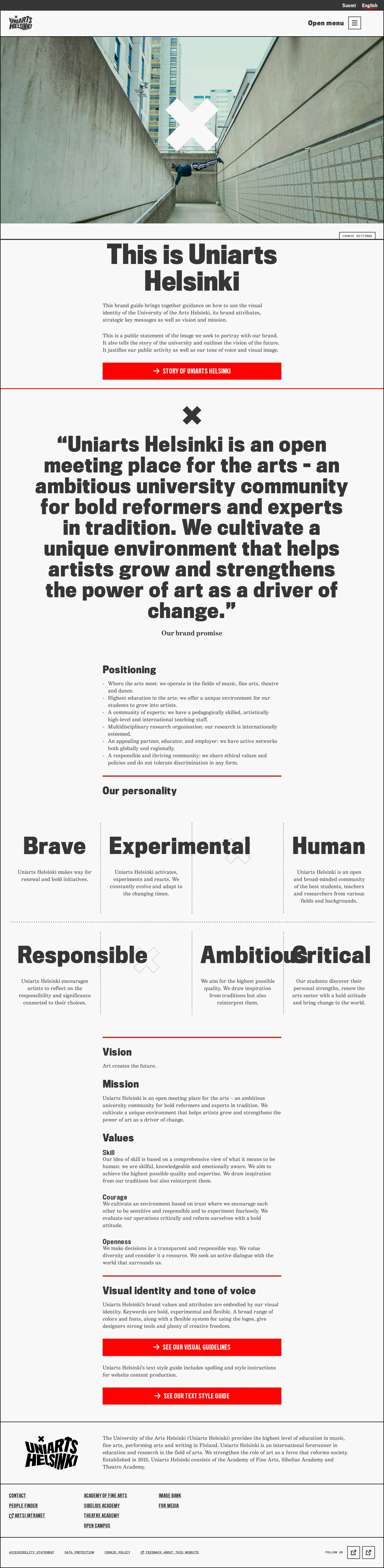
English-language brand guide landing page displaying the university's positioning, values, personality grid, and guideline shortcuts.

Brand architecture documentation detailing master brand hierarchy, academy sub-brands, and deprecated identity versions.
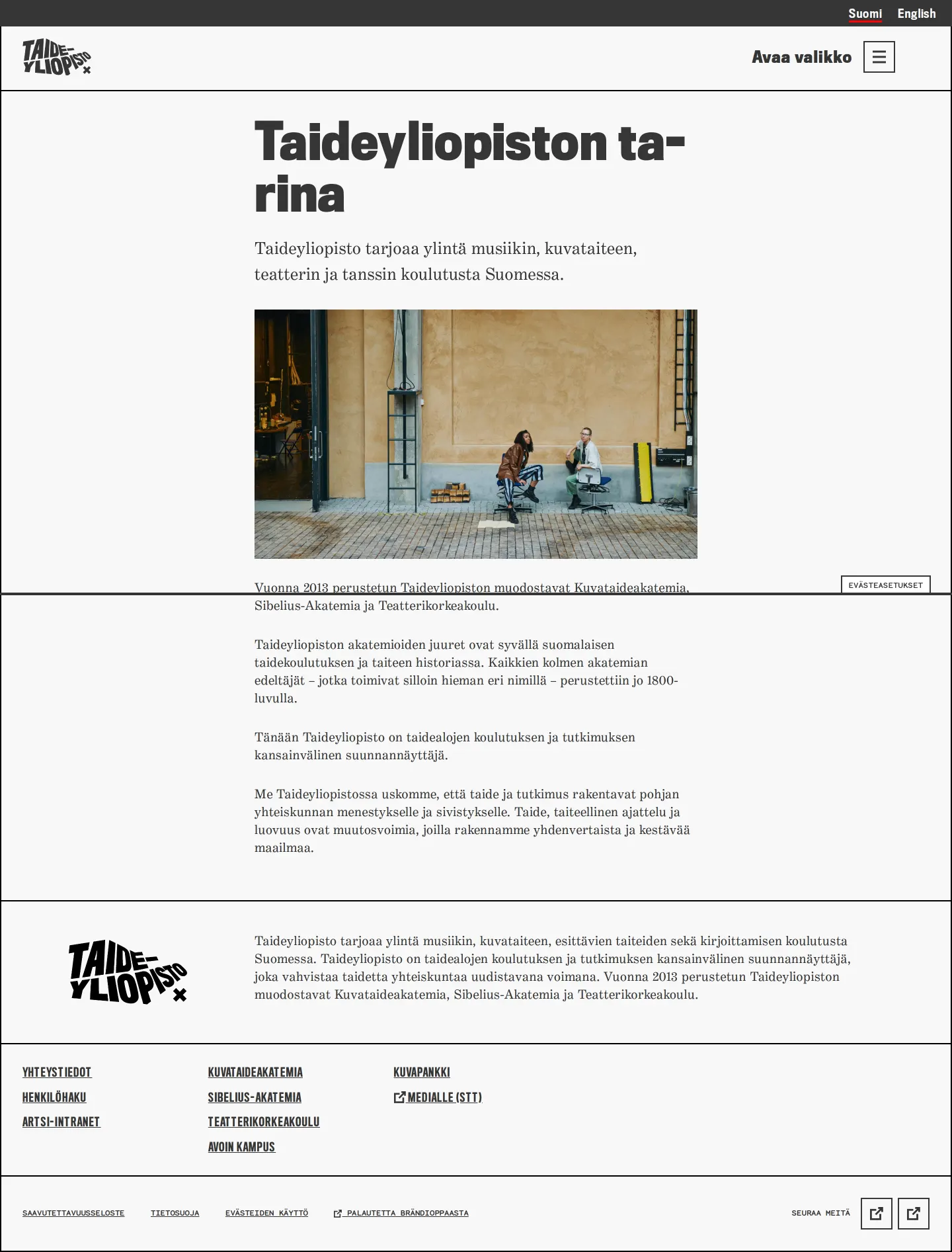
Narrative brand story page describing Uniarts Helsinki's origins and mission alongside full-width interior photography.

Editorial style guide covering accessible web writing, spelling rules, and academy naming across Finnish, English, and Swedish.
Want a brand center like Uniarts Helsinki’s?
Create your brand center with Freedam ↗Freedam's take
I love the uncompromising energy in Uniarts Helsinki's identity work. The distinctive perspective wordmark and bold X symbol cut straight across candid photography, immediately giving the institution an experimental edge. What stands out to me just as much is their editorial care. Rather than treating writing rules as an afterthought, they give tone of voice, web accessibility, and multilingual naming conventions equal weight alongside brand architecture. It feels like a living toolkit built for real university life across languages.
At a glance
- Sections
- Periaatteet · Tunnukset: tekstilogot ja X-merkki · Alaorganisaatiot ja konseptit · Alaorganisaatioiden tunnukset · Markkinointikonseptit · Kriteerit brändiarkkitehtuurille · Kirjoittamisen tyylikirja
- Tone
- Bold, academic, and structured with an experimental creative edge.
What I noticed
- The hero section pairs candid photography with an oversized white geometric mark and the university's distinctive distorted wordmark.123
- The brand architecture section visually contrasts current academy lockups against deprecated 2019 versions crossed out in red.45
- The editorial style guide provides specific writing rules across Finnish, English, and Swedish alongside guidance on active voice and accessibility.67
Numbers refer to the screenshots above.
What I could not see
- No downloadable asset files, logo bundles, or design templates were accessible in the captured screens.
Ideas to borrow
- Display deprecated brand marks crossed out directly beside current lockups to clarify historical logo retirements for staff and partners.5
Reviewed on 26 September 2026. Request a correction · I built this
Similar brand centers
All brand guidelines →