Globant brand guidelines
Globant presents The Green Book, an online brand guideline hub covering voice, logo rules, color palettes, typography, and photography standards.
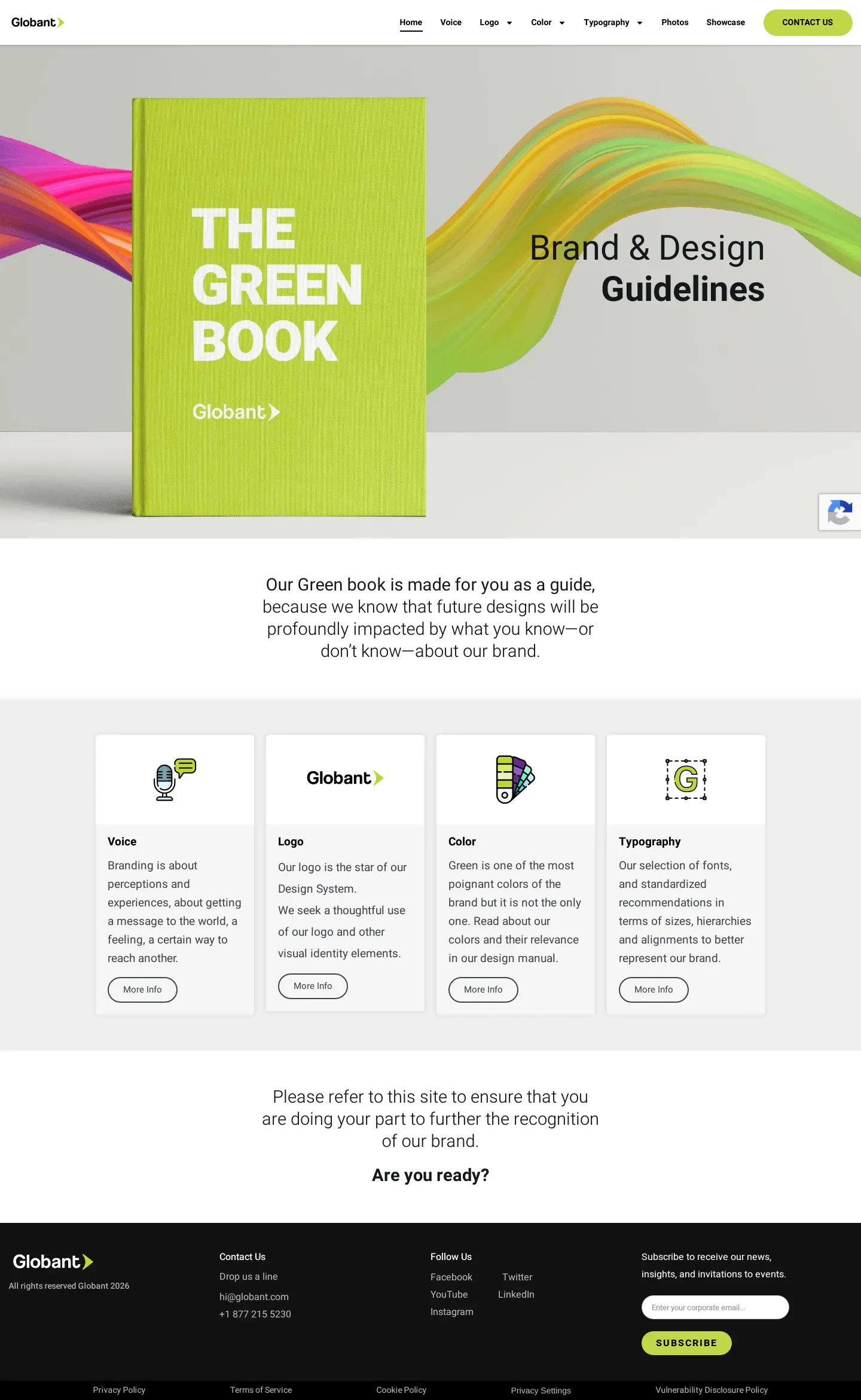
Homepage of Globant's Brand & Design Guidelines, titled 'The Green Book'.
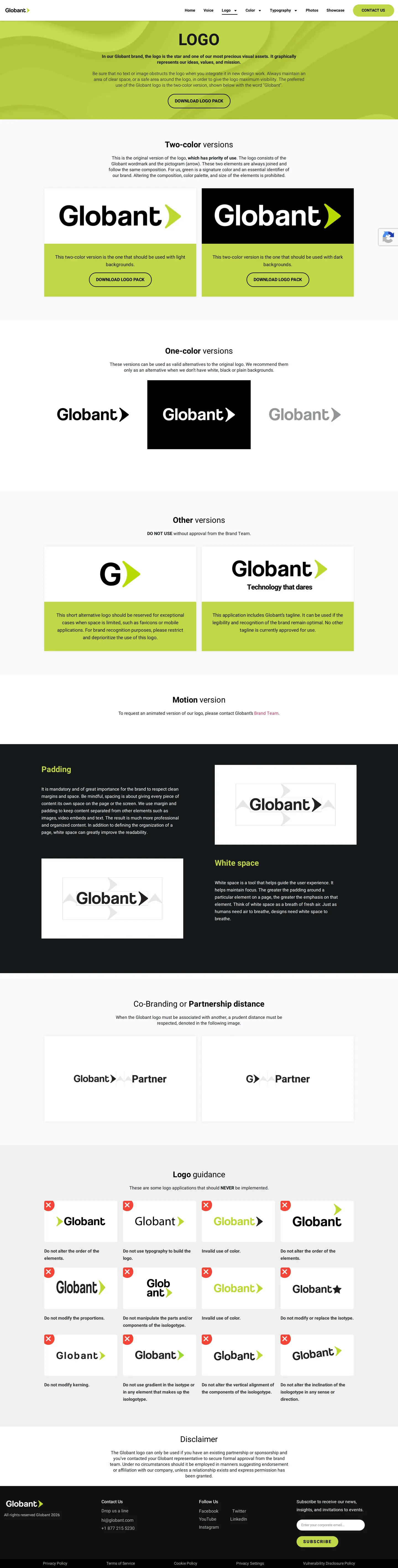
Globant logo guidelines page detailing color variations, clear space rules, co-branding distance, and incorrect logo applications.
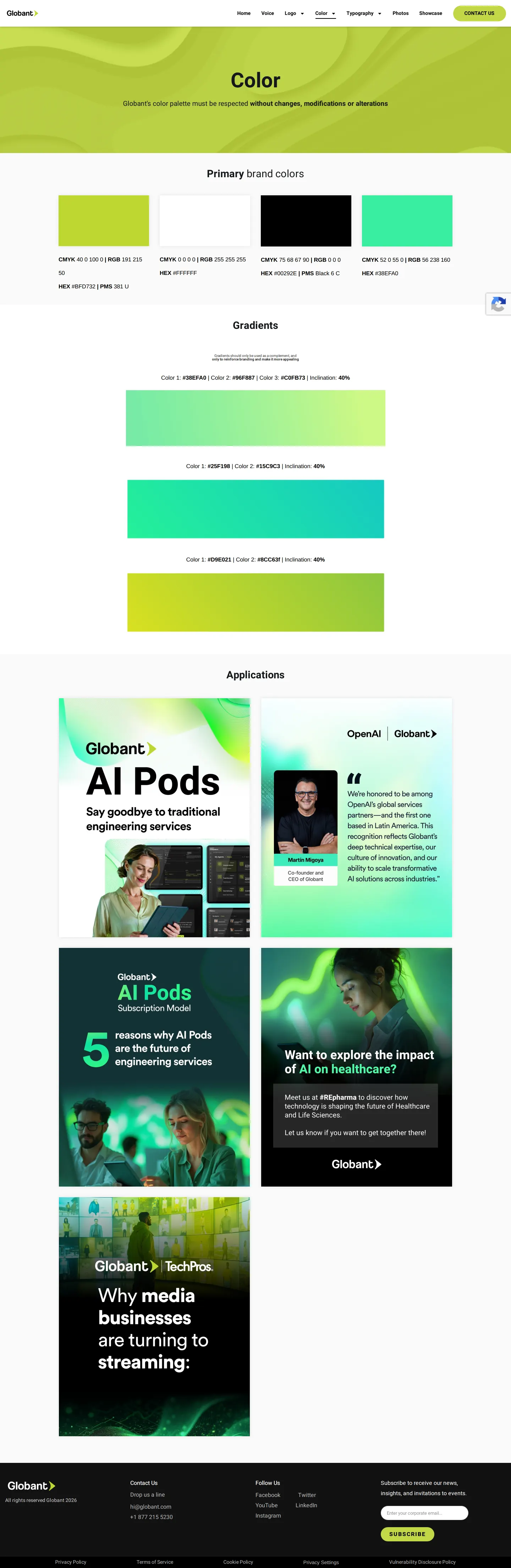
Brand color guidelines page for Globant featuring primary swatches, gradient specifications, and marketing asset applications.
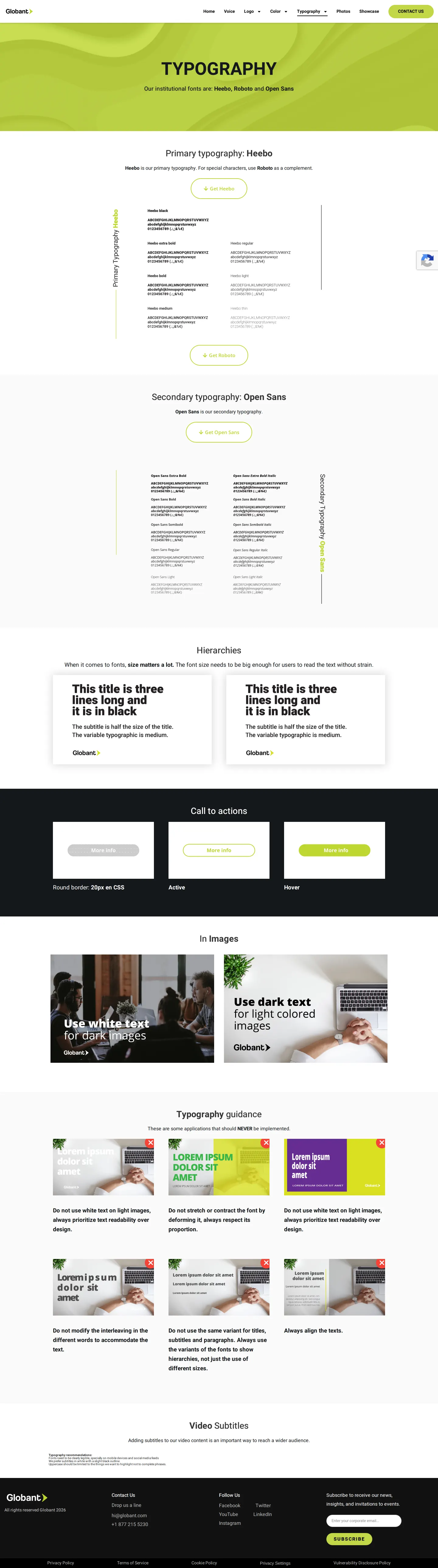
Brand typography guidelines page detailing institutional typefaces, hierarchy rules, call-to-action styling, text-over-image usage, and typographic don'ts.
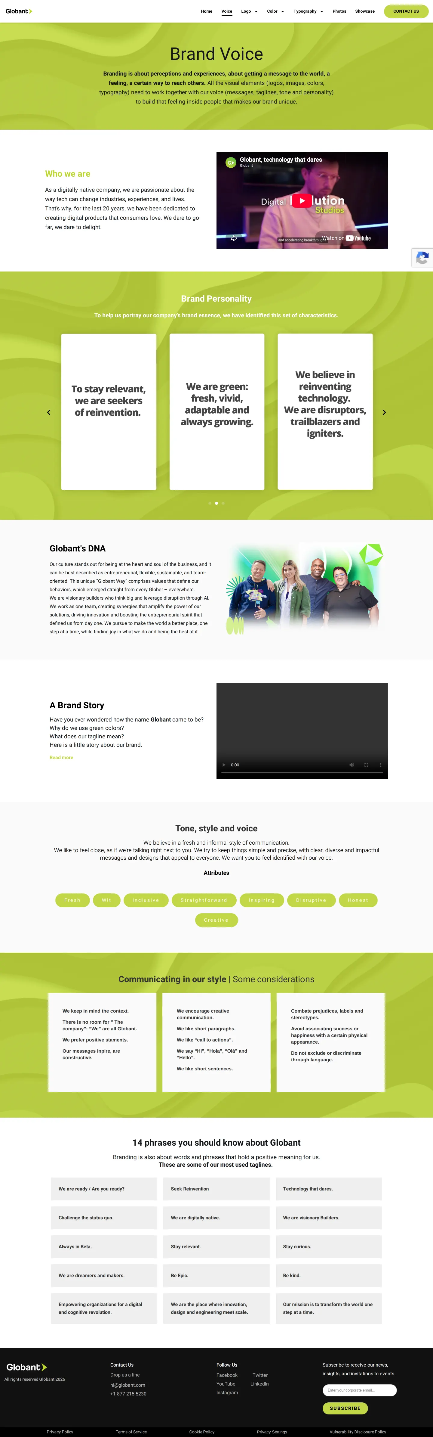
Brand voice guidelines page for Globant featuring company mission, personality pillars, tone attributes, and common taglines.
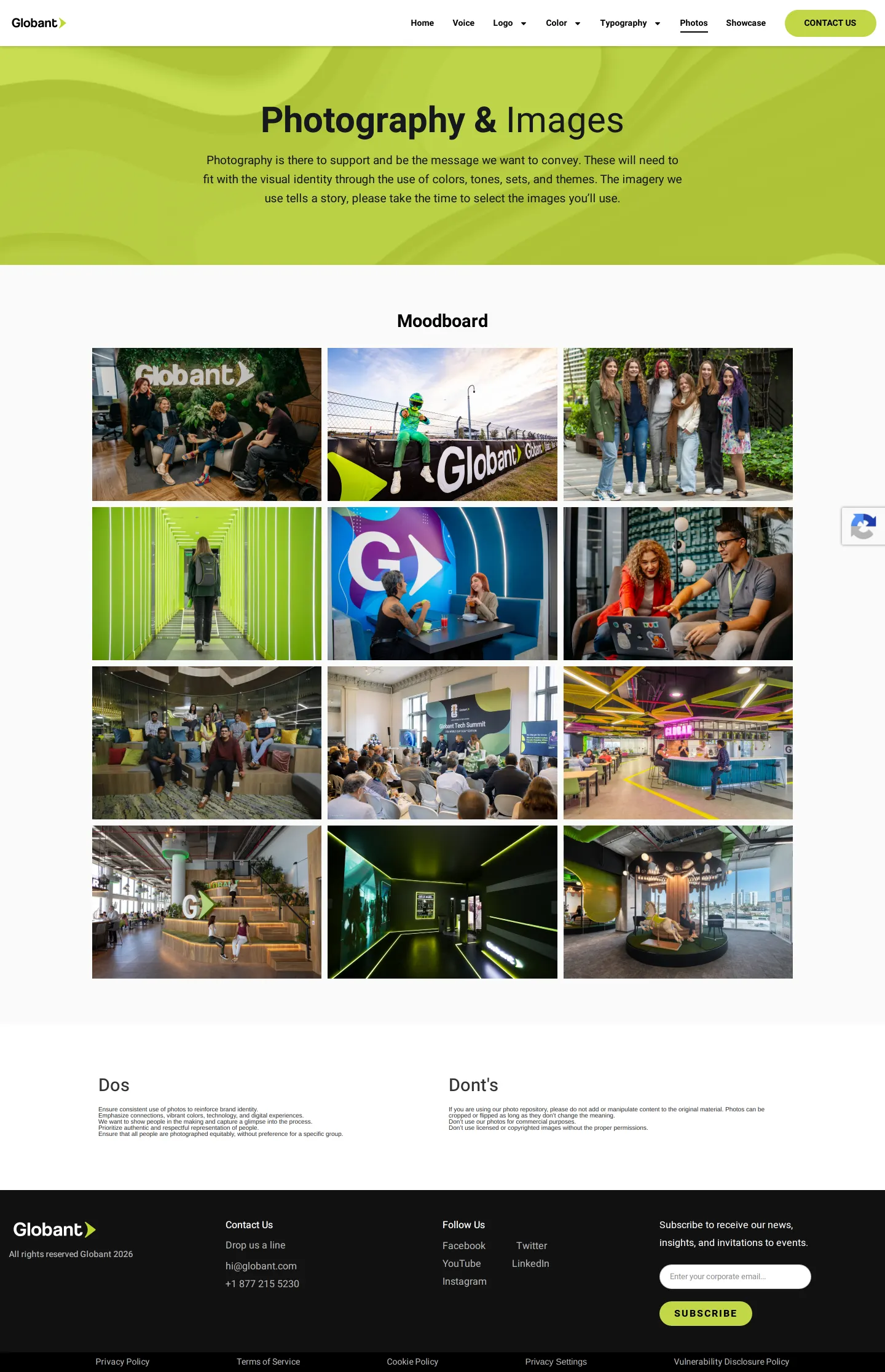
Photography and imagery guidelines page for Globant featuring a moodboard grid and rules for photo usage.
Want a brand center like Globant’s?
Create your brand center with Freedam ↗Freedam's take
I like how Globant introduces their guidelines through The Green Book metaphor right on the homepage. Everything a collaborator needs is easy to reach across six distinct chapters, from the voice pillars to concrete rules for video subtitles. The logo section caught my attention with its generous set of twelve clear incorrect usage diagrams, paired with exact partnership spacing metrics. While many portals stop at basic font scales, their typography section actually defines button states and mobile caption legibility. It feels practical, direct, and focused on maintaining clean visual standards across digital touchpoints.
At a glance
- Sections
- Home · Voice · Logo · Color · Typography · Photos · Showcase · CONTACT US
- Downloads
- ZIP
- Tone
- Direct, structured, and instructional guidelines aimed at brand alignment across digital applications.
What I noticed
- The portal introduces itself on the homepage as The Green Book alongside a 3D book graphic.12
- The logo page provides twelve prohibited usage examples marked with red X icons alongside partnership spacing rules.34
- Typography guidelines detail primary, complementary, and secondary fonts alongside specific recommendations for video subtitles on mobile.567
- The voice chapter compiles fourteen specific corporate phrases to guide messaging.89
Numbers refer to the screenshots above.
What I could not see
- Could not inspect the contents of the Showcase page.
- Could not view individual file formats inside the downloaded logo zip pack.
Ideas to borrow
Quick answers
Reviewed on 25 September 2026. Request a correction · I built this