
Digia brand guidelines
Digia Brand Guidebook is a focused online identity guide built on Corebook, detailing logo rules, color palettes, typography specs, and subsidiary usage.
Freedam's take — I spent some time looking through Digia's online brand guidebook, and I appreciate how straightforward they keep everything. Built on Corebook, the site covers the foundational identity elements clearly. The logo section neatly separates digital and print downloads alongside clear rules for sizing and spacing. Their typography guidance is refreshingly direct: Manrope serves as the primary typeface with an external link straight to Google Fonts, while Arial is clearly designated as the fallback. It is clean, focused, and gives teams the practical guidance they need without adding unnecessary layers of complexity.
Details
- Type
- Guidelines
- Access
- Public
- Source
- brand.digia.com
- Industry
- Technology, Professional services
- Capabilities
- Guidelines, Downloads
- Tags
- logo usage, typography, color system, brand architecture, asset downloads, font downloads, corebook
- Added
- Last checked
What I noticed
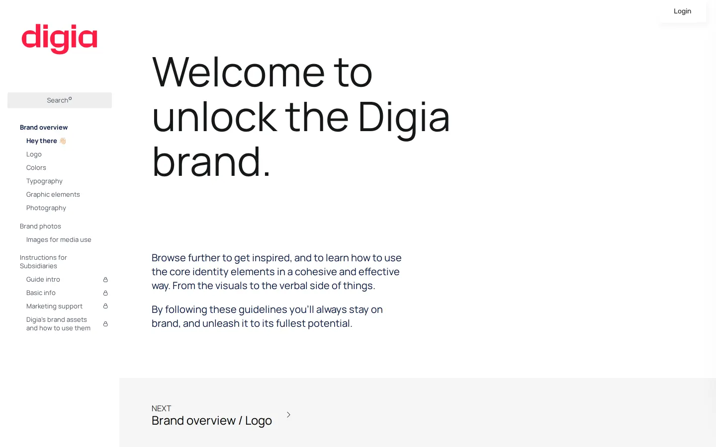
- The brand center is built on Corebook.1234
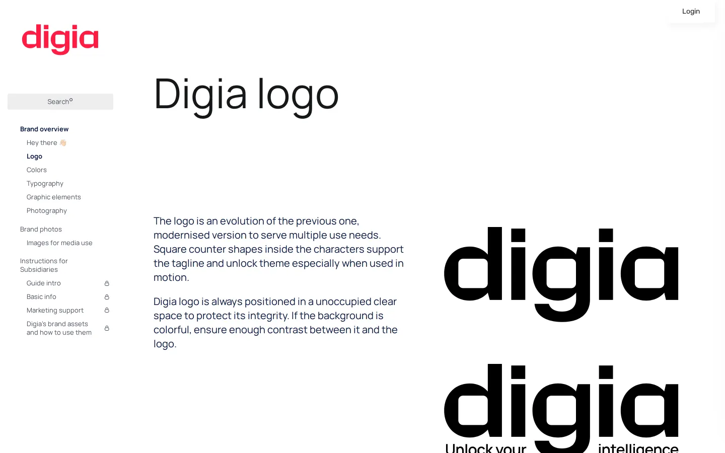
- The logo section divides download links into screen and print categories.56
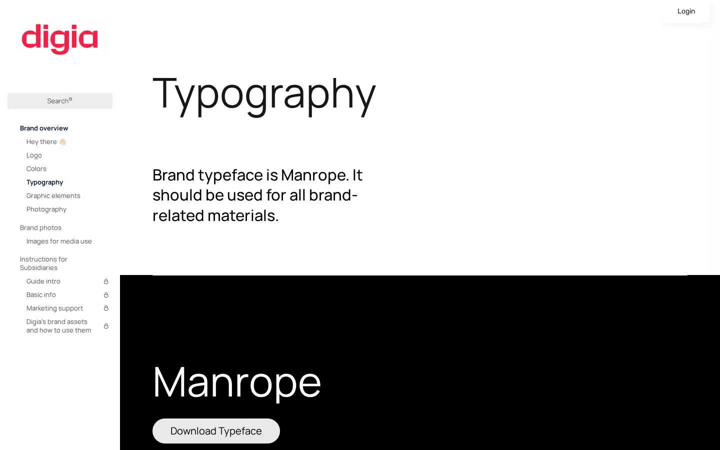
- Manrope is designated as the brand typeface with a direct link to Google Fonts, and Arial is designated as the fallback font.7891011
- The guidelines include dedicated instructions for subsidiaries.12
Numbers refer to the screenshots above.
What I could not see
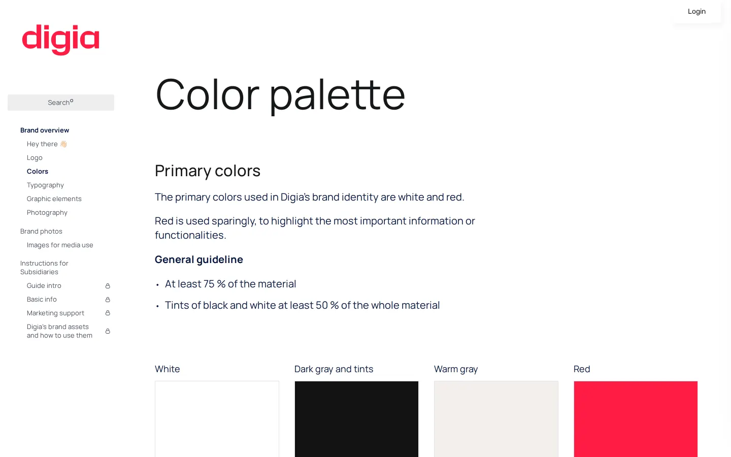
- Could not inspect full asset files, color hex values, or detailed text on subsidiary instructions due to limited page text capture.
Ideas to borrow
- Linking directly to a free open-source font host like Google Fonts simplifies font distribution for internal teams and vendors.11
Reviewed on 18 September 2026. Request a correction · I built this

