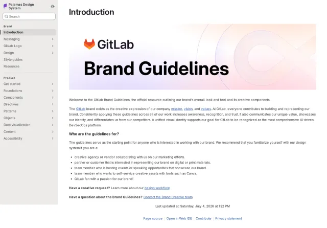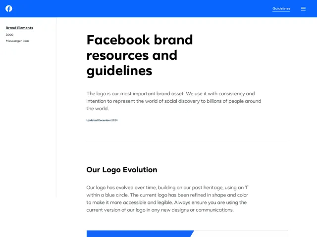
GitHub brand guidelines
GitHub's Brand Toolkit offers comprehensive brand guidelines, color palettes, custom type specimens, and downloadable logo assets.
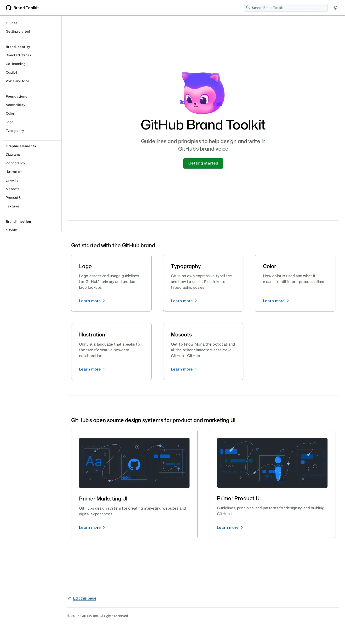
Homepage of the GitHub Brand Toolkit showcasing an introductory hero section, navigation sidebar, topic cards, and design system links.
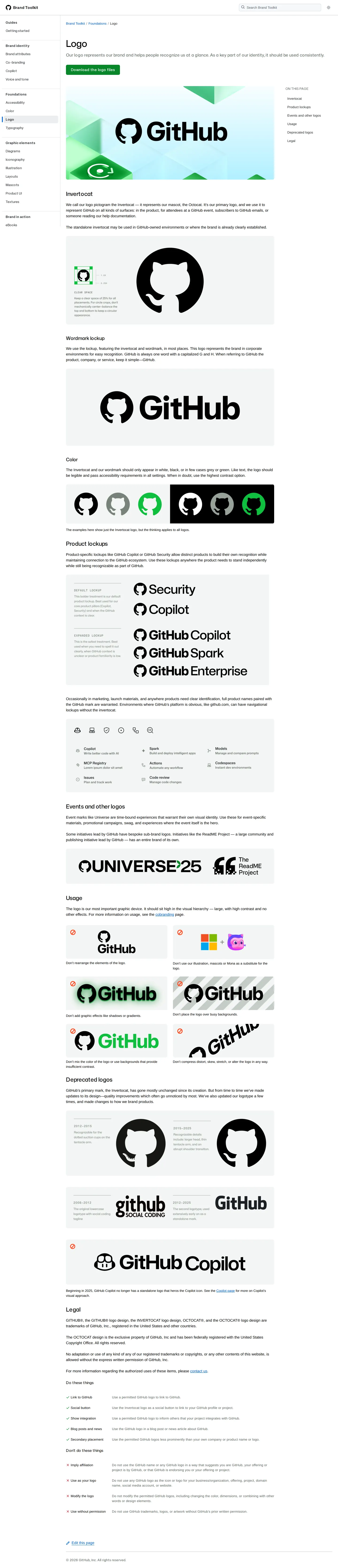
GitHub brand guidelines page detailing rules and variations for the Invertocat logo, wordmark, and product lockups.
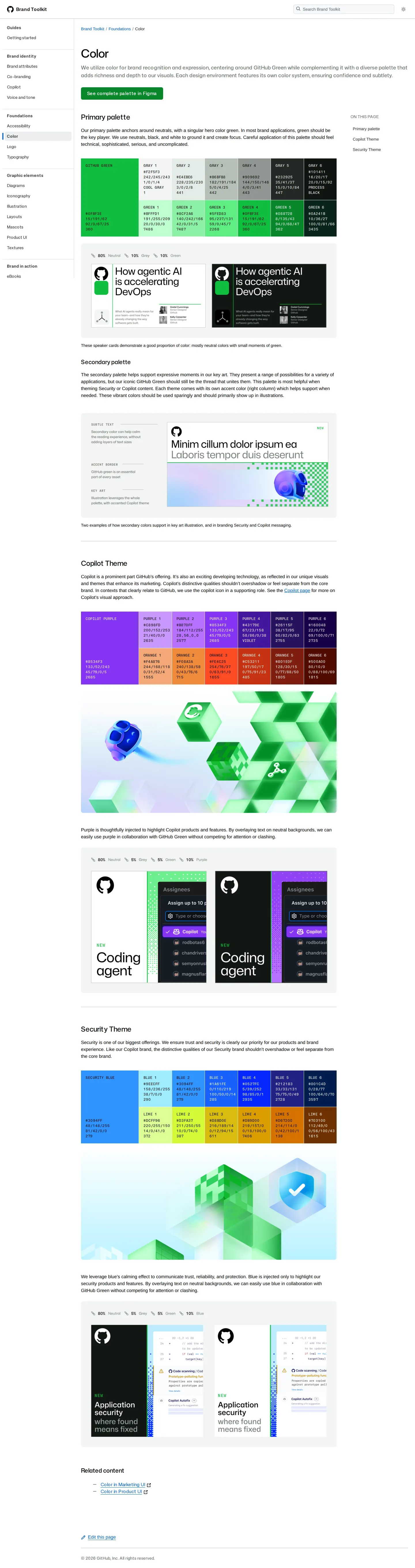
Color foundations page detailing the primary palette, Copilot theme, and Security theme color systems with percentage breakdown examples.
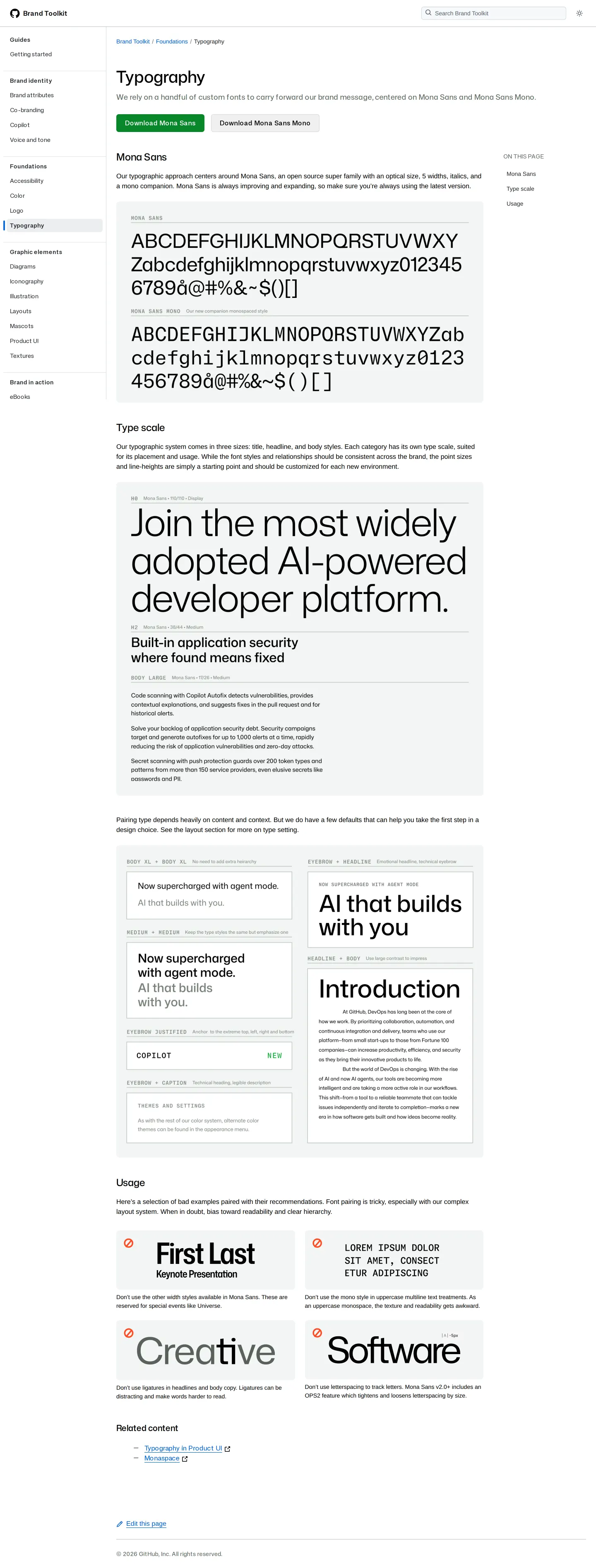
Typography page detailing Mona Sans and Mona Sans Mono typefaces, scale hierarchy, pairing examples, and usage rules.
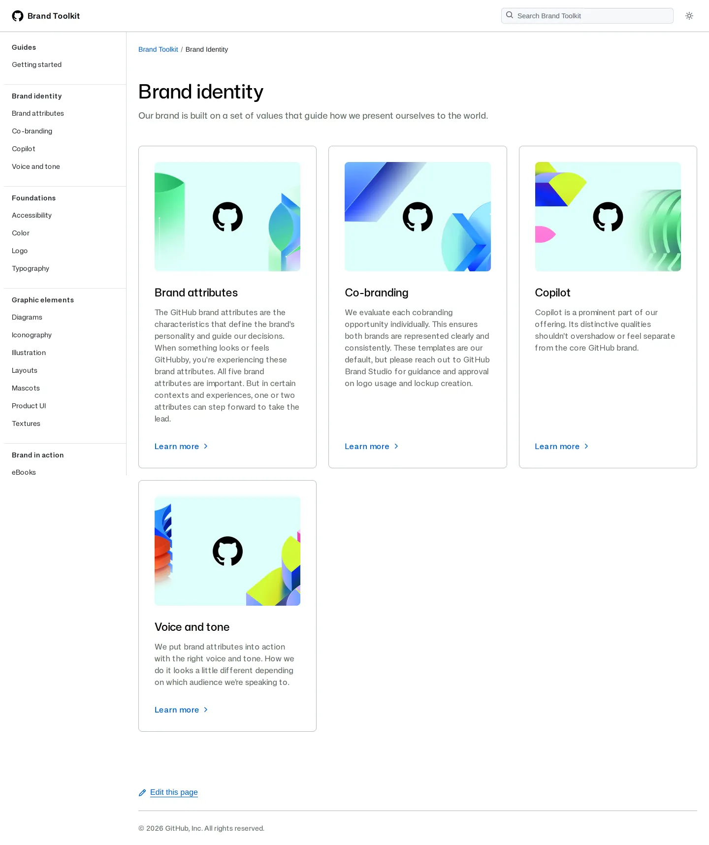
Brand identity landing page on GitHub Brand Toolkit showing navigation cards for subtopics.
Want a brand center like GitHub’s?
Create your brand center with Freedam ↗Freedam's take
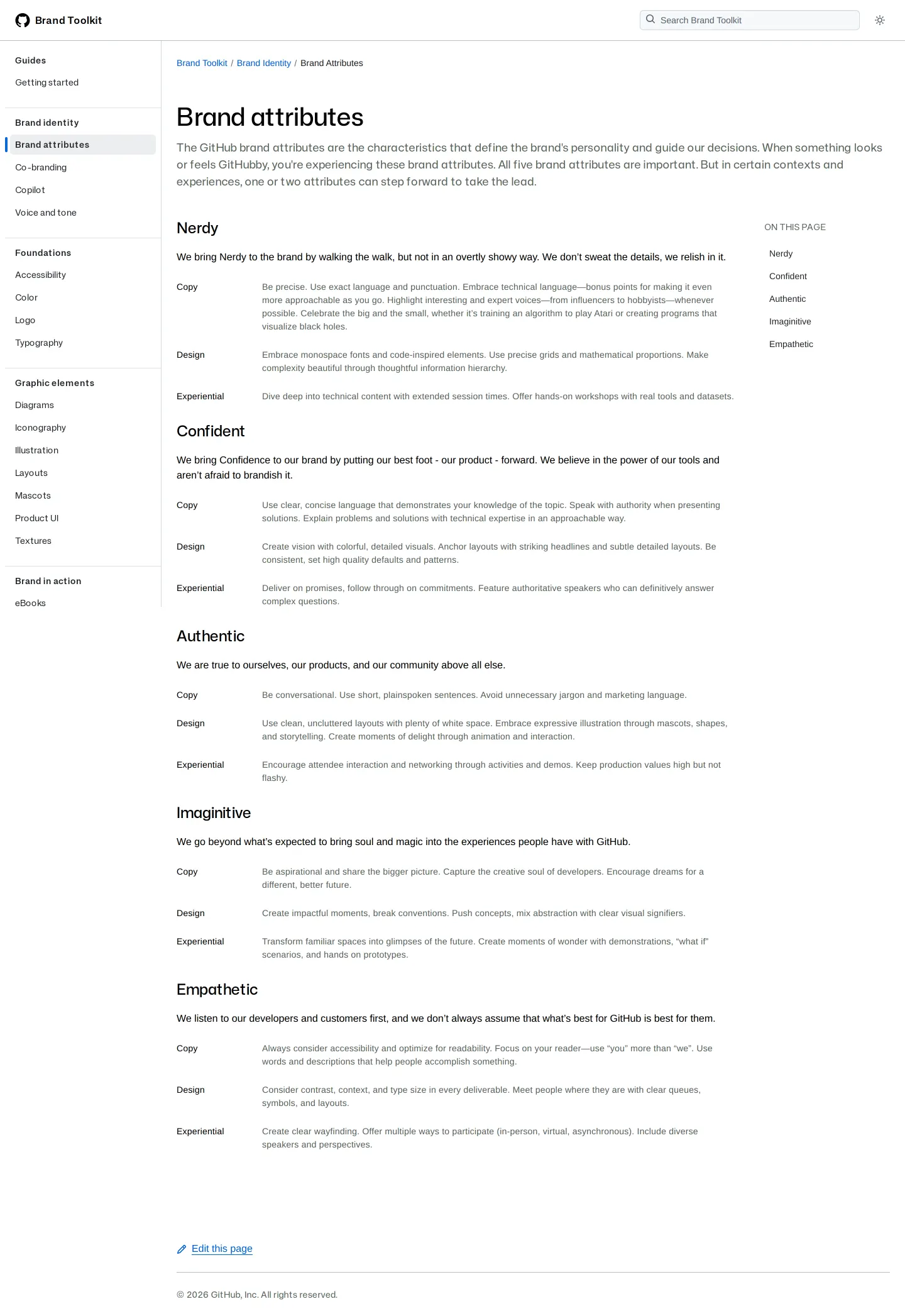
I love how GitHub structures their Brand Toolkit. Instead of presenting a static manual, they treat brand documentation like a living software design system. The persistent sidebar keeps everything navigable, letting you bounce effortlessly from high-level brand attributes like Nerdy and Empathetic directly into typographic pairings for Mona Sans. Seeing visual proportion ratios right above marketing layout mockups makes the color balance feel tangible. They also bridge the gap to engineering by connecting brand foundations straight to Primer marketing and product UI libraries.
At a glance
- Sections
- Guides · Brand identity · Foundations · Graphic elements · Brand in action · Motion identity
- Downloads
- ZIP
- Tone
- Clear, technical, and developer-friendly documentation focused on consistent application.
What I noticed
- The Logo page provides a downloadable ZIP file of logo assets and specifies clear space rules along with visual 'Don't' examples.123
- Typography guidelines showcase Mona Sans and Mona Sans Mono with download links hosted on GitHub repositories.456
- The Color page displays tint and shade swatches with HEX, RGB, CMYK, and Pantone values alongside visual palette proportion tags.78
- The documentation connects brand rules directly with GitHub's open-source design systems Primer Marketing UI and Primer Product UI.9101112
Numbers refer to the screenshots above.
What I could not see
- Could not inspect the full contents of the downloadable ZIP archive.
- Could not view unvisited subpages such as Co-branding, Accessibility, and Swag.
Ideas to borrow
Quick answers
Where can I download the GitHub logo files?
The official logo files are available as a downloadable ZIP package on the Logo foundations page.1
Reviewed on 25 September 2026. Request a correction · I built this