GNOME brand guidelines
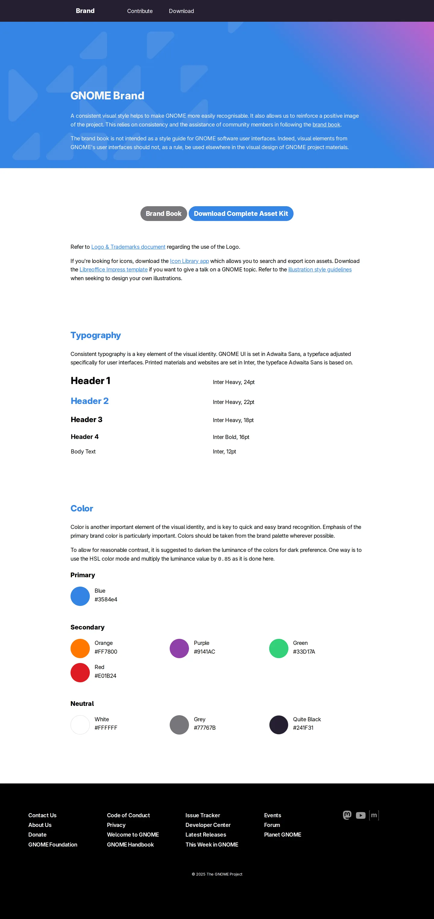
GNOME provides a straightforward brand portal documenting core typography, structured color palettes, and direct download links for their assets and brand book.
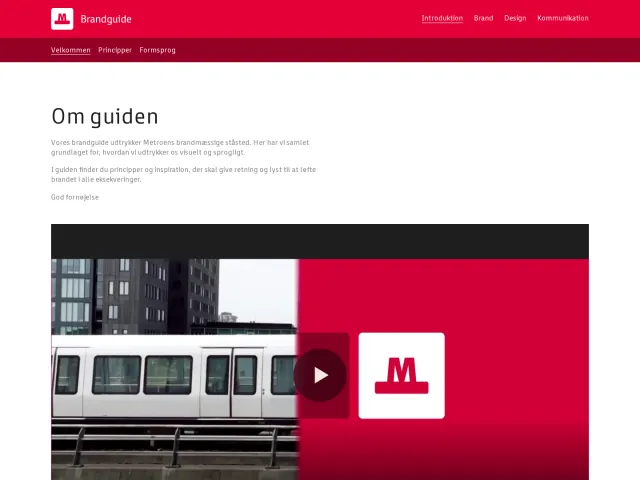
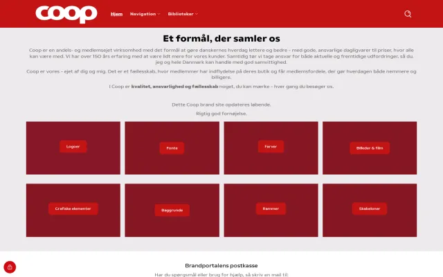
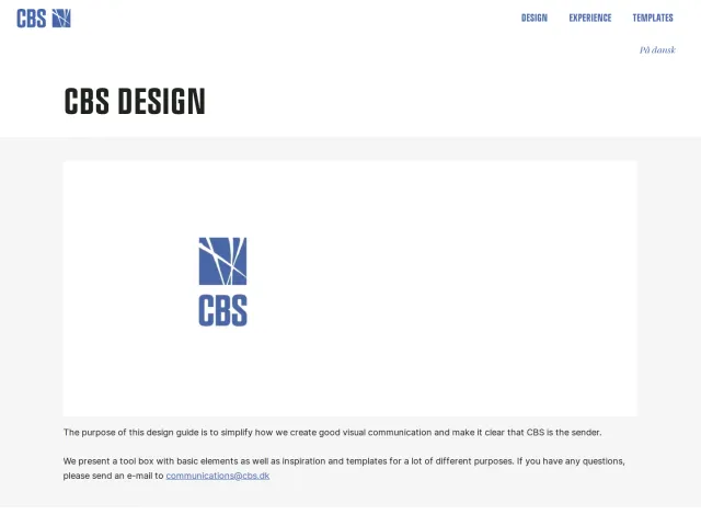
Freedam's take — I added GNOME's brand site to the gallery because it keeps things wonderfully concise. The documentation focuses on core essentials like typography and color palettes split into primary, secondary, and neutral tiers. Instead of overcomplicating things with elaborate interactive widgets, it links straight to a comprehensive brand book PDF hosted on their GitLab alongside a direct download for the complete asset kit. It feels like an honest, functional guide tailored to an open-source community that just needs clear rules and direct access to source materials.
Details
- Type
- Guidelines
- Access
- Public
- Source
- brand.gnome.org
- Industry
- Technology
- Capabilities
- Guidelines, Downloads
- Tags
- open source, color system, typography, pdf downloads, asset downloads, minimal
- Added
- Last checked
What I noticed
- The page includes dedicated sections for typography and colors categorized into primary, secondary, and neutral swatches.12345
- Direct download links are provided for a brand book PDF hosted on GitLab and a complete logo asset archive.67
- The site provides broad navigation links out to wider community resources like the GNOME Handbook, Issue Tracker, and Developer Center.8910
Numbers refer to the screenshots above.
What I could not see
- Could not view interactive asset search, filtering, or media templates from the single page capture.
Ideas to borrow
- Hosting the formal brand book PDF directly in a version-controlled repository allows community members to track guideline changes transparently.6
Reviewed on 18 September 2026. Request a correction · I built this
Similar brand centers
All brand guidelines →