CBC/Radio-Canada brand guidelines
CBC/Radio-Canada provides a graphic standards entry page featuring a brand resources dropdown selector framed by extensive corporate navigation.
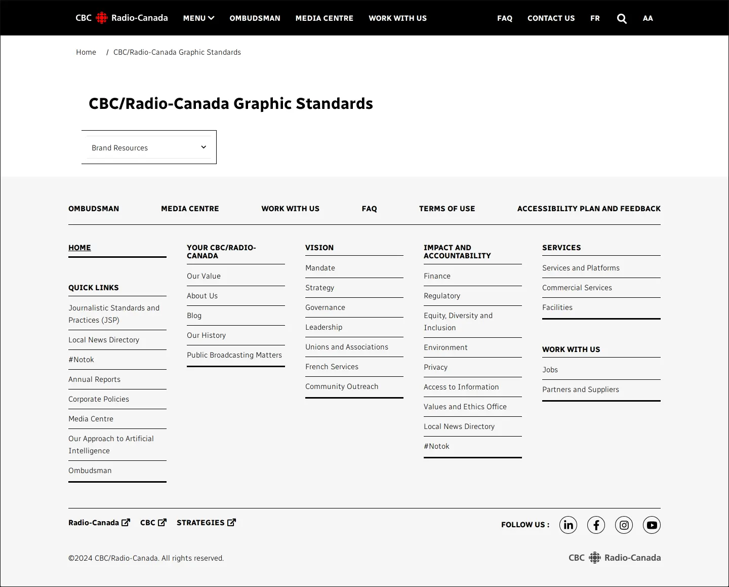
CBC/Radio-Canada Graphic Standards landing page featuring a dropdown selector for brand resources and extensive corporate footer navigation.
Want a brand center like CBC/Radio-Canada’s?
Create your brand center with Freedam ↗Freedam's take
When I looked at the CBC/Radio-Canada graphic standards page, I was struck by how minimal the landing view is. Rather than exposing full visual guidelines right away, the site positions a single Brand Resources dropdown selector beneath the primary heading. It sits within the broadcaster's broader corporate framework, surrounded by extensive site-wide navigation and governance links. I find it fascinating how quiet the initial entry point feels, acting as a gateway rather than laying out logos, typography, or broadcast design rules on the page itself.
At a glance
- Sections
- Brand Resources
- Tone
- A minimal, utility-driven public corporate landing page providing quick access via a resource dropdown.
What I noticed
- The primary page heading reads 'CBC/Radio-Canada Graphic Standards'.12
- A single dropdown selector labeled 'Brand Resources' is positioned directly below the main heading.3
- The page header includes top navigation links such as Ombudsman, Media Centre, and Work With Us alongside the CBC/Radio-Canada logo.4
- The page relies on a compact selector interface rather than displaying identity rules inline.
Numbers refer to the screenshots above.
What I could not see
- The contents and options inside the Brand Resources dropdown menu were not visible in the capture.
- No specific logo files, typography rules, color palettes, or downloadable assets were displayed on screen.
Ideas to borrow
- Using a simple dropdown selector on a public corporate landing page can help route visitors to specific brand materials without cluttering the main layout.3
Reviewed on 25 September 2026. Request a correction · I built this
Similar brand centers
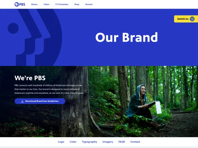
All brand guidelines →CBC/Radio-Canada presents a minimal landing page centered on a single Brand Resources dropdown selector. In contrast, PBS exposes core identity elements like logos, color, typography, and downloadable guideline PDFs directly on a single page, while ZDF offers detailed broadcast-specific sections including lower thirds, openers, and closers.