
Case Western Reserve University brand guidelines
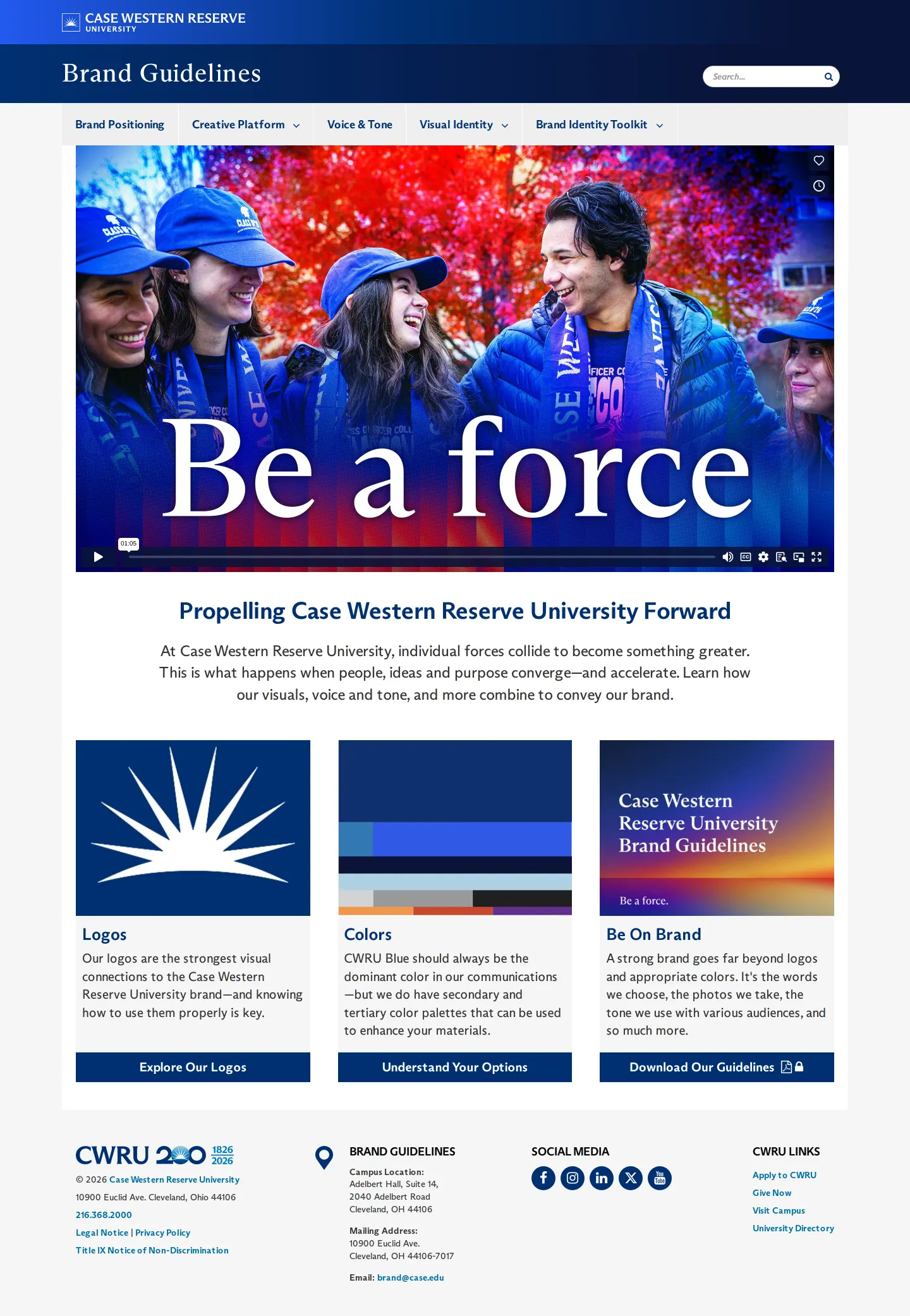
The Case Western Reserve University brand center outlines the university's positioning, voice and tone, creative platform, and core visual identity assets.
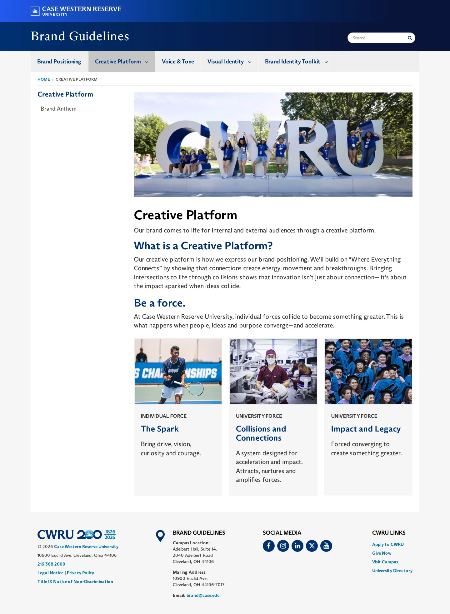
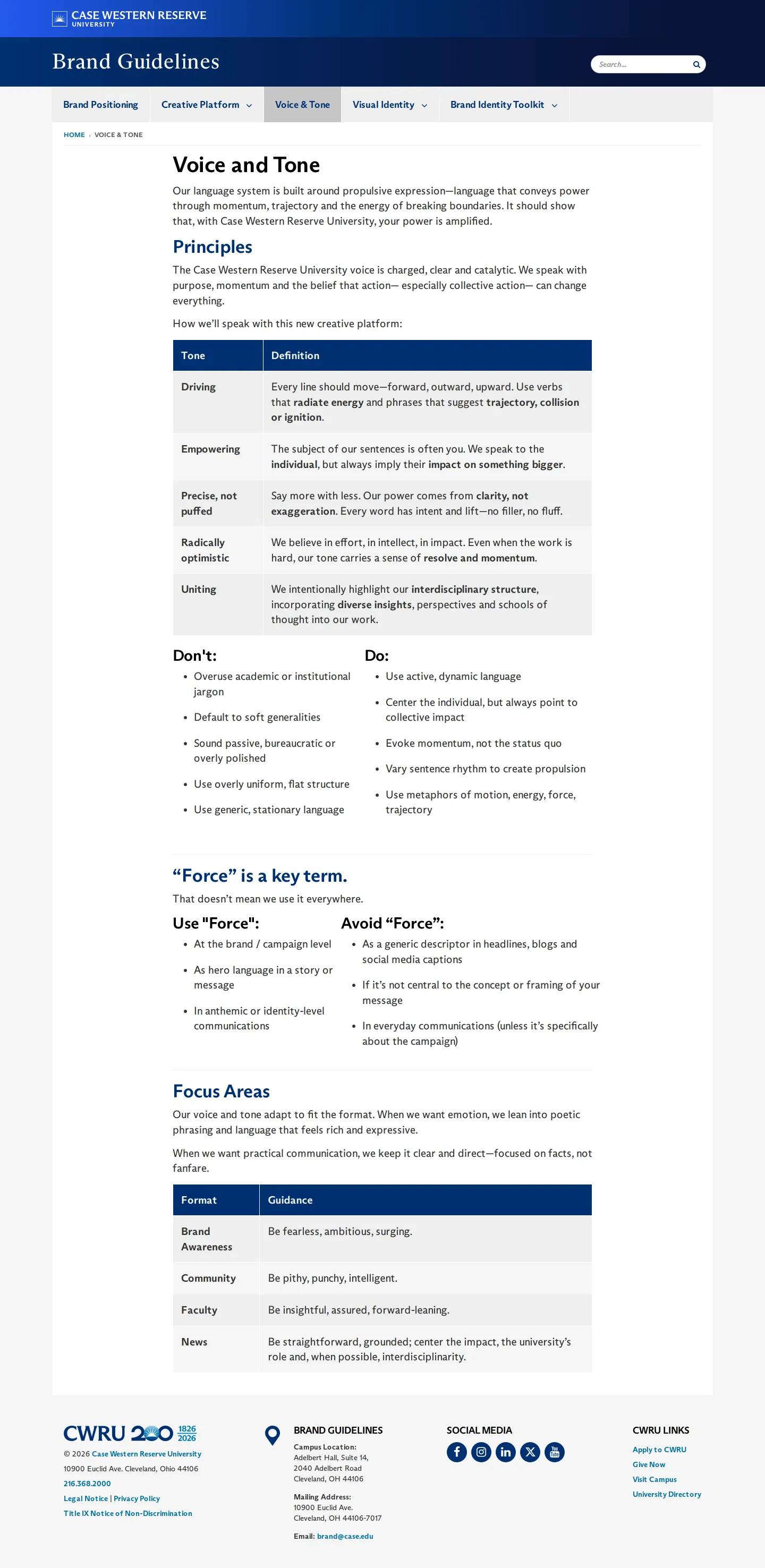
Freedam's take — I really appreciate how structured the Case Western Reserve University brand center is. It moves beyond standard visual identity elements to lay out a thorough verbal platform. I noticed they frame their positioning around The Weaver personality archetype and anchor their copy around the core concept of being a force. They even break down specific do and don't rules for using the word force in writing, alongside clear rules for logos, color proportions, and downloads. It is a thoughtful example of balancing deep strategic narrative with practical everyday guidance for an academic institution.
Details
- Type
- Guidelines
- Access
- Public
- Source
- case.edu
- Industry
- Education
- Capabilities
- Guidelines, Asset browsing, Search, Downloads
- Tags
- tone of voice, brand story, color system, logo usage, editorial guidelines, asset downloads
- Added
- Last checked

What I noticed
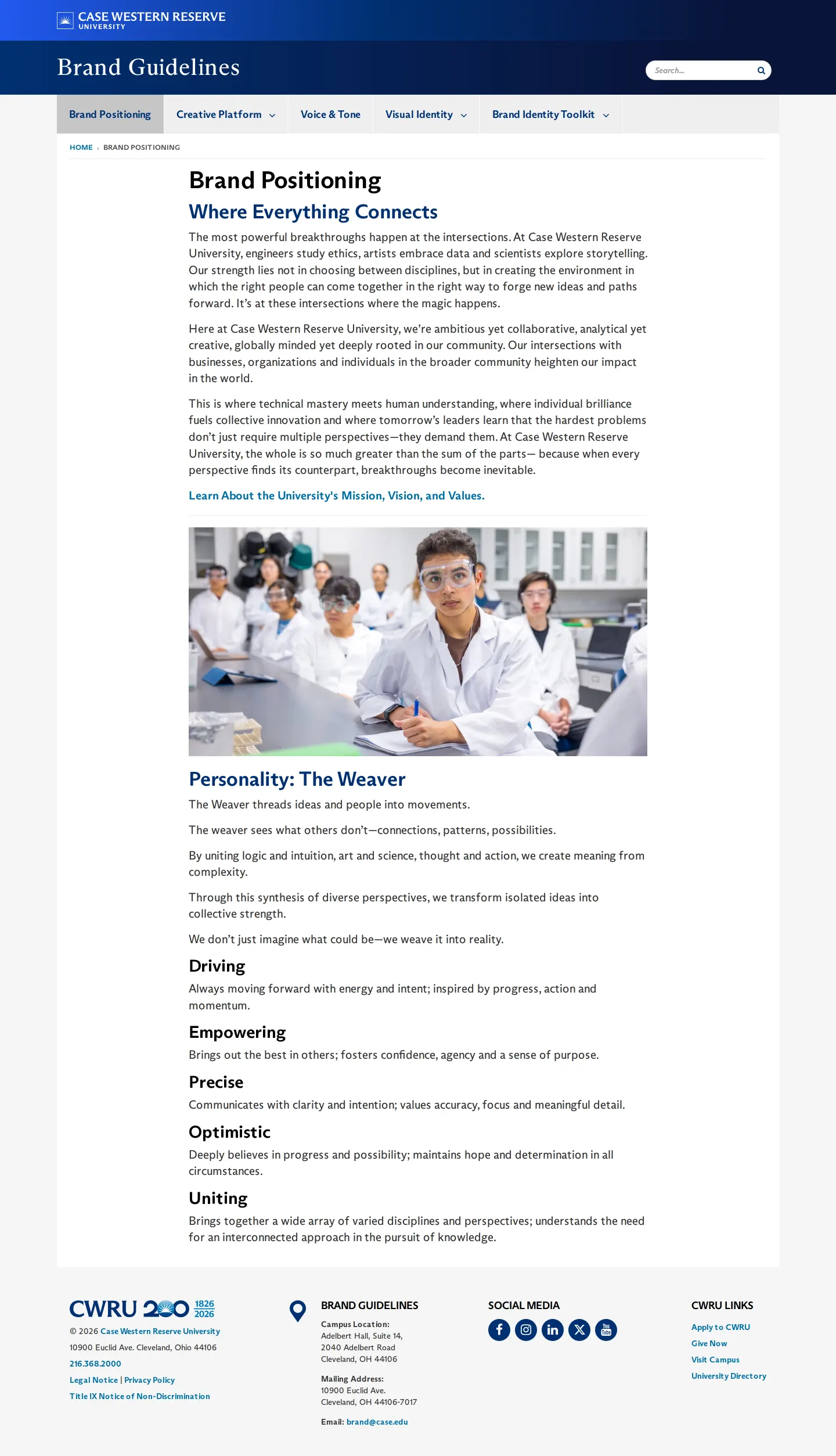
- The brand positioning outlines five personality traits—Driving, Empowering, Precise, Optimistic, and Uniting—under the archetype 'The Weaver'.123456
- The voice and tone section provides explicit guidance on how to use and when to avoid the key term 'Force'.789
- Logo files are hosted externally and accessible via a Webdam download link.10
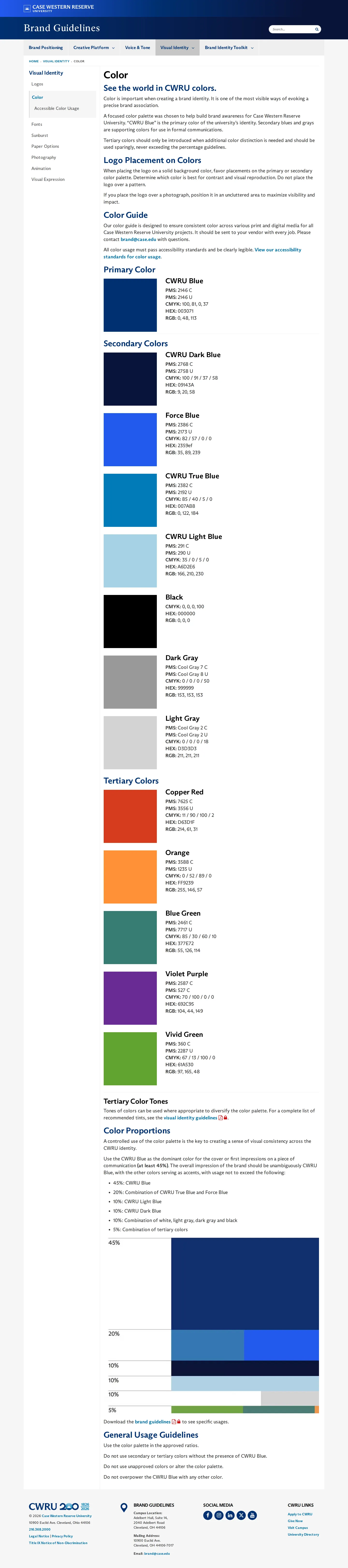
- The site organizes its color palette into primary, secondary, and tertiary tiers alongside dedicated guidance on color proportions.11121314
Numbers refer to the screenshots above.
What I could not see
- Template files and self-service creation tools were not visible in the captured pages.
- Access to external Webdam assets could not be verified beyond the destination link.
Ideas to borrow
Reviewed on 18 September 2026. Request a correction · I built this

