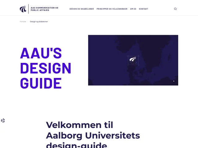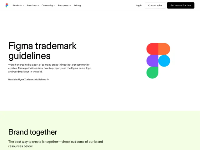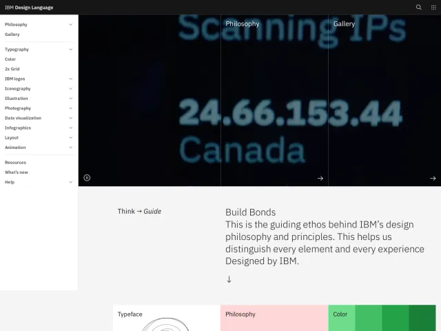
Bitget brand guidelines
Official guidelines covering Bitget's identity system, typography, color rules, and emerging creative workflows.
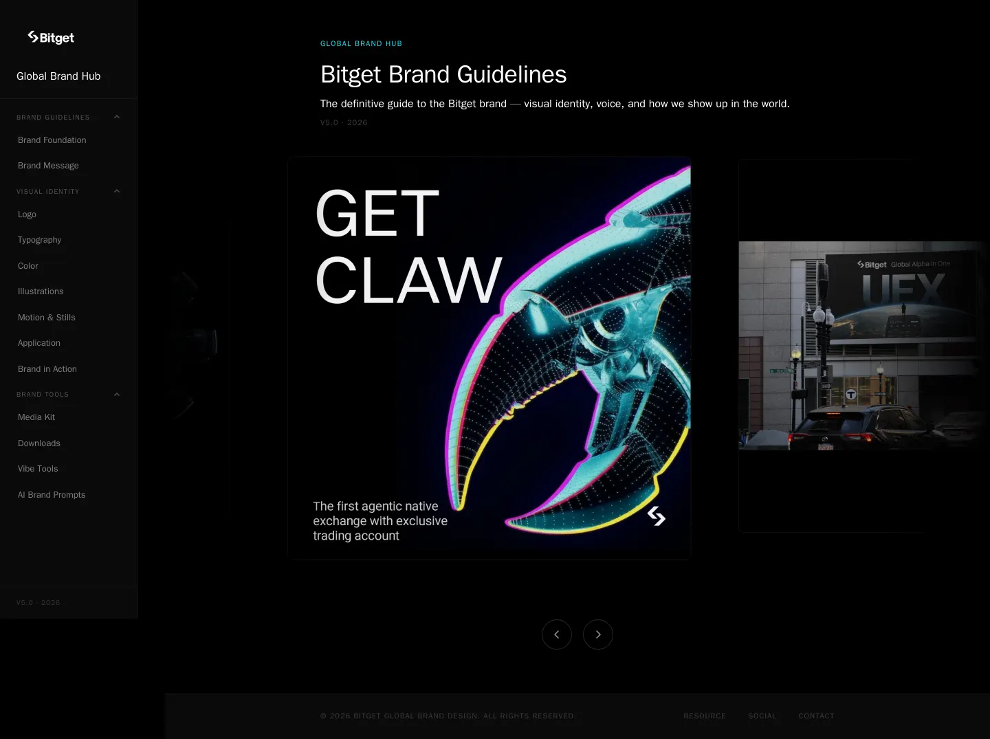
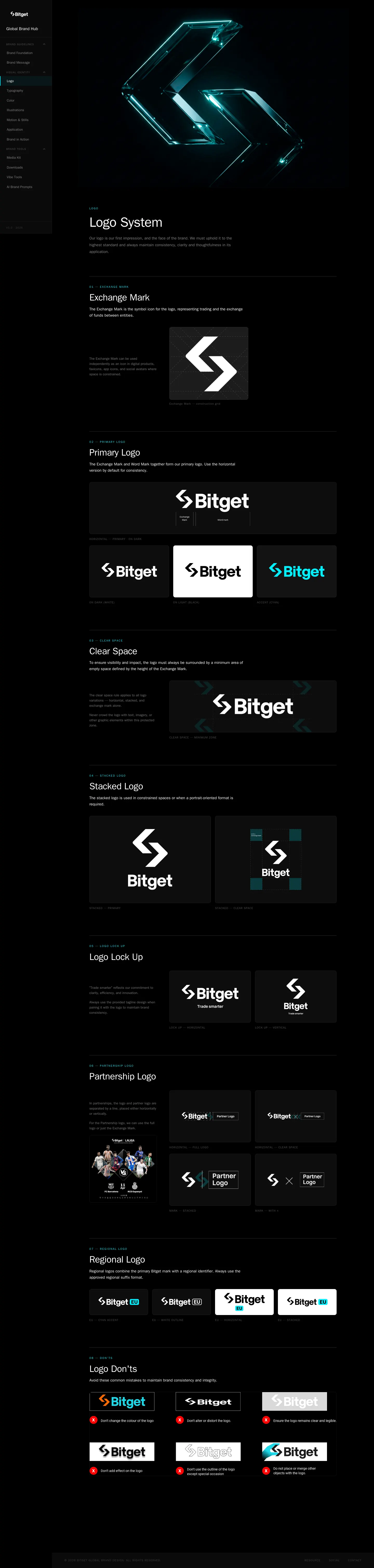
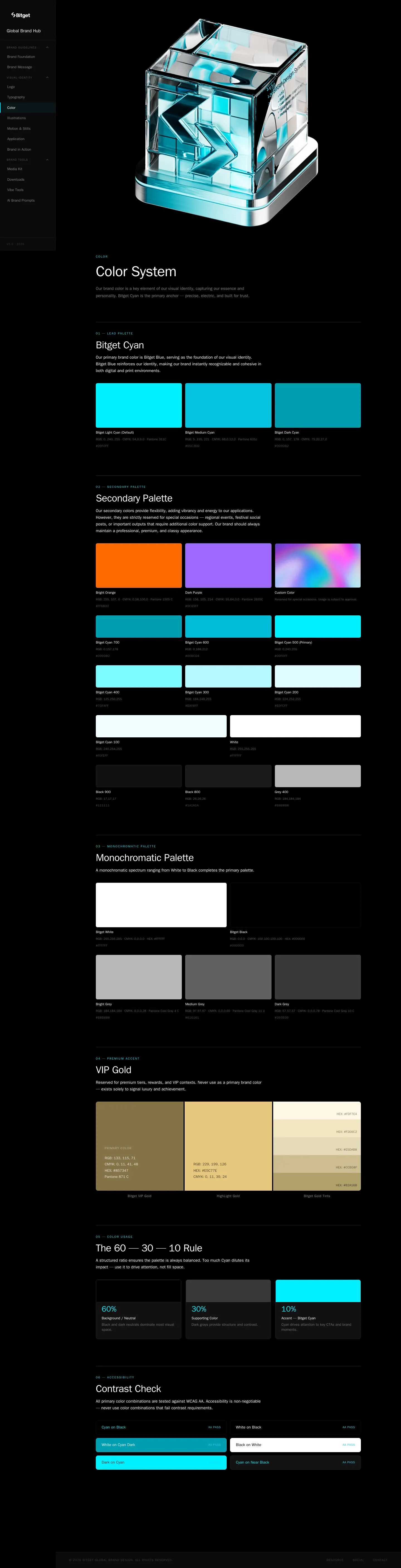
Freedam's take — I really enjoy looking through Bitget's brand hub because of how thorough and modern it feels. Across the navigation, you immediately spot interesting forward-looking sections like vibe tools and AI brand prompts alongside traditional essentials like logo lockups and clear space rules. Their color system breaks down practical ratios like the 60-30-10 rule and includes contrast checks, while typography covers Switzer, Bitget Pulse, and Noto Sans. It is a comprehensive, hands-on reference that addresses current creative workflows directly.
Details
- Type
- Guidelines
- Access
- Public
- Source
- brand.bitget.com
- Industry
- Crypto & web3
- Capabilities
- Guidelines, Downloads
- Tags
- color system, typography, logo usage, brand story, accessibility
- Added
- Last checked

What I noticed
- The navigation menu includes sections for Vibe Tools and AI Brand Prompts alongside standard identity chapters.12
- The typography documentation specifies Switzer, Bitget Pulse, and Noto Sans, alongside type scales and hierarchy.34567
- The color system outlines Bitget Cyan, VIP Gold, a 60-30-10 rule, and contrast check guidelines.891011
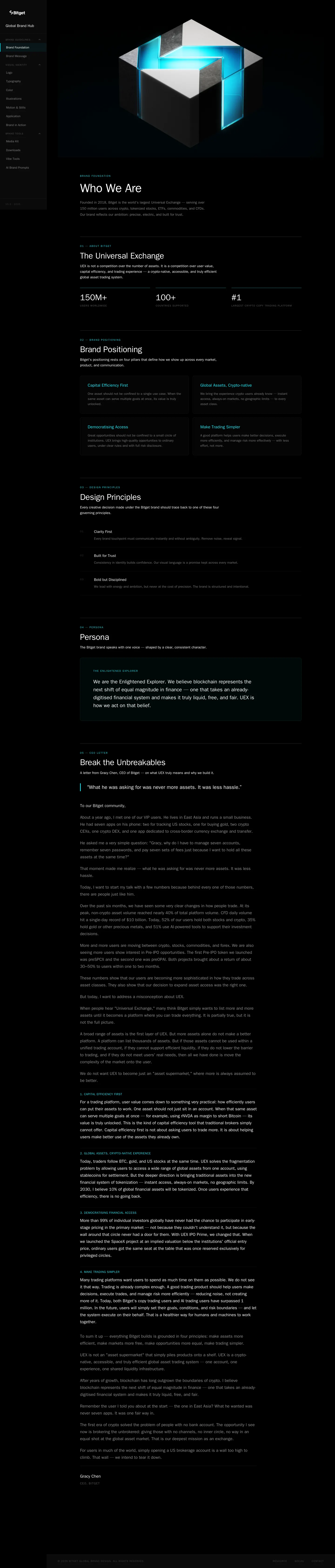
- The brand foundation defines the company as The Universal Exchange and articulates core design principles.1213
Numbers refer to the screenshots above.
What I could not see
- The internal contents of the Vibe Tools and AI Brand Prompts pages were not captured in this evidence bundle.
- The contents of the download center and media kit pages were not captured.
Ideas to borrow
Reviewed on 18 September 2026. Request a correction · I built this