
BI Norwegian Business School brand guidelines
BI Norwegian Business School's design manual provides comprehensive identity guidelines, motion standards, downloadable assets, and practical utility templates.
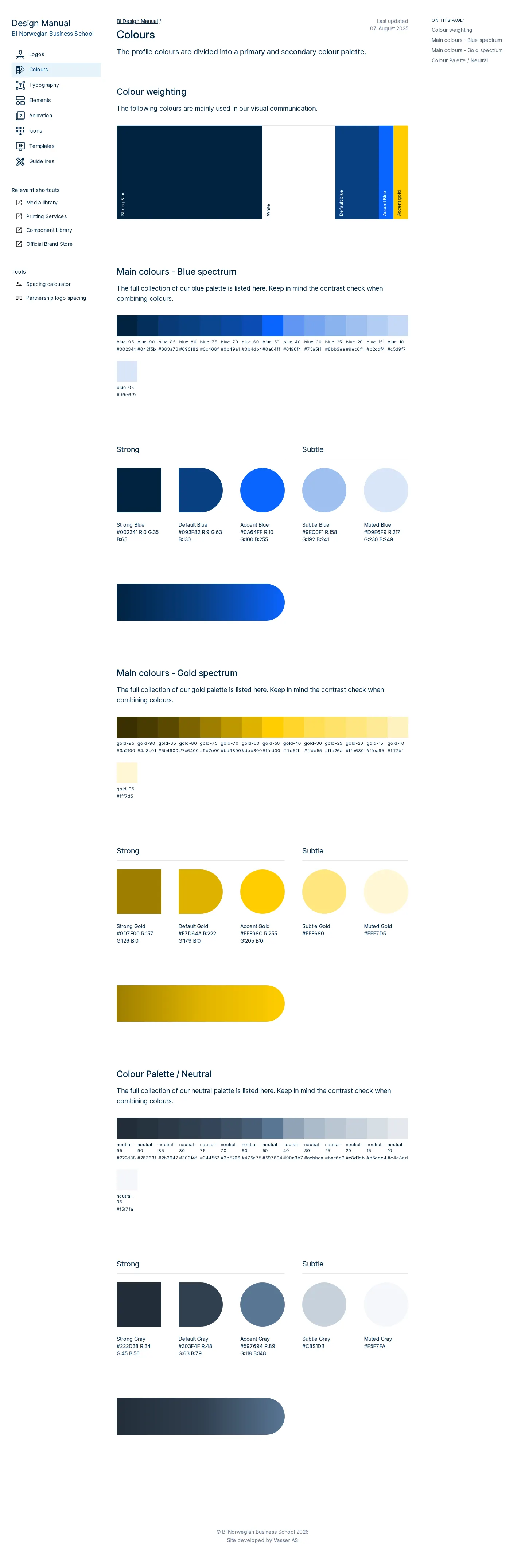
Freedam's take — I love seeing how thoroughly BI Norwegian Business School organizes its design system. Beyond the standard typography featuring Museo Slab and brand color palettes, the manual dedicates full sections to motion, including lower thirds, HTML5 animations, and an audio signature. The navigation also points to practical utilities like a spacing calculator and dedicated teaching templates. It feels like an honest working manual built to support staff across classrooms, screen graphics, and print collateral, keeping day-to-day identity production grounded and consistent.
Details
- Type
- Guidelines
- Access
- Public
- Source
- design.bi.no
- Industry
- Education
- Capabilities
- Guidelines, Asset browsing, Downloads, Templates
- Tags
- motion design, audio branding, presentation templates, typography, print & stationery, comprehensive
- Added
- Last checked
What I noticed
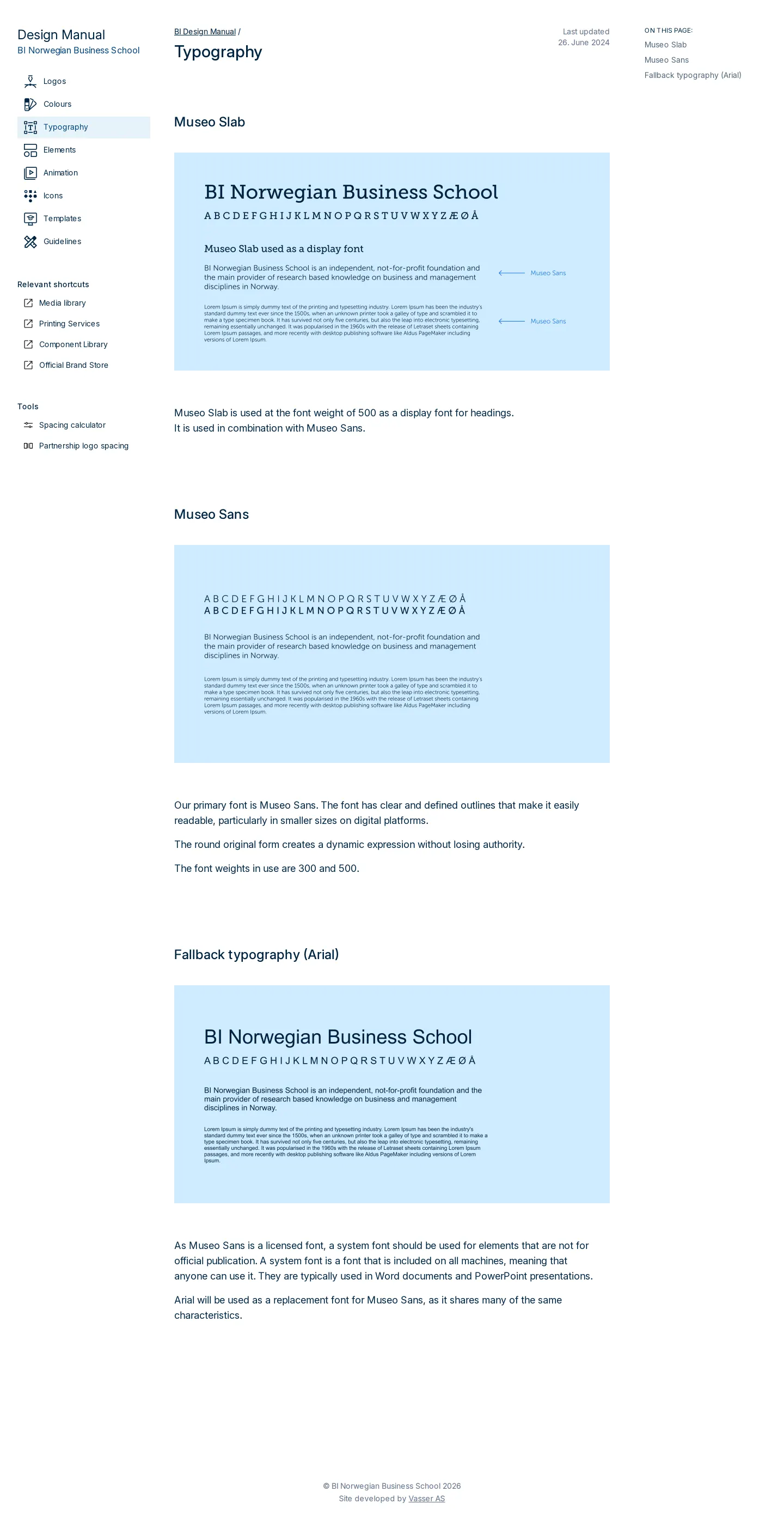
- The typography documentation covers Museo Slab, Museo Sans, and Arial fallback options.123
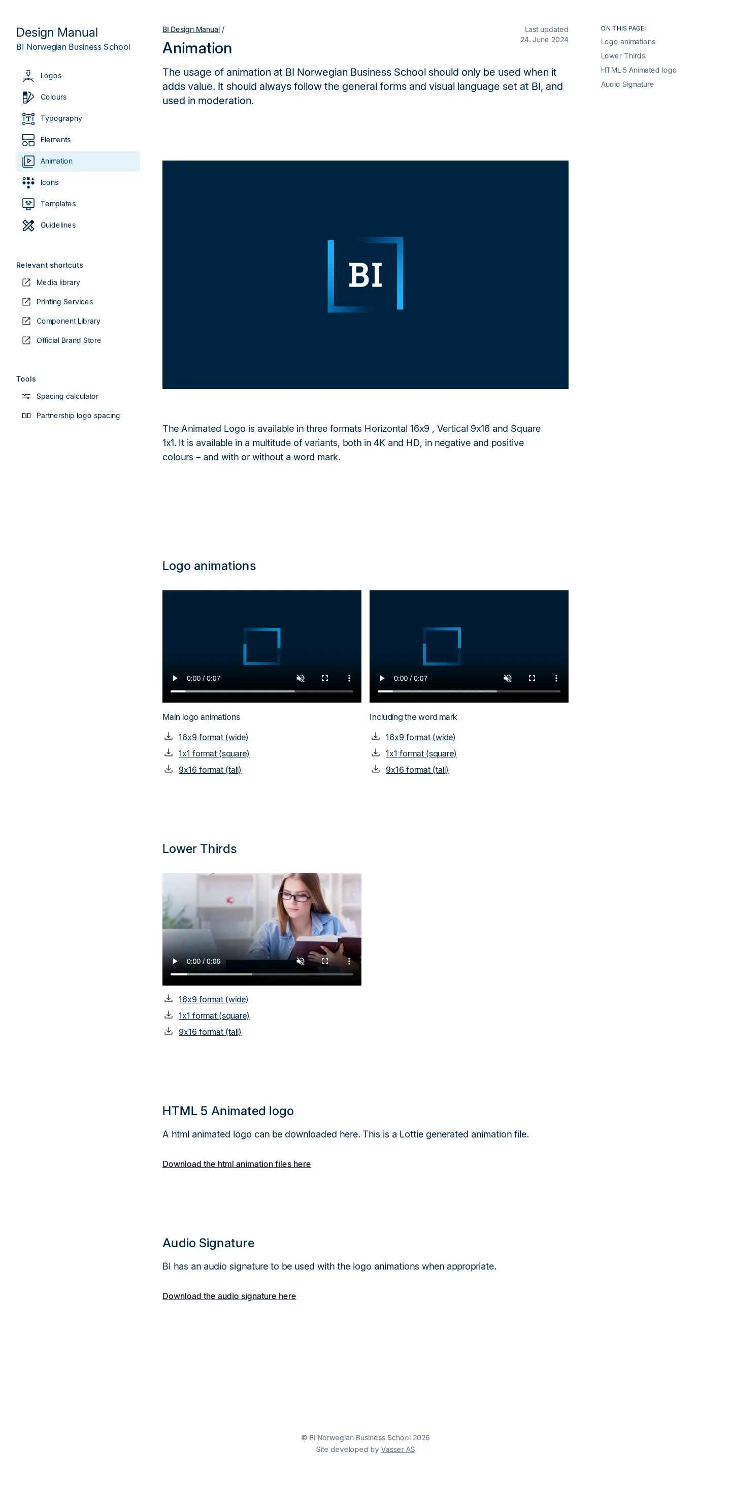
- The animation section provides guidance and downloads for lower thirds, logo animations, HTML5 animation files, and an audio signature.456789
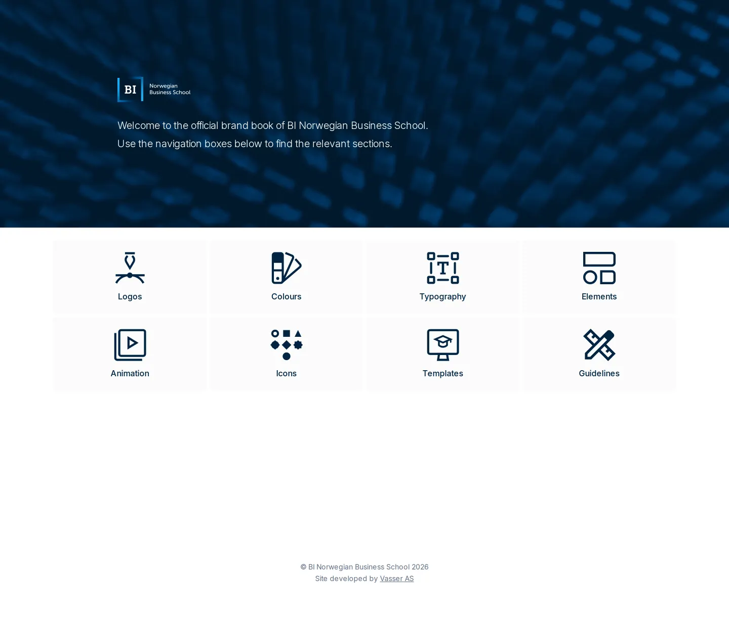
- The global navigation includes links to tools such as a Spacing calculator and Partnership logo spacing.1011
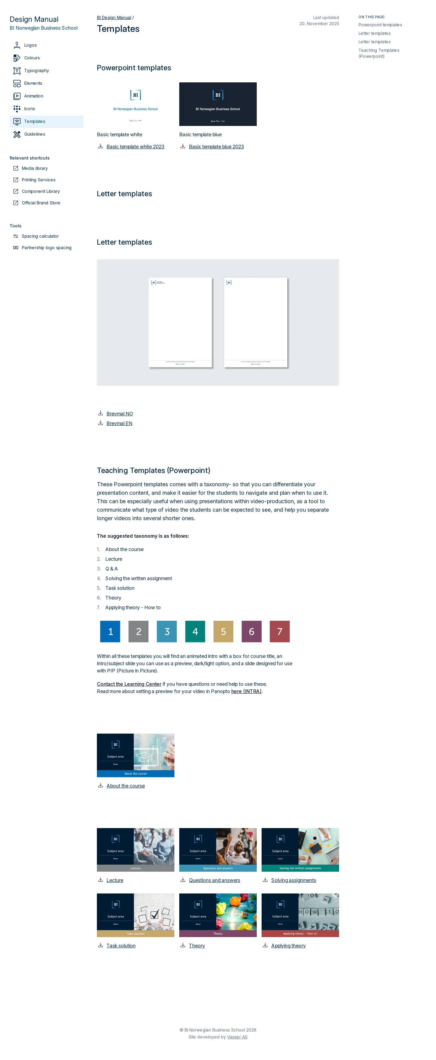
- Template sections supply PowerPoint files specifically tailored for teaching alongside standard presentations and letters.121314
Numbers refer to the screenshots above.
What I could not see
- Could not view the contents or functionality of the Spacing calculator, Component Library, or Media library links directly from the capture.
Ideas to borrow
- Including dedicated teaching presentation templates helps academic staff keep course content on-brand without extra friction.
Reviewed on 18 September 2026. Request a correction · I built this

