Zurich Insurance brand guidelines
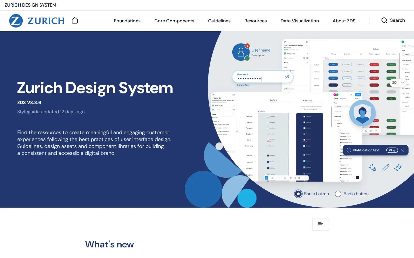
Zurich Insurance presents comprehensive digital guidelines covering core components, design foundations, and data visualization tools.
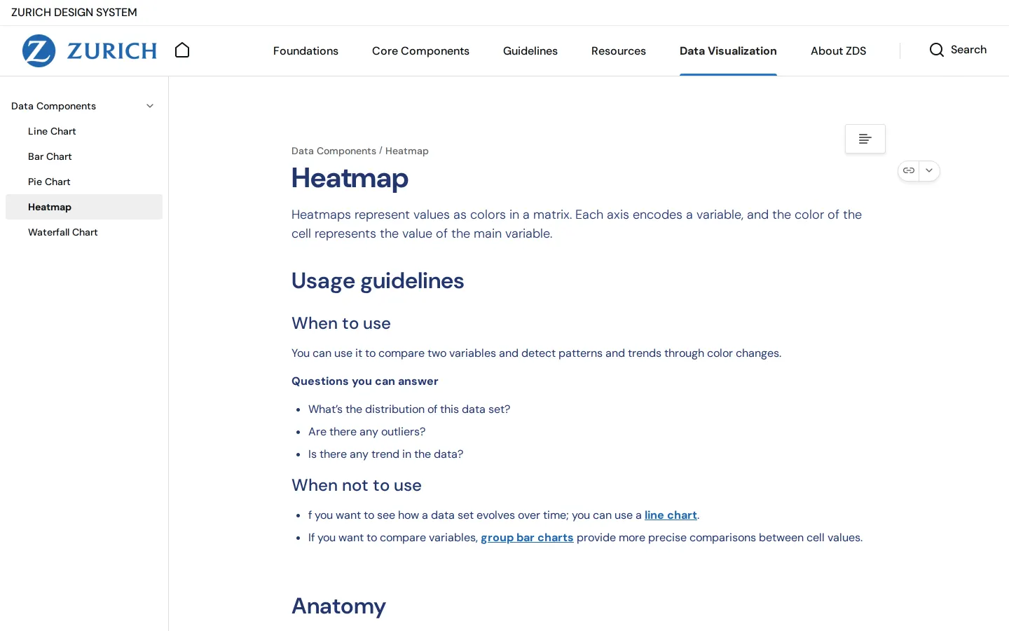
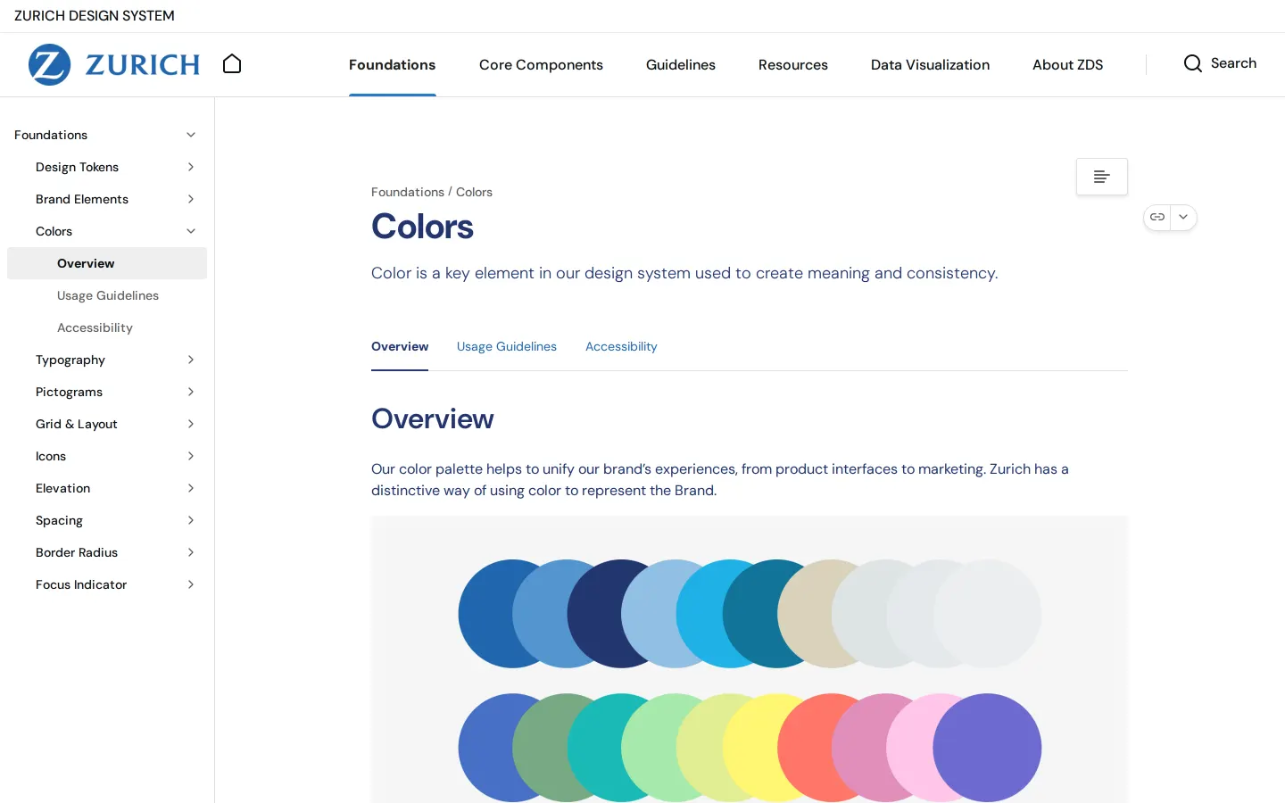
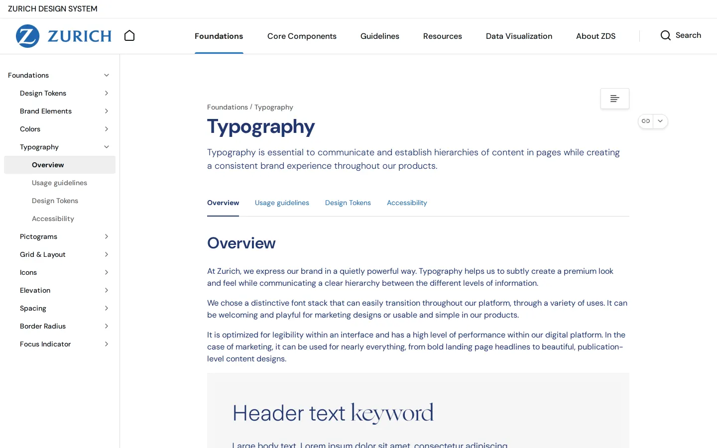
Freedam's take — I spent some time exploring the Zurich Design System, and I appreciate how thoroughly it bridges basic UI needs with data presentation. Built on zeroheight, the site lays out standard foundations like typography, colors, and iconography, but it also provides a dedicated section for data visualization. Pages like the heatmap guide walk through practical usage, chart anatomy, and configuration details. Seeing accessibility integrated directly into foundation sections like colors, typography, and icons shows a disciplined commitment to building accessible digital interfaces.
- Type
- Guidelines
- Access
- Public
- Source
- design.zurich.com
- Industry
- Finance
- Capabilities
- Guidelines, Asset browsing, Search
- Tags
- insurance, design system, zeroheight, data visualization, components
- Added
- Last checked
What I noticed
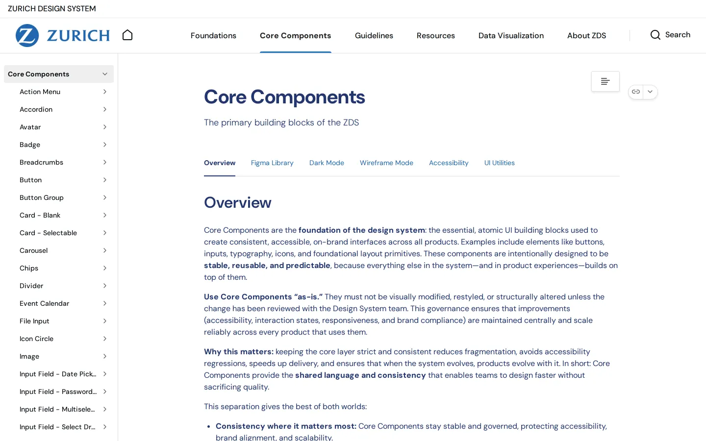
- The documentation platform includes a dedicated section for data visualization with chart types such as heatmaps, bar charts, and line charts.1234
- The documentation is built on the zeroheight platform.567
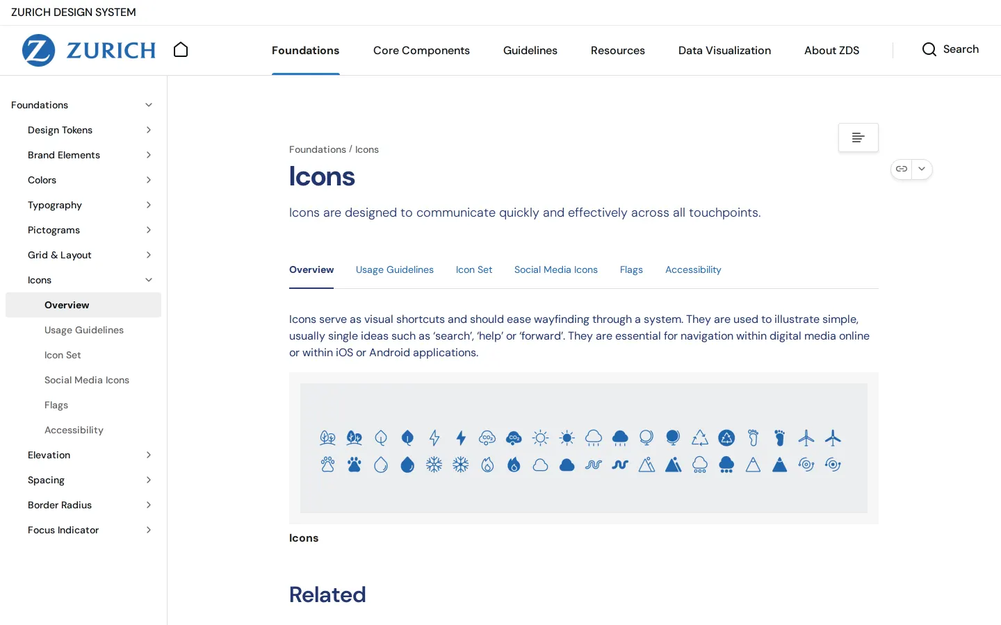
- Foundations pages for colors, typography, and icons each include specific accessibility subtopics.8910
- The heatmap component page details usage guidelines, anatomy, styling themes, and interaction.11121314
Numbers refer to the screenshots above.
What I could not see
- Could not view the contents of downloadable design files or code packages.
- Could not view whether interactive live code demos exist inside the component pages.
Ideas to borrow
Reviewed on 16 September 2026. Request a correction · I built this