Global Payments brand guidelines
Global Payments provides a Brandfolder-hosted brand portal featuring identity standards, tone of voice pillars, logo specifications, and quick links to core creative assets.
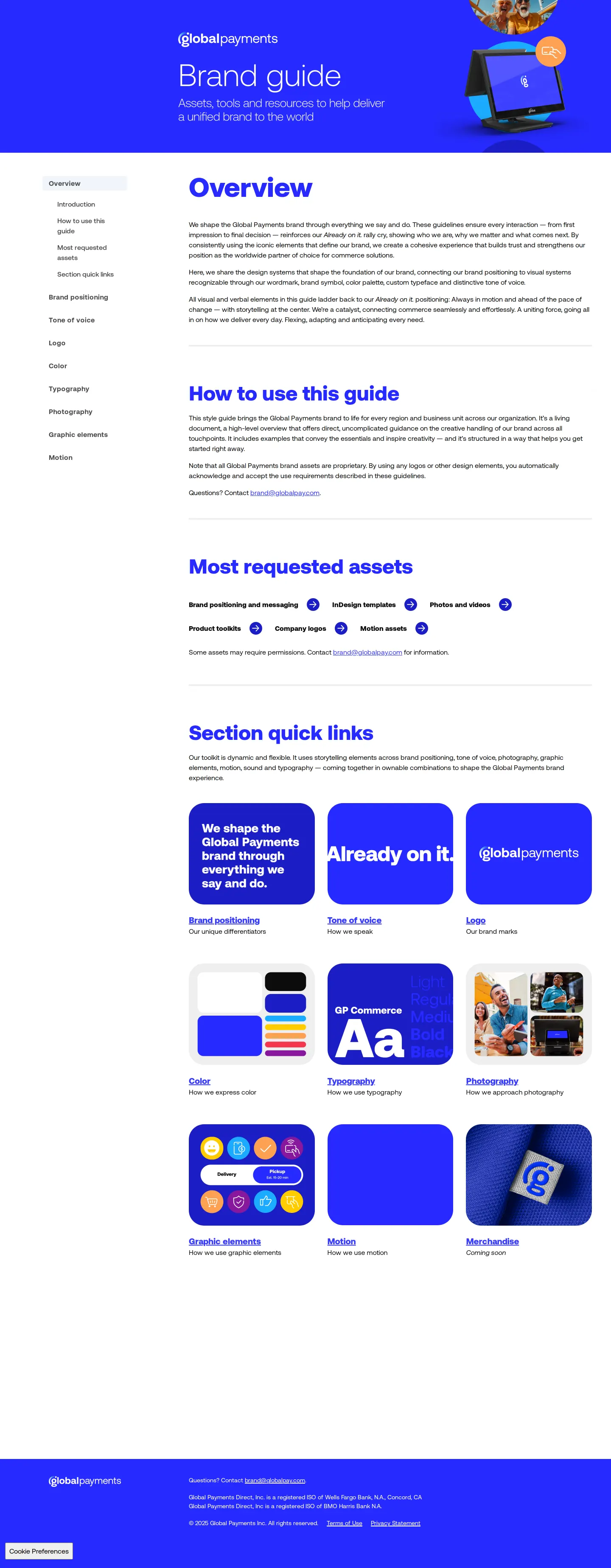
The overview screen displays quick access to frequently requested files and a card grid linking to main guidelines chapters.

The logo page outlines symbol geometry, 23.5-degree alignment, minimum sizes, clearspace, and misuse examples.

Color documentation details primary, secondary, and tertiary palettes with color codes, usage ratios, and contrast rules.
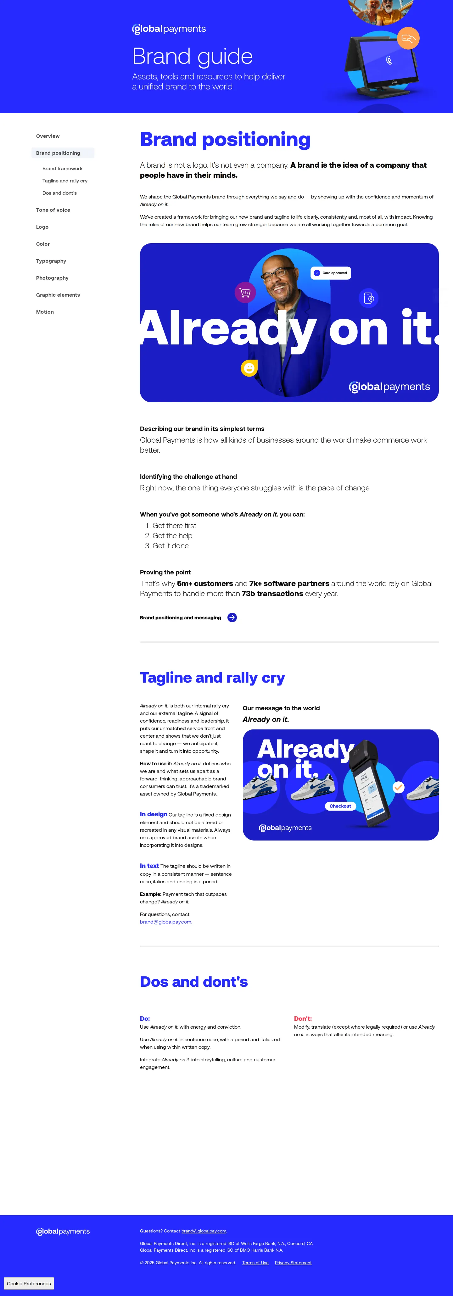
Brand positioning guidance covers the core rally cry 'Already on it.' along with design and copy rules.
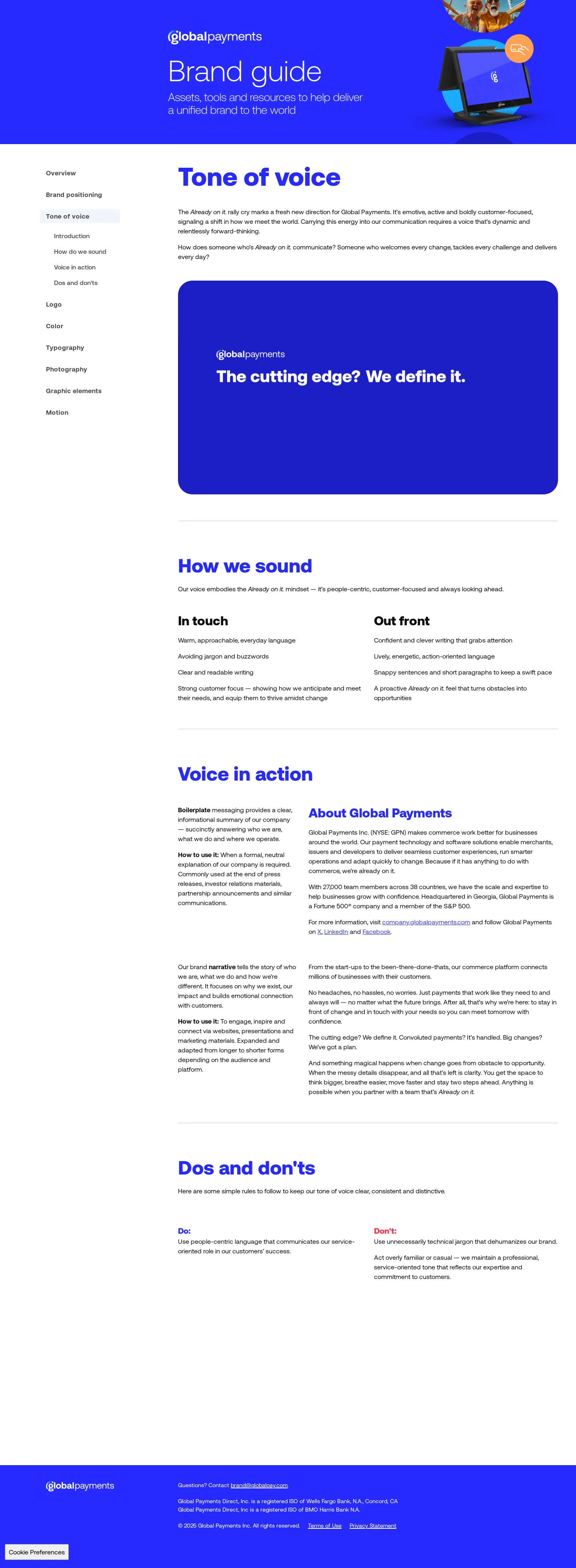
Tone of voice principles explain messaging pillars 'In touch' and 'Out front' with sample copy and writing dos and don'ts.
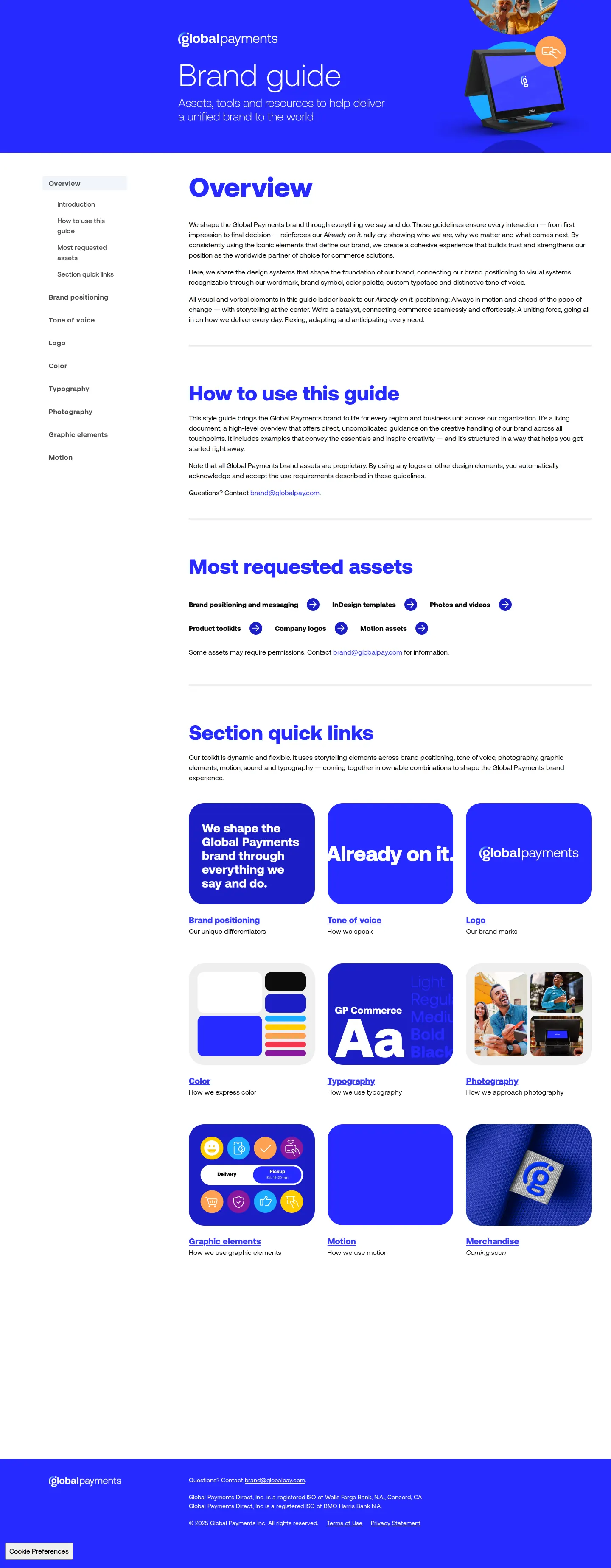
Introductory guide screen offering navigation links, asset shortcuts, and an overview of brand resources.
Freedam's take
I like how direct this portal is right from the start. Global Payments puts a row of most requested assets directly on the overview screen, letting teams jump straight to InDesign templates, company logos, and toolkits without drilling through the sidebar. The documentation is thorough, too. I appreciate the visual precision in the logo chapter, where they note the symbol's arc and ping are aligned to an Earth-tilt angle of 23.5 degrees. It balances storytelling with clear, practical guardrails across color proportions and editorial voice.
At a glance
- Sections
- Overview · Brand positioning · Tone of voice · Logo · Color · Typography · Photography · Graphic elements · Motion · Merchandise
- Tone
- Clear, direct, and structured corporate guidelines tailored for enterprise identity and everyday creative execution.
What I noticed
- The overview page features a 'Most requested assets' section linking to InDesign templates, photos and videos, product toolkits, company logos, and motion assets.12
- The logo guidelines explain that the symbol's 'Arc and Ping' is set at an Earth-tilt angle of 23.5 degrees.3
- Color swatches provide codes for HEX, RGB, CMYK, and PMS alongside percentage-based application guidelines.45
- The tone of voice framework divides the brand's writing style into two primary pillars named 'In touch' and 'Out front'.6
Numbers refer to the screenshots above.
What I could not see
- Could not inspect the full typography documentation or specific download packages for GP Commerce.
- Could not view the contents of the upcoming Merchandise section.
Ideas to borrow
Quick answers
What is the primary corporate typeface for Global Payments?
The primary typeface shown across the guidelines preview and typography sections is 'GP Commerce'.78
What is the minimum digital display size for the Global Payments logo?
The minimum digital sizing specification is 32 pixels (or 8.47 mm), alongside a dedicated 16x16 pixel version for favicons.9
Reviewed on 26 September 2026. Request a correction · I built this
Similar brand centers
All brand guidelines →Global Payments spans corporate identity, voice pillars, and logo geometry across dedicated pages. Apple Pay focuses instead on channel-specific marketing rules and badge downloads, while dLocal uses an x-height clearspace metric with public SVG downloads rather than linking to asset packages.