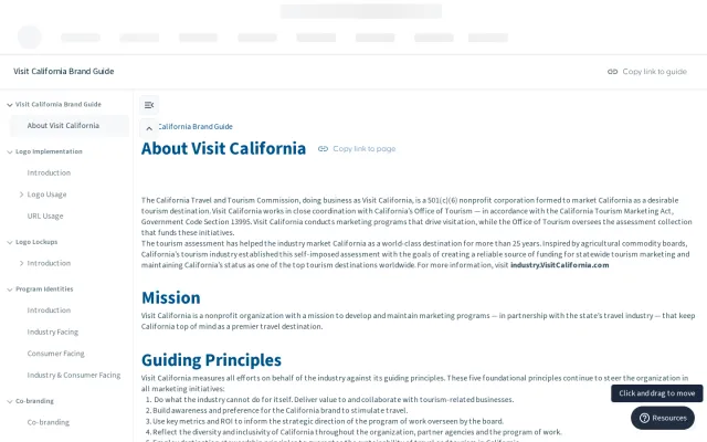
 Visit California
Travel & hospitality
Guidelines
Visit California
Travel & hospitality
Guidelines
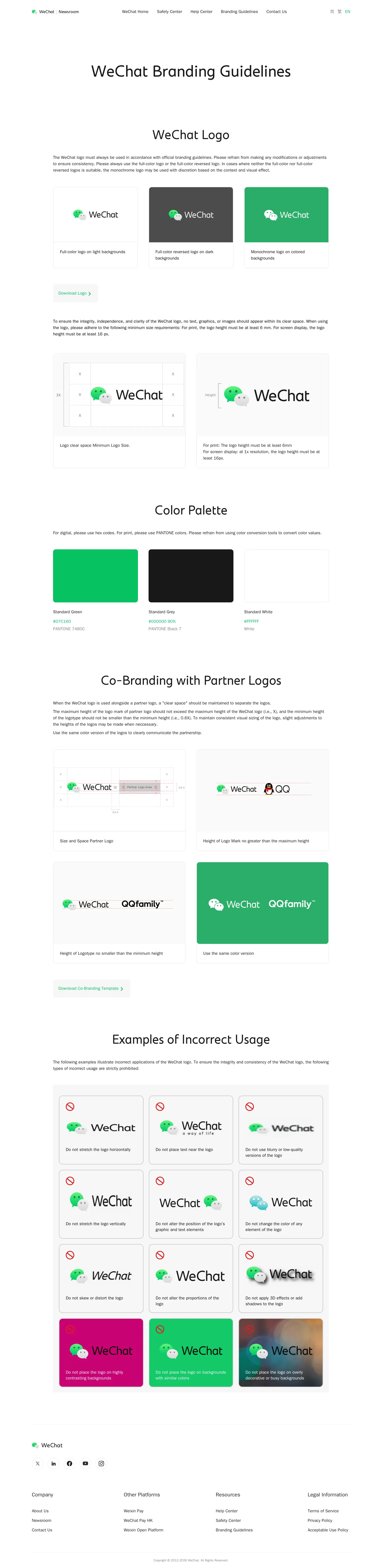
WeChat provides a concise, single-page brand guide covering logo rules, clear space, minimum sizing, co-branding guidelines, and downloadable assets.
Freedam's take — I like how direct the WeChat branding guidelines page is. It sets out the essentials clearly without getting lost in unnecessary background. You get practical logo specifications, complete with clear space rules and minimum dimensions for both print and digital screens. There is a dedicated section for color palettes, alongside visual guidance on co-branding arrangements with partner logos and clear examples of incorrect usage. Direct download packages for the core logo and co-branding templates sit right alongside the instructions, making it straightforward for partners and creators to implement the mark accurately.
Numbers refer to the screenshots above.
Reviewed on 17 September 2026. Request a correction · I built this