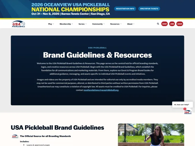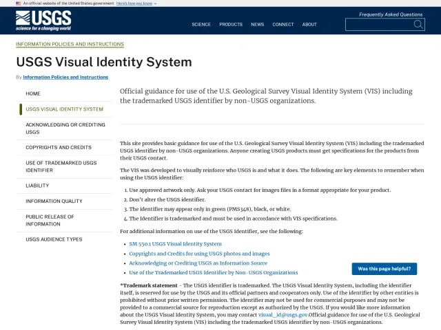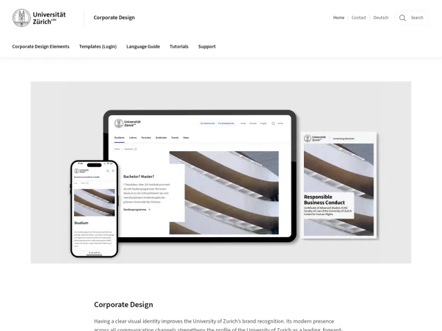
Visma brand guidelines
Visma's brand guidelines provide clear rules for typography, colour systems, and logos alongside downloadable assets.
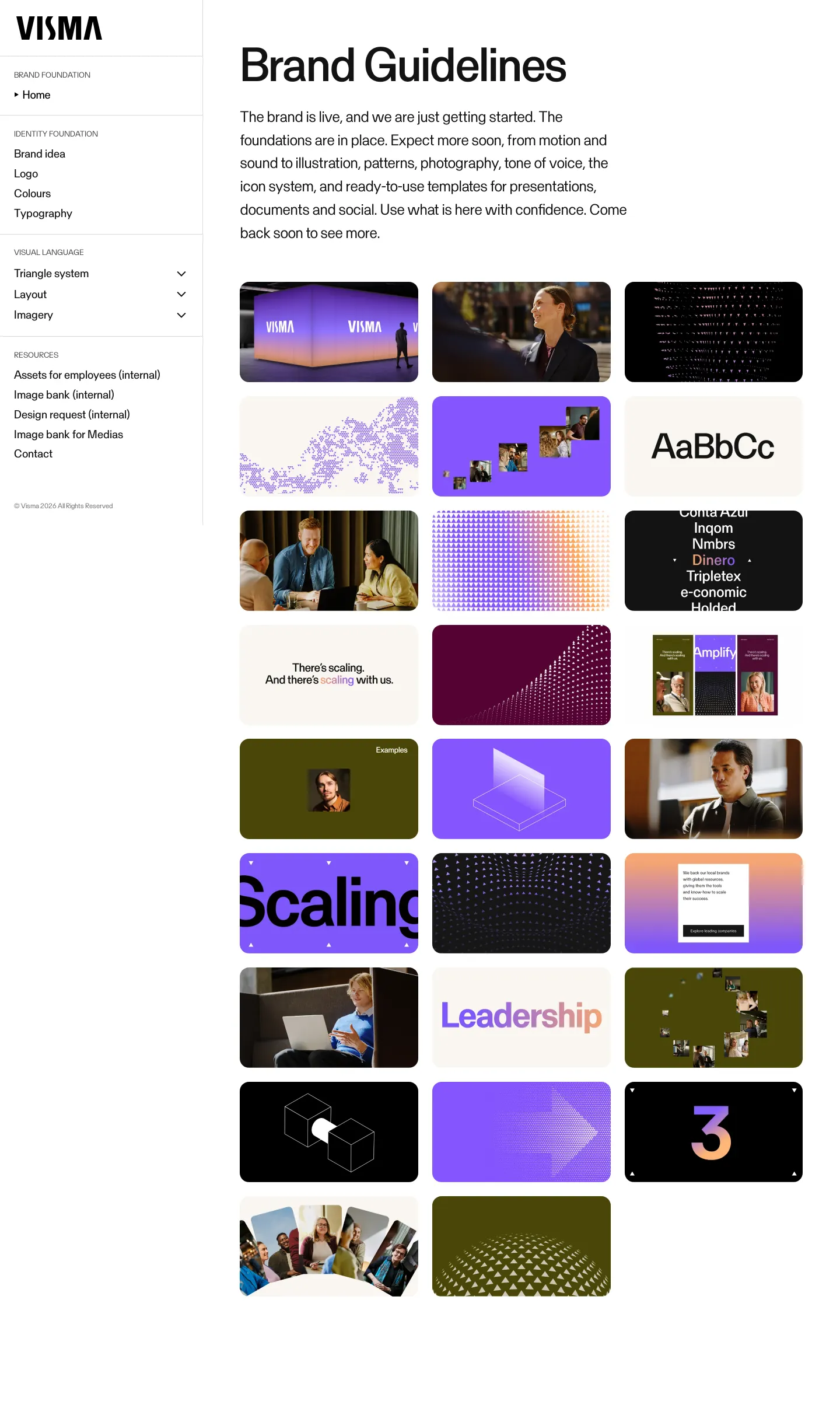
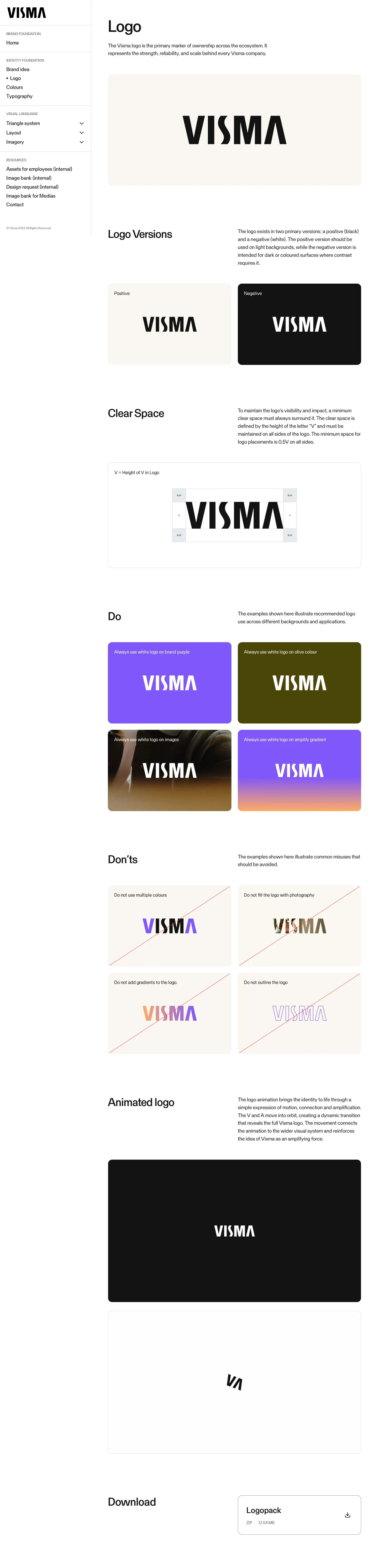
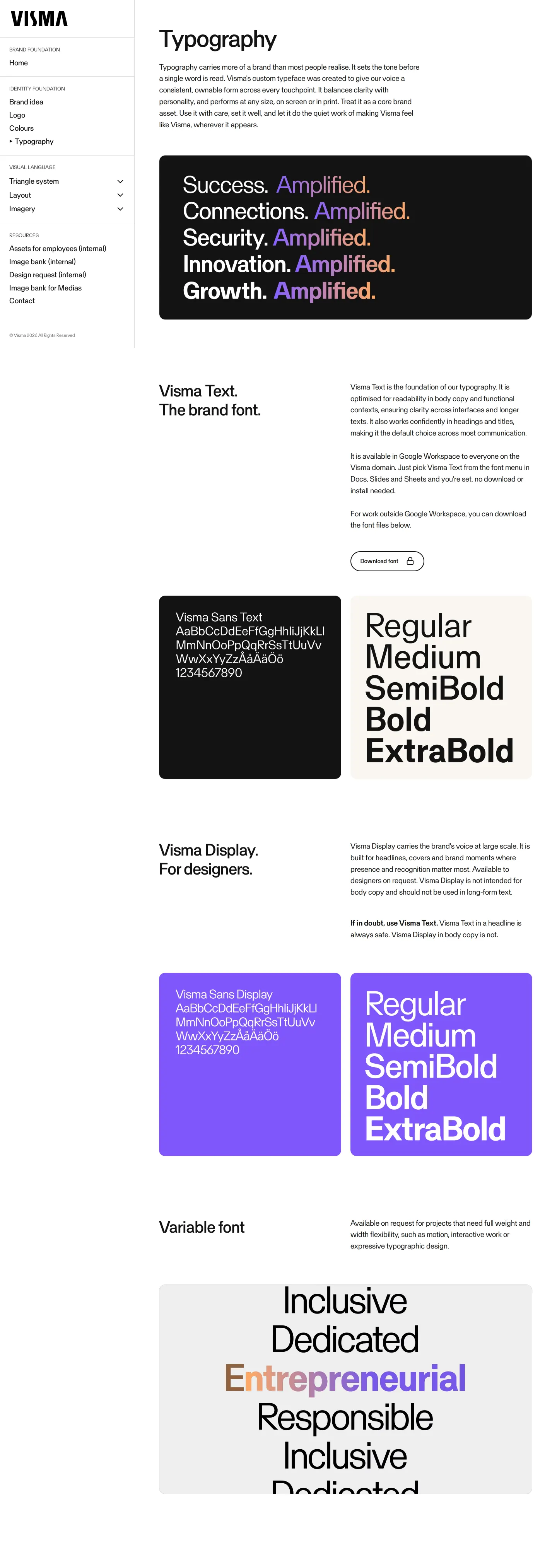
Freedam's take — I like how Visma approaches their identity structure online. Hosted on HubSpot, their design site outlines essential assets like custom fonts, logo dos and don'ts, and detailed colour systems. I appreciate that they differentiate typography roles, clearly distinguishing Visma Text as the primary brand font from Visma Display for specialized design work. They also give straightforward guidance on their gradient system, noting that it acts as an accent rather than a foundation. It feels like an honest, working brand resource that balances public-facing access with clearly labeled internal portals.
- Type
- Guidelines
- Access
- Public
- Source
- design.visma.com
- Industry
- Technology
- Capabilities
- Guidelines, Asset browsing, Downloads
- Tags
- typography, color system, do's and don'ts, logo usage, asset downloads, hubspot
- Added
- Last checked

What I noticed
- The typography section distinguishes between Visma Text for general brand use and Visma Display for designers.12
- The guidelines site is hosted on HubSpot.34567
- The colour documentation notes that the amplify gradient is intended as an accent rather than a foundation.89
Numbers refer to the screenshots above.
What I could not see
- Could not view internal employee asset portals or internal image banks due to access restrictions.
- Could not inspect the full visual layouts of triangle glyphs, patterns, and compositions pages as they were not captured.
Ideas to borrow
- Teams can clarify typography usage by explicitly labeling which font cuts are intended for general staff versus dedicated designers.
Reviewed on 17 September 2026. Request a correction · I built this
Similar brand centers
All brand guidelines →