UW Medicine brand guidelines
UW Medicine provides a practical brand portal featuring guidance on a logo refresh, brand architecture rules, and quick links to everyday institutional tasks.
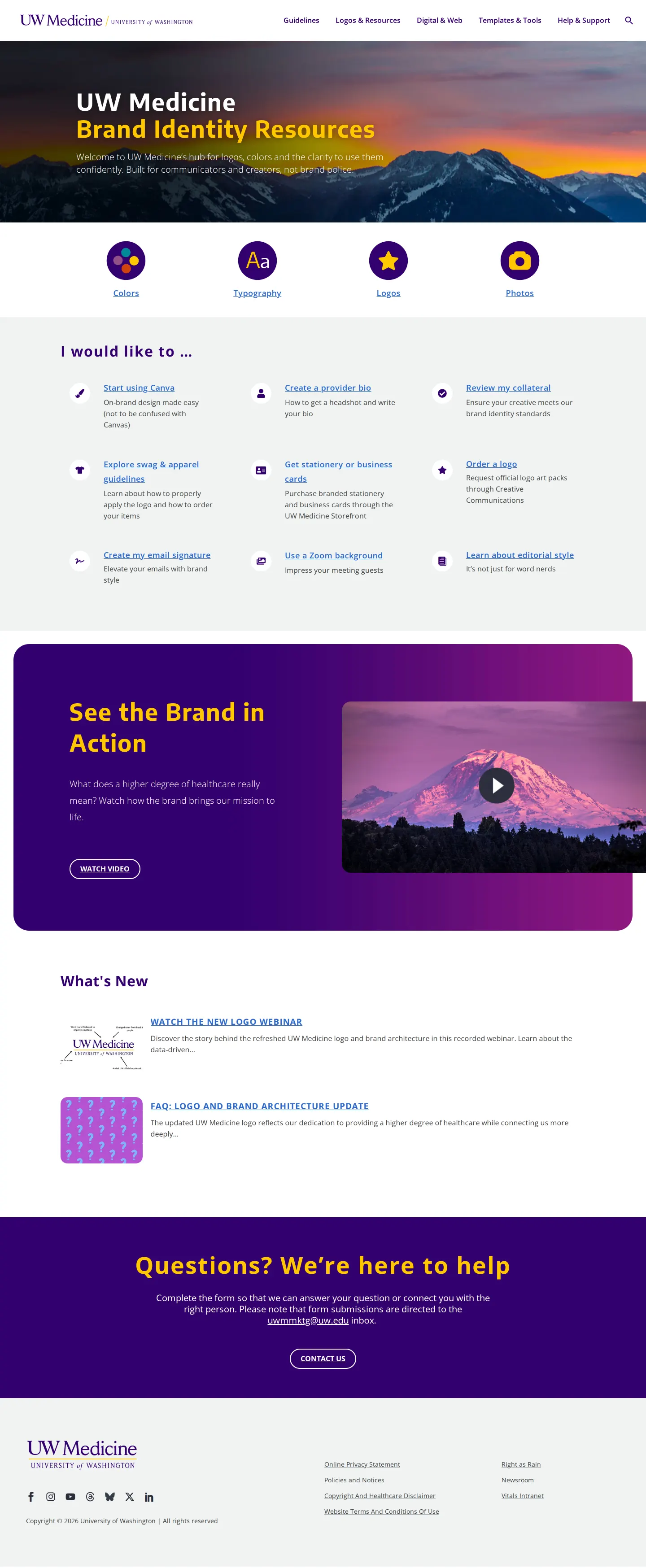
UW Medicine brand identity homepage with quick-access category icons, task shortcuts, and video section.
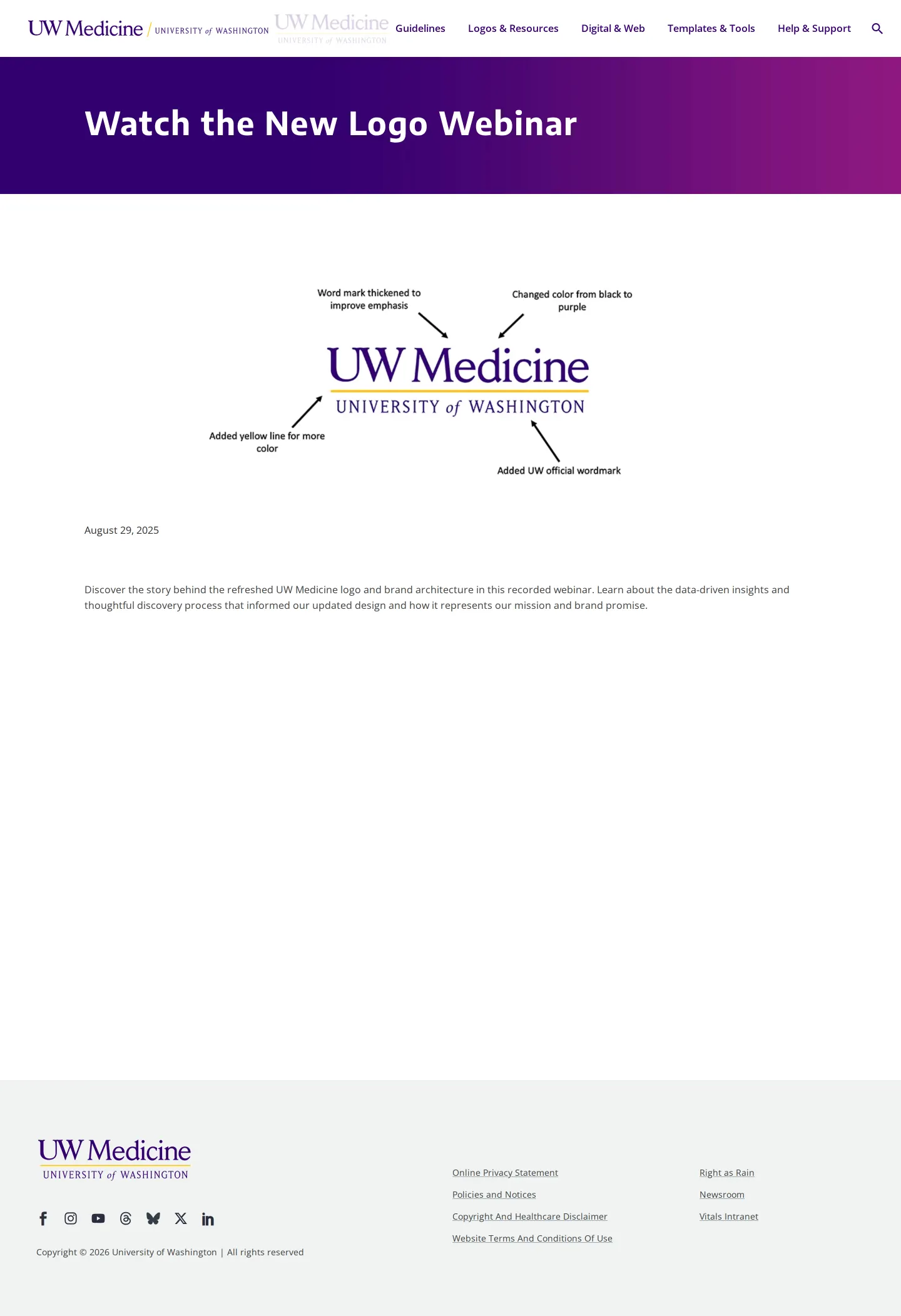
Webinar page detailing the refreshed UW Medicine logo with an annotated graphic of typography and color changes.

Brand architecture and logo update FAQ featuring old versus new comparisons and brochure layout mockups.
Questions and feedback form with sidebar links to brand review requests and the employee intranet.
Want a brand center like UW Medicine’s?
Create your brand center with Freedam ↗Freedam's take
I like how pragmatic this portal is for a complex healthcare organization. Instead of burying updates in a static PDF, the team put together a dedicated webinar and an extensive FAQ page breaking down their logo refresh. You get an annotated diagram pointing out exact typography and color shifts, along with a side-by-side table contrasting old and new marks across primary, entity, and service line tiers. The homepage also organizes daily tasks directly through an 'I would like to' section, connecting staff straight to Canva, swag, and stationery setups without getting lost in unnecessary theory.
At a glance
- Sections
- Guidelines · Logos & Resources · Digital & Web · Templates & Tools · Help & Support
- Tone
- Direct and institutional, focused on helping staff implement brand changes and access daily communication tools.
What I noticed
- The homepage features an 'I would like to ...' section with quick links to nine common tasks such as Canva, swag, stationery, and email signatures.1
- A dedicated webinar page explains the refreshed logo with an annotated breakdown highlighting bolder type, color updates, and an added yellow line.234
- The FAQ page includes a side-by-side comparison table showing 'NEW' versus 'OLD' logo lockups across Primary, Entity, and Service Line categories.5
- A contact and feedback page provides an inquiry form alongside a sidebar linking to a brand review request and the internal intranet.678
Numbers refer to the screenshots above.
What I could not see
- Direct download links and asset file format packages were not viewable in the captured screens.
- Internal intranet pages behind the Vitals link were not captured.
Ideas to borrow
Quick answers
Reviewed on 25 September 2026. Request a correction · I built this
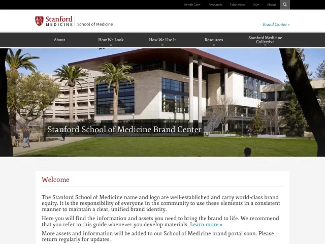
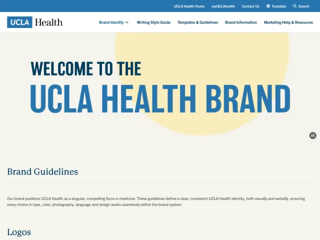
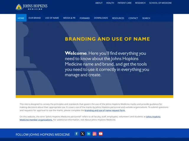
Similar brand centers
All brand guidelines →UW Medicine focuses on explaining its logo refresh through a recorded webinar and old-versus-new tables. In contrast, Stanford Medicine emphasizes structured downloads across EPS, SVG, and PNG packages along with widescreen PowerPoint templates. UCLA Health centers on institution-wide media policies, providing guidelines for hospital filming, photography, and staff social media engagement.