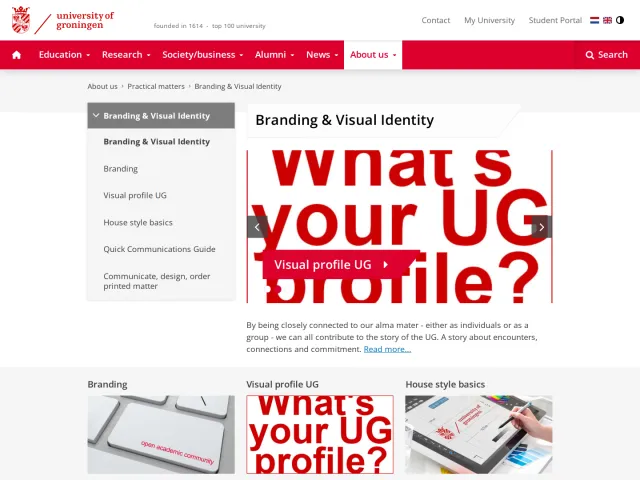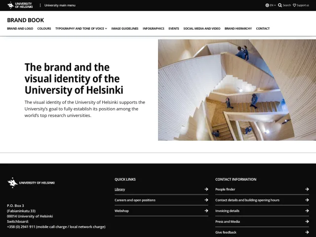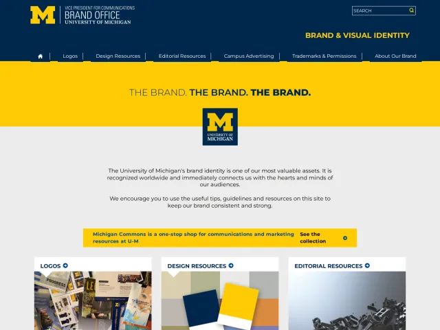
Utrecht University brand guidelines
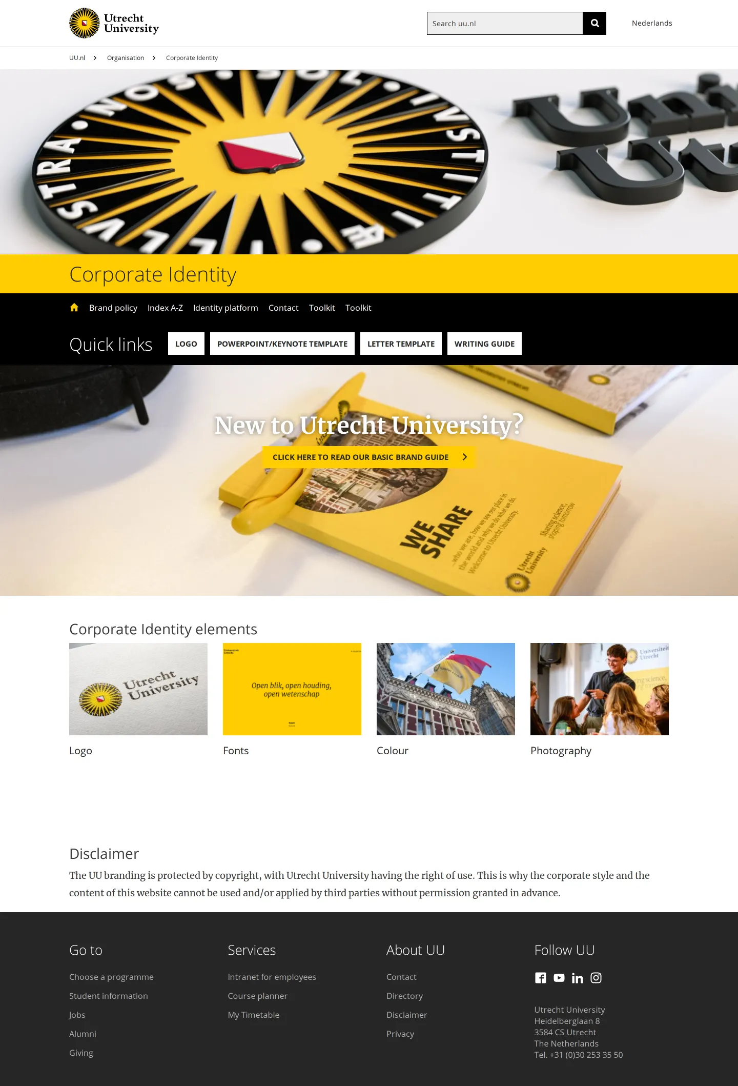
Utrecht University hosts its corporate identity guidelines directly on its primary website, offering downloadable brand assets and templates alongside practical presentation guidance.
Freedam's take — I like how pragmatic the corporate identity section is for Utrecht University. It lives directly within the institution's main digital presence, keeping everything accessible to students, staff, and partners. The team makes asset collection straightforward, offering direct file downloads for lockups in both Dutch and English alongside neatly separated print and digital files. I particularly appreciate the presentation guidance, which pairs practical Keynote and PowerPoint templates with four plain-spoken presentation principles. It gives people sensible editorial advice before sending them off with a slide deck.
Details
- Type
- Guidelines
- Access
- Public
- Source
- uu.nl
- Industry
- Education
- Capabilities
- Guidelines, Search, Downloads, Templates
- Tags
- presentation templates, typography, color system, logo usage, asset downloads, multilingual
- Added
- Last checked
What I noticed
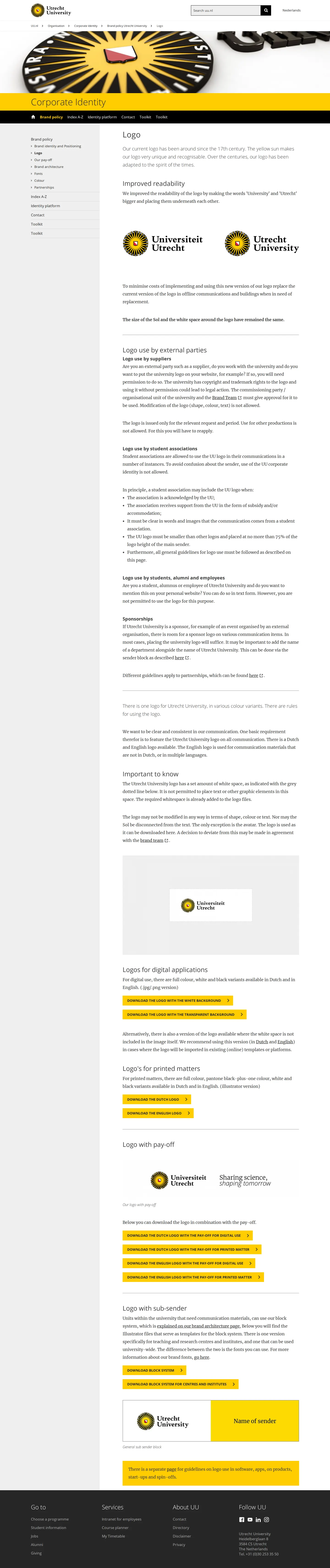
- The identity platform provides separate direct downloads for Dutch and English logo lockups optimized for digital and print uses.123456
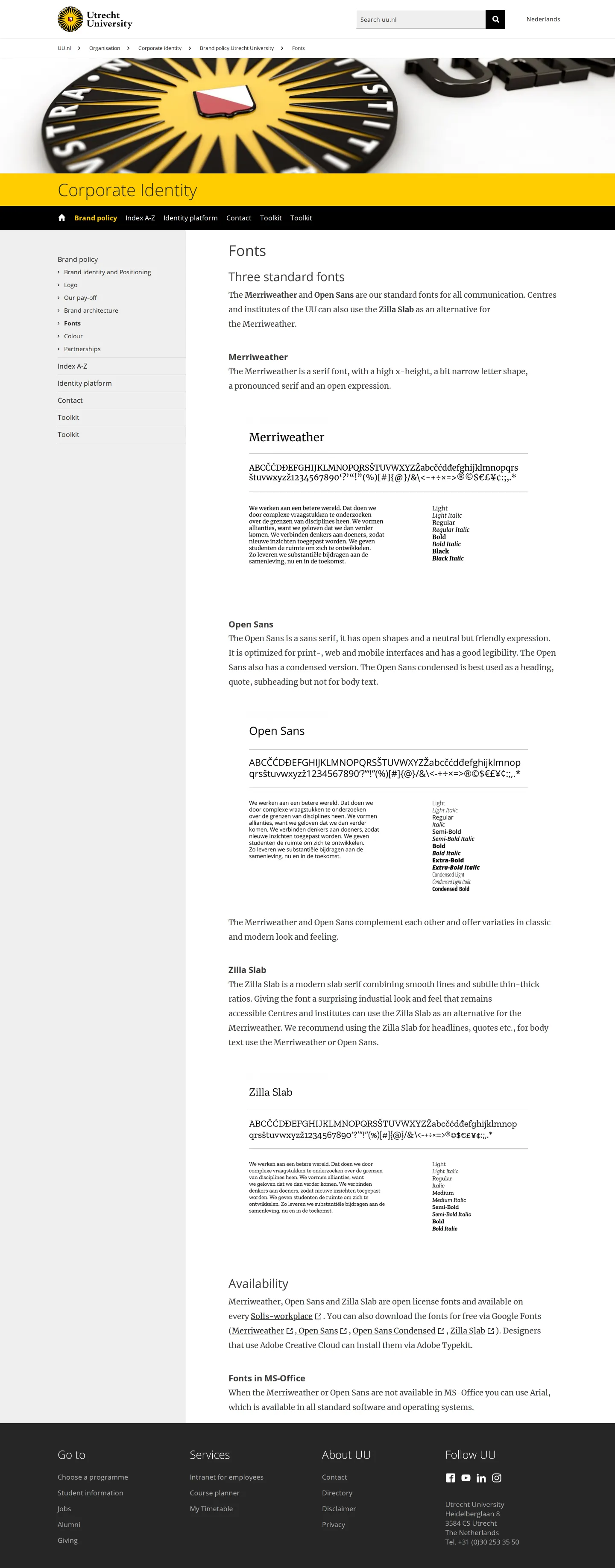
- The typography guidelines document three standard typefaces: Merriweather, Open Sans, and Zilla Slab.78910
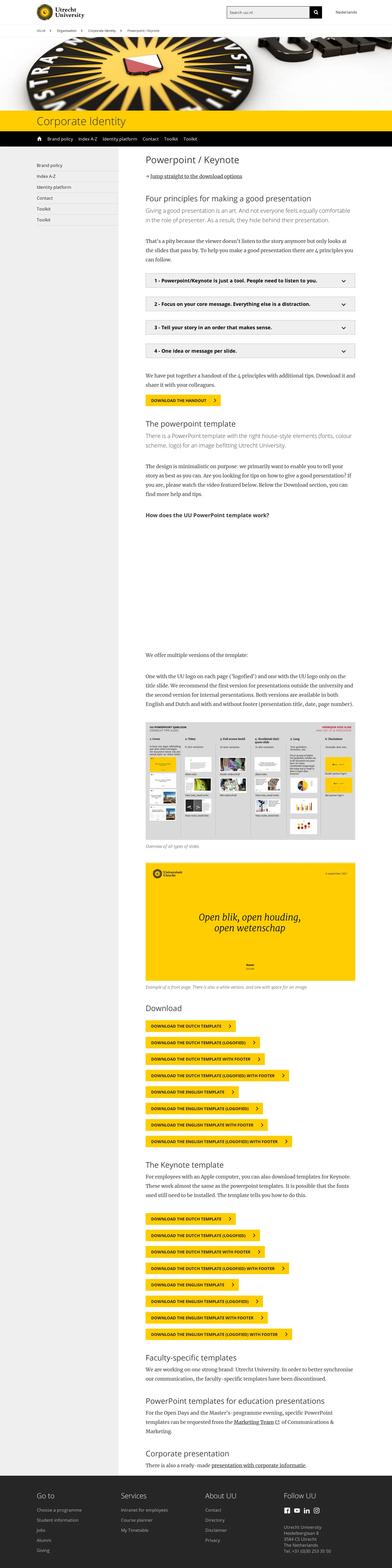
- The presentation template section includes four core principles for structuring a good deck before offering slide downloads.1112131415
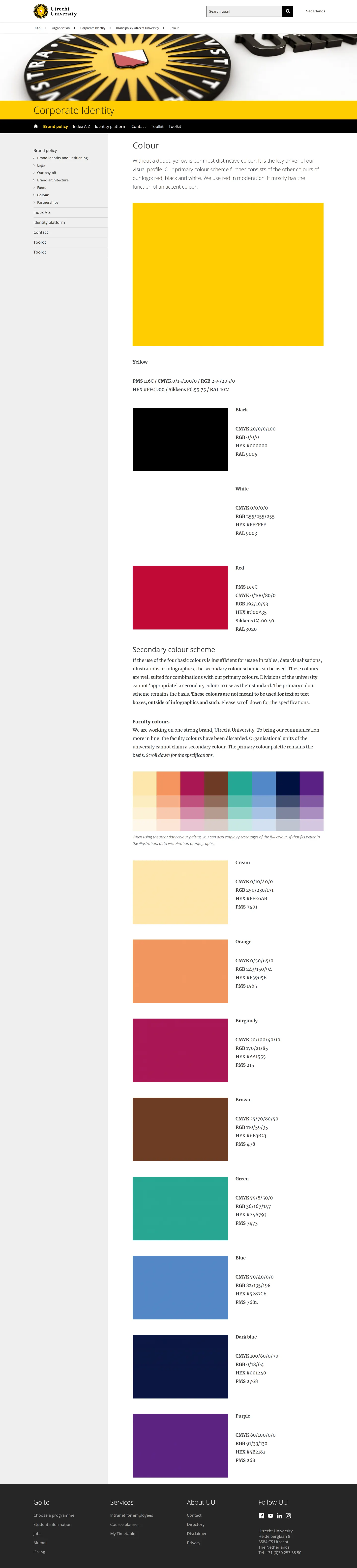
- Utrecht University identifies yellow as its most distinctive brand color alongside red, black, and white.16
Numbers refer to the screenshots above.
What I could not see
- Internal assets requiring employee intranet authentication could not be accessed.
- Specific faculty secondary color hex codes and color breakdowns were not visible on the captured top-level page.
Ideas to borrow
Reviewed on 17 September 2026. Request a correction · I built this
Similar brand centers
All brand guidelines →