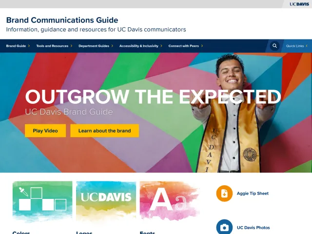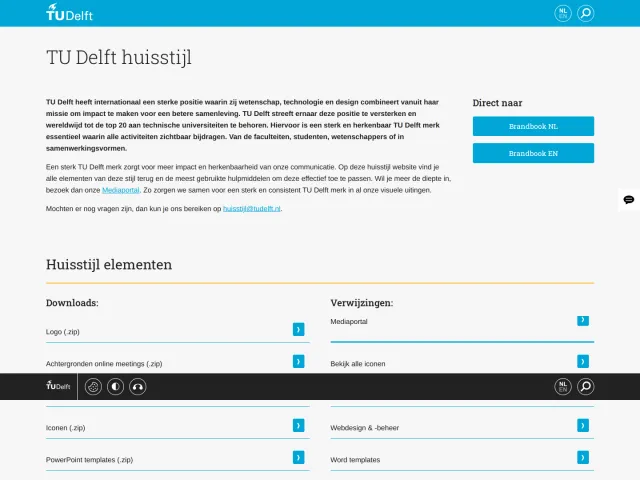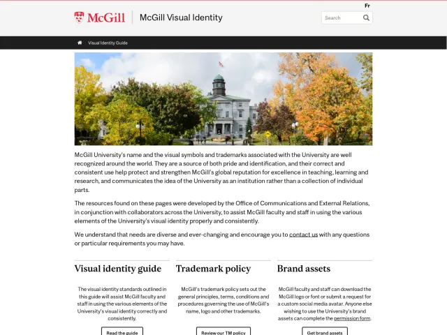
University of Nottingham brand guidelines
University of Nottingham brand guidelines detailing visual identity, editorial standards, colour systems, and asset usage rules.
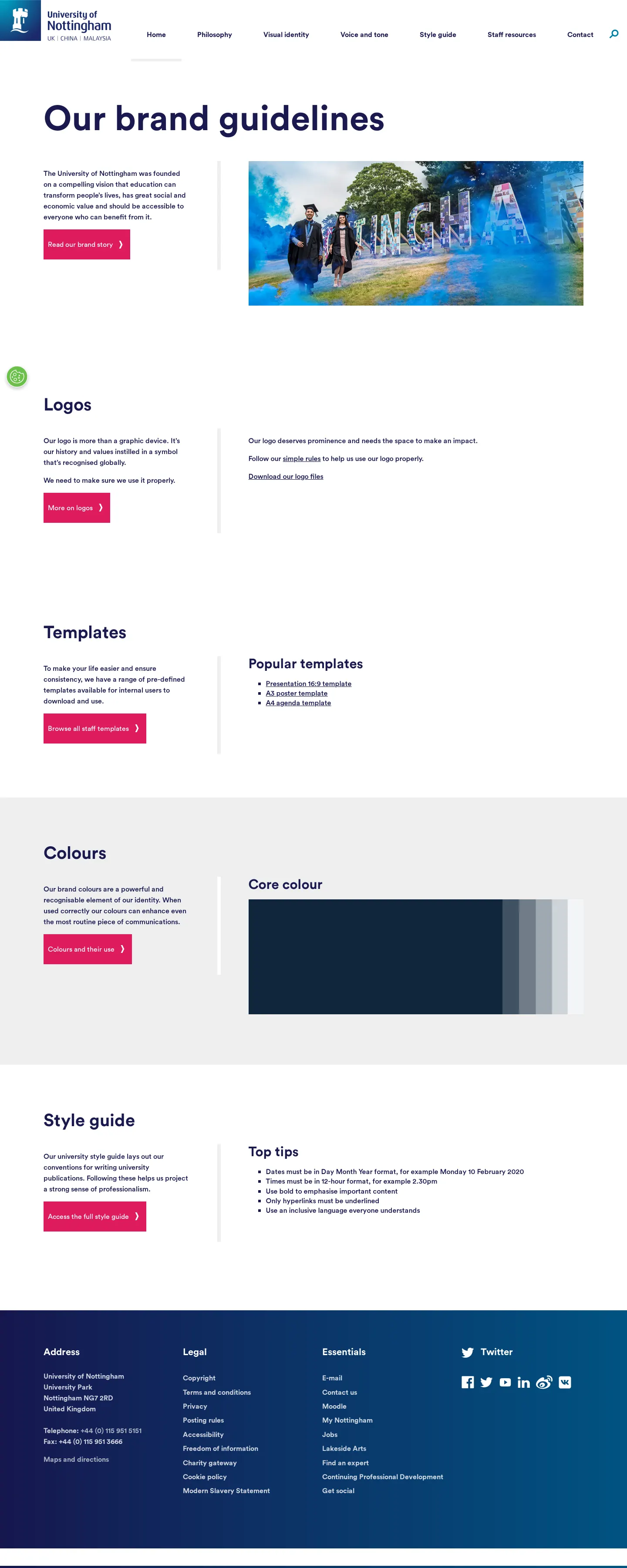
Brand guidelines homepage highlighting direct links to logos, popular templates, color palettes, and editorial writing tips.

Logo guidelines page showing logo construction, exclusion zones, digital variations, and partnership lockup layouts.

Colour specification page detailing Nottingham Blue, supporting swatches, tint values, and WCAG contrast ratings.
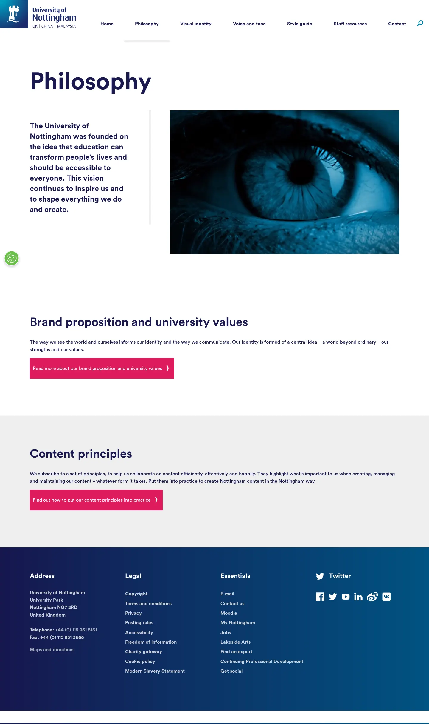
Philosophy section covering brand proposition, university values, and content collaboration principles.
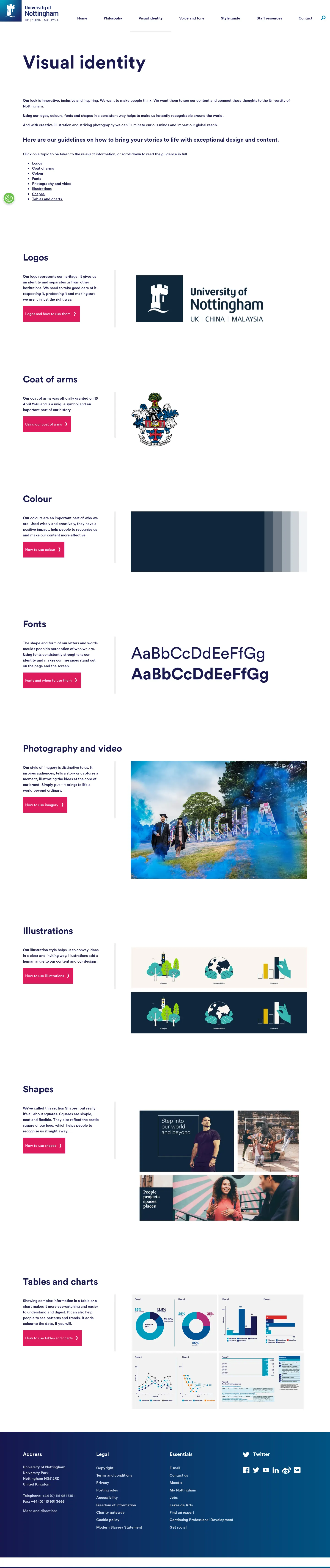
Visual identity directory indexing logos, coat of arms, colour, typography, imagery, and layout shapes.
Want a brand center like University of Nottingham’s?
Create your brand center with Freedam ↗Freedam's take
I like how pragmatic the University of Nottingham brand guidelines feel. The homepage routes straight to everyday needs, pointing staff directly to presentation templates, poster layouts, and writing tips. The visual identity breakdown is especially clear. I appreciate that they define Nottingham Blue as a full replacement for black and explicitly limit designers to two supporting tones. Moving asset downloads out to SharePoint creates an internal gate, but the public pages offer deep guidance, from strict exclusion zones to co-branding layouts and clear accessibility matrices.
At a glance
- Sections
- Philosophy · Visual identity · Voice and tone · Style guide · Staff resources · Contact
- Downloads
- JPEG, EPS, PNG
- Tone
- Clear, practical, and academic with structured rules for internal and collaborative use.
What I noticed
- The master logo is built from three distinct elements: the castle square, logotype, and location line.1
- Nottingham Blue is designated as the primary university colour and acts as a direct replacement for black.2
- The colour accessibility section includes a contrast matrix referencing WCAG compliance levels with AAA, AA, and DNP ratings.3
- Logo downloads point to an external SharePoint repository.45
Numbers refer to the screenshots above.
What I could not see
- Could not inspect the downloadable logo files and presentation templates behind the SharePoint link.
- Could not view full dedicated pages for typography, photography, illustrations, or voice and tone.
Ideas to borrow
Quick answers
Where can I download the University of Nottingham logo files?
Logo files in JPEG, EPS, and PNG formats are available via an external SharePoint link provided on the homepage and logo page.457
What is the primary brand colour for the University of Nottingham?
Nottingham Blue is designated as the primary university colour and is used as a direct replacement for black.2
How is the logo exclusion zone calculated?
The exclusion zone around the logo is defined as 50% of the depth of the castle square emblem.8
Reviewed on 26 September 2026. Request a correction · I built this
Similar brand centers
All brand guidelines →