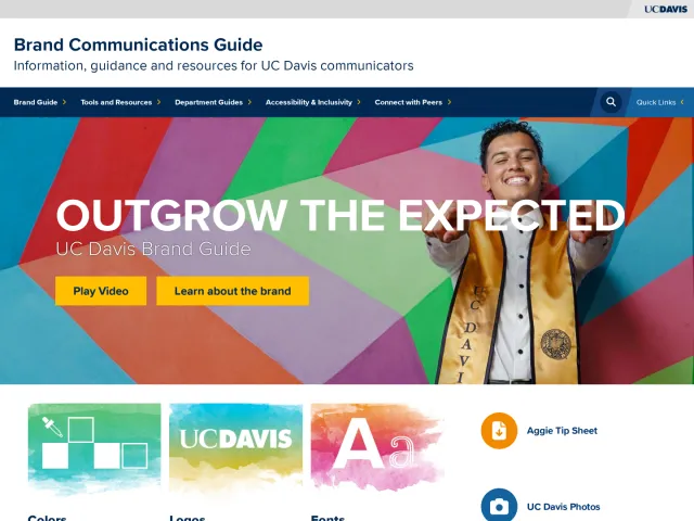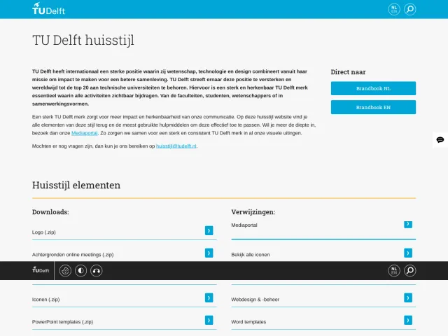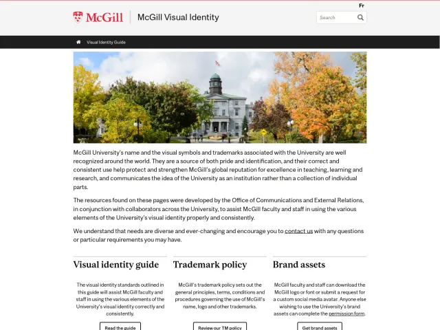
University of Groningen brand guidelines
The University of Groningen house style portal details the institution's visual identity, typography rules, color palettes, and template instructions.
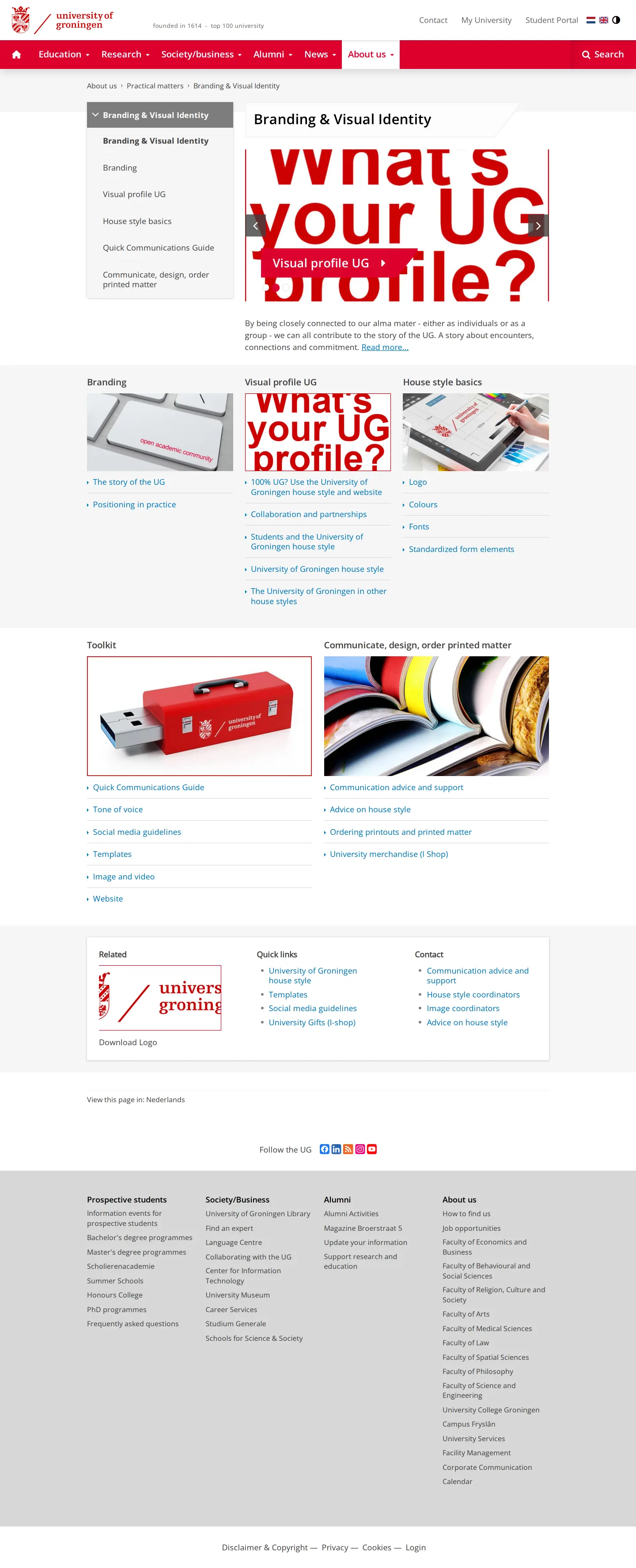
Landing page for the University of Groningen's Branding & Visual Identity guidelines portal.
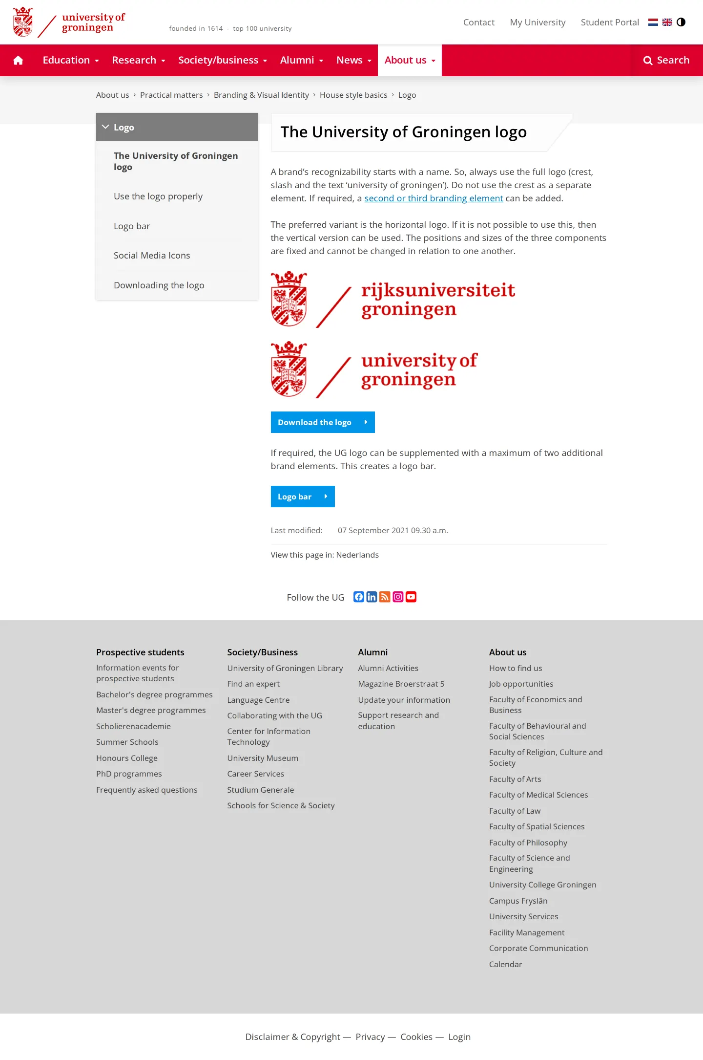
Logo guidelines page showing crest and wordmark lockups in Dutch and English with navigation to download links.
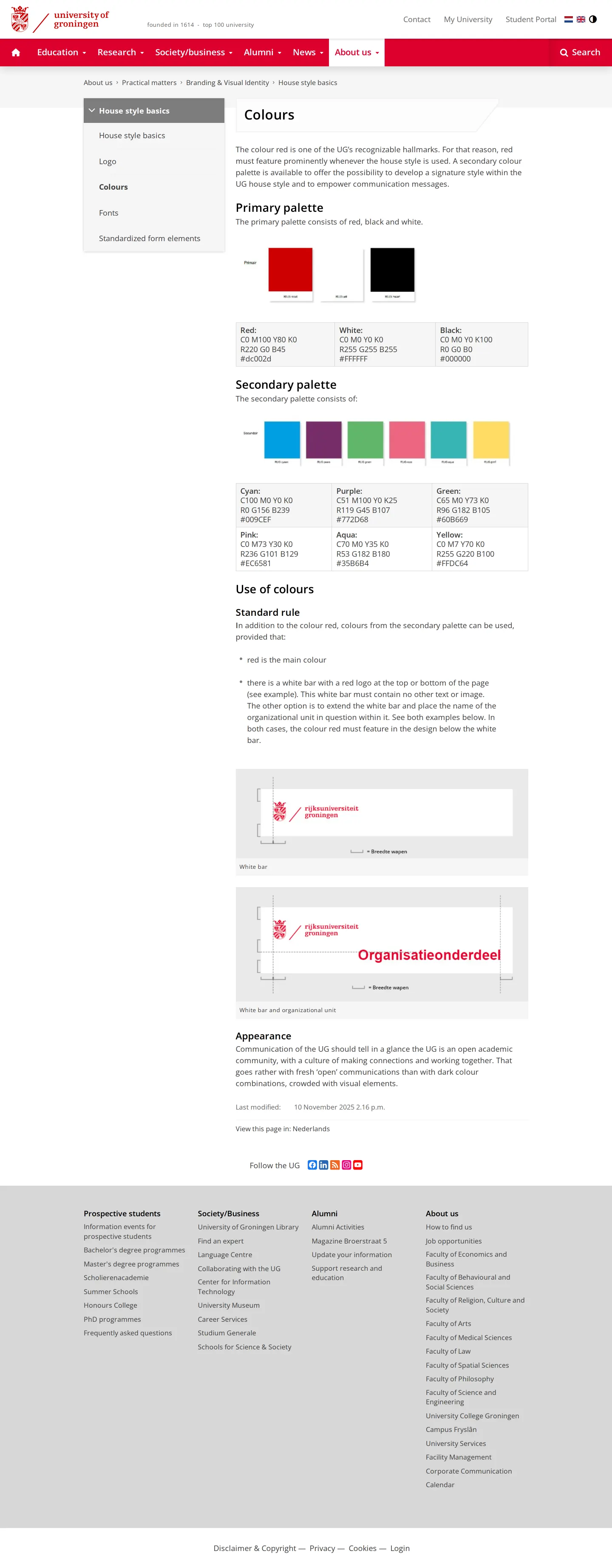
Colours page presenting primary and secondary color palettes with CMYK, RGB, and HEX specifications.
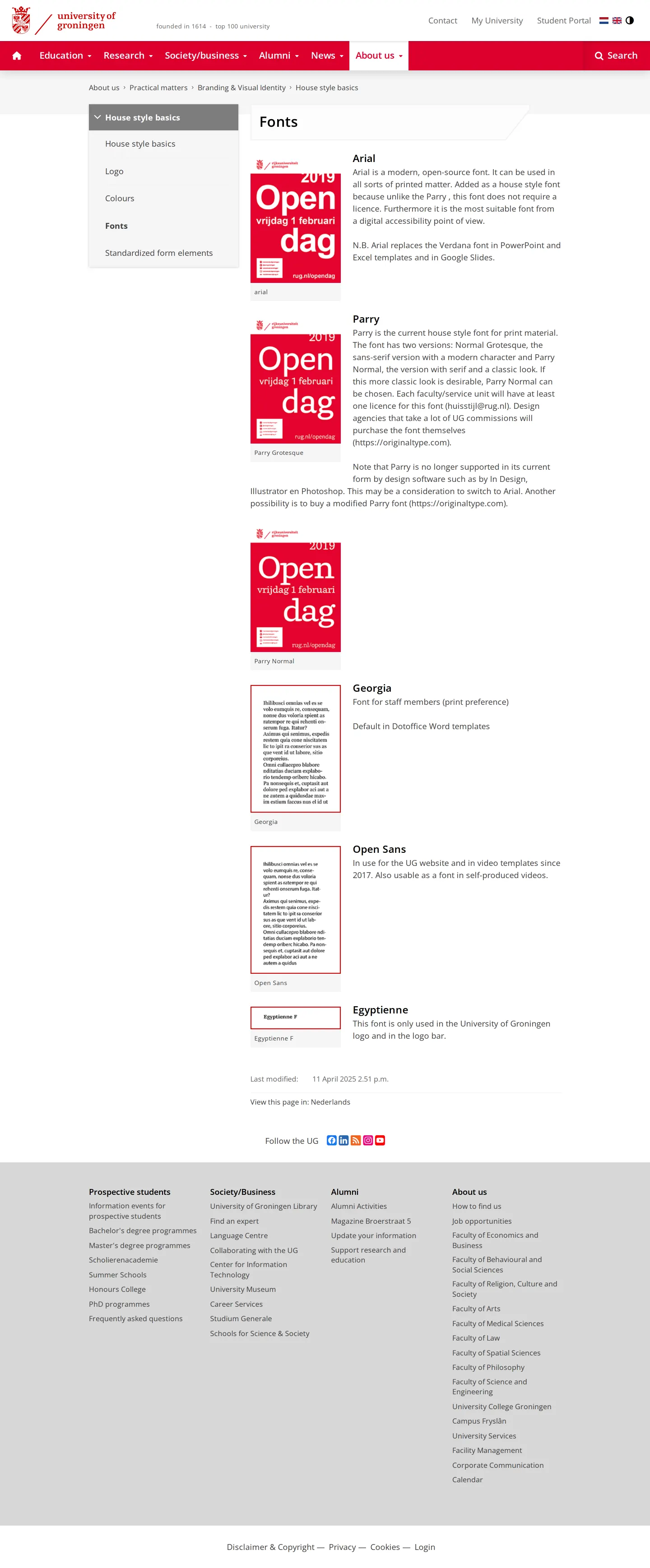
Brand typography guidelines detailing usage rules for Arial, Parry, Georgia, Open Sans, and Egyptienne.
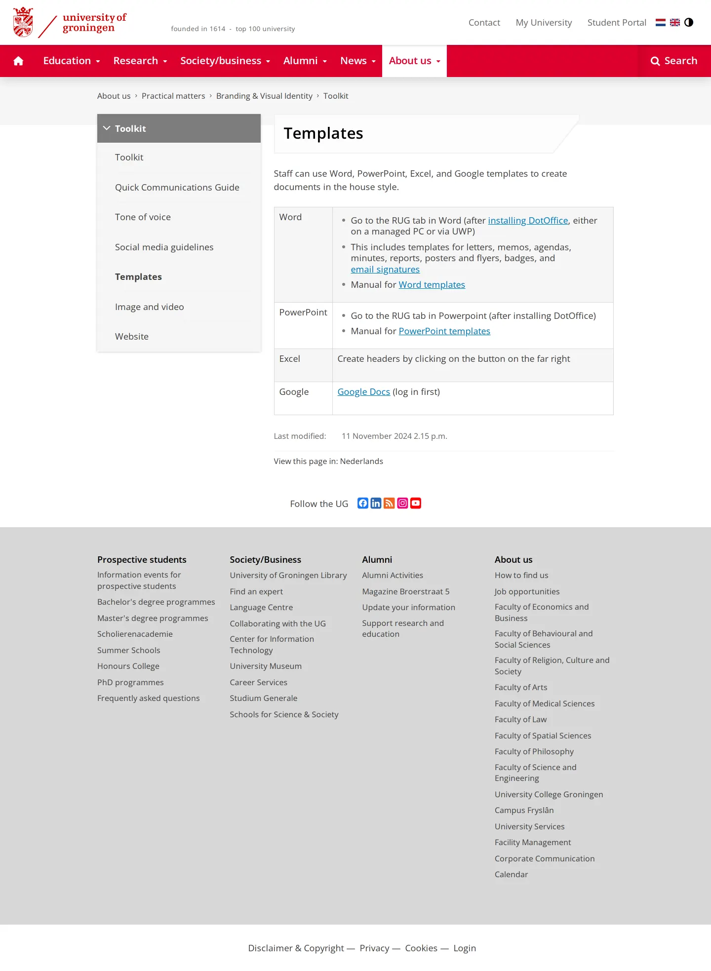
Templates page in the toolkit outlining document template access for Word, PowerPoint, Excel, and Google Docs.
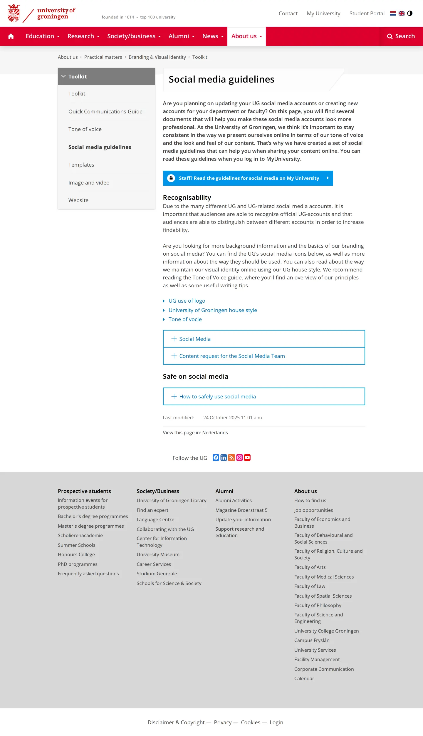
Social media guidelines page providing account setup principles and an internal portal login prompt for staff.
Want a brand center like University of Groningen’s?
Create your brand center with Freedam ↗Freedam's take
I spent time exploring the University of Groningen house style pages, and I appreciate how clearly the rules are laid out. The team provides precise specifications for typography, explicitly reserving Egyptienne exclusively for the logo and logo bar while detailing exact contexts for Arial, Georgia, Open Sans, and Parry. Their color guide separates the primary red, white, and black from an energetic secondary palette with exact print and screen values. While certain full social media guidance notes prompt staff to access MyUniversity, the foundational visual standards remain open and organized.
At a glance
- Sections
- Branding · Visual profile UG · House style basics · Quick Communications Guide · Toolkit · Contact
- Tone
- A practical, instructional tone focused on consistency and institutional identity across administrative and academic touchpoints.
What I noticed
- The full logo consists of the crest, slash, and text, with strict rules prohibiting the crest from being used alone.1
- The typography system specifies distinct roles for five typefaces, including reserving Egyptienne strictly for the logo and logo bar.23
- The color system defines a primary palette of red, white, and black alongside a secondary palette of cyan, purple, green, pink, aqua, and yellow.45
- The social media guidelines page features a callout prompting staff to log into MyUniversity to view the complete guidelines.6
Numbers refer to the screenshots above.
What I could not see
- The contents and file formats inside the external logo download repository (logobank) could not be viewed directly.
- The complete social media guidelines located behind the MyUniversity staff login were not accessible.
- The downloadable template files linked via DotOffice and manuals could not be inspected.
Ideas to borrow
Quick answers
Where can the University of Groningen logo be downloaded?
The logo guidelines page provides links to download the logo via an external logobank page.1011
What fonts are officially specified in the University of Groningen house style?
The brand specifies Arial for print and slide decks, Parry for editorial serif and sans-serif uses, Georgia for staff print preferences and Word templates, Open Sans for web and video, and Egyptienne exclusively for the logo and logo bar.712893
Reviewed on 26 September 2026. Request a correction · I built this
Similar brand centers
All brand guidelines →