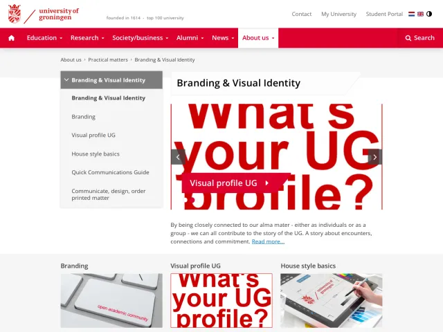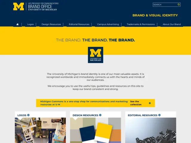
University of Helsinki brand guidelines
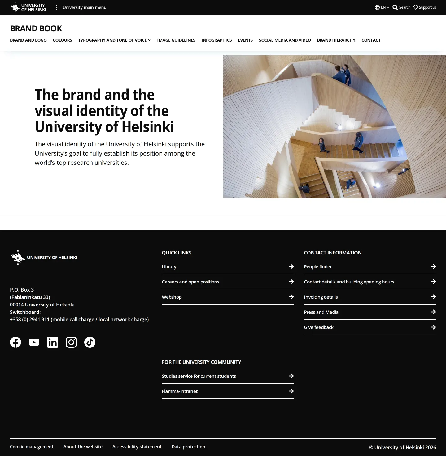
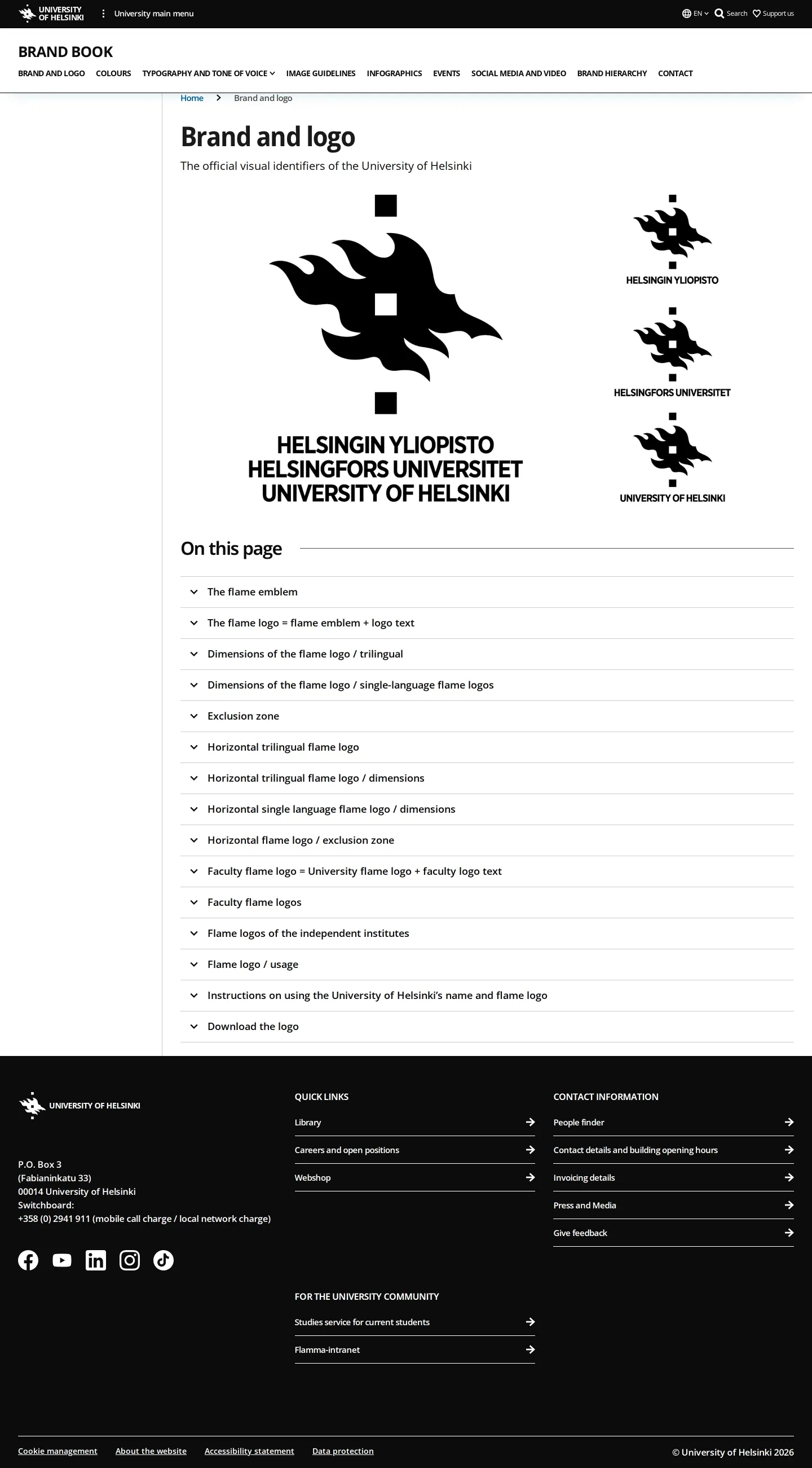
University of Helsinki's brand book provides visual identity rules covering faculty colors, photography, infographics, and event materials directly within its main university domain.
Freedam's take — I really appreciate how the University of Helsinki organizes its brand portal right inside its main institutional site. Rather than keeping things abstract, the guidelines divide color usage across faculties and independent institutes while keeping core black, white, and accent blue consistent. What stands out to me is the dedicated guidance around infographics and event collateral like roll-ups and partitions. Seeing specific categories for science and community imagery makes the identity feel grounded in actual campus life.
Details
- Type
- Guidelines
- Access
- Public
- Source
- helsinki.fi
- Industry
- Education
- Capabilities
- Guidelines, Asset browsing
- Tags
- color system, photography, data visualization, event branding, social media
- Added
- Last checked
What I noticed
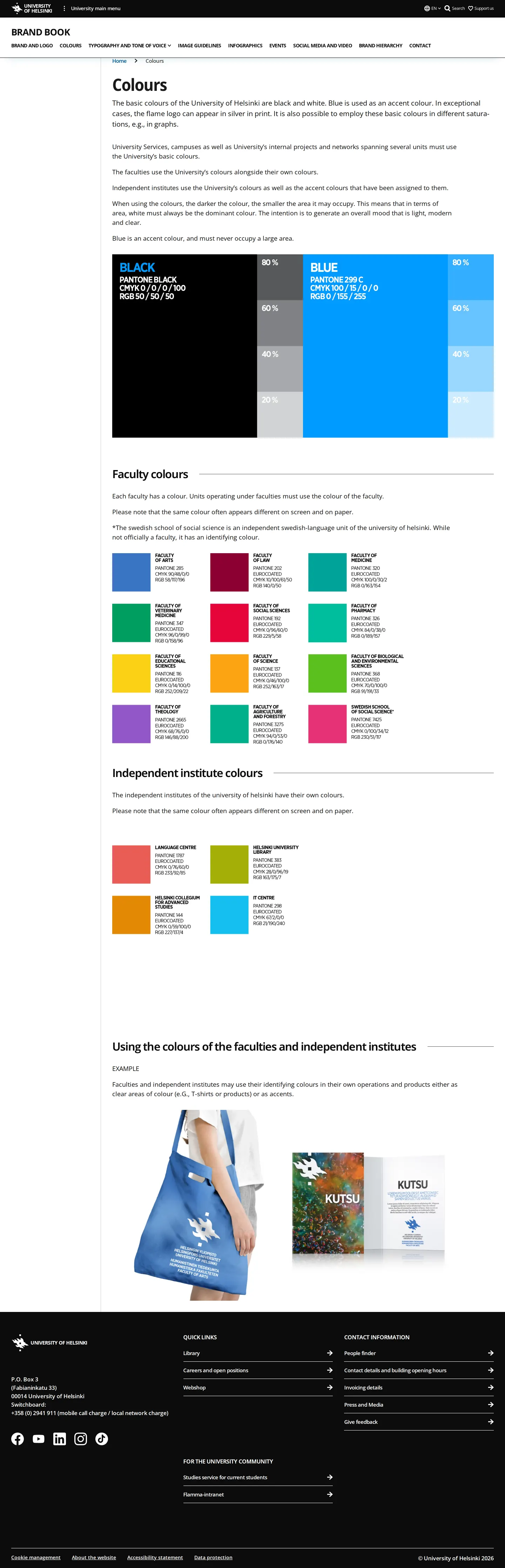
- The core palette relies on black and white with blue as an accent color, complemented by specific colors for faculties and independent institutes.123
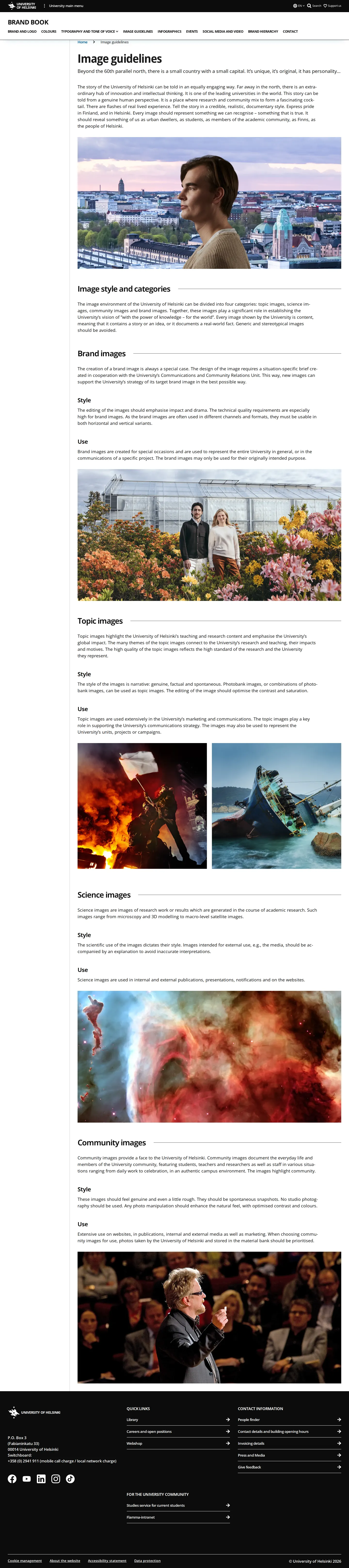
- Photography guidelines are split into distinct categories including brand images, topic images, science images, and community images.4567
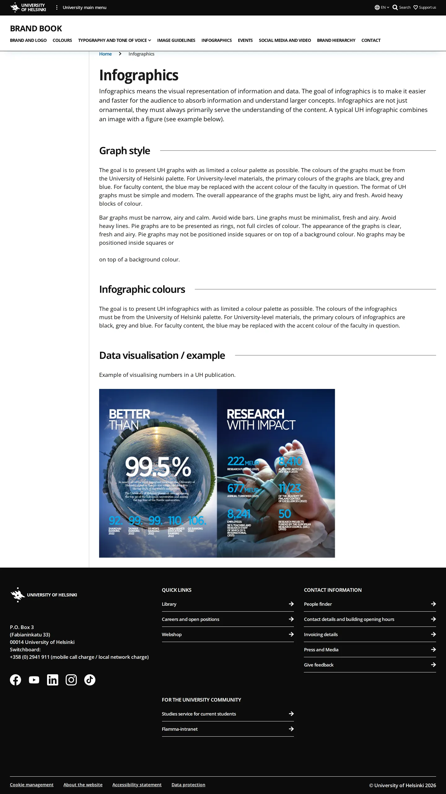
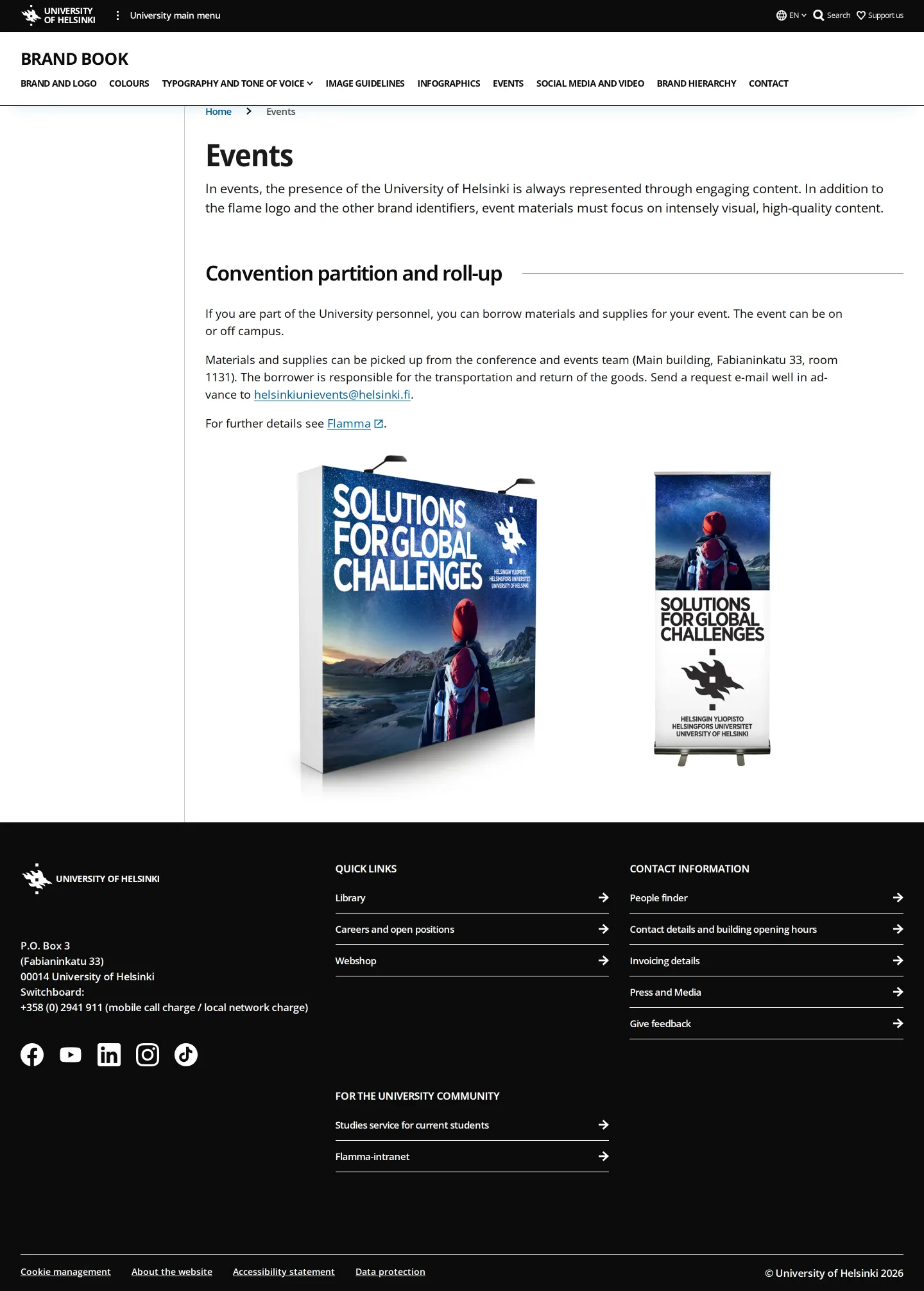
- The portal dedicates full sections to applied media such as infographics, events, and social media and video.89101112
Numbers refer to the screenshots above.
What I could not see
- No search functionality or direct asset download mechanisms were observed in the captured pages.
- Full details for brand hierarchy, social media, and video were not captured in this crawl.
Ideas to borrow
Reviewed on 17 September 2026. Request a correction · I built this
Similar brand centers
All brand guidelines →