University of Glasgow brand guidelines
The University of Glasgow's Brand Toolkit provides staff with guidelines on logos, messaging, typography, and tiered color palettes.
Freedam's take — I like finding university guidelines tucked right inside their staff intranet frameworks. Glasgow titles this edition as their new toolkit for 2026, setting out clear practical fundamentals across logo variants, messaging, typography, and color. The typography section jumps straight into real-world use cases like A3 posters and PowerPoint slides, while the identity rules give dedicated space to Gaelic and dual-language marks. Structuring palettes into distinct light and dark secondary tiers also gives academic communicators plenty of flexibility without losing the core university blue.
Details
- Type
- Guidelines
- Access
- Public
- Source
- gla.ac.uk
- Industry
- Education
- Capabilities
- Guidelines, Search, Downloads
- Tags
- typography, logo usage, color system, multilingual, presentation templates
- Added
- Last checked
What I noticed
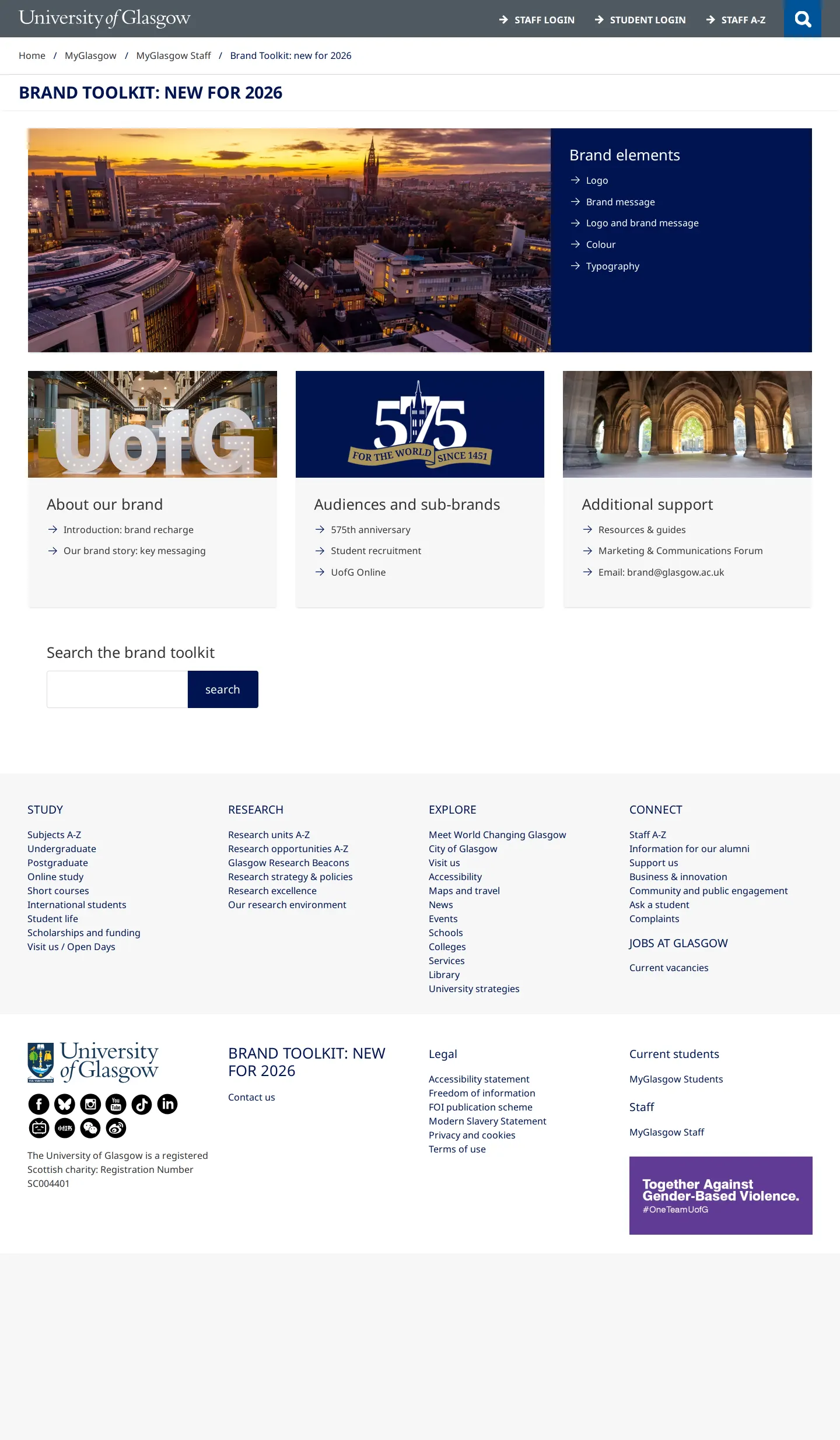
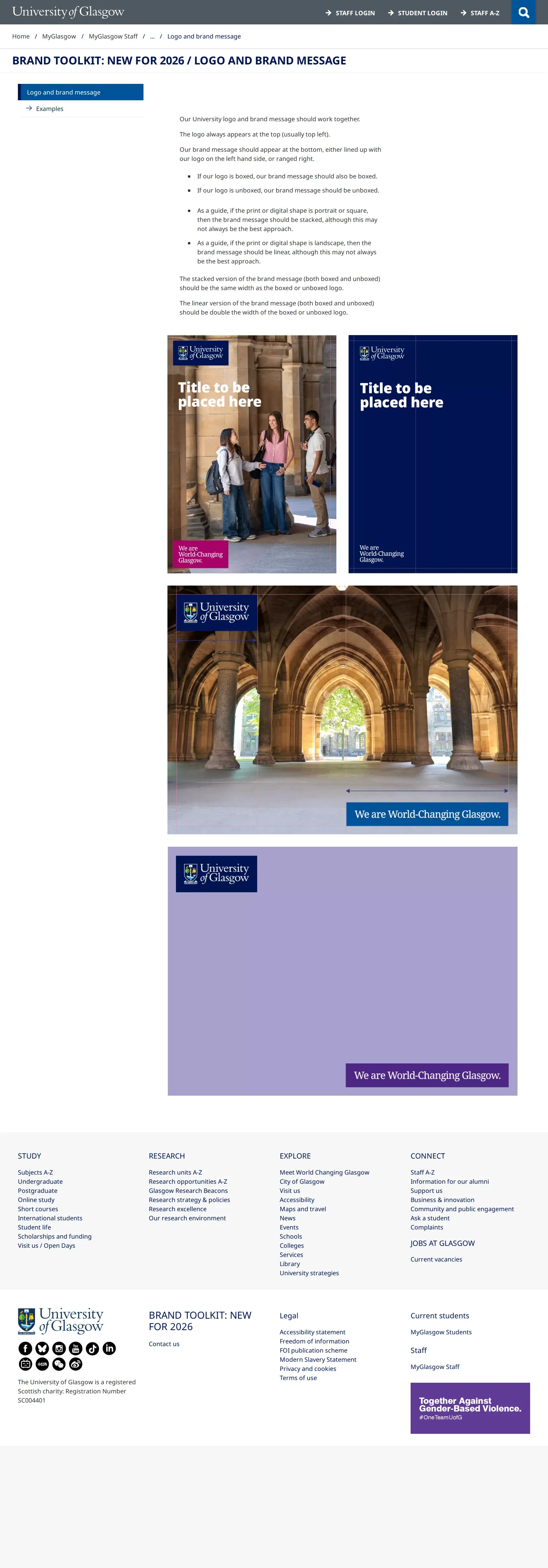
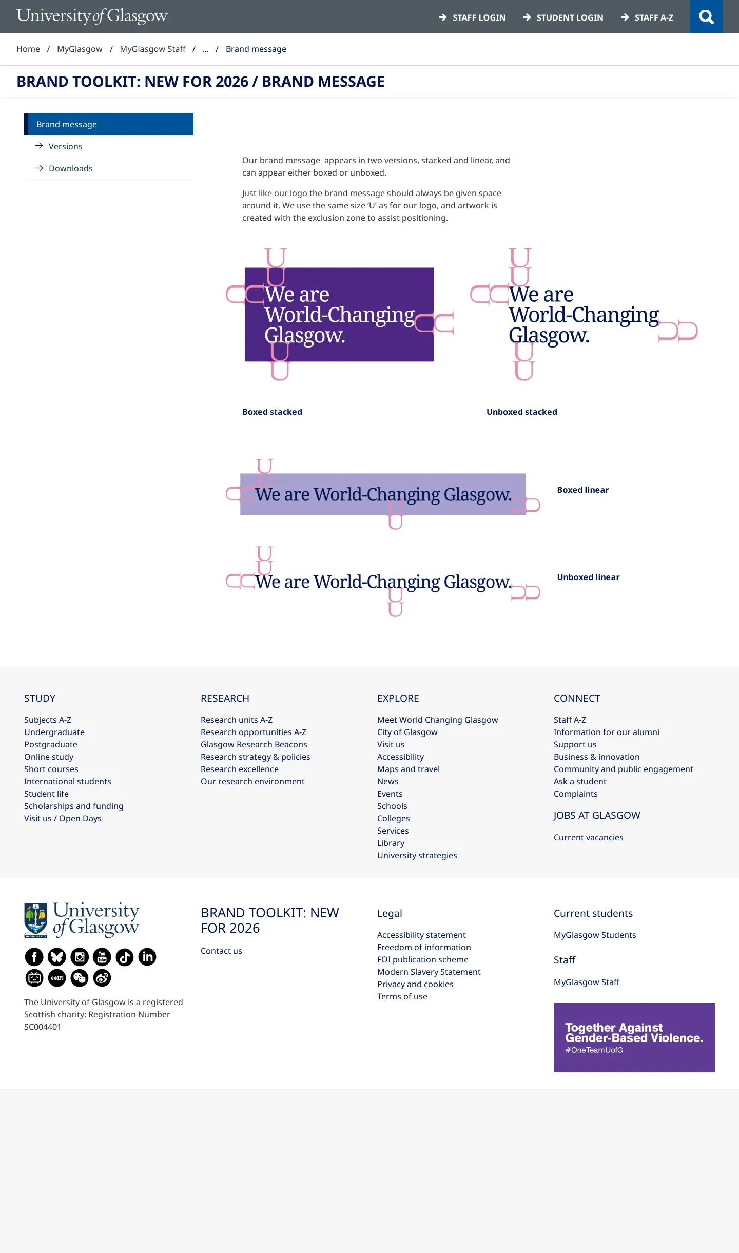
- The toolkit is titled 'BRAND TOOLKIT: NEW FOR 2026' within the university's MyGlasgow staff section.12
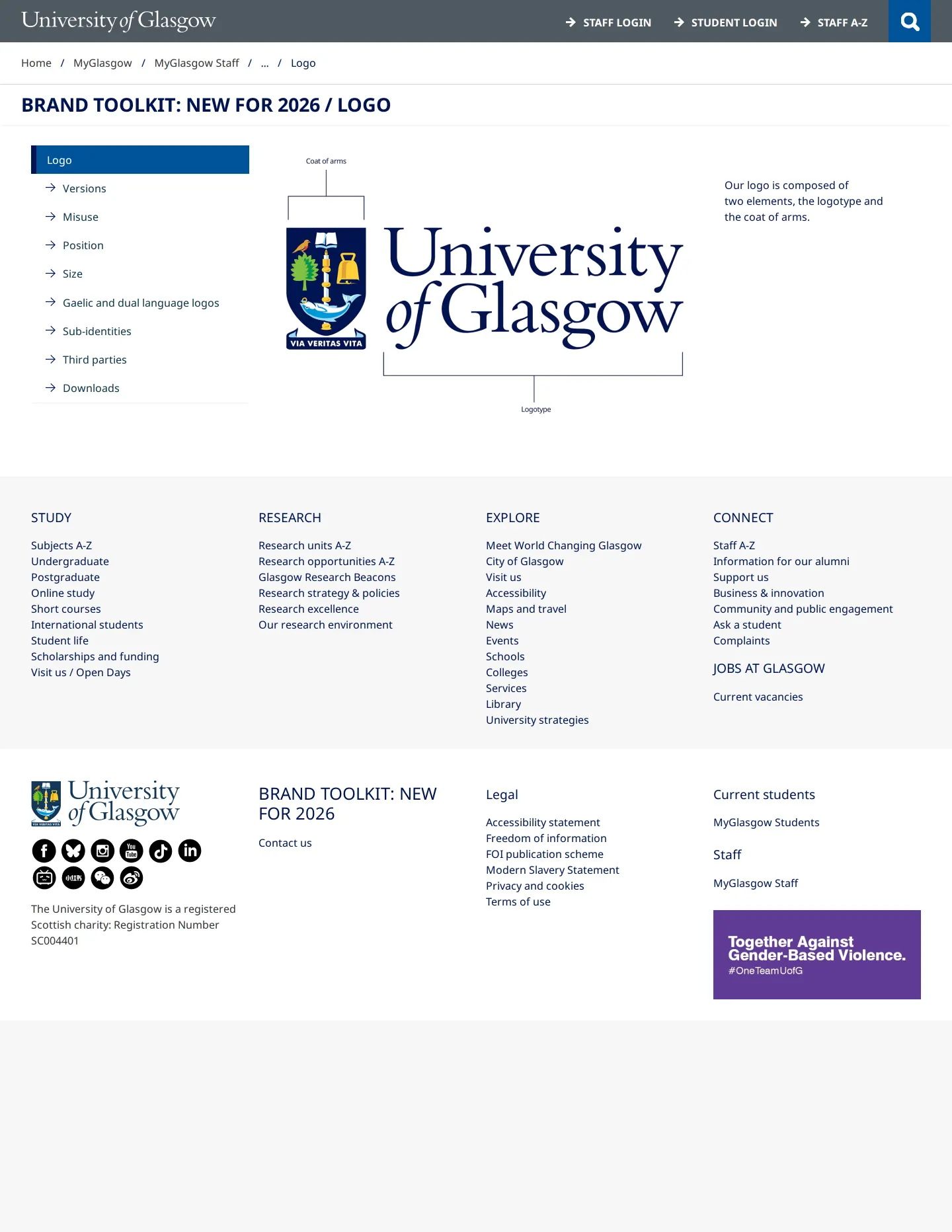
- The logo section includes guidance specifically for Gaelic and dual-language marks.3
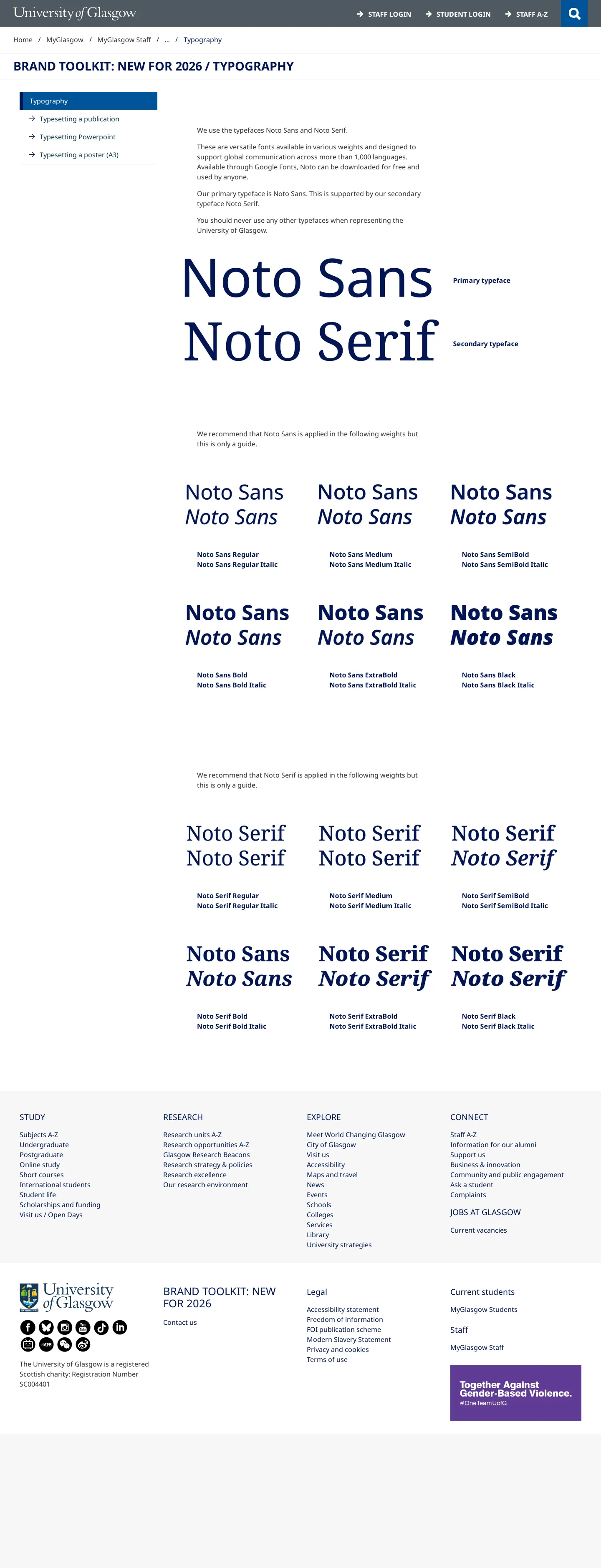
- The typography documentation offers typesetting instructions for specific formats such as PowerPoint and A3 posters.45
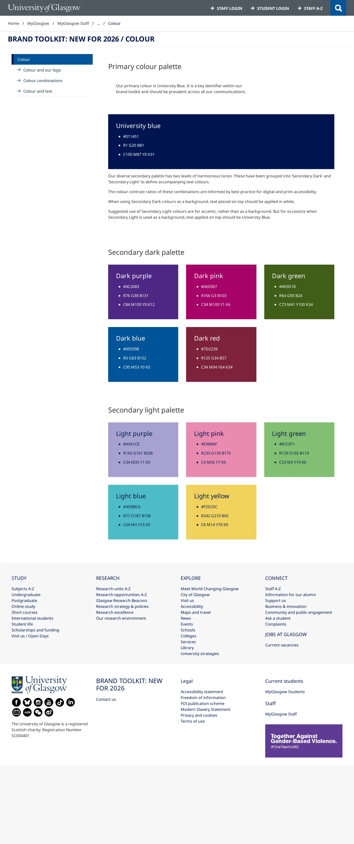
- The color system organizes hues into primary university blue alongside secondary dark and light palettes.6789
Numbers refer to the screenshots above.
What I could not see
- Content behind the staff login or on restricted asset download links could not be viewed.
Ideas to borrow
- Provide format-specific typesetting guides directly alongside basic font specimens to help internal teams assemble slides and posters accurately.
Reviewed on 18 September 2026. Request a correction · I built this