University of Georgia brand guidelines
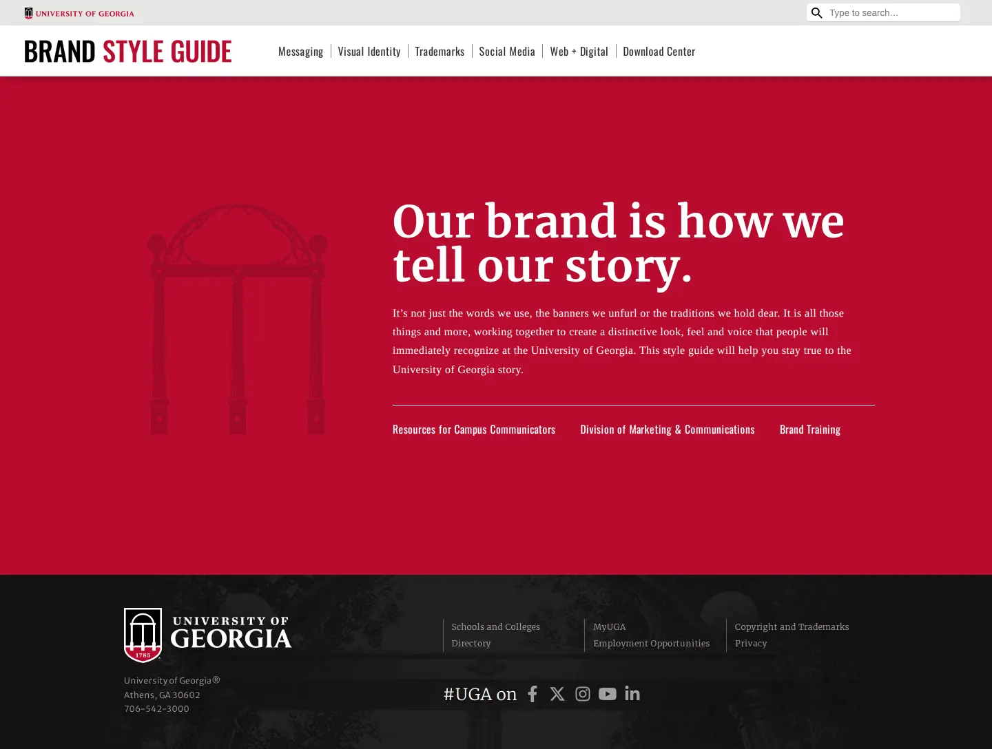
The University of Georgia brand style guide sets out rules for logos, color standards, trademarks, and messaging frameworks across campus communications.
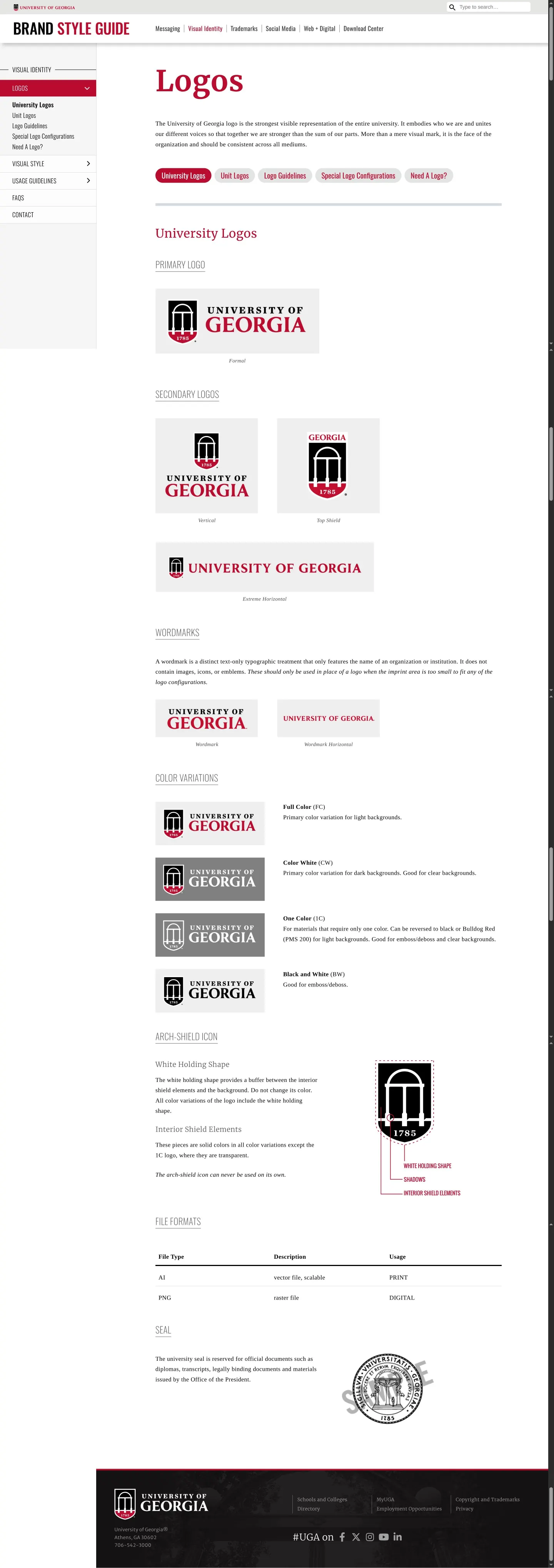
Logos page showing configurations, color variations, arch-shield icon details, and usage rules.
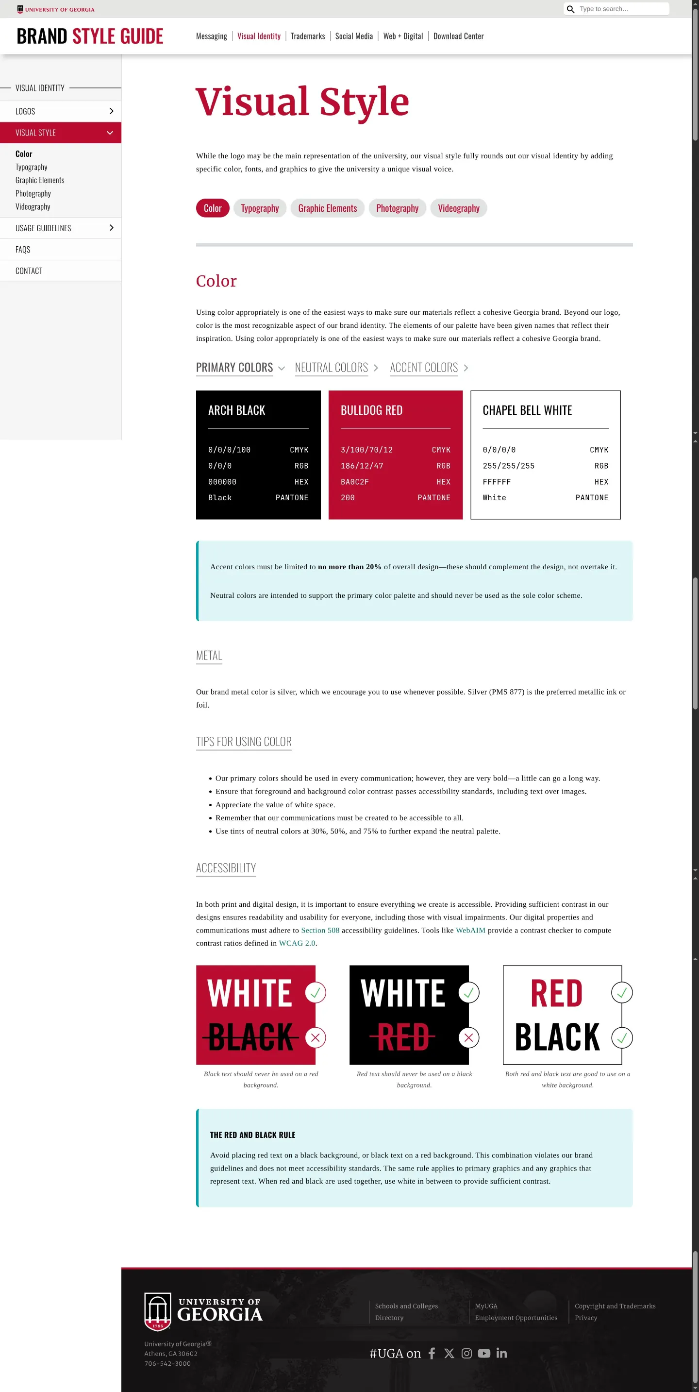
Visual style guide showing primary colors, accent rules, accessibility contrast, and the Red and Black Rule.
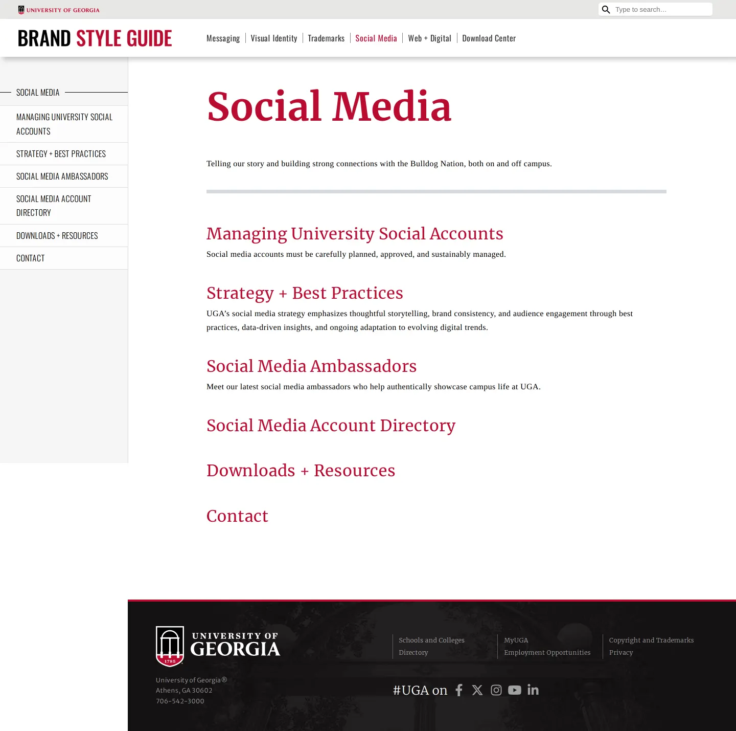
Social media overview page detailing university accounts, strategy, best practices, and resource links.
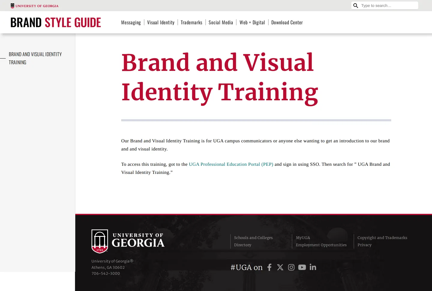
Brand and visual identity training page outlining portal access for campus communicators.
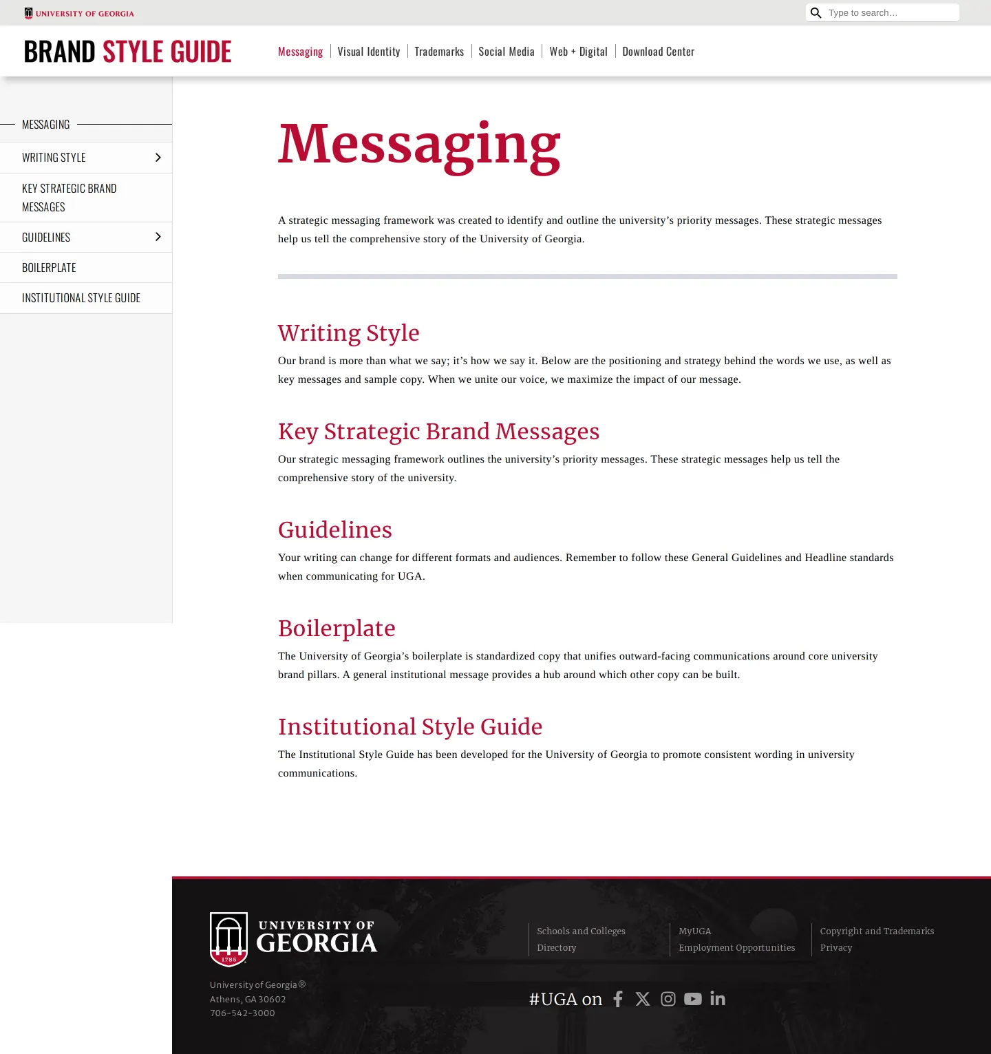
Messaging framework page outlining writing style, strategic brand messages, and boilerplate copy.
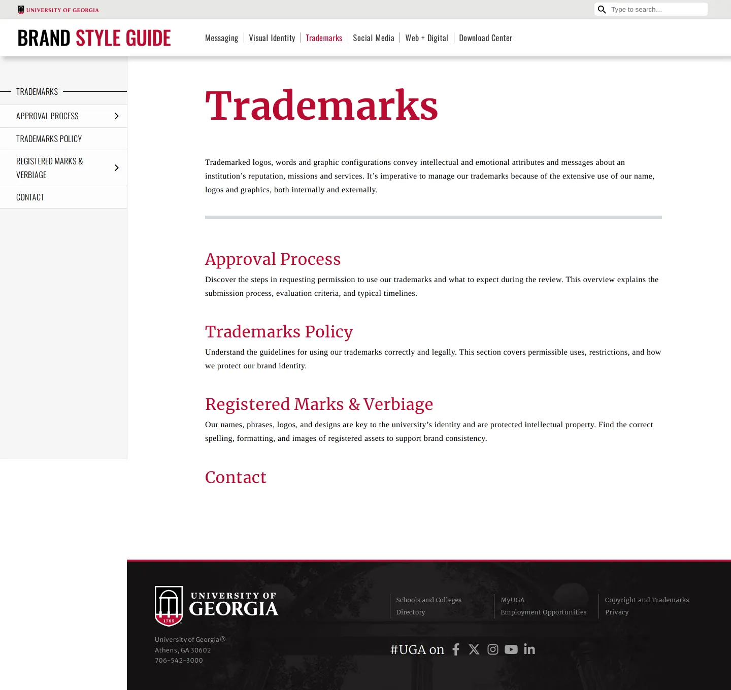
Trademarks overview page featuring approval steps, usage policy, and registered mark standards.
Want a brand center like University of Georgia’s?
Create your brand center with Freedam ↗Freedam's take
I like how direct the University of Georgia is with its core visual rules. The guidelines clearly present the arch-shield mark alongside explicit instructions that it must never appear by itself. On the color side, they set clear boundaries by capping accent colors at twenty percent of a design and laying down a strict rule prohibiting red text on black or black text on red. Connecting file format recommendations directly to print and digital needs gives campus communicators practical clarity without getting in the way.
At a glance
- Sections
- Messaging · Visual Identity · Trademarks · Social Media · Web + Digital · Download Center
- Downloads
- AI, PNG
- Tone
- Structured, authoritative, and practical guidance tailored for campus communicators.
What I noticed
- The logo section outlines primary and secondary configurations alongside an explicit rule stating the arch-shield icon can never be used alone.12
- The color guidelines define Arch Black, Bulldog Red, and Chapel Bell White, while limiting accent colors to no more than 20% of an overall design.34
- The site establishes a 'Red and Black Rule' that explicitly bans placing red text on black backgrounds or black text on red backgrounds.5
- External asset downloads are directed to an external digital arch portal.6
Numbers refer to the screenshots above.
What I could not see
- Specific typography, photography, and videography guideline content was not captured beyond sub-navigation links.
- The external download center portal content was not captured.
Ideas to borrow
- Provide a distinct negative rule callout, like the Red and Black Rule, to quickly settle high-risk legibility and contrast issues.5
Quick answers
Can the University of Georgia arch-shield icon be used by itself?
No, an explicit guideline states that the arch-shield icon can never be used on its own.2
What is the University of Georgia Red and Black Rule?
The Red and Black Rule strictly forbids placing red text on black backgrounds or black text on red backgrounds.5
When can the official university seal be used?
The official university seal is restricted to diplomas, transcripts, and materials from the Office of the President.7
Reviewed on 26 September 2026. Request a correction · I built this
Similar brand centers
All brand guidelines →