University of Florida brand guidelines
The University of Florida Brand Center provides comprehensive identity standards, color ratios, typography decision tools, social media rules, and web themes.
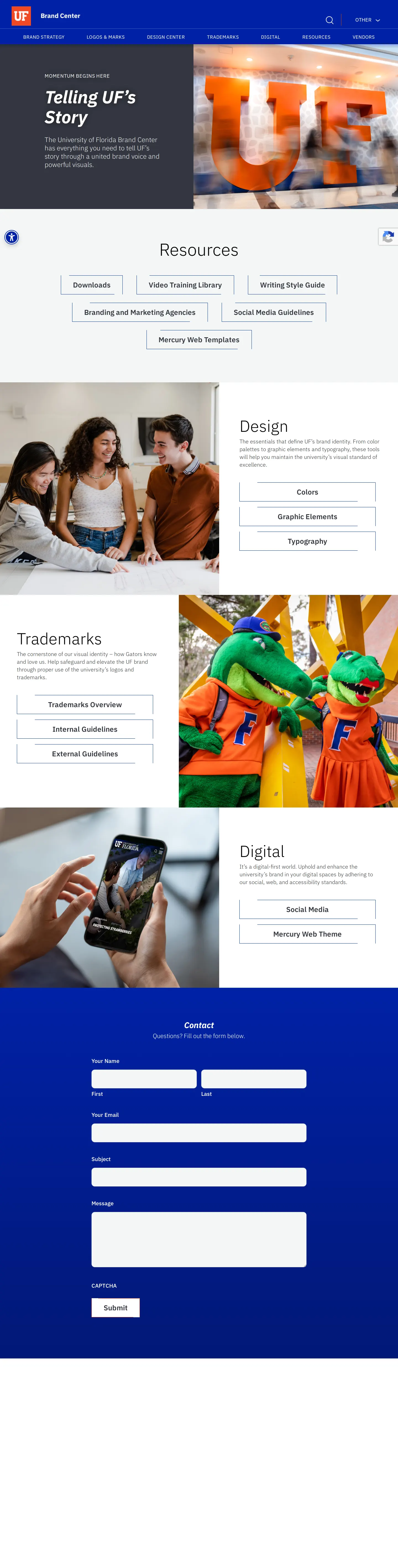
University of Florida Brand Center home screen showing navigation to design, digital, and trademark resources.

Color guidelines page specifying core orange and blue palettes, ratios, and accessibility contrast standards.

Typography documentation featuring font specimens, usage rules, and a typeface selection flowchart.
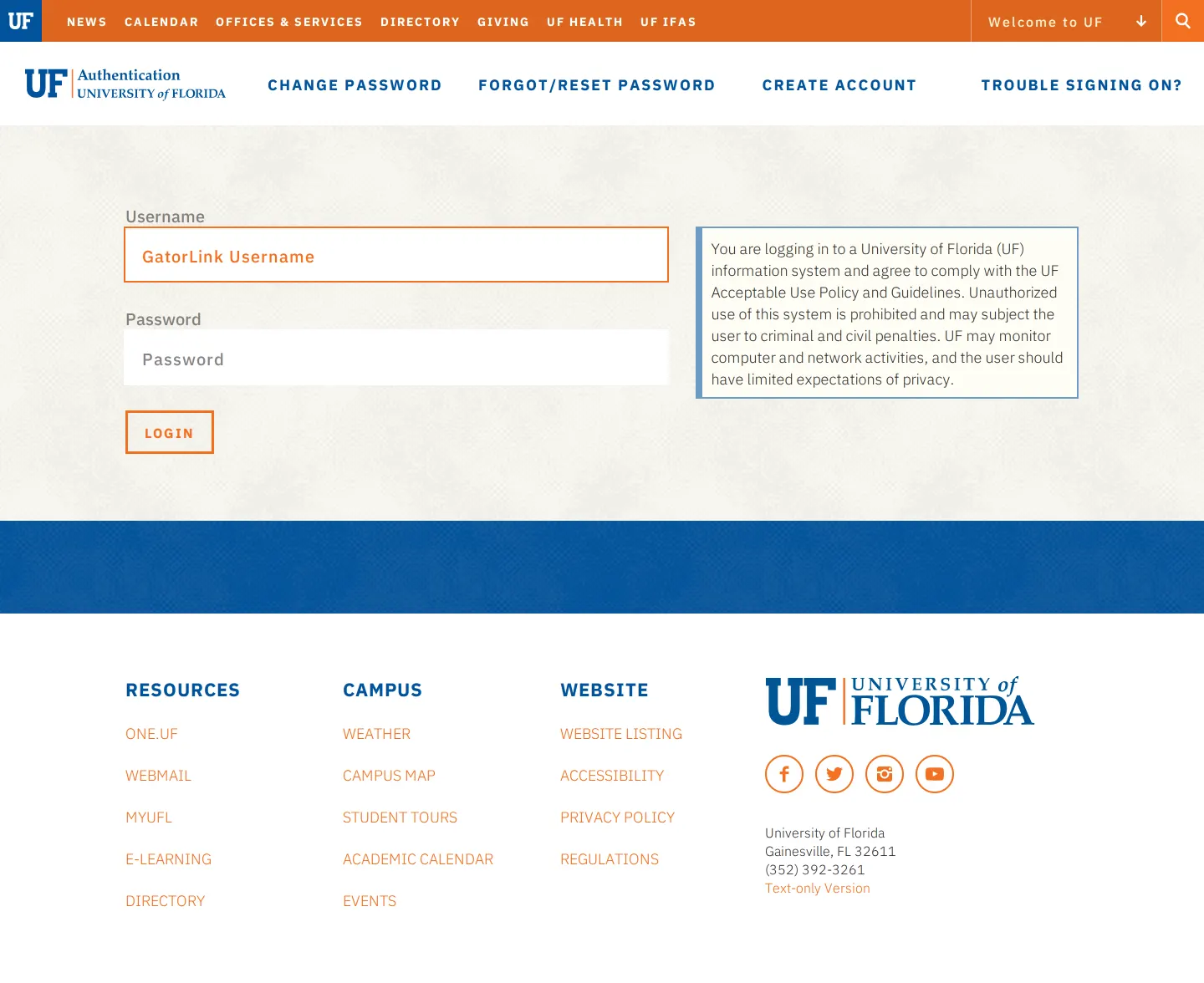
GatorLink single sign-on authentication portal for University of Florida internal web services.

Mercury Web Theme page offering downloadable base code and WordPress templates for campus websites.

Social media guide detailing account approval processes, monogram avatar rules, and accessibility standards.
Want a brand center like University of Florida’s?
Create your brand center with Freedam ↗Freedam's take
I like how pragmatic the University of Florida Brand Center feels. Instead of just laying out color swatches and font weights, it offers clear operational tools for campus creators. The typography section features a decision-tree infographic titled 'Which UF Typeface Should I Use?' to help designers choose between IBM Plex Sans, Source Serif, and Anybody. On the digital side, they provide their custom Mercury web theme directly as downloadable base code and WordPress files. Everything feels geared toward everyday production needs across diverse departments.
At a glance
- Sections
- BRAND STRATEGY · LOGOS & MARKS · DESIGN CENTER · TRADEMARKS · DIGITAL · RESOURCES · VENDORS
- Downloads
- ZIP
- Tone
- A practical, instructional campus hub focused on clear implementation rules and downloadable digital assets.
What I noticed
- The typography guidelines include a decision-tree infographic titled 'Which UF Typeface Should I Use?' that maps scenarios to typefaces like IBM Plex Sans, Source Serif, Anybody, Noto Sans, IBM Plex Mono, and Atkinson Hyperlegible.1
- Color guidelines establish a ratio recommending primary colors comprise roughly 80% and supporting colors comprise about 20% of communications.2
- The Mercury Web Theme page supplies zip downloads for both base code files and a WordPress template alongside links to content management platforms.3456
- Social media instructions require specific accessibility measures such as CamelCase hashtags and profile avatars featuring the UF monogram.78
Numbers refer to the screenshots above.
What I could not see
- Could not inspect the full downloads repository behind the general downloads page or behind password-protected single sign-on screens.
- Could not view the contents of the zip archives for dark mode or the web templates.
Ideas to borrow
- Provide a font selection flowchart that directly answers which brand typeface to choose depending on the medium and message.1
Quick answers
What primary typefaces are used by the University of Florida?
The University of Florida uses IBM Plex Sans as its sans-serif workhorse, Source Serif as its serif typeface, and Anybody as its display typeface.9
Where can developers get University of Florida web templates?
The Mercury Web Theme page offers self-service zip downloads for base code files and WordPress templates.346
What are the recommended color ratios for UF branding?
Communications should use primary colors for about 80% and supporting colors for roughly 20% of the palette balance.2
Reviewed on 25 September 2026. Request a correction · I built this
Similar brand centers
All brand guidelines →