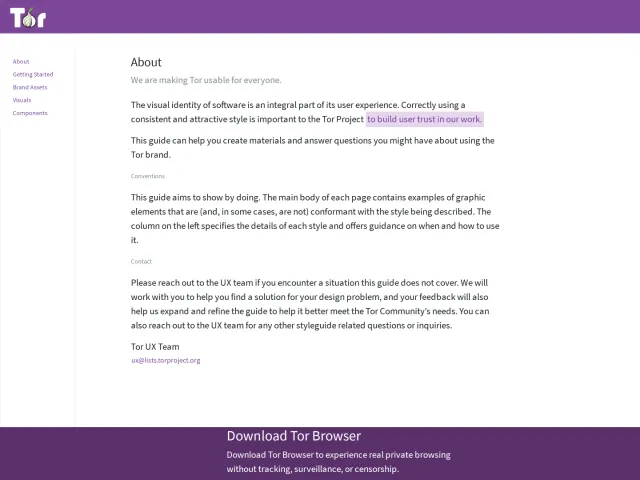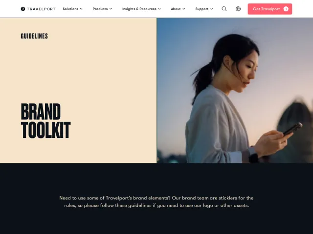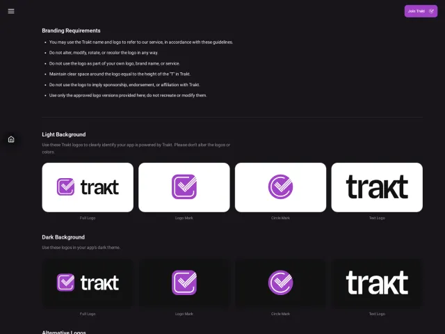
University of Connecticut brand guidelines
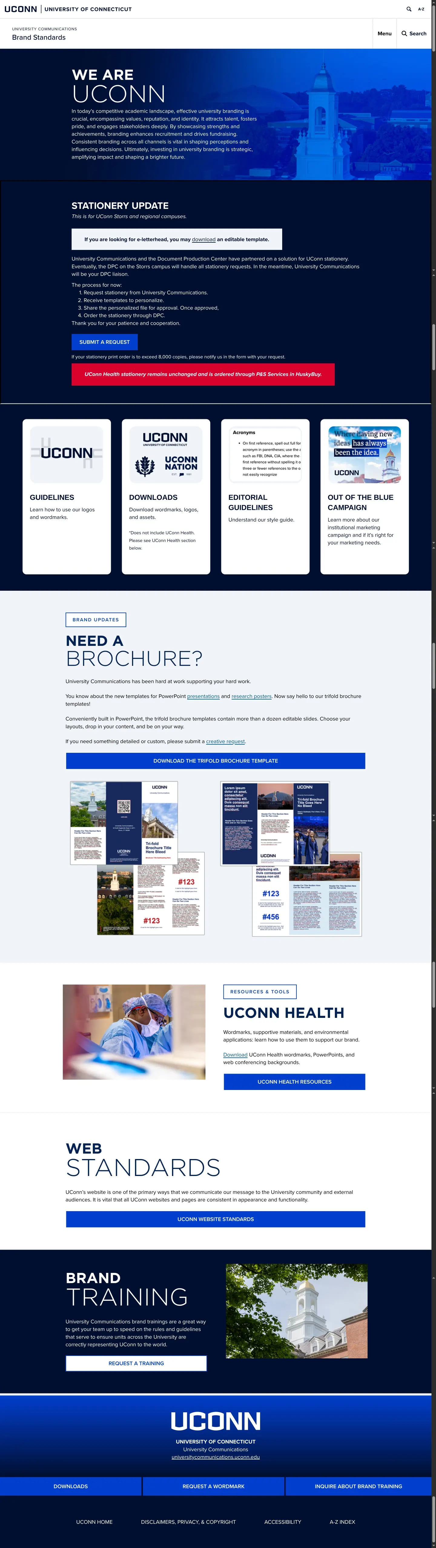
University of Connecticut's brand center outlines visual identity standards, campaign guidance, editorial style, and health division resources.
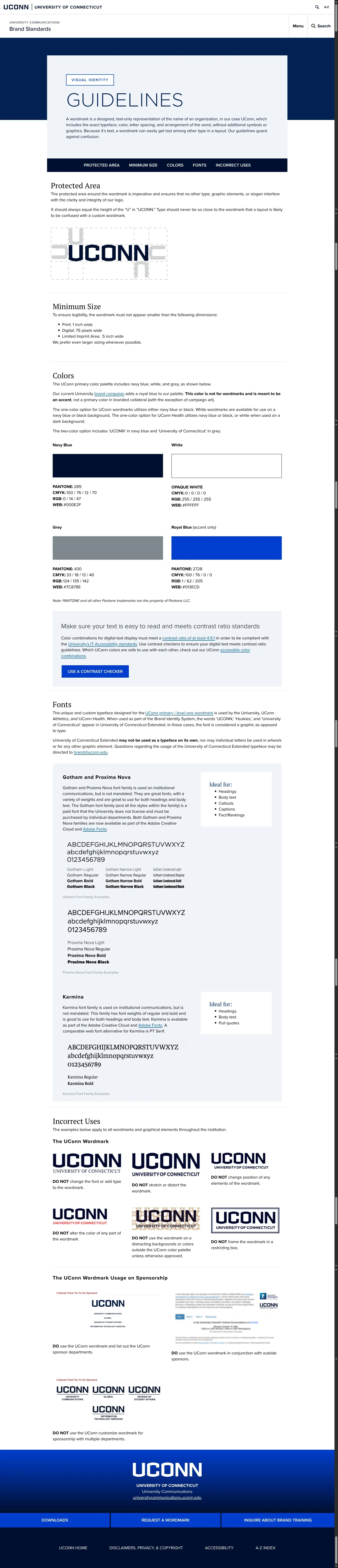
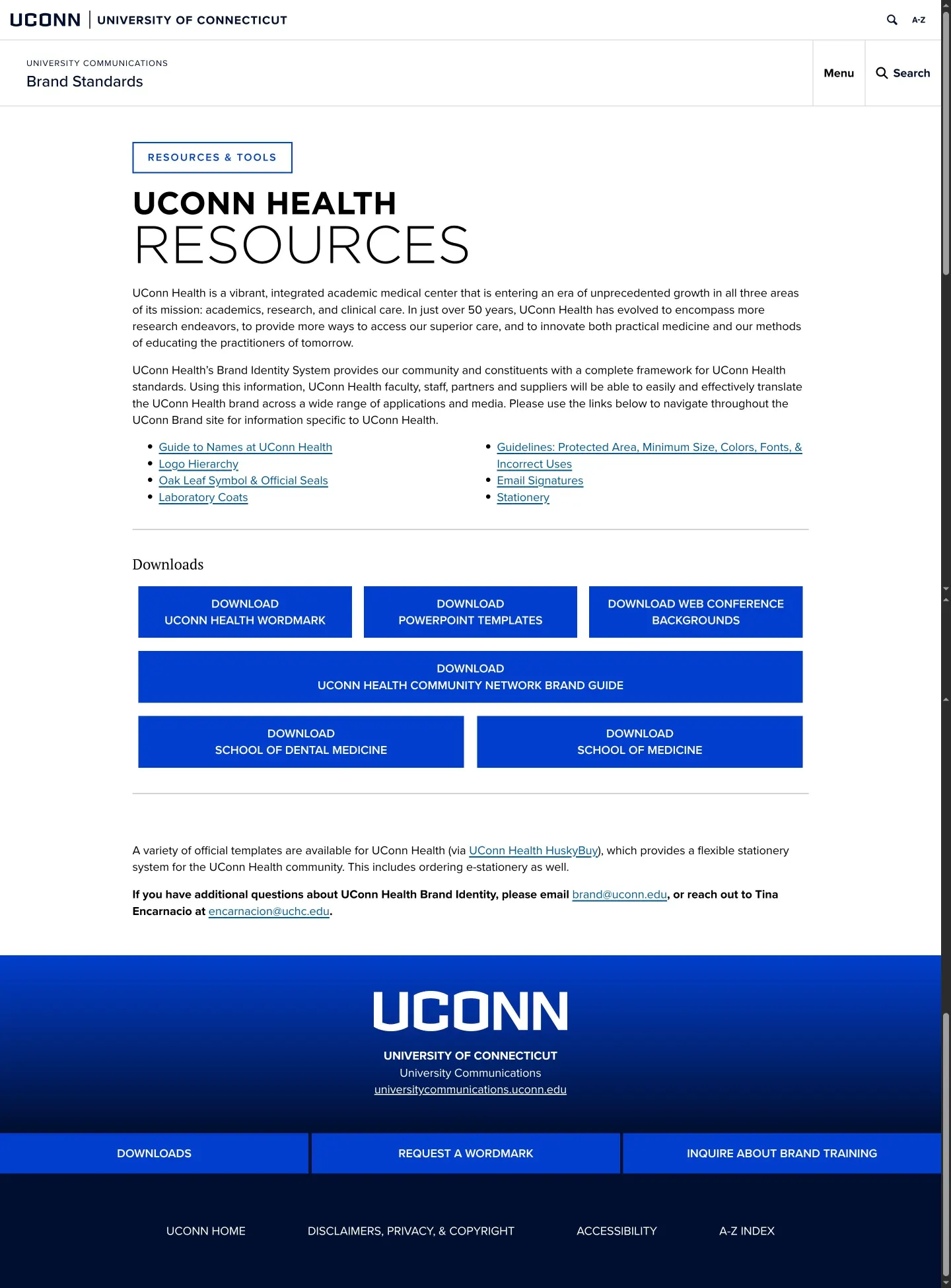
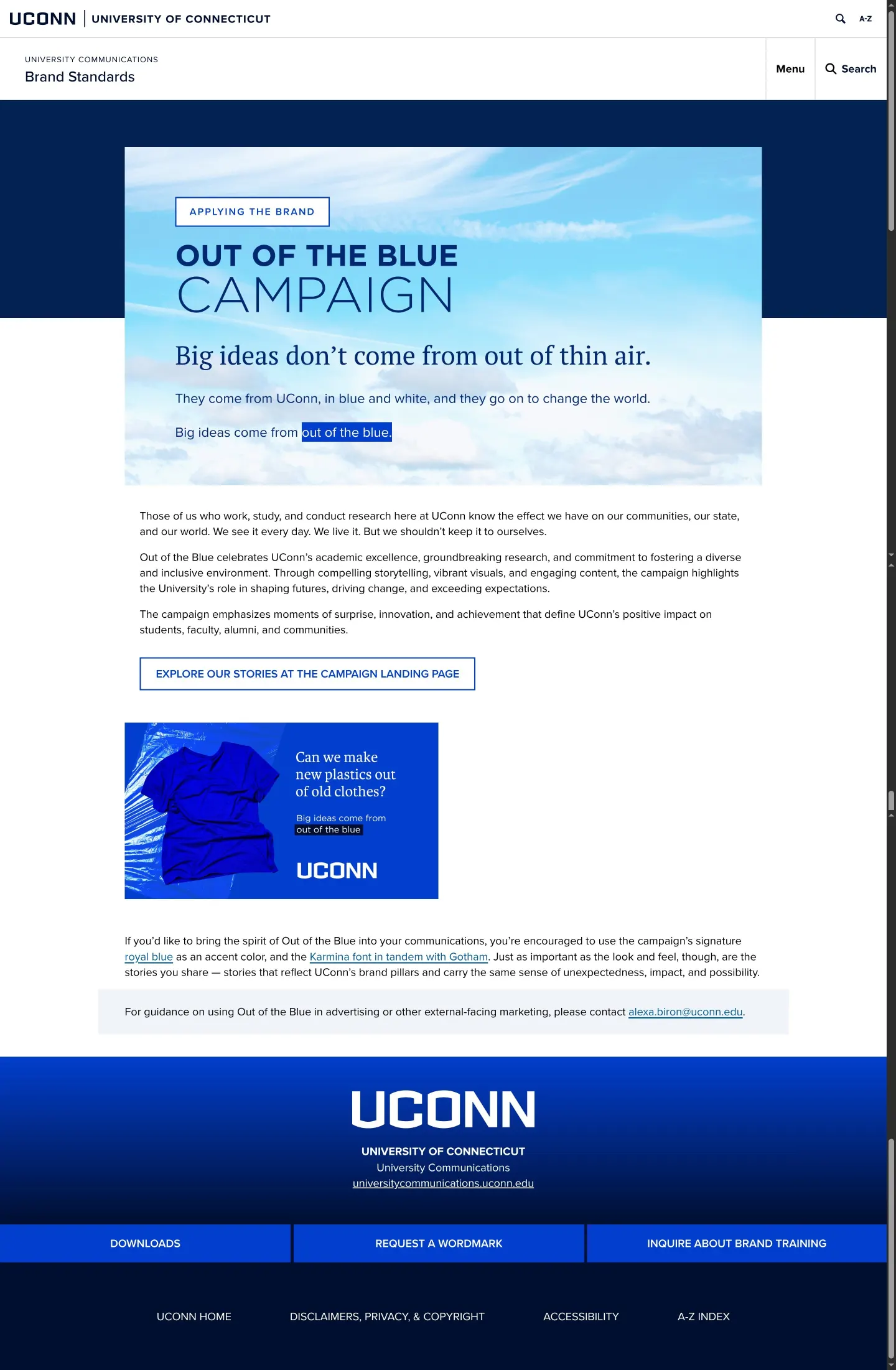
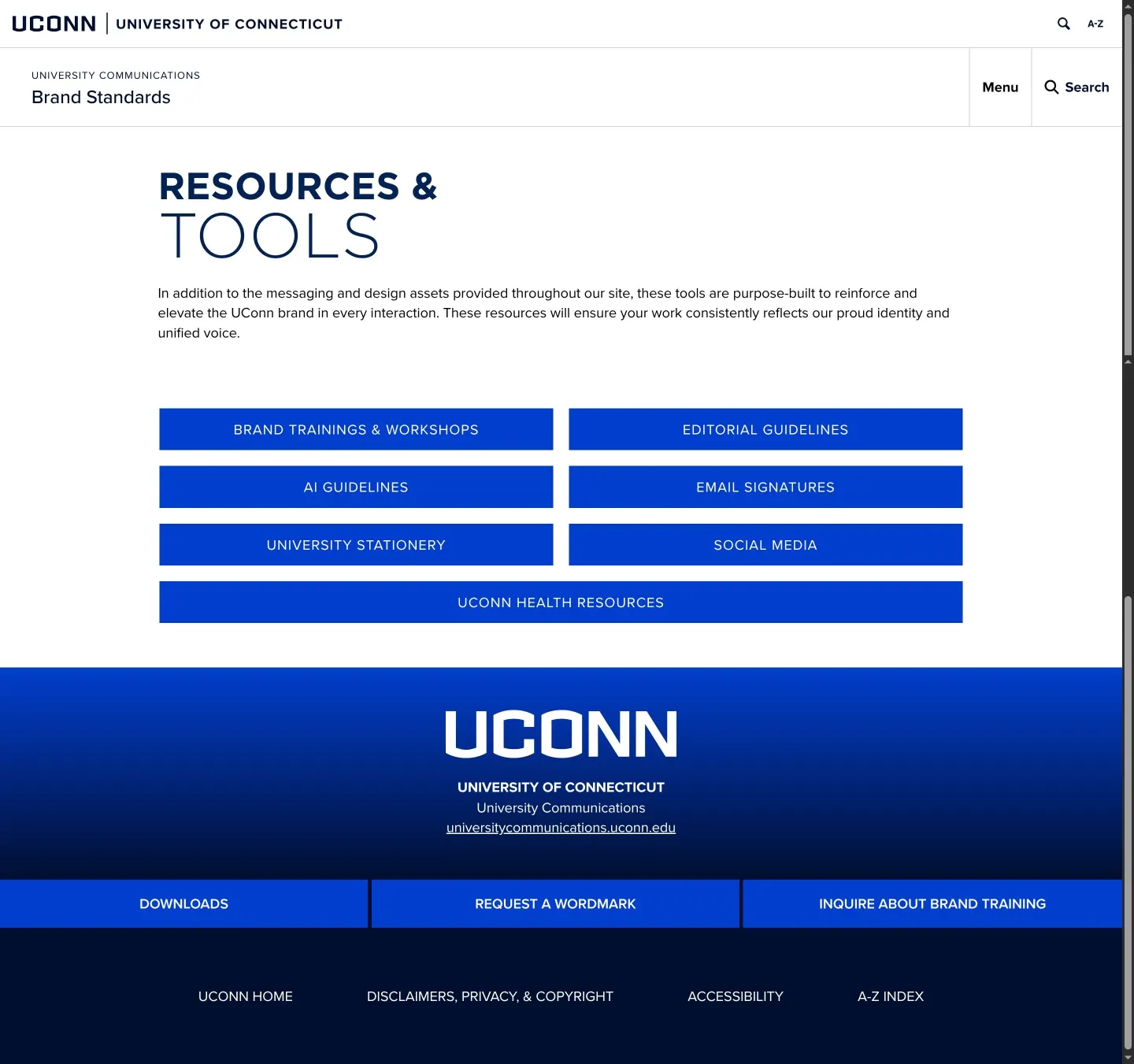
Freedam's take — I like how direct the University of Connecticut brand standards are. Rather than burying essential assets, the site lays out clear routes to stationery, editorial rules, and specific campaigns like Out of the Blue. I appreciate the dedicated section for UConn Health, which offers tailored assets like presentation templates and web conference backgrounds. The visual identity rules tackle practical concerns upfront, including contrast ratio guidance alongside Gotham, Proxima Nova, and Karmina typography. It feels built to serve a wide campus community quickly.
Details
- Type
- Guidelines
- Access
- Public
- Source
- brand.uconn.edu
- Industry
- Education
- Capabilities
- Guidelines, Search, Downloads, Campaigns
- Tags
- editorial guidelines, presentation templates, typography, brand architecture, print & stationery
- Added
- Last checked

What I noticed
- The typography guidelines specify Gotham, Proxima Nova, and Karmina as official fonts.123
- The portal provides dedicated downloadable assets for UConn Health, including PowerPoint templates and virtual backgrounds.45
- The site features an extensive editorial guidelines section covering terms from academic degrees to campus terminology.678910
Numbers refer to the screenshots above.
What I could not see
- External asset downloads hosted on SharePoint were not directly inspected beyond their link references.
- The full content of the twenty-three additional editorial guideline headings was not viewable in the summary.
Ideas to borrow
- Structuring sub-brand assets like health sciences separately while keeping them under the central brand portal keeps navigation clean for distinct campus audiences.
Reviewed on 18 September 2026. Request a correction · I built this