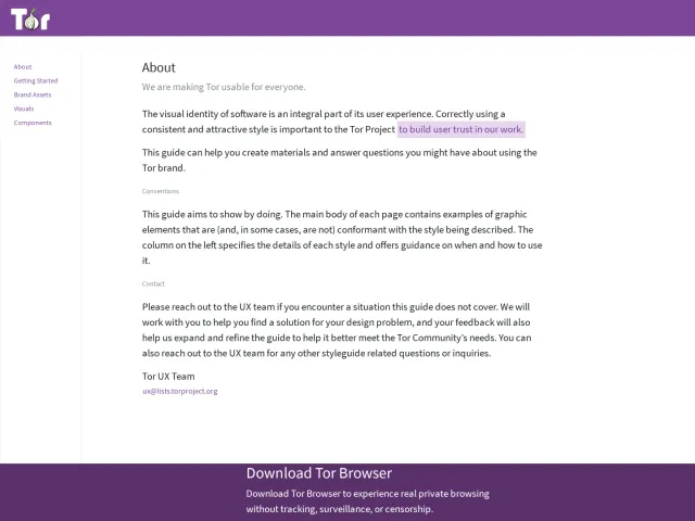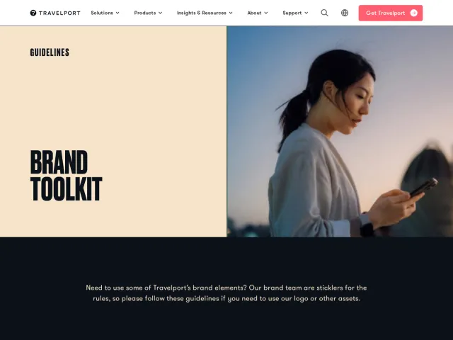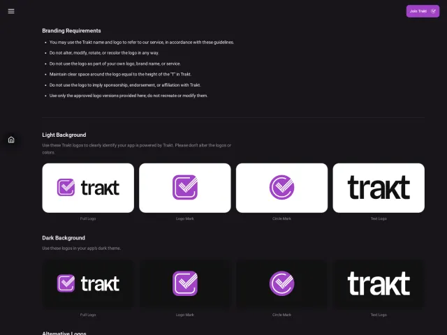
University of Colorado Boulder brand guidelines
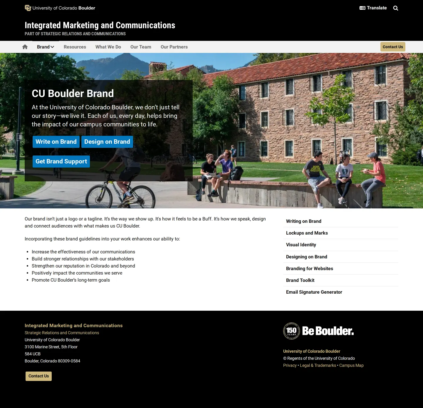
CU Boulder's brand center outlines institutional messaging, visual design rules, and campus logo lockups for university communicators.
Freedam's take — I spent time browsing the University of Colorado Boulder brand site, managed by their Integrated Marketing and Communications team. It is built directly into their standard web framework, keeping everything grounded and functional. I appreciate how clearly the content is separated into writing and visual disciplines. The writing section lays out positioning, audiences, and tone, while the visual guidance covers lockups, typography, and athletics marks like Ralphie. It feels very much like an operational handbook designed to align a sprawling campus network of communicators through shared principles.
Details
- Type
- Guidelines
- Access
- Public
- Source
- colorado.edu
- Industry
- Education
- Capabilities
- Guidelines, Search, Partner resources
- Tags
- tone of voice, typography, logo usage, editorial guidelines, search
- Added
- Last checked

What I noticed
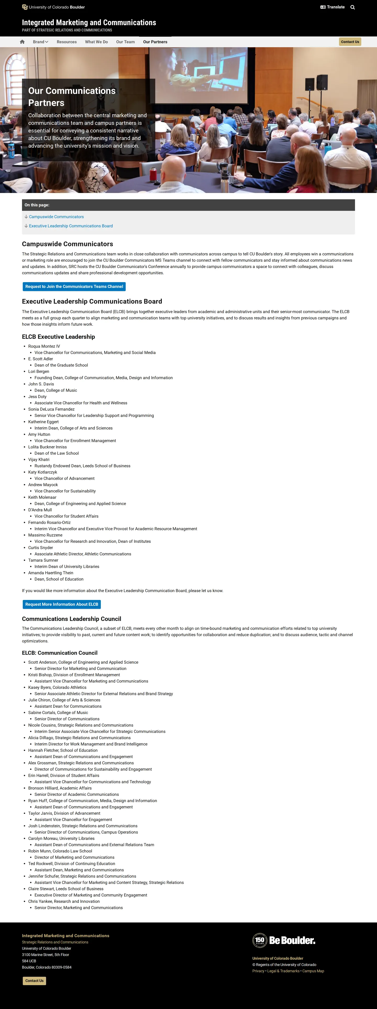
- The brand guidelines are hosted by Integrated Marketing and Communications, part of Strategic Relations and Communications.12
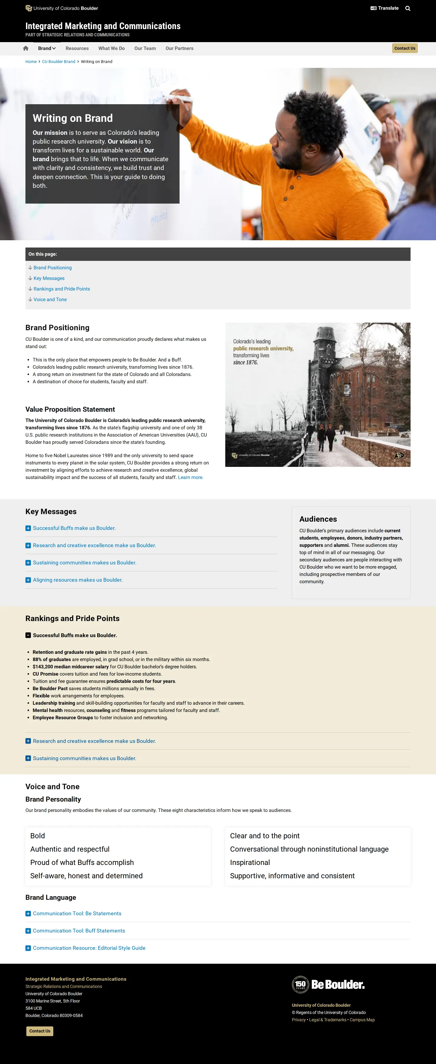
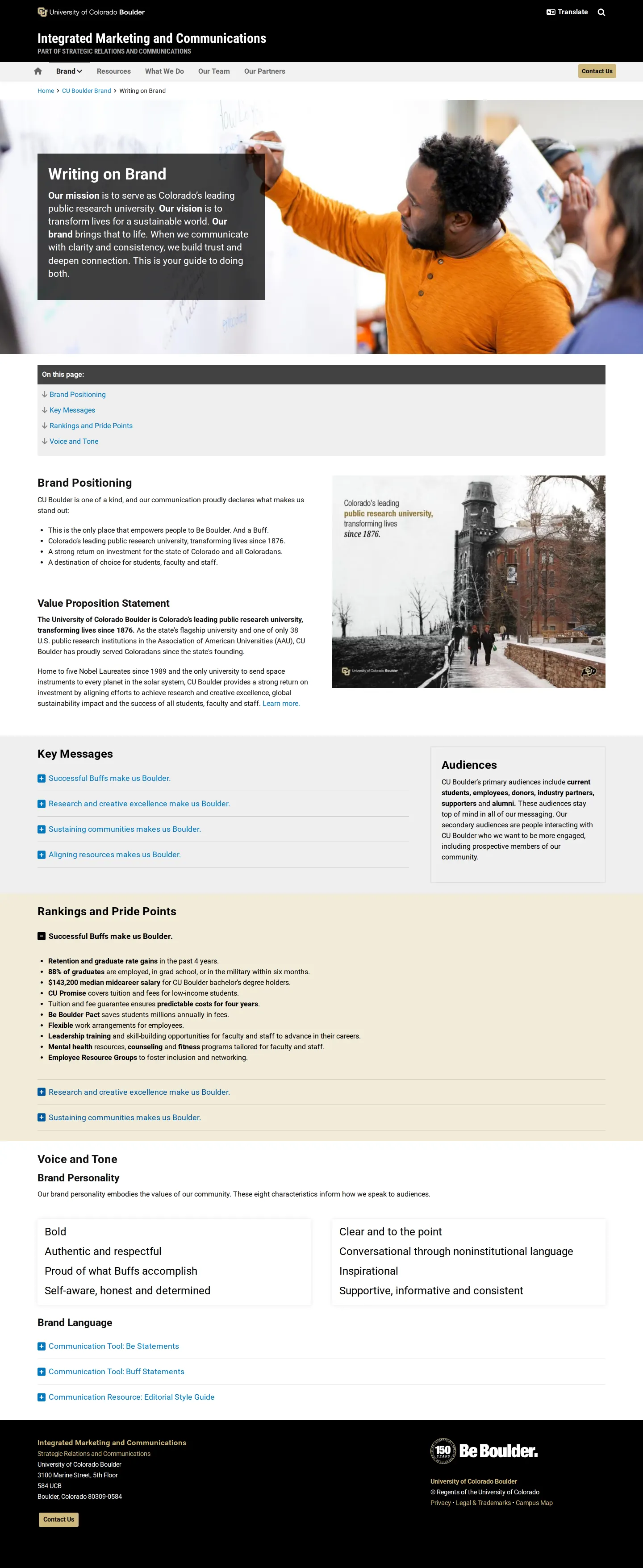
- The site provides dedicated guidance for writing, detailing positioning, value propositions, and tone.345
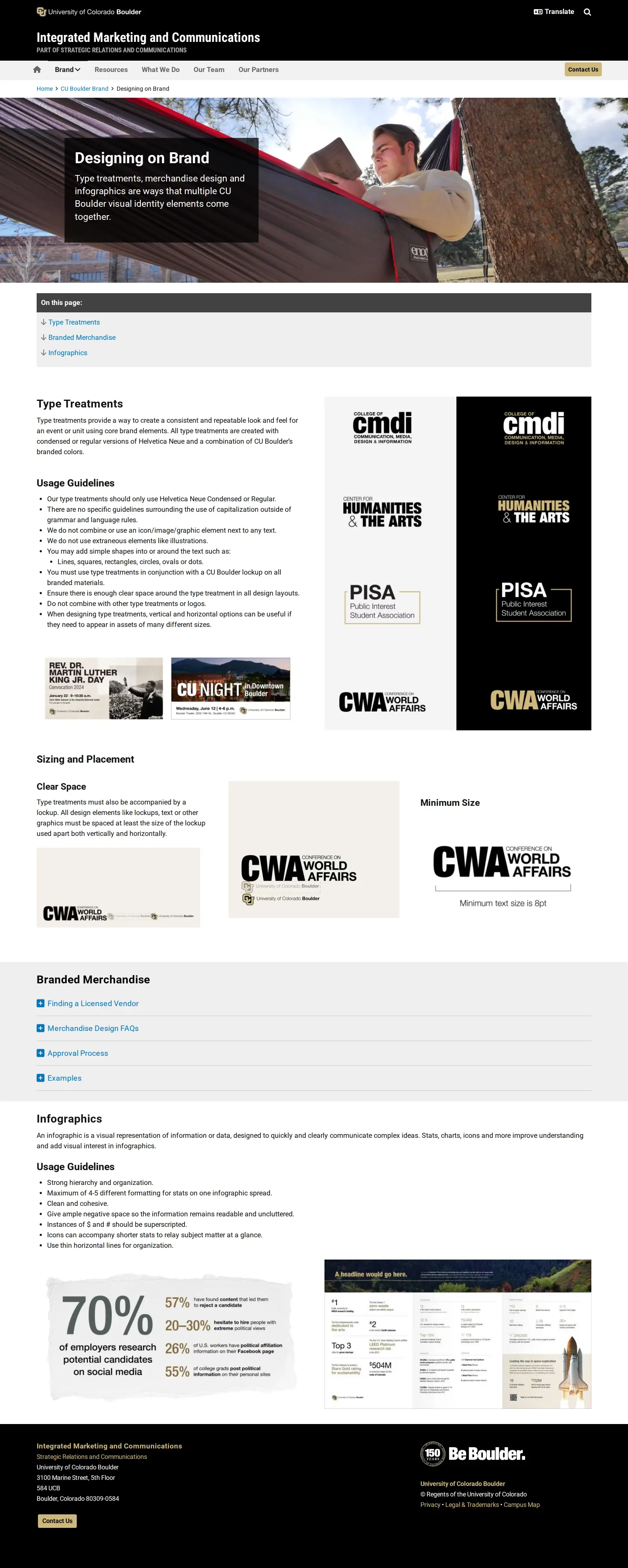
- Design specifications include athletics marks such as Ralphie and the interlocking CU.678
- A site search mechanism is available across the pages.91011
Numbers refer to the screenshots above.
What I could not see
- Could not view downloadable asset file formats or see if an asset library exists behind an institutional login.
- Could not inspect digital design tokens or web component code snippets.
Ideas to borrow
- Separating guidelines clearly into distinct writing and design tracks helps both copywriters and visual designers navigate directly to relevant standards.
Reviewed on 18 September 2026. Request a correction · I built this