University of California, Irvine brand guidelines
UC Irvine's brand portal provides core visual identity guidelines, detailed color tiers, typography choices, and official business asset templates.
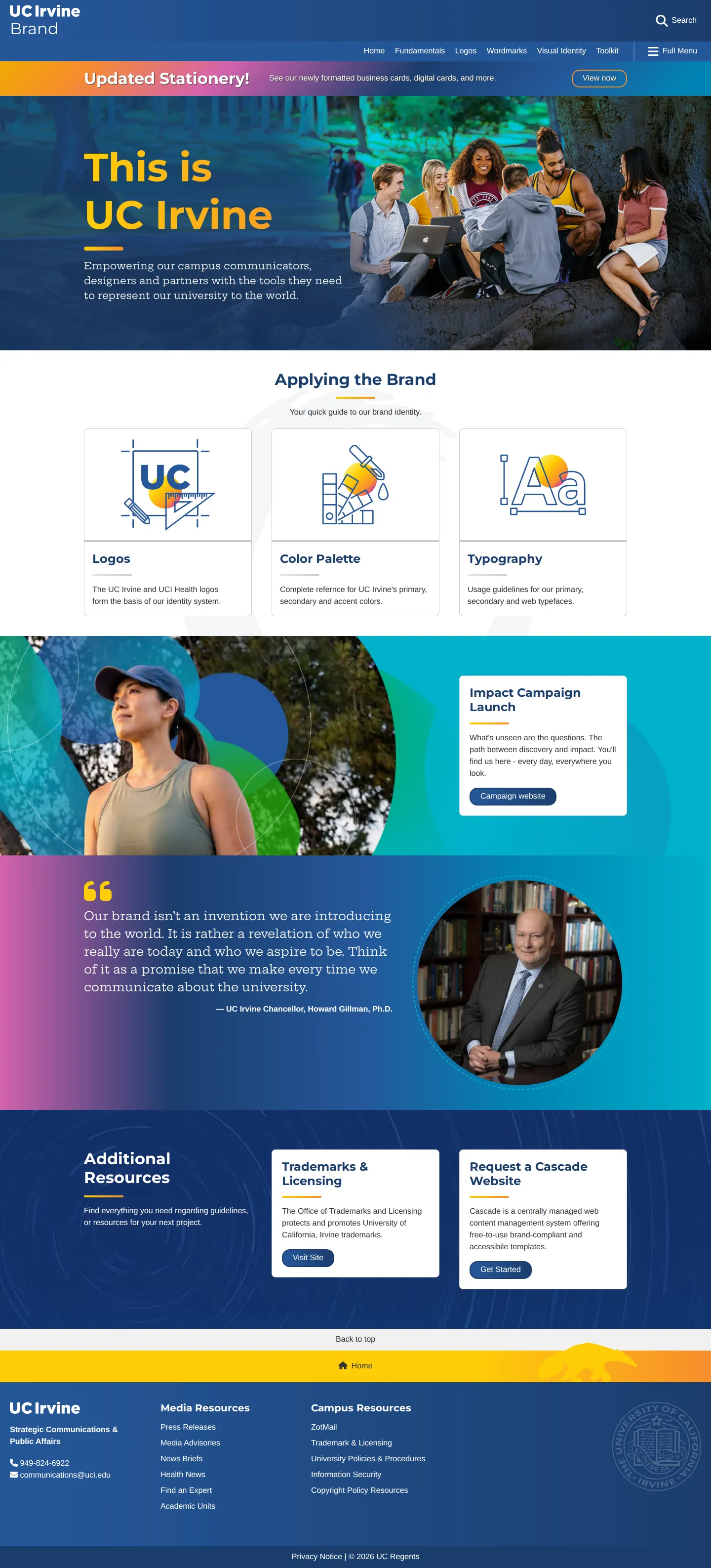
UC Irvine brand homepage featuring quick links to core identity guides, campaign announcements, and stationery updates.
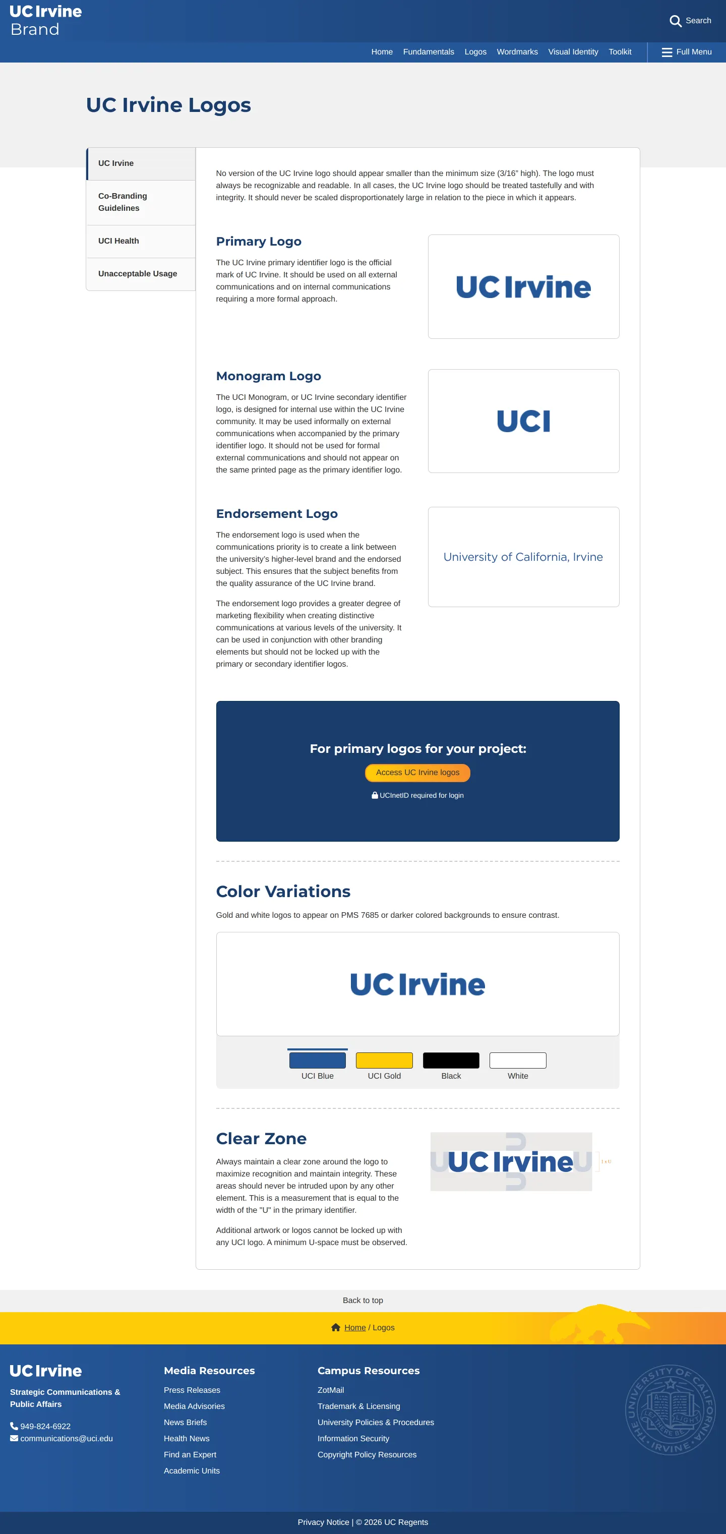
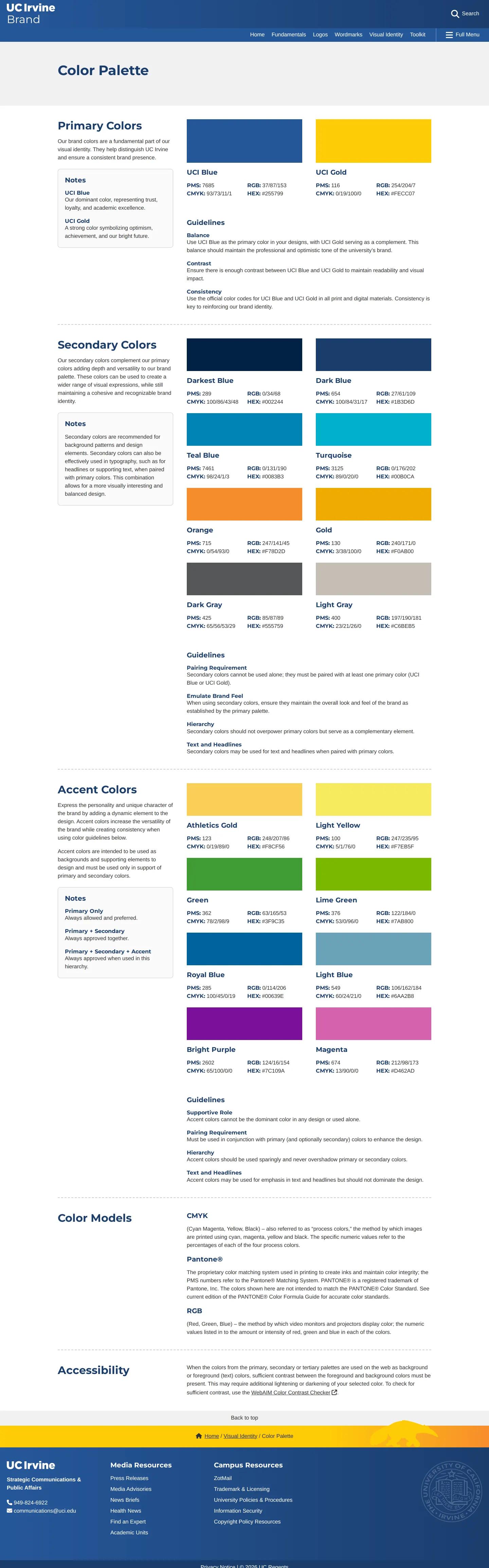
Color palette page detailing primary, secondary, and accent colors alongside usage notes and accessibility contrast tools.
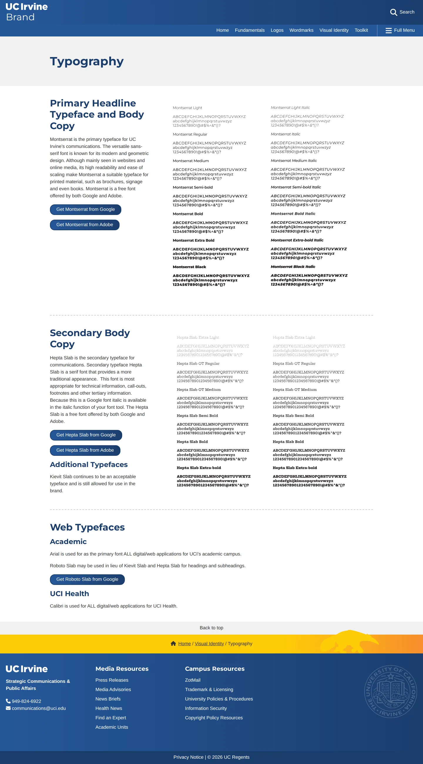
Typography guide displaying Montserrat and Hepta Slab weights, download links, and web fallback font rules.
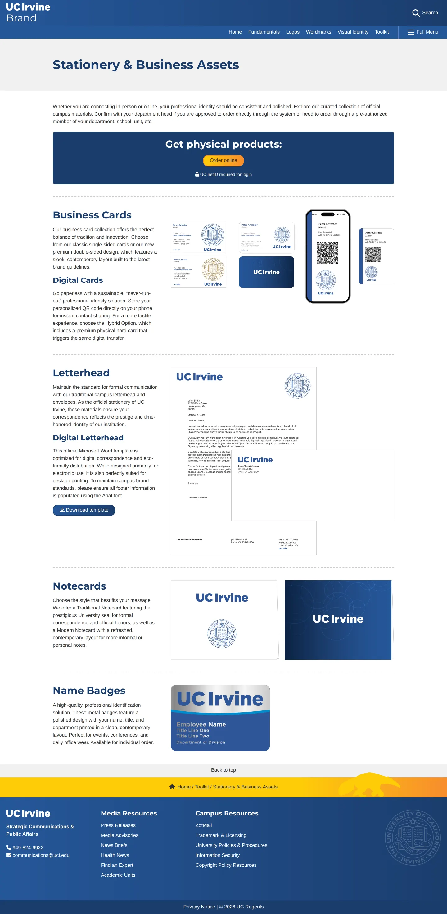
Stationery and business assets showcase presenting physical product orders, digital cards, and letterhead downloads.
Want a brand center like University of California, Irvine’s?
Create your brand center with Freedam ↗Freedam's take
I like how practical UC Irvine keeps its brand center. Exploring the identity sections, I immediately noticed how thoroughly they document their colors, splitting them into clear primary, secondary, and accent tiers with print and digital formulas. The typography choices are grounded, pairing Montserrat and Hepta Slab alongside clear fallback guidance for web and health units. Adding direct links to an accessibility contrast checker and hosting stationery templates via a digital asset management platform makes this an exceptionally functional workspace for campus teams.
At a glance
- Sections
- Fundamentals · Logos · Wordmarks · Visual Identity · Toolkit
- Downloads
- Template download via Widen DAM
- Tone
- A practical and structured university manual focused on clear visual execution and accessible communication standards.
What I noticed
- Primary colors are identified as UCI Blue and UCI Gold, with swatches showing PMS, CMYK, RGB, and HEX formulas.12
- The color guidelines include an accessibility section featuring a direct link to the WebAIM Color Contrast Checker.34
- Montserrat is specified as the primary headline and body copy font, supported by Hepta Slab as secondary body copy.56
- The stationery page offers an order button behind a UCInetID login alongside a template download linked to a Widen DAM asset.789
Numbers refer to the screenshots above.
What I could not see
- Could not inspect the full range of asset file types inside the linked Widen DAM system.
- Could not view the contents of the co-branding guidelines or unacceptable logo usage pages.
Ideas to borrow
- Pair color system documentation with external links to accessibility contrast checkers directly in the guideline pages.4
Quick answers
Reviewed on 25 September 2026. Request a correction · I built this
Similar brand centers
All brand guidelines →