UnitedHealthcare brand portal
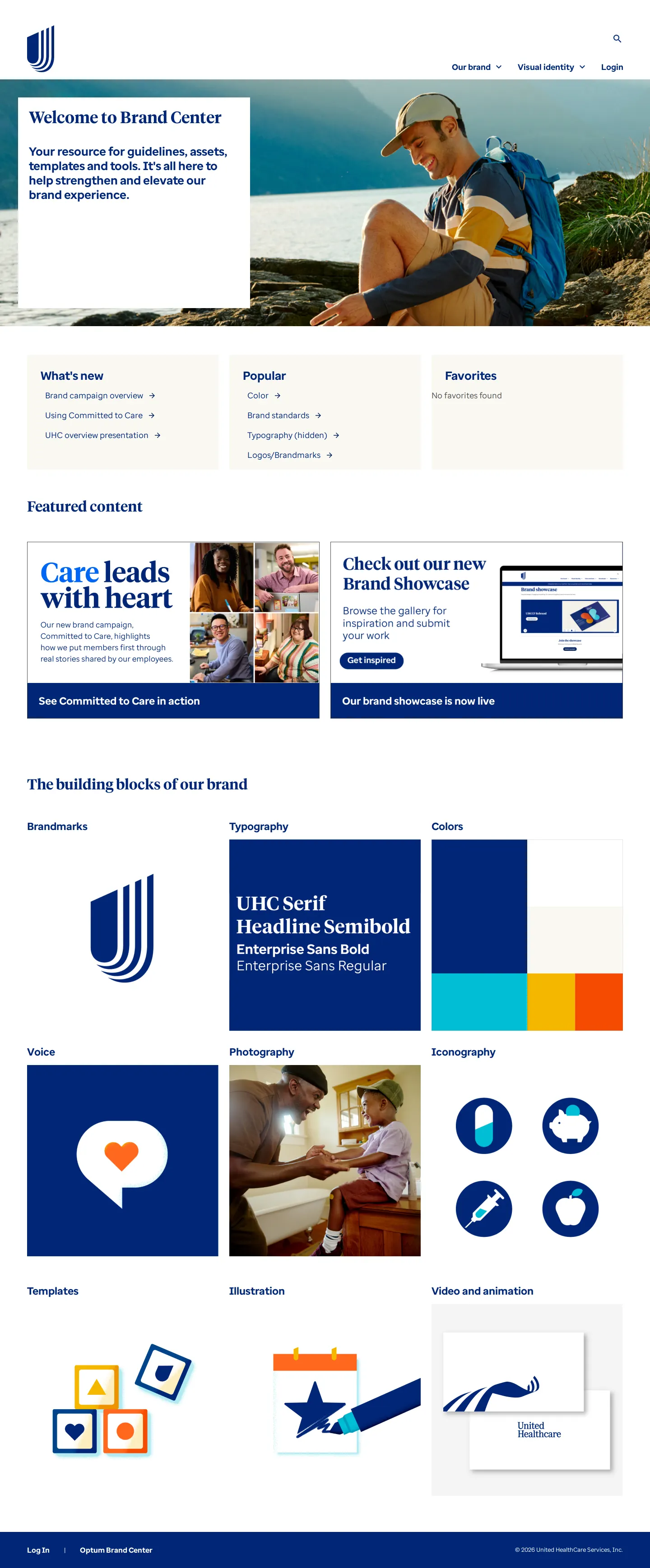
UnitedHealthcare's brand center outlines core visual identity standards, covering logos, color systems, and Enterprise Sans typography with practical usage guides.
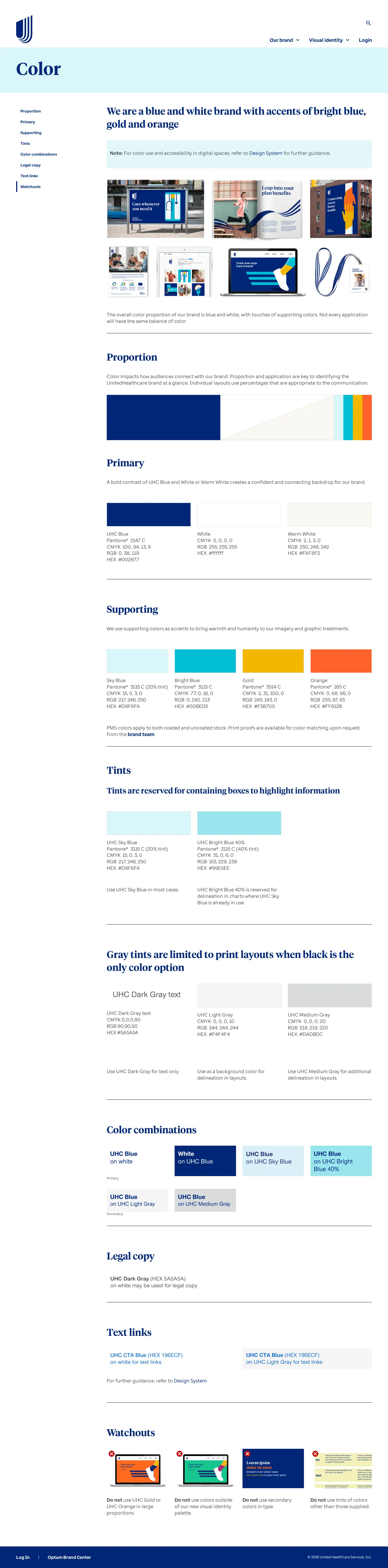
Freedam's take — I spent some time looking through the UnitedHealthcare Brand Center, and I really appreciate how directly it addresses practical implementation questions. Pages dedicated to marks and typography feature explicit sections like which mark to use and which font to use, making choices straightforward for anyone producing collateral. The color section details clear rules around proportions, tints, and legal copy, while recurring watchouts highlight what not to do. Some assets require authentication behind a login, but the core identity rules provide a structured, instructional baseline that avoids ambiguity.
Details
- Type
- Brand portal
- Access
- Public
- Source
- brand.uhc.com
- Industry
- Finance, Health
- Capabilities
- Guidelines, Asset browsing, Search, Downloads, Templates
- Tags
- logo usage, typography, color system, do's and don'ts, gated access, accessibility, search
- Added
- Last checked


What I noticed
- The Brand Center homepage frames the site as a resource for guidelines, assets, templates, and tools.1
- The logos section includes guidance on the U-mark, wordmarks, lock-ups, third-party use, and watchouts.234567
- The typography documentation introduces Enterprise Sans as the brand font and covers accessibility requirements and download options.8910
- A login prompt and search functionality appear across all captured site pages.1112131415161718
Numbers refer to the screenshots above.
What I could not see
- Content under 'Our brand' navigation was not captured.
- Specific asset downloads and presentations were restricted behind a login or permissions wall.
Ideas to borrow
Reviewed on 18 September 2026. Request a correction · I built this
Similar brand centers
All brand portals →