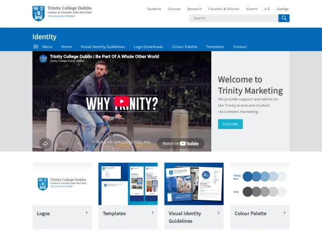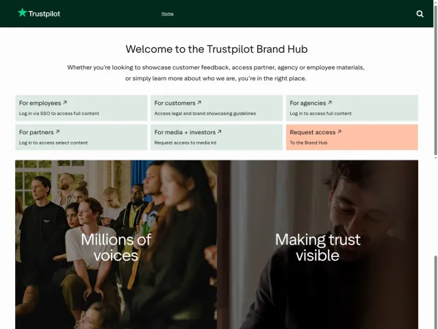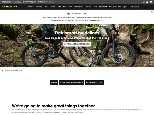
UniCredit brand guidelines
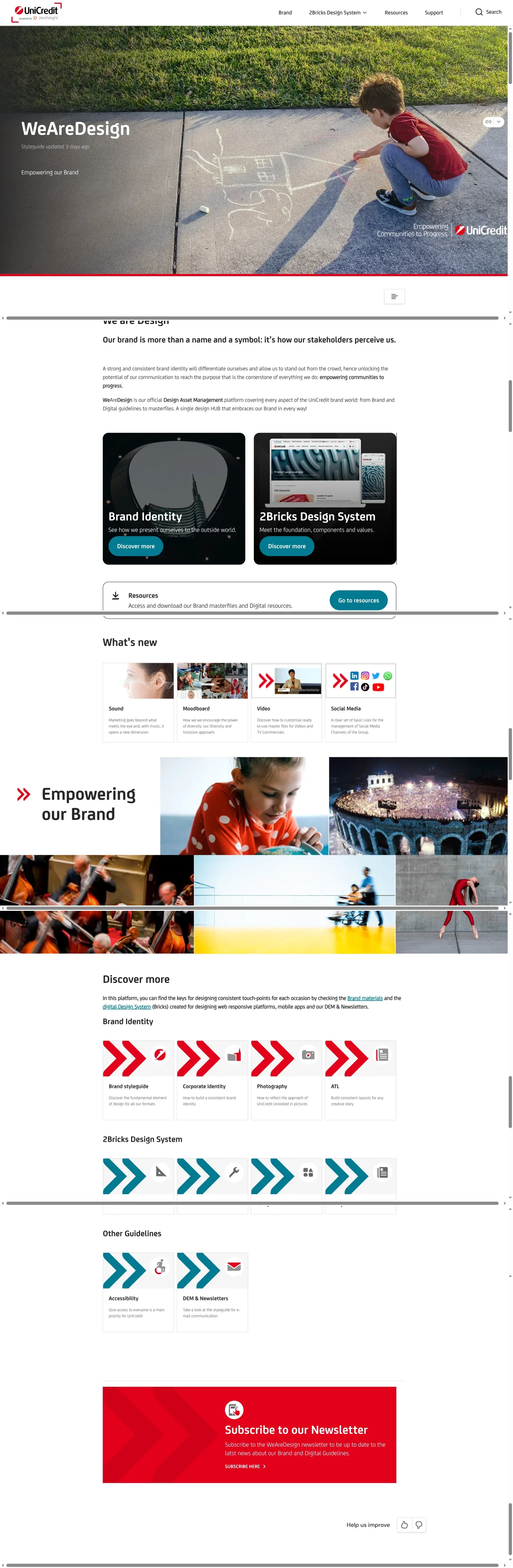
UniCredit's WeAreDesign portal unifies brand identity guidelines and the 2Bricks design system documentation on zeroheight.
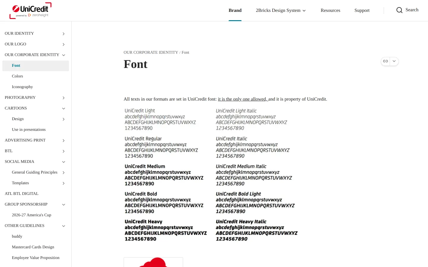
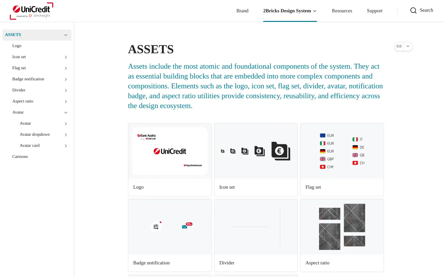
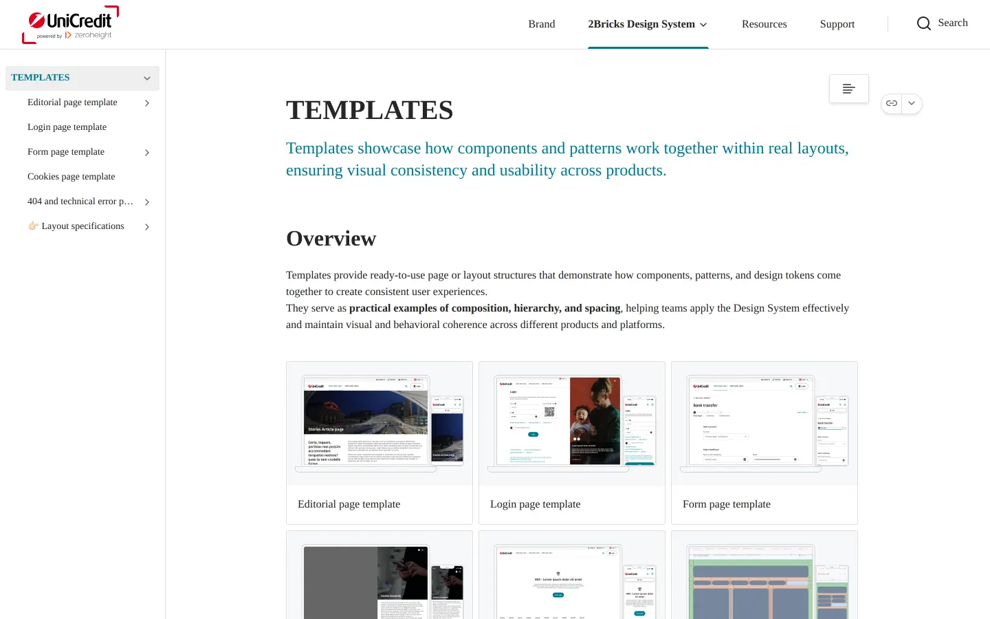
Freedam's take — I like how UniCredit brings core corporate branding and product design together under their WeAreDesign portal. Built on zeroheight, the site connects brand identity rules with their 2Bricks design system. What catches my eye is the breadth of specific application areas documented in the sidebar, covering everything from presentations and social media to App Store guidelines and Mastercard designs. They also provide direct access to assets like their custom font and interface templates. It feels like a thorough workspace that equips both digital product builders and marketing teams from a single address.
Details
- Type
- Guidelines
- Access
- Public
- Source
- zeroheight.com
- Industry
- Finance
- Capabilities
- Guidelines, Asset browsing, Search, Downloads, Templates
- Tags
- product design, font downloads, presentation templates, social media, ui components, asset downloads, zeroheight
- Added
- Last checked
What I noticed
- The portal documentation is built using zeroheight.123
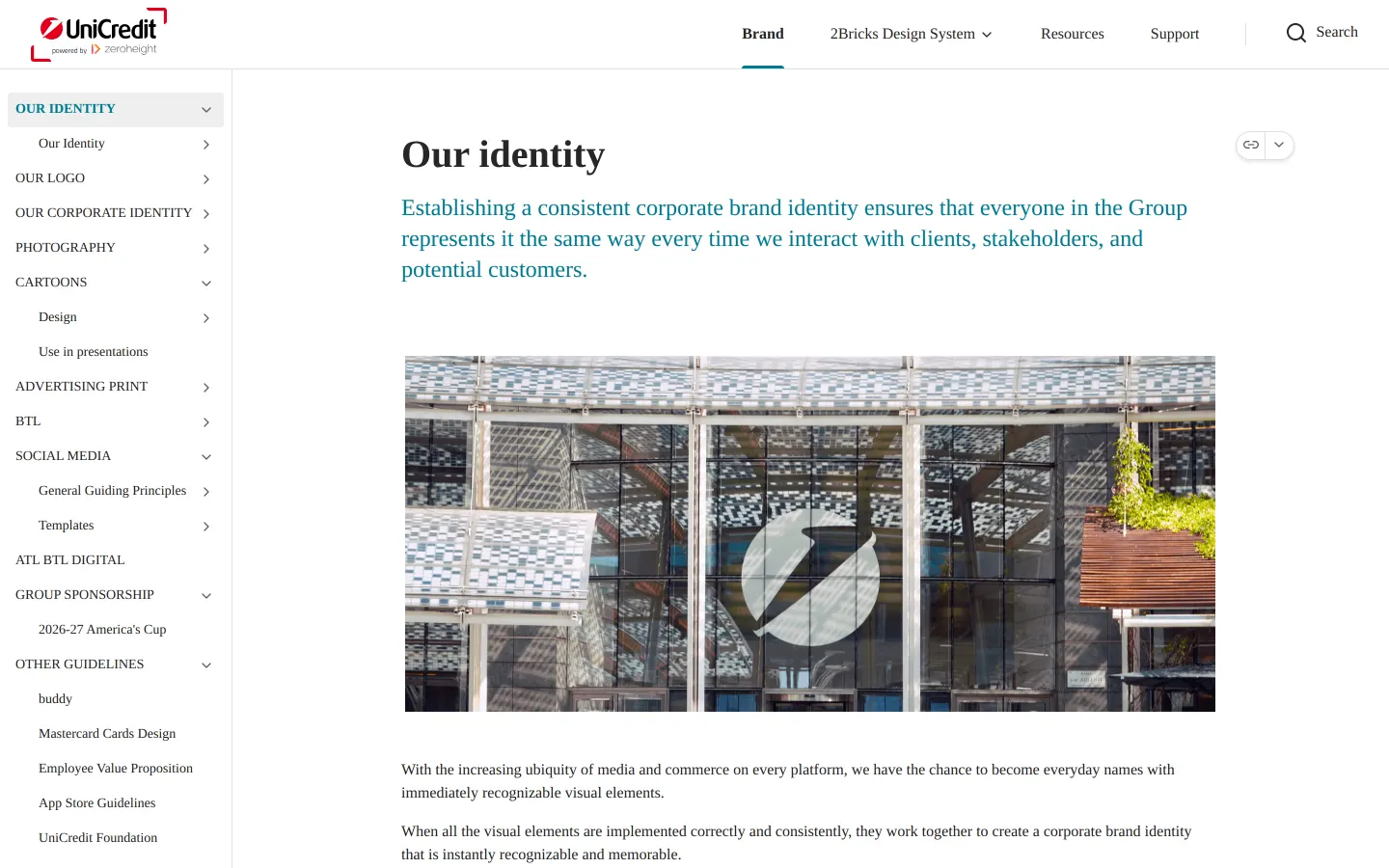
- The navigation connects corporate brand identity rules alongside the 2Bricks Design System.4567
- A direct download link is provided for the UniCredit Font.8
- The guidelines feature dedicated sections for specific use cases including Mastercard Cards Design, App Store Guidelines, and Cartoons.91011
Numbers refer to the screenshots above.
What I could not see
- Could not inspect the full download files or licensing terms behind the font download link.
- Could not view code implementation details or storybook integrations for the 2Bricks design system components.
Ideas to borrow
- Co-locate digital product design components and brand collateral specifications within the same portal navigation to give teams a single reference point.
Reviewed on 18 September 2026. Request a correction · I built this
Similar brand centers
All brand guidelines →