Travelport brand guidelines
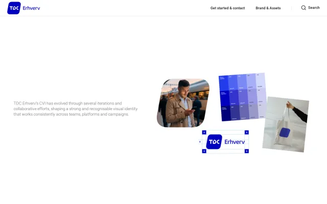
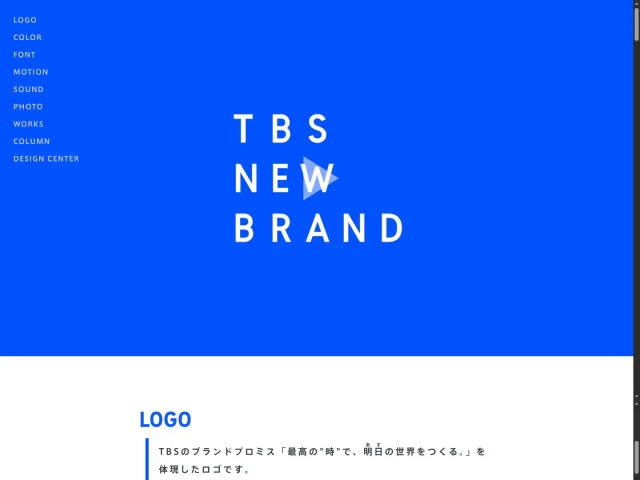
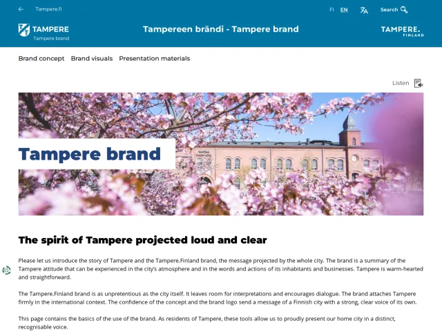
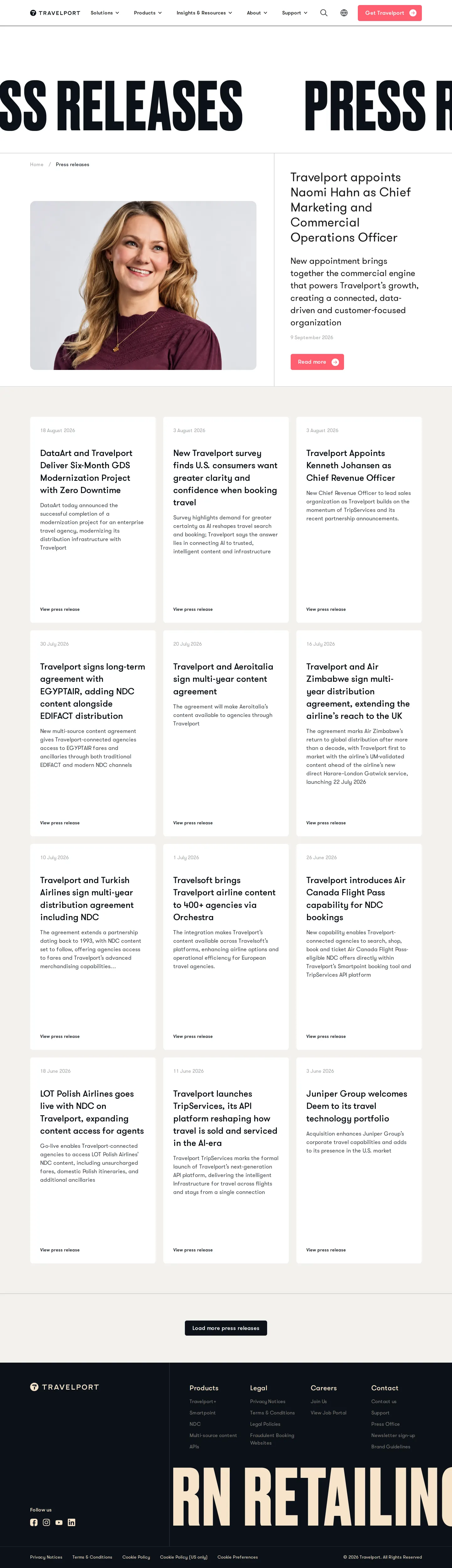
Travelport provides an accessible brand toolkit covering logo usage, color palettes, direct asset downloads, and location photography.
Freedam's take — I love when guidelines stay concise and give partners exactly what they need on a single page. Travelport lays out their brand toolkit with straightforward rules for logo clear space, colorways, and placement, alongside direct downloads for EPS, SVG, PNG, and JPG formats. They detail both primary and secondary color palettes, calling out shades like Sand, Soft black, Olive, and Coral. What really stood out to me was the curated downloads for office imagery across Langley, Dublin, and Denver, giving media and partners approved physical context right alongside the core graphic assets.
Details
- Type
- Guidelines
- Access
- Public
- Source
- travelport.com
- Industry
- Technology, Travel & hospitality
- Capabilities
- Guidelines, Search, Downloads
- Tags
- logo usage, color system, photography, asset downloads, vector assets, single page
- Added
- Last checked

What I noticed
- The brand guidelines page provides direct download links for logo files in EPS, SVG, PNG, and JPG formats.1234
- The color system specifies both a primary brand palette including Sand and Soft black, and a secondary brand palette including Olive, White, and Coral.567891011
- The site provides downloadable imagery packs for Travelport offices in Langley, Dublin, and Denver.12131415161718
Numbers refer to the screenshots above.
What I could not see
- I could not inspect detailed typography rules, editorial voice guidance, or digital interface components, as they are not visible on the single-page toolkit.
Ideas to borrow
Reviewed on 18 September 2026. Request a correction · I built this
Similar brand centers
All brand guidelines →