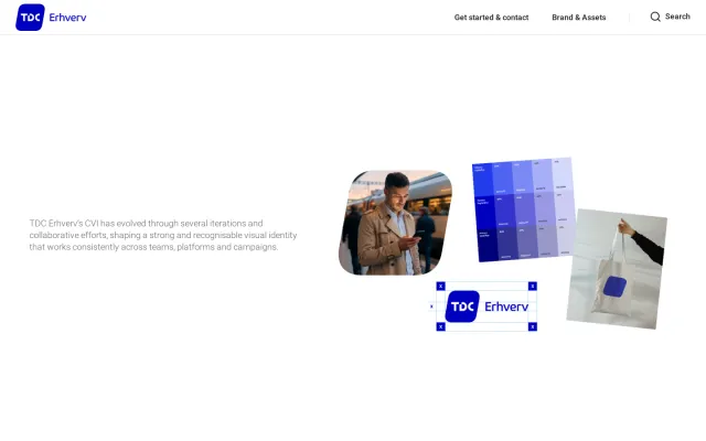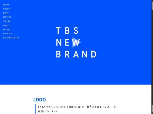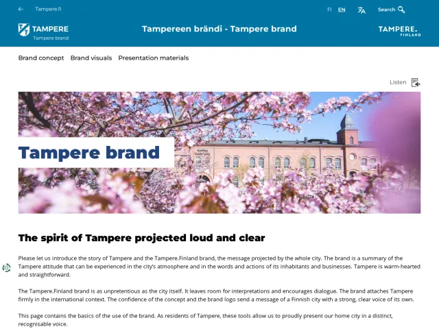
Travel Portland brand guidelines
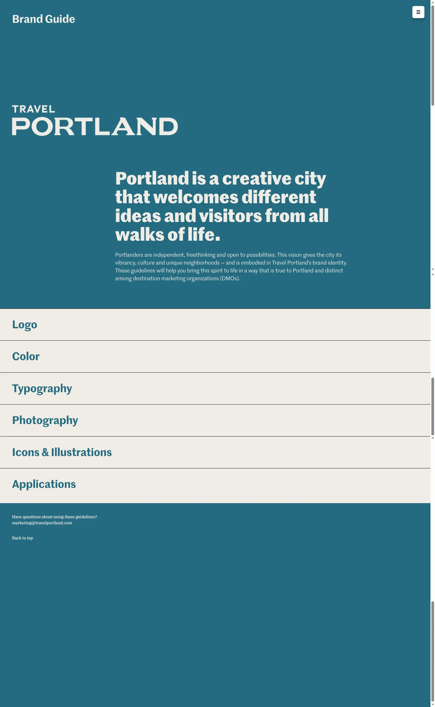
The Travel Portland Brand Guide provides core visual identity documentation across dedicated pages for logo, color, typography, photography, and icons.
Freedam's take — I like how clear and focused the Travel Portland brand guide feels right from the start. The site separates essentials cleanly across dedicated sections for their logo, color palette, typography, photography, and an illustration system. What stands out to me is how direct the asset access is: the team provides zip packages for the full logo suite, an icon set, and their custom illustrations right on the relevant pages. Having dedicated guidelines alongside bundled downloads makes it very easy for partners to grab exactly what they need without extra friction.
Details
- Type
- Guidelines
- Access
- Public
- Source
- brand.travelportland.com
- Industry
- Travel & hospitality, Public sector
- Capabilities
- Downloads
- Tags
- logo usage, color system, typography, photography, iconography, illustration, asset downloads
- Added
- Last checked





What I noticed
- The guide includes distinct pages for Logo, Color, Typography, Photography, and Icons & Illustrations.12345
- Direct download links are provided for a full logo set and a logo usage guide.67
- The system page offers downloadable zip files for large icons and an illustration set.89
Numbers refer to the screenshots above.
What I could not see
- I could not see the written copy, color swatches, or typography specs within the page bodies because full text content was not captured.
Ideas to borrow
- Place packaged asset bundles, such as icon and illustration sets, directly within the relevant documentation pages to reduce friction for external partners.
Reviewed on 18 September 2026. Request a correction · I built this
Similar brand centers
All brand guidelines →