Tennessee Titans brand guidelines
The Tennessee Titans brand section showcases their refreshed visual identity, breaking down uniform typography, musical motifs, and regional symbolism across media galleries.
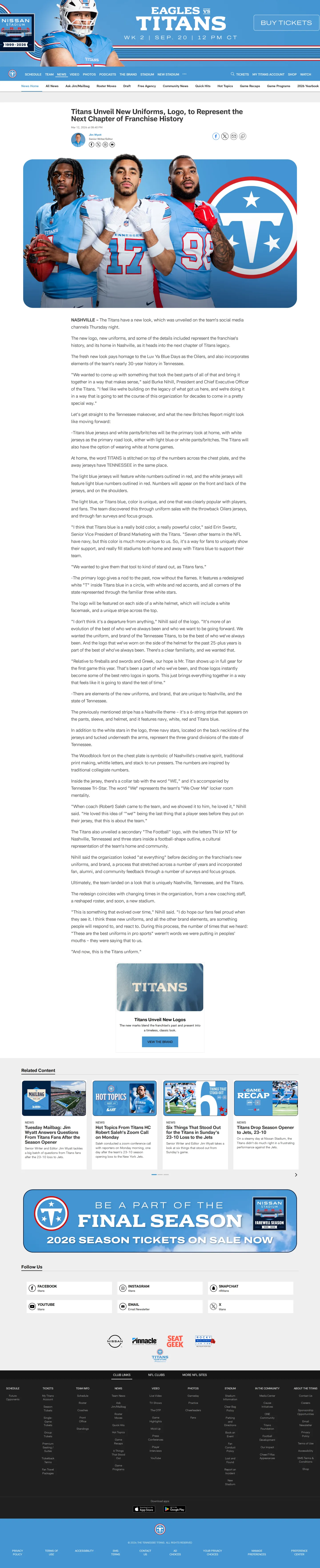
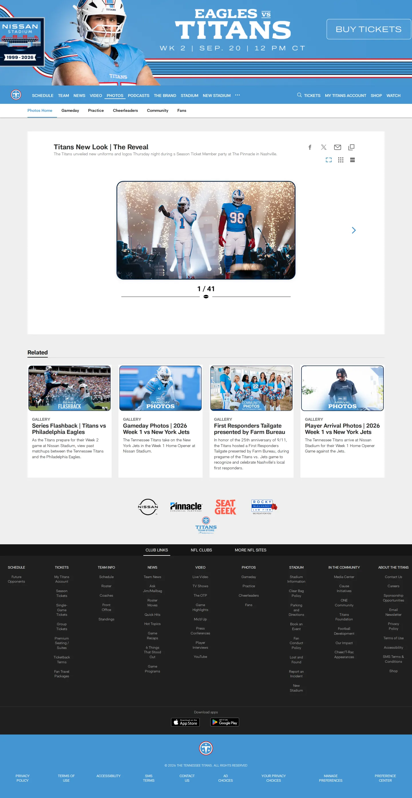
Freedam's take — I love when athletic identities tie their design decisions directly to local culture. The Titans built this hub to introduce their visual refresh, unpacking every uniform element from the woodblock-inspired chest wordmark to the 6-String Stripe referencing Nashville music history. Rather than acting as an isolated manual, it lives inside their team website alongside reveal videos, fan events, and photography galleries. I appreciate how clearly the details are framed, giving supporters and partners a direct look at the meaning stitched into the collar tabs, striping, and numbers.
Details
- Type
- Guidelines
- Access
- Public
- Source
- tennesseetitans.com
- Industry
- Sports
- Capabilities
- Guidelines, Asset browsing, Search
- Tags
- brand story, merchandise, typography, photography
- Added
- Last checked


What I noticed
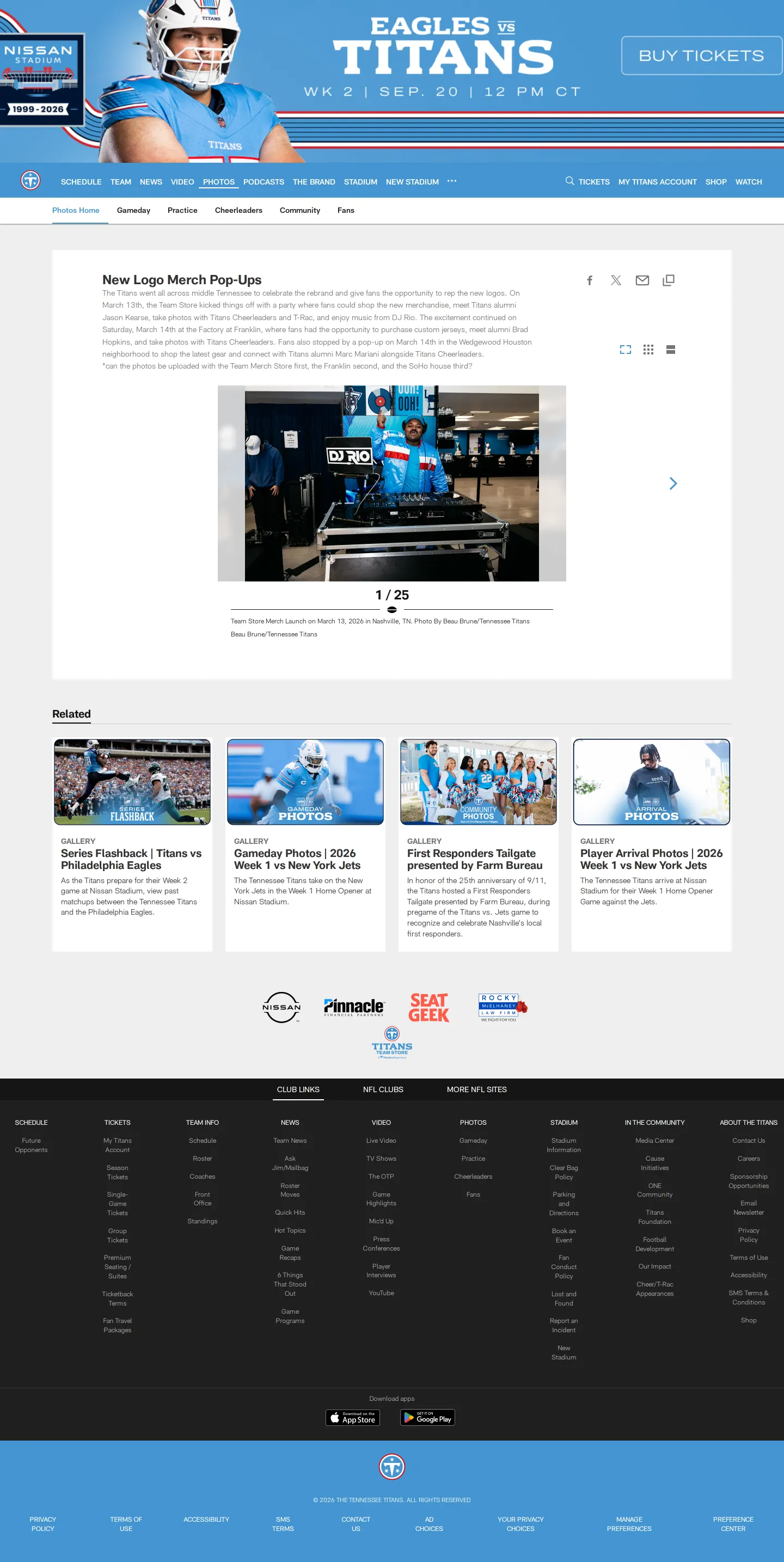
- The primary wordmark uses a bold serif font inspired by classic athletics and Tennessee woodblock type, while the away jersey uses a sans-serif typeface.1
- The uniform striping, named the '6-String Stripe', incorporates Nashville's music heritage across the helmet, pants, and sleeves.2
- The collar tab displays the Tennessee Tri-Star on the outside and the word 'WE' on the inside.3
Numbers refer to the screenshots above.
What I could not see
- No downloadable logo packs, vector art files, or color code specifications were visible in the captured pages.
- No formal brand application rules or partner usage guidelines were observed.
Ideas to borrow
Reviewed on 18 September 2026. Request a correction · I built this