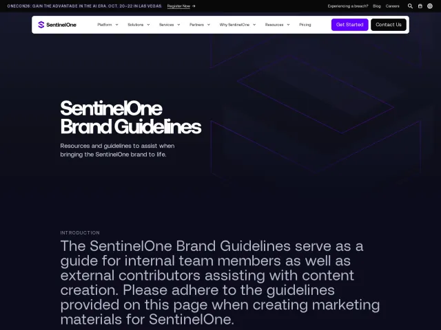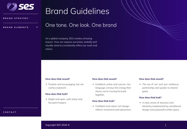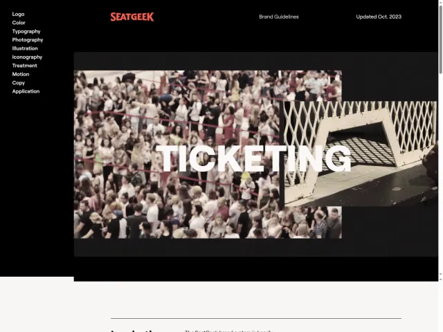
TH Mannheim brand guidelines
TH Mannheim provides brand design guidelines covering typography, color rules, and logo usage instructions including the Mannheimer Punkt.
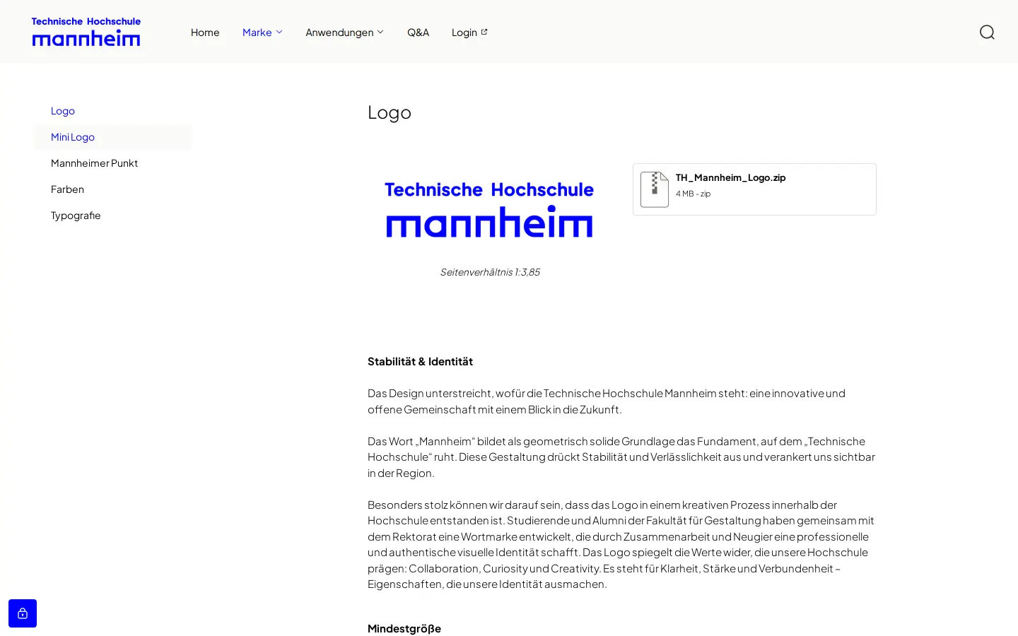
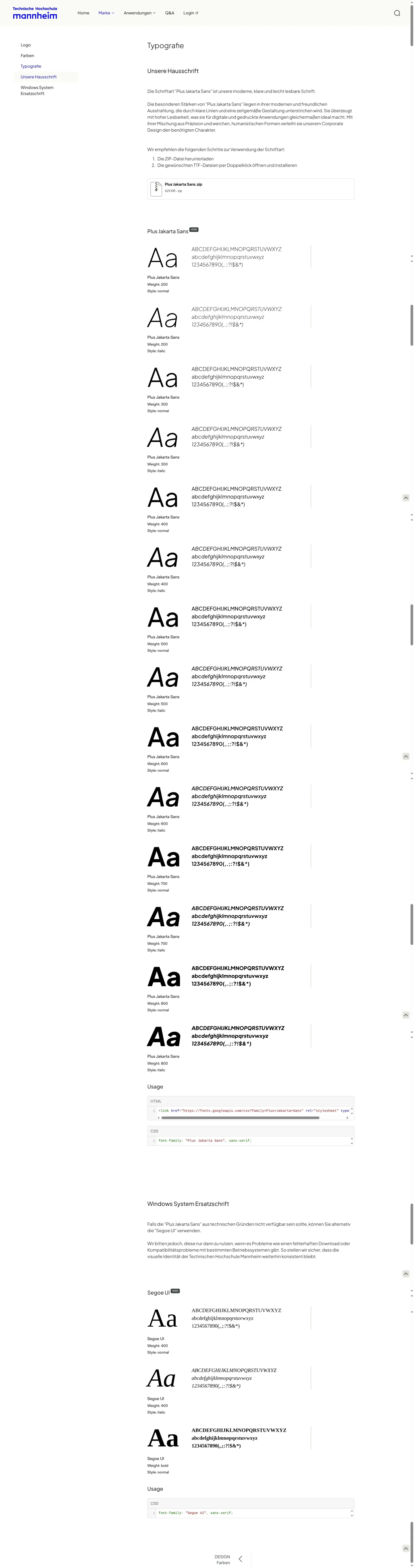
Freedam's take — I like how direct the brand guidelines for TH Mannheim feel right from the homepage. The navigation guides you smoothly into essential design elements like the logo, typography, and color palette. On the logo page, they outline clear dos and don'ts alongside a dedicated section for what they call the Mannheimer Punkt, giving a local voice to their brand assets. In the typography section, they balance their primary typeface, Plus Jakarta Sans, with an accessible system fallback like Segoe UI. It is an organized, grounded reference manual for university communicators.
Details
- Type
- Guidelines
- Access
- Public
- Source
- marke.th-mannheim.de
- Industry
- Education
- Capabilities
- Guidelines
- Tags
- logo usage, typography, color system, do's and don'ts, frontify
- Added
- Last checked
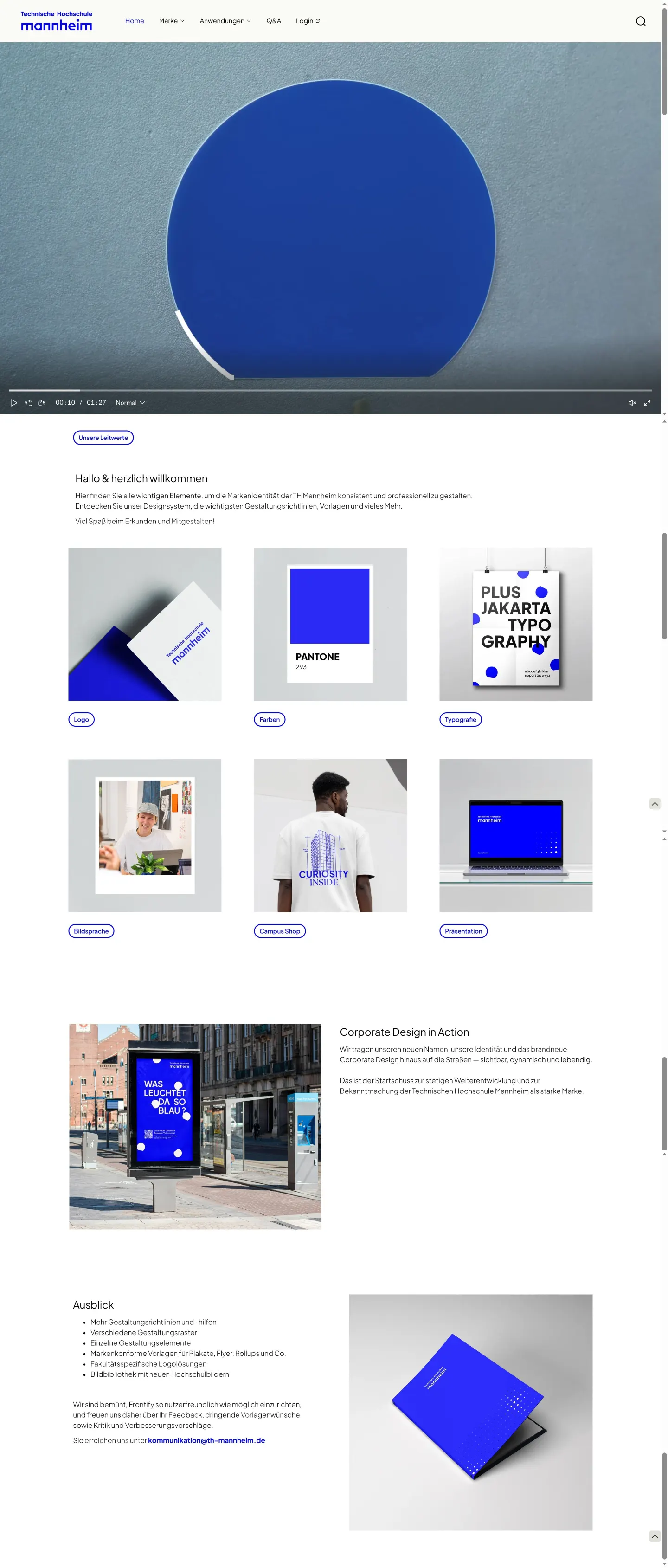
What I noticed
- The site is hosted using Frontify.123
- The typography guidelines specify Plus Jakarta Sans as the primary brand font alongside Segoe UI as a Windows system fallback.4567
- Logo documentation includes rules for clear space, dos and don'ts, a mini logo, and a graphic element called Mannheimer Punkt.891011121314
Numbers refer to the screenshots above.
What I could not see
- Did not observe public file download links or asset library pages in the captured views.
- Could not inspect the full content behind the login link or external portal areas.
Ideas to borrow
- Detailing an explicit system font replacement alongside primary web fonts helps ensure typography remains consistent across standard office software.
Reviewed on 18 September 2026. Request a correction · I built this