Technical University of Denmark brand guidelines
Technical University of Denmark provides comprehensive identity guidelines covering brand hierarchy, logo placement, color systems, typography, and stationery templates.
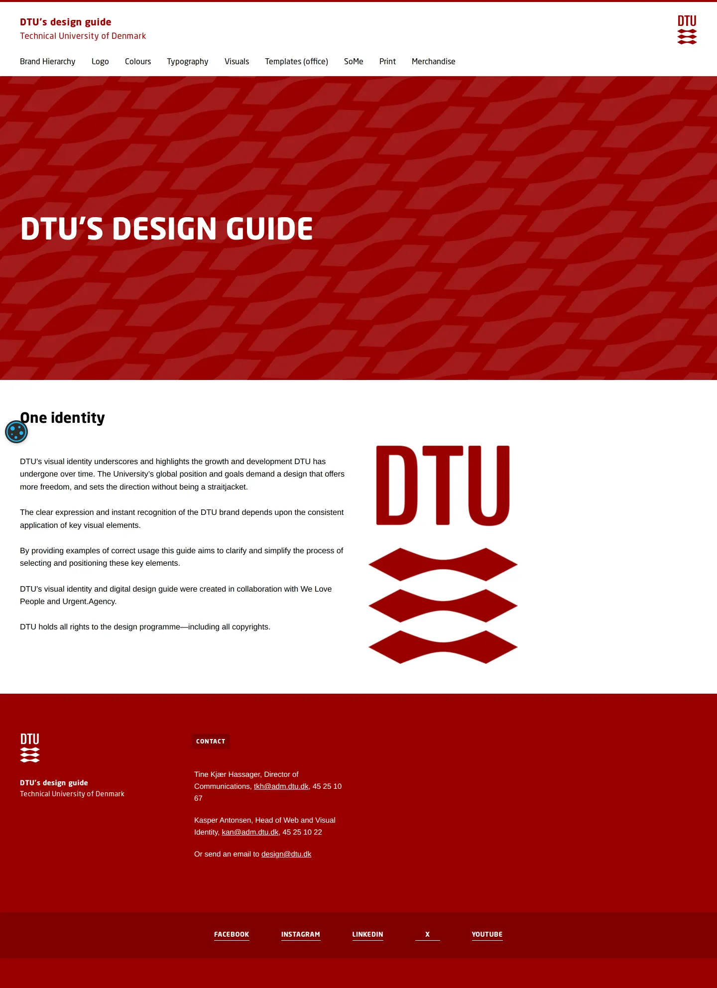
Homepage of DTU's design guide featuring an introductory overview of the visual identity and brand portal navigation.
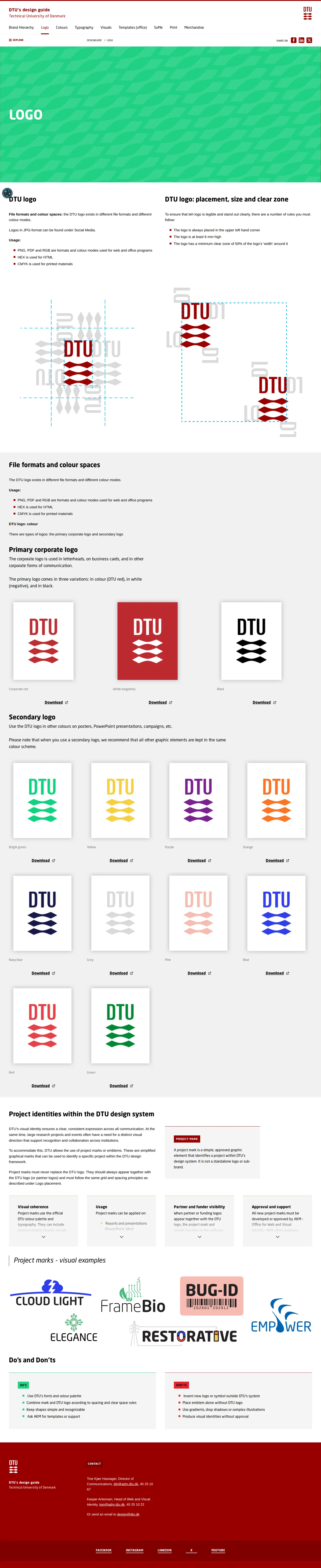
DTU brand guidelines page detailing logo placement rules, clear zone specifications, colour variations, download links, and project marks.
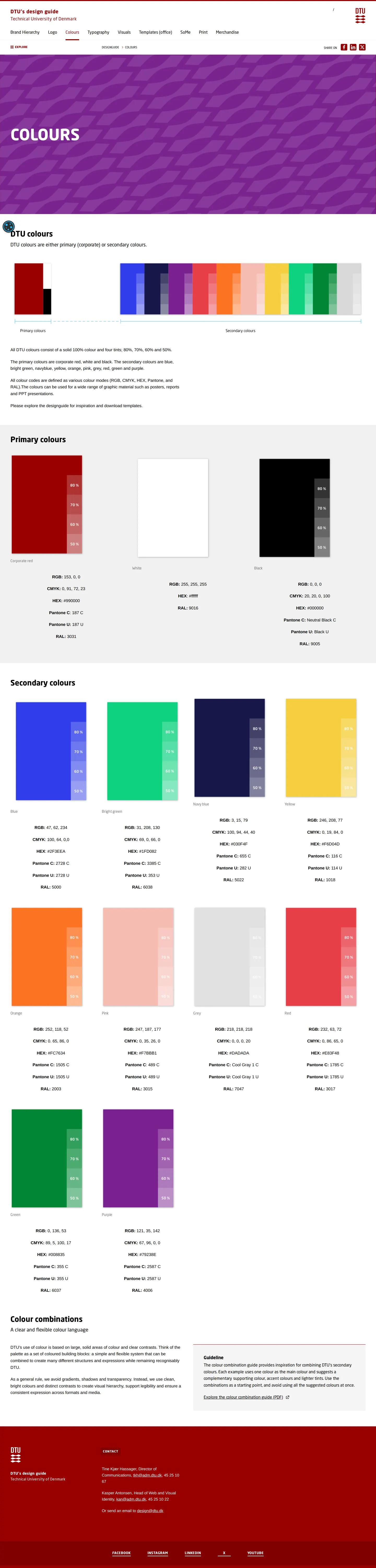
DTU brand guidelines page displaying primary and secondary colour palettes along with usage guidelines.
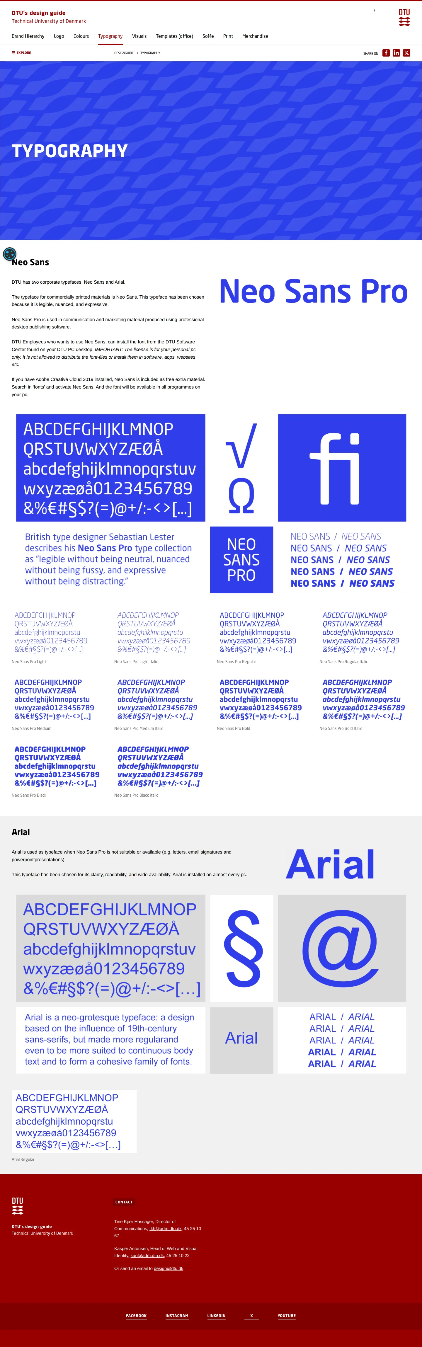
DTU's typography guideline page detailing the primary corporate typeface Neo Sans and secondary typeface Arial.

DTU templates page presenting office stationary and presentation layout guidelines with download instructions.

Brand hierarchy guidelines page for DTU showing rules for combining the logo with various entity describers and co-branding partners.
Want a brand center like Technical University of Denmark’s?
Create your brand center with Freedam ↗Freedam's take
I really appreciate how thorough the Technical University of Denmark is with practical university needs. Looking through their guidelines, the hierarchy breakdown stands out immediately. Instead of vague advice, they give precise rules for combining the DTU mark with departments, centres, and external partners. The colour section is equally disciplined, pairing swatches with clear tint increments and exact values across print, digital, and architectural standards like RAL. Even academic workflows get attention with presentation guidance covering both PowerPoint and LaTeX via Overleaf. It feels grounded in how a technical institution actually works day to day.
At a glance
- Sections
- Brand Hierarchy · Logo · Colours · Typography · Visuals · Templates (office) · SoMe · Print · Merchandise
- Downloads
- Tone
- Structured, systematic, and academic guidance focused on institutional coherence.
What I noticed
- The brand hierarchy defines distinct rules for university, department, centre, and project describers alongside co-branding partnerships.123456
- The logo placement rule mandates that the DTU logo is always positioned in the upper left-hand corner.78
- Colour swatches include values for RGB, CMYK, HEX, Pantone C, Pantone U, and RAL, accompanied by tint increments from 50% to 80%.910
- The typography guidelines specify Neo Sans as the primary corporate typeface and Arial as the secondary typeface for office documents.1112
Numbers refer to the screenshots above.
What I could not see
- Could not inspect the full contents of downloadable logo asset archives or the color combination PDF.
- Could not view internal SharePoint templates or restricted employee downloads behind authentication.
- Could not access the contents of the Visuals, SoMe, Print, or Merchandise sections as their pages were not captured.
Ideas to borrow
Quick answers
What are the primary typefaces used by DTU?
DTU uses Neo Sans as its primary corporate typeface and Arial as the secondary fallback for office documents and presentations.1112
Reviewed on 25 September 2026. Request a correction · I built this
Similar brand centers
All brand guidelines →