Technion – Israel Institute of Technology brand guidelines
Technion’s brand guidelines portal details bilingual identity assets, core typography pairings, and color usage for the university.
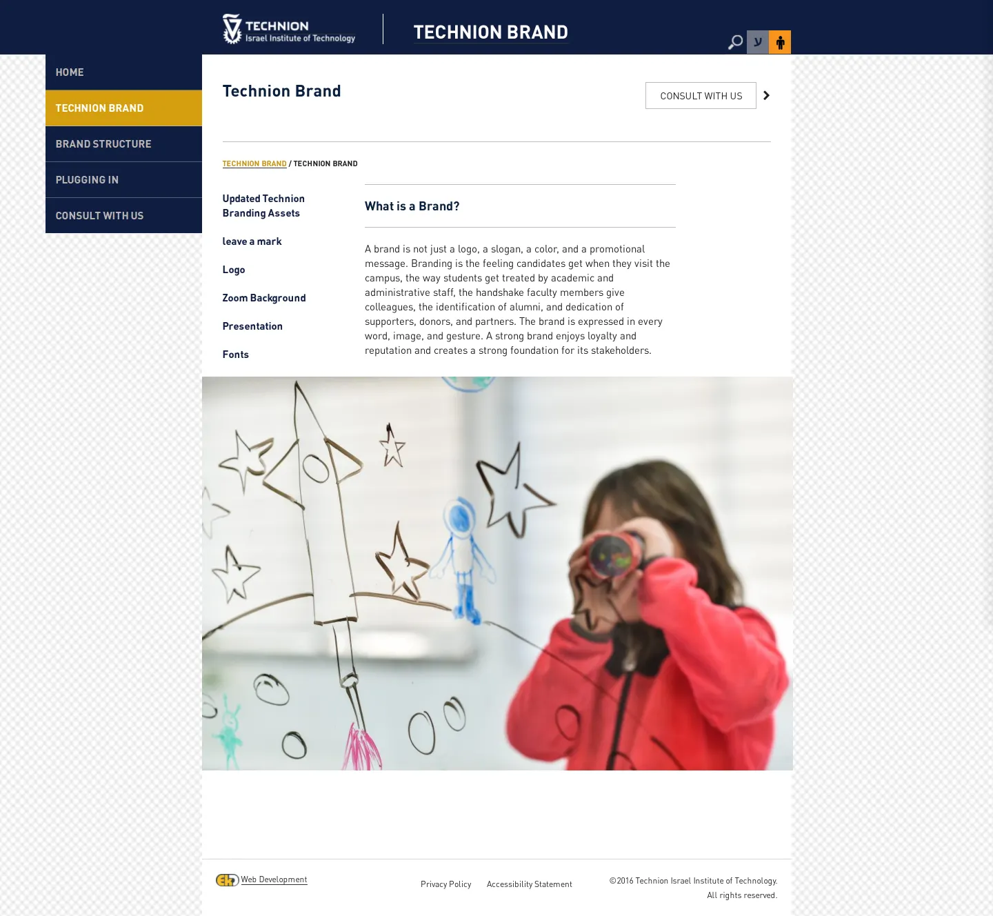
Technion Brand overview page introducing brand concepts with left-hand navigation and asset links.
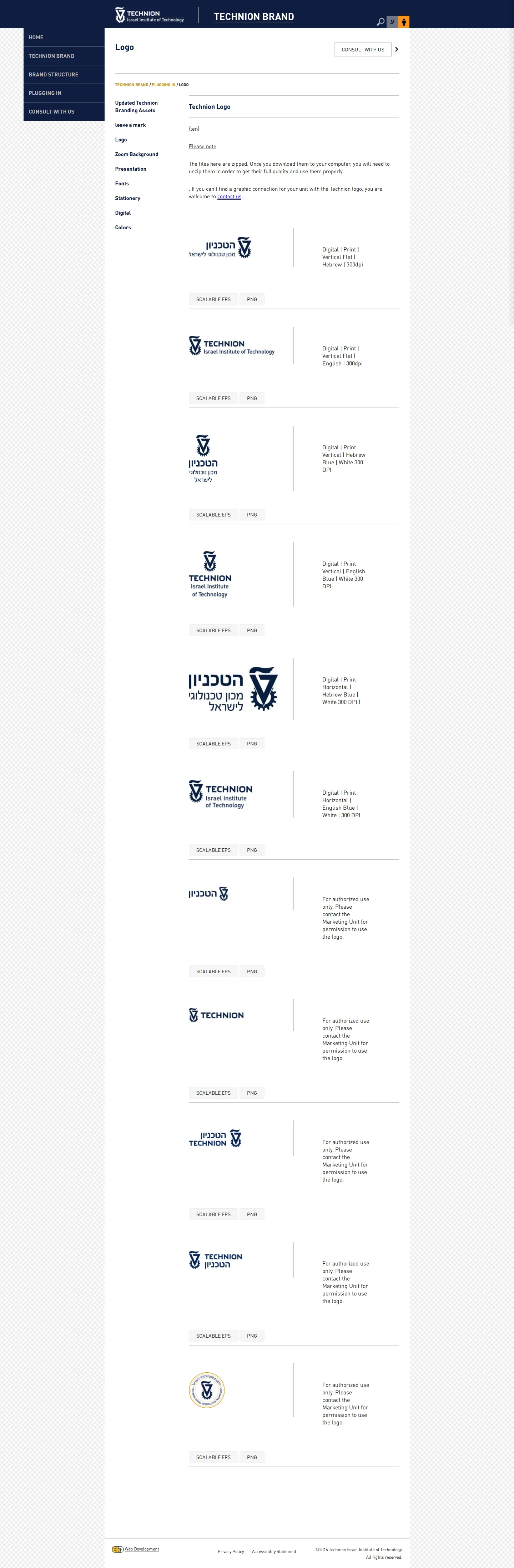
Logo download page showing English and Hebrew lockup variations with EPS and PNG format links.
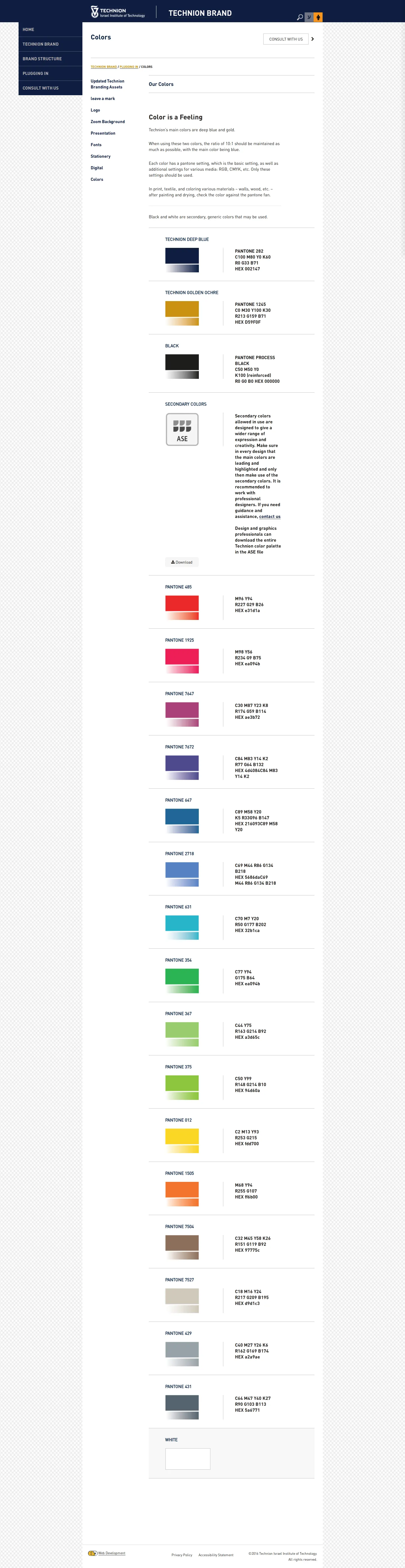
Colors page presenting Technion Deep Blue and Golden Ochre alongside primary and secondary palette swatches.
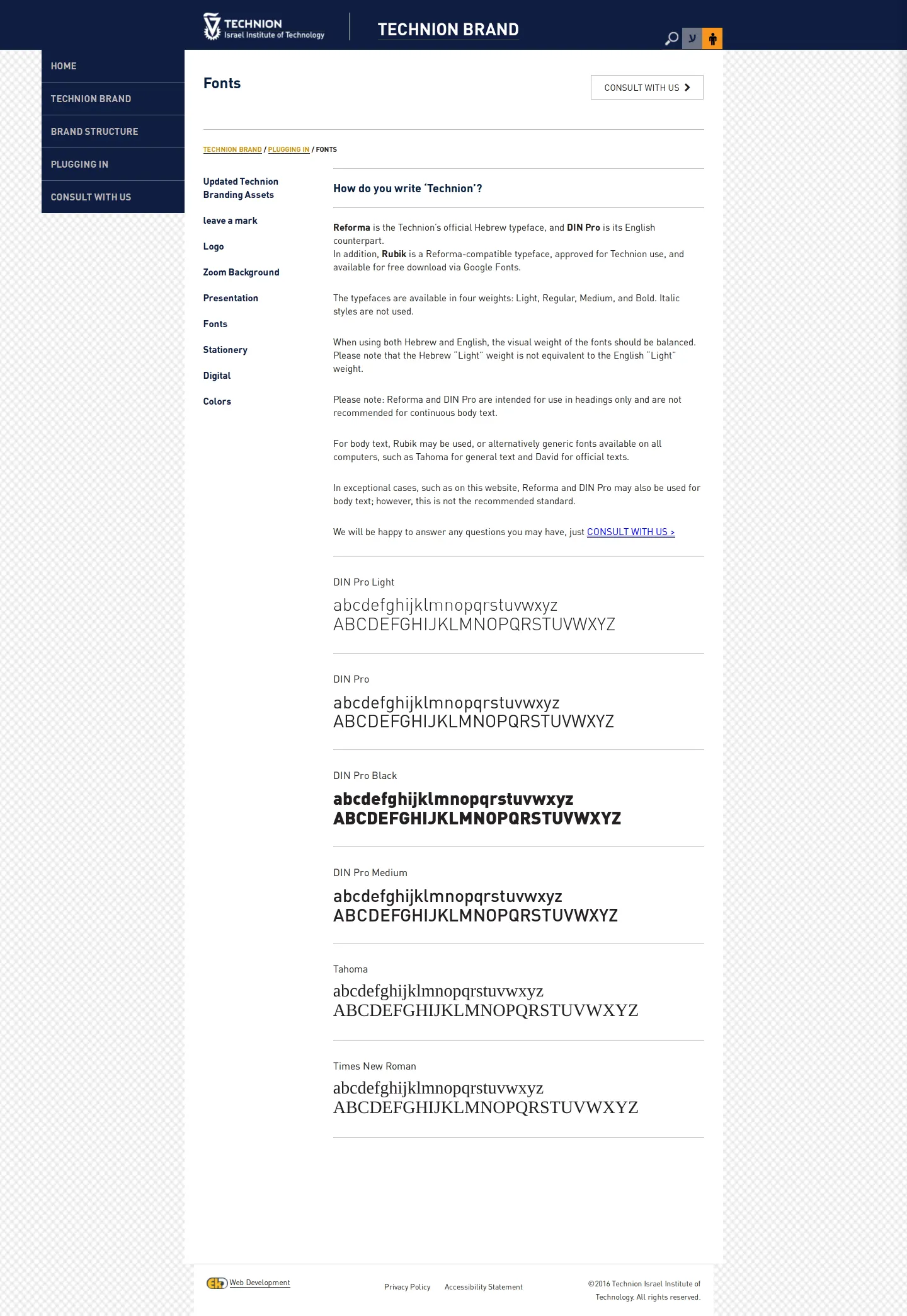
Typography standards page displaying Reforma and DIN Pro pairings along with Latin font specimens.
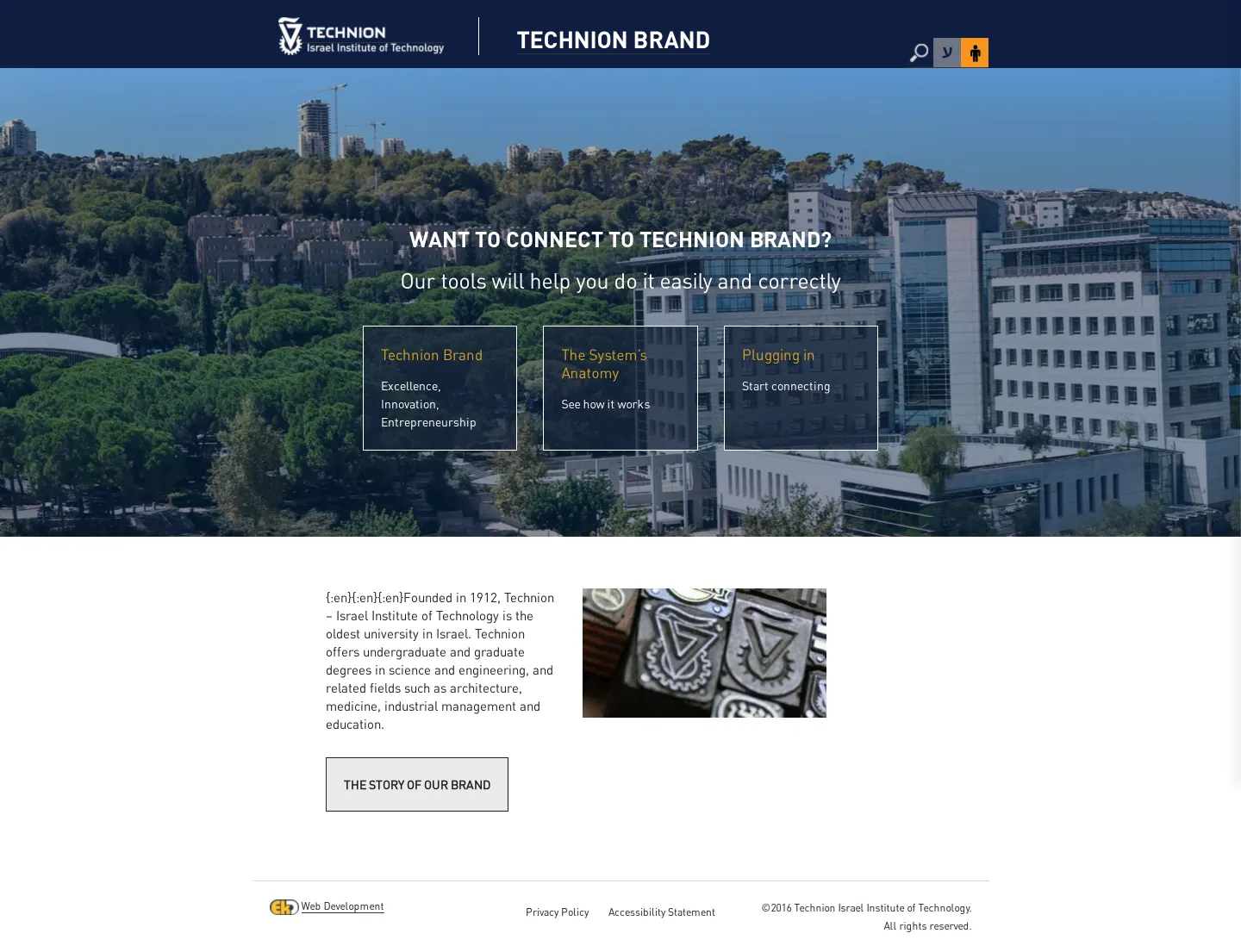
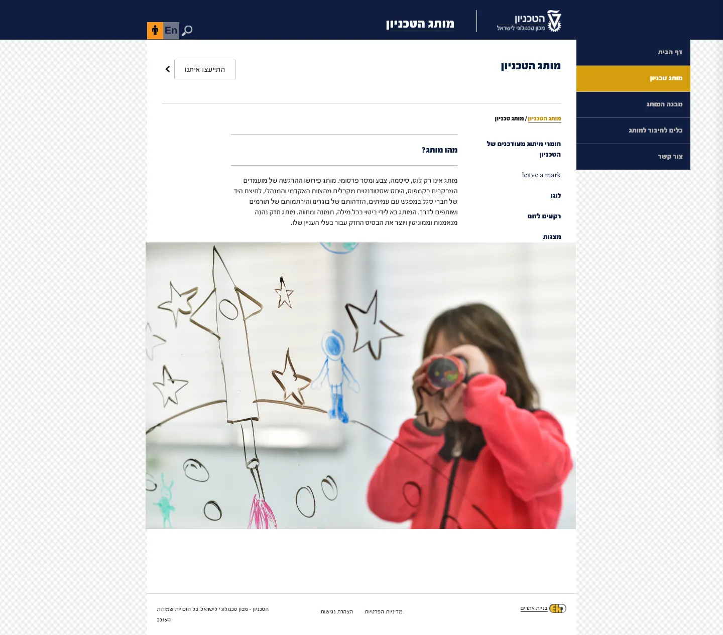
Hebrew overview page featuring right-to-left navigation and introductory brand messaging.
Want a brand center like Technion – Israel Institute of Technology’s?
Create your brand center with Freedam ↗Freedam's take
I spent time exploring how Technion handles its bilingual identity across English and Hebrew. The site provides practical clarity for complex institutional needs, from direct ZIP downloads of EPS and PNG lockups to exact color recipes and typeface pairings. I appreciate the straightforward rule establishing a 10:1 balance between Technion Deep Blue and Golden Ochre. The typography guidance thoughtfully pairs Reforma for Hebrew headlines with DIN Pro for English, while reserving standard system fonts like Tahoma and David for longer reading. It feels like an honest, functional working tool built to serve the daily needs of university teams.
At a glance
- Sections
- Home · Technion Brand · Brand Structure · Plugging In · Consult With Us
- Downloads
- EPS, PNG, ZIP, ASE
- Tone
- A practical, instructional resource designed for campus communicators managing bilingual institutional assets.
What I noticed
- The portal provides downloadable logo packages in EPS and PNG formats for both English and Hebrew lockups, including vertical and horizontal arrangements.123456
- Color guidelines specify Technion Deep Blue and Technion Golden Ochre as primary colors, mandating a 10:1 ratio between blue and gold.78
- Typography specifications designate Reforma as the official Hebrew typeface and DIN Pro for English, noting both should only be used for headings rather than continuous body text.910
- Certain logo variations are labeled for authorized use only and require contacting the Marketing Unit for permission.11
Numbers refer to the screenshots above.
What I could not see
- Full guidelines on stationery, presentations, and Zoom backgrounds were visible in menus but not captured in detail.
- Brand structure guidelines could not be evaluated beyond the sidebar navigation item.
Ideas to borrow
- Providing an explicit numerical ratio rule for primary palette colors, such as 10:1, can help decentralized teams balance brand colors consistently.8
Quick answers
Reviewed on 25 September 2026. Request a correction · I built this
Similar brand centers
All brand guidelines →