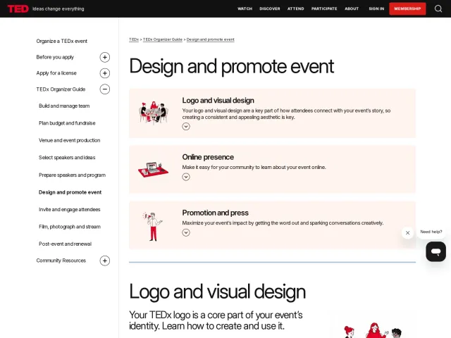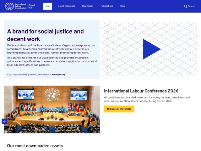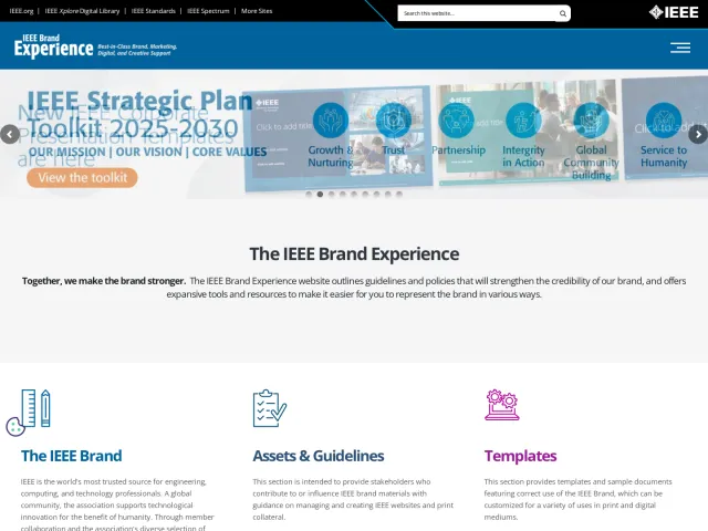
Tearfund brand guidelines
Tearfund's brand portal provides comprehensive identity guidance spanning organizational story, tone of voice, visual standards, and dedicated comms sections.
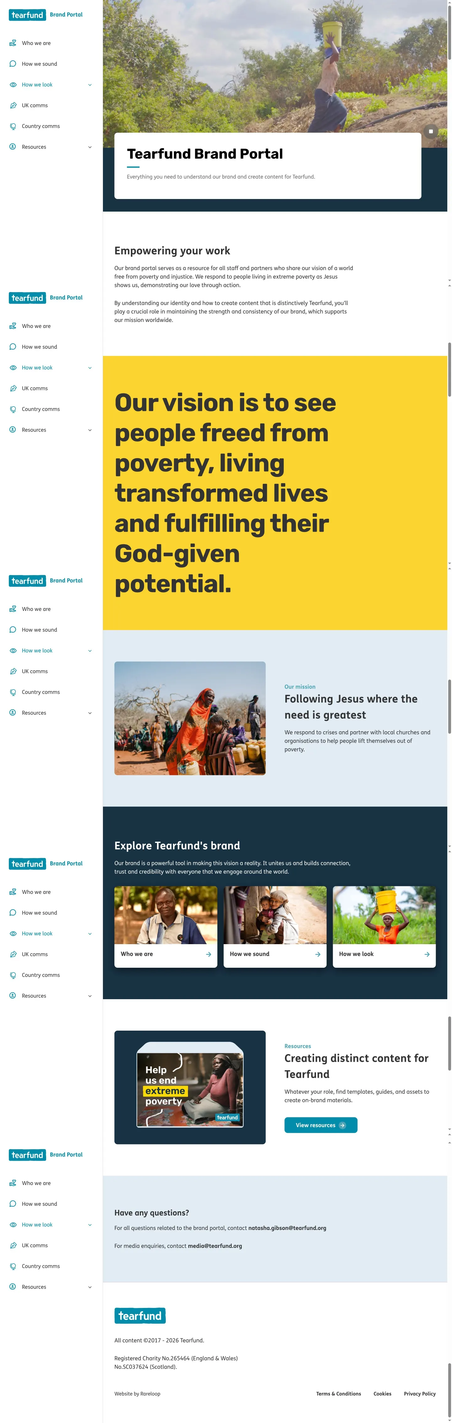
Homepage of the Tearfund Brand Portal displaying brand mission statements, navigation cards, and contact information.
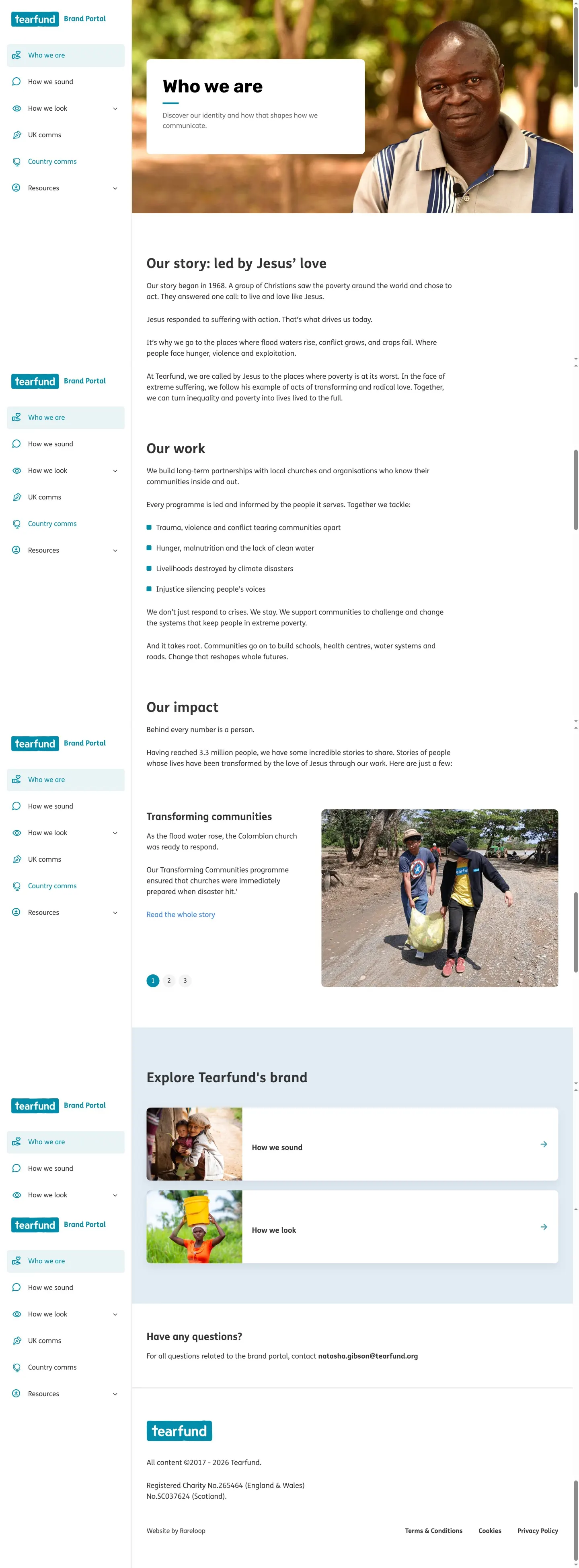
Tearfund's brand portal page introducing the organization's mission, history, and impact.

Tearfund's brand guidelines portal page detailing logo usage, partnerships, misuse rules, and downloadable asset resources.

Tone of voice guidelines page from the Tearfund Brand Portal detailing voice attributes, examples, and rules.
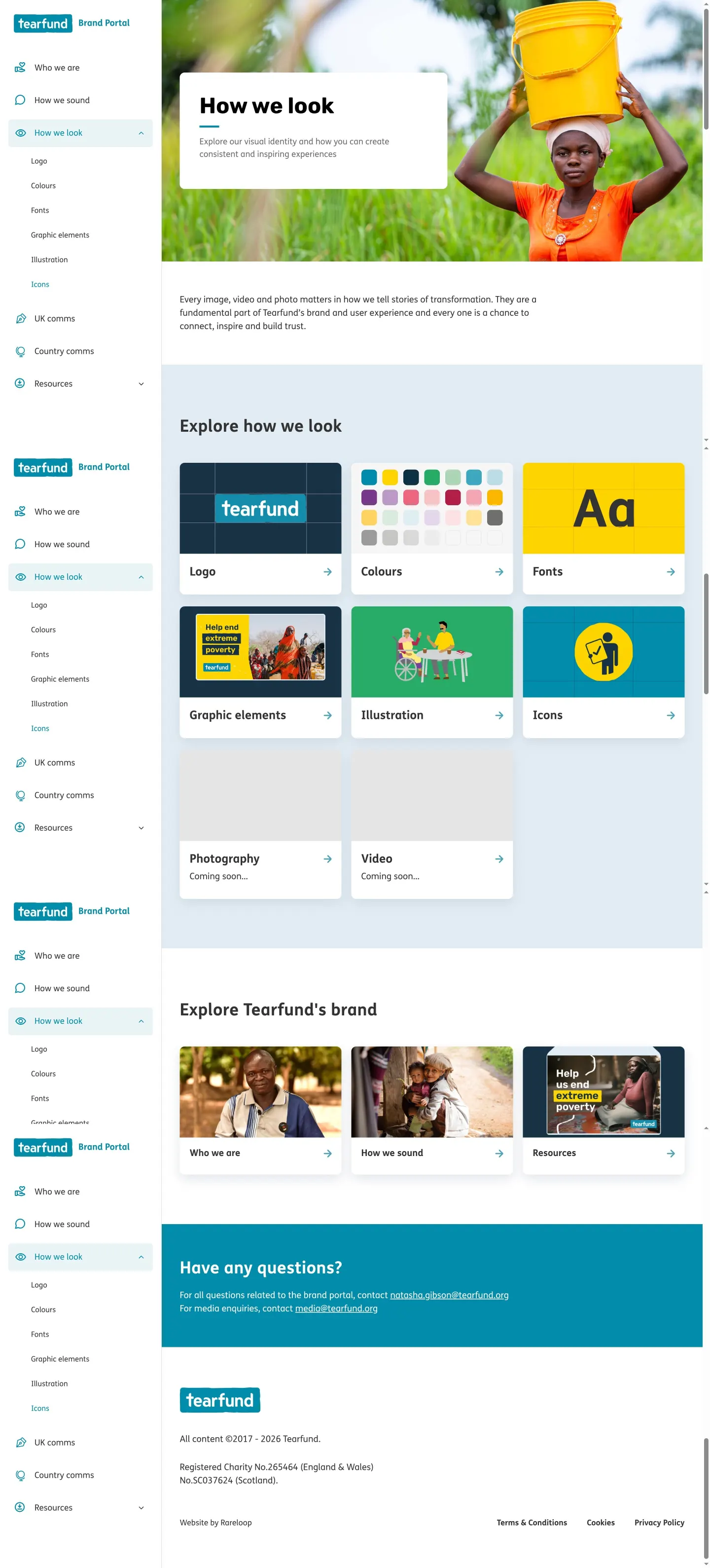
Overview landing page for the visual identity section of Tearfund's Brand Portal, showing links to various visual asset guidelines.
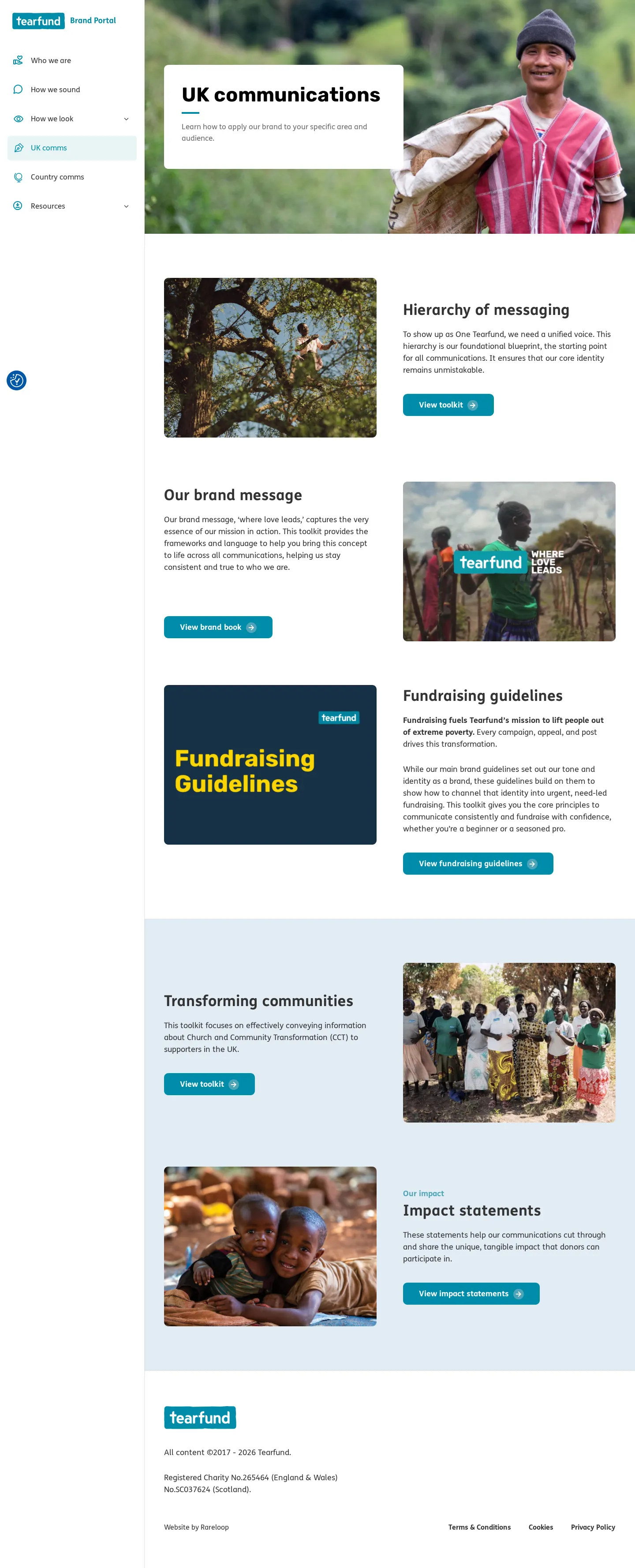
Tearfund Brand Portal page for UK communications, featuring a messaging hierarchy section and photographic imagery.
Brand portal page for Tearfund Country comms featuring a placeholder section.
Want a brand center like Tearfund’s?
Create your brand center with Freedam ↗Freedam's take
I really appreciate how clearly Tearfund separates its brand guidance into distinct operational contexts. Alongside foundational sections like identity and tone of voice, the portal designates dedicated spaces for UK communications and regional country communications. The tone of voice breakdown is especially practical, highlighting pillars like Unflinching, Devoted, and Assured with direct dos and don'ts across real campaign channels. On the visual side, the logo documentation offers clear rules for partnership lockups and sensitive locations, paired with direct asset downloads.
At a glance
- Sections
- Who we are · How we sound · How we look · UK comms · Country comms · Resources
- Tone
- Warm, principled, and mission-led, balancing practical writing directives with purposeful storytelling.
What I noticed
- The brand portal is structured into dedicated sections for Who we are, How we sound, How we look, UK comms, Country comms, and Resources.1
- Tearfund defines its tone of voice around three pillars: Unflinching, Devoted, and Assured, accompanied by do and don't rules.23
- The logo guidelines page features rules for partnership lockups, clear space defined by character width, and a downloadable asset pack.45
- The site is powered by WordPress 7.1.6
Numbers refer to the screenshots above.
What I could not see
- Specific downloadable file types inside the asset packs could not be inspected directly from the visible pages.
- Country comms content was not fully populated and showed placeholder text.
Ideas to borrow
- Define partnership logo spacing dynamically using specific character widths from the primary logotype.4
Quick answers
What are the core traits of Tearfund's tone of voice?
Tearfund's tone of voice is defined as Unflinching, Devoted, and Assured.2
How should brand partnership logos be spaced with Tearfund's logo?
Spacing between logos is determined by the width of the 'un' characters from the Tearfund wordmark.4
Can the monochrome Tearfund logo be used freely?
No, the monochrome black-and-white logo requires permission via email before use.7
Reviewed on 25 September 2026. Request a correction · I built this
Similar brand centers
All brand guidelines →