SeatGeek brand guidelines
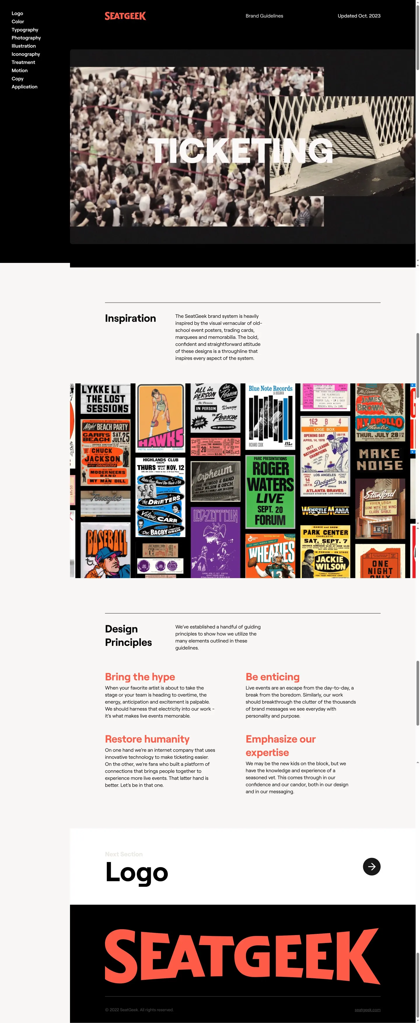
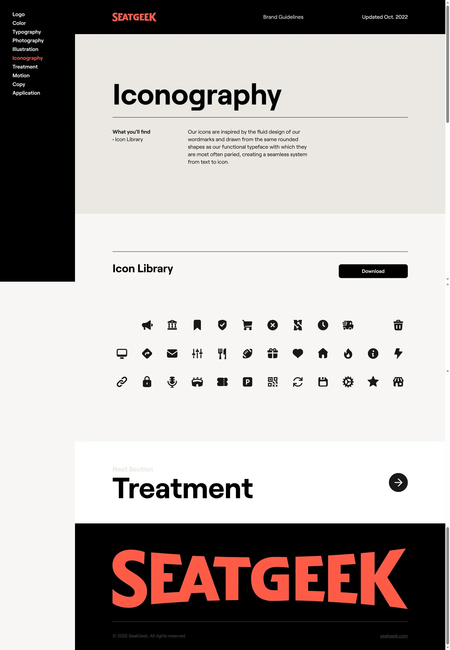
SeatGeek provides an accessible online guideline site featuring dedicated sections and direct asset downloads for logos, typography, color, and iconography.
Freedam's take — I like how direct and focused SeatGeek's brand site is. Instead of burying foundational assets deep inside complex menus, the site organizes core visual elements into clean sections for logo, color, typography, photography, and iconography. I appreciate that they provide targeted download links right alongside bulk options, letting you grab specific logo lockups, fonts like Roobert and Headliner, or icon packages without extra friction. It feels practical, straightforward, and built to get external partners and designers what they need with minimal effort.
Details
- Type
- Guidelines
- Access
- Public
- Source
- brand.seatgeek.com
- Industry
- Technology, Media & entertainment
- Capabilities
- Downloads
- Tags
- logo usage, color system, typography, photography, iconography, asset downloads, font downloads
- Added
- Last checked
What I noticed
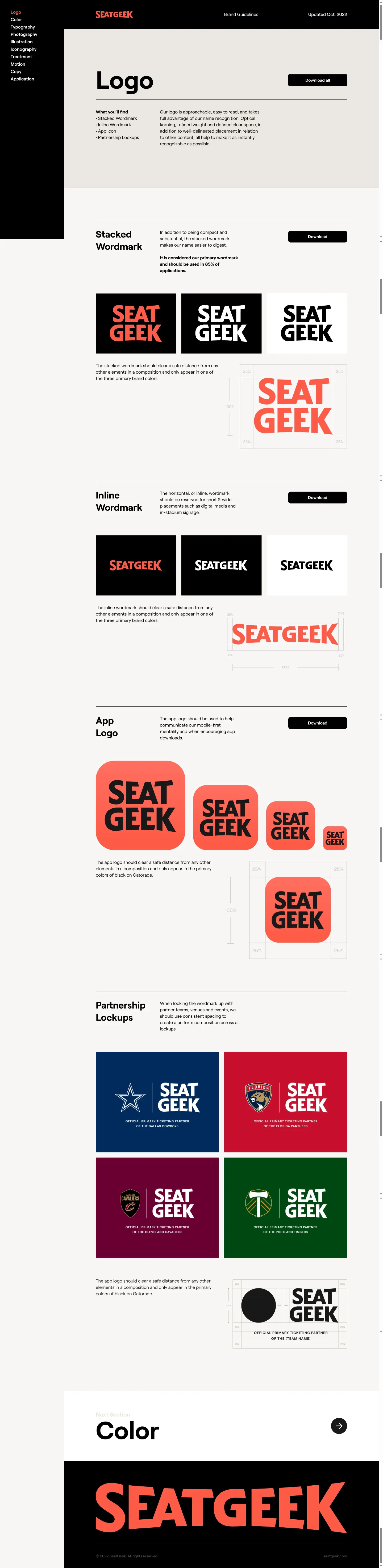
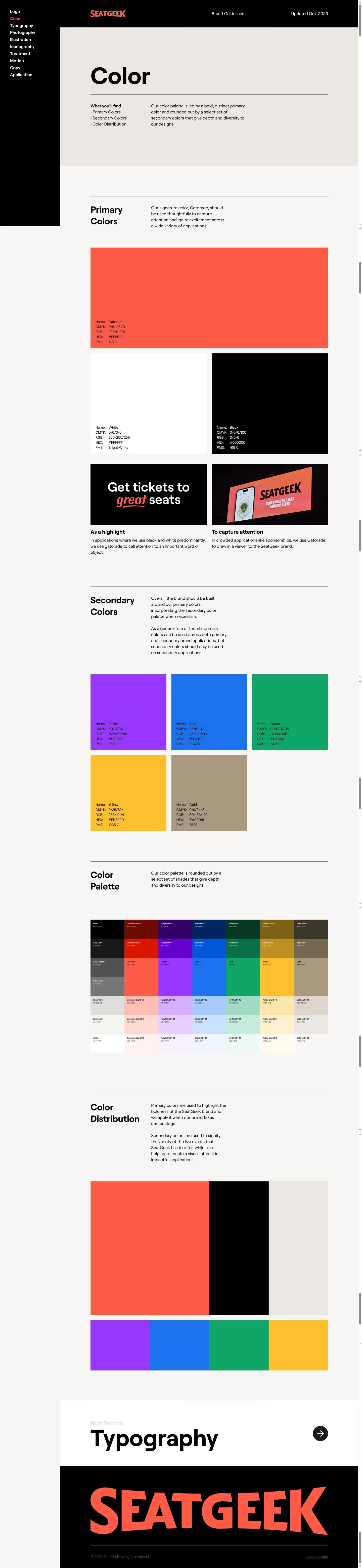
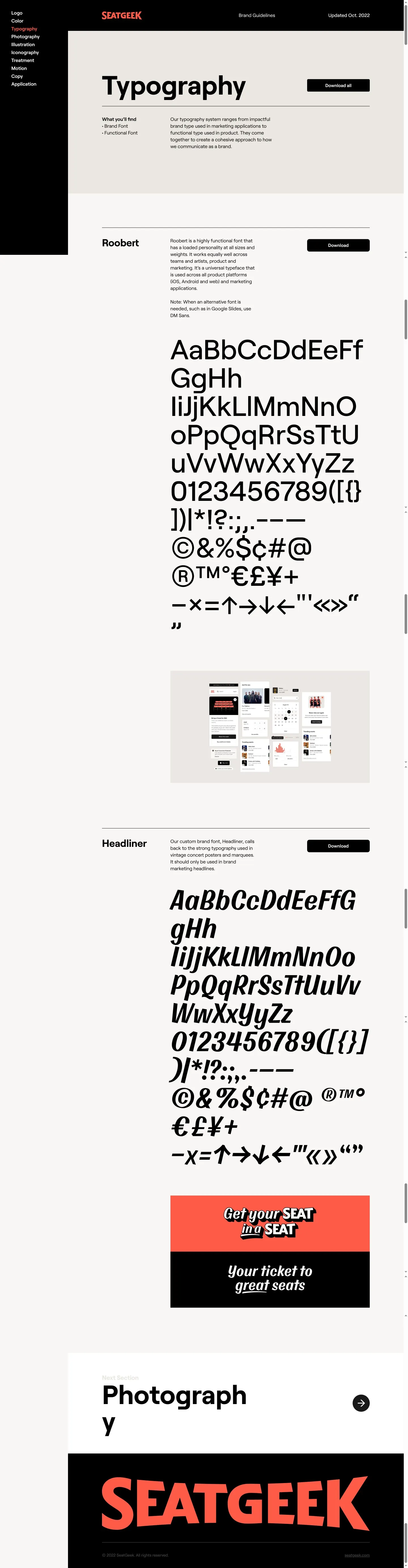
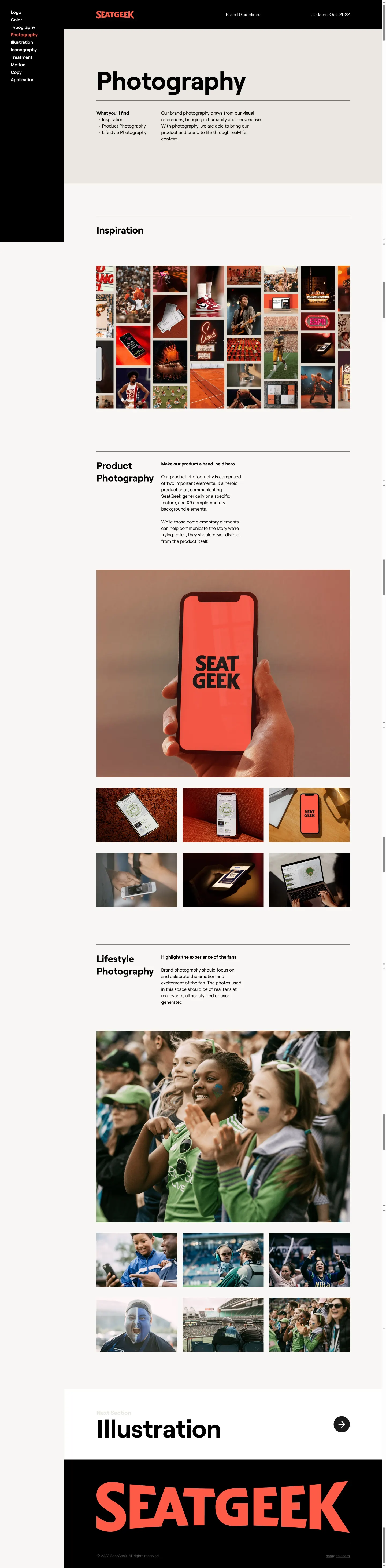
- The site contains distinct pages covering Logo, Color, Typography, Photography, and Iconography.12345
- Download options include comprehensive bulk bundles alongside specific packages like Stacked, Inline, and App Icon.6789
- The typography section offers downloads for font families named Roobert and Headliner.1011
- The asset delivery focuses on utility by grouping related files into clean archive downloads.
Numbers refer to the screenshots above.
What I could not see
- Could not inspect interactive color palette values or copy buttons from the provided captures.
- Could not verify specific photography usage rules or campaign guidelines beyond the page title.
Ideas to borrow
Reviewed on 18 September 2026. Request a correction · I built this
Similar brand centers
All brand guidelines →