Ruter brand guidelines
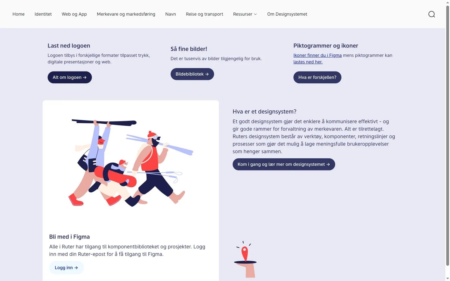
Ruter provides an extensive Norwegian brand center covering identity foundations, digital applications, naming conventions, and transit marketing environments.
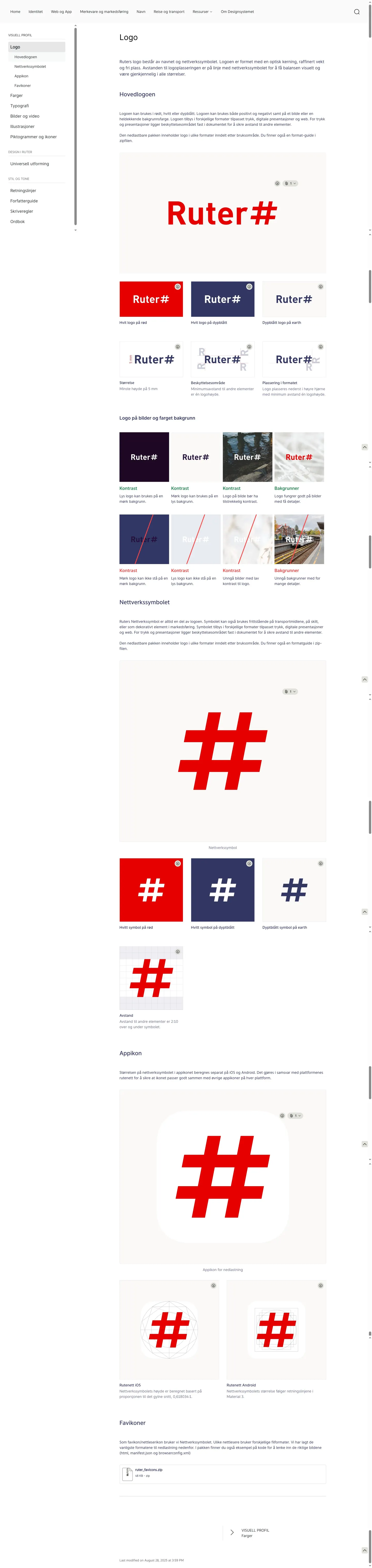
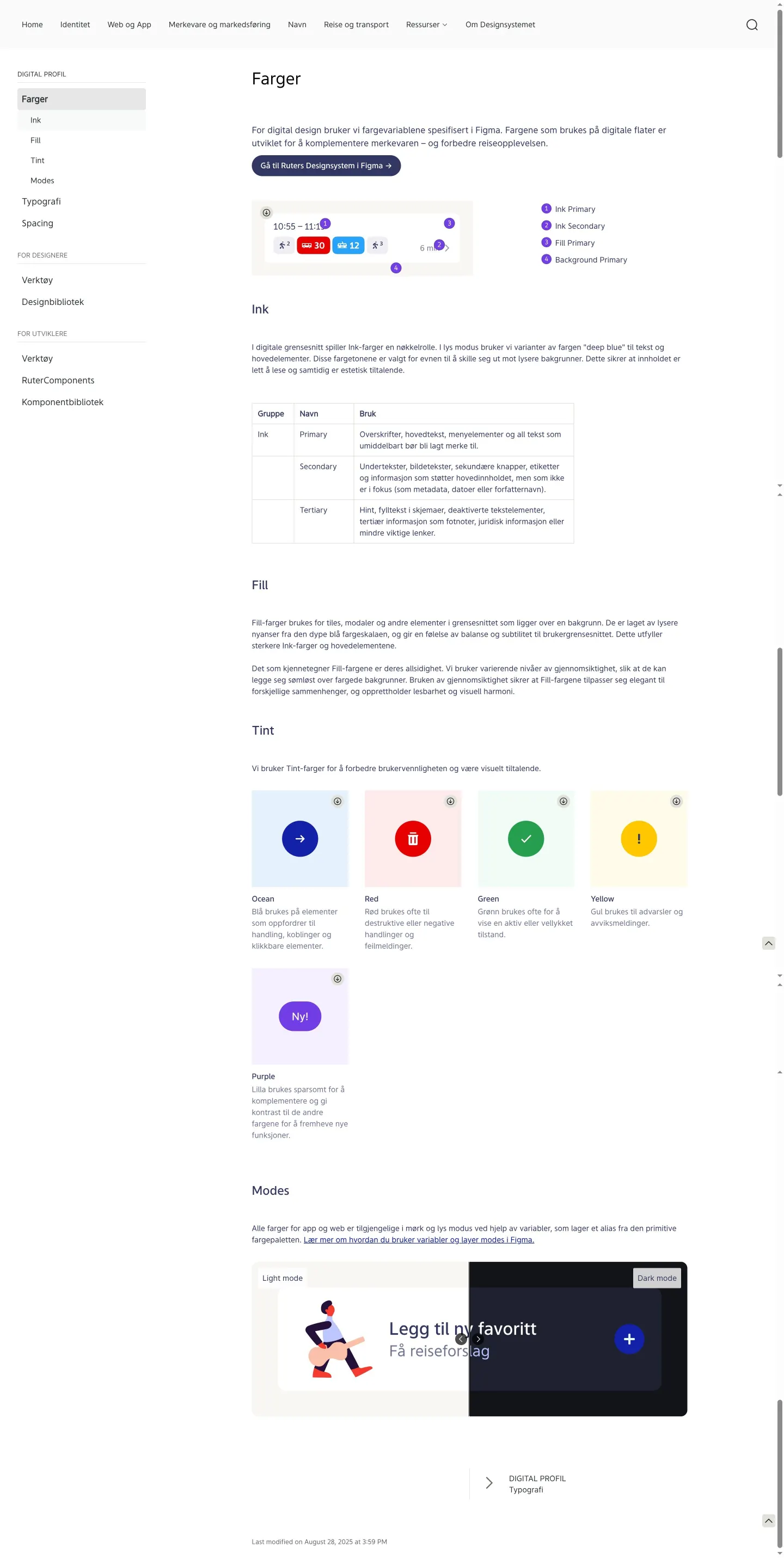
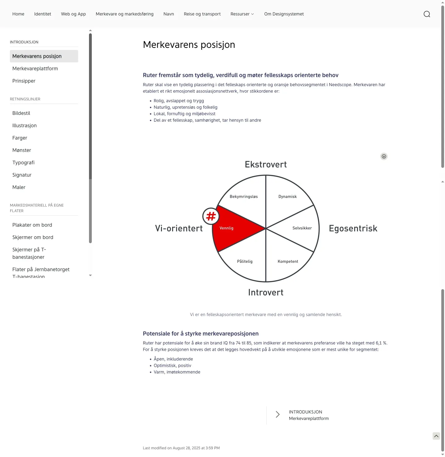
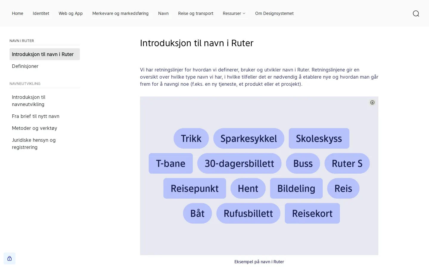
Freedam's take — I really like how thorough the Ruter guidelines feel. They cover the expected identity basics like logos, typography, and color systems, but they also carve out distinct sections for naming methodology, digital products, and physical transit environments. It is always refreshing to see a brand hub that addresses physical touchpoints alongside digital interfaces. Seeing specific sections for station screens and onboard posters shows how deeply connected this system is to everyday transit spaces in Norway.
Details
- Type
- Guidelines
- Access
- Public
- Source
- brand.ruter.no
- Industry
- Transport & logistics
- Capabilities
- Guidelines
- Tags
- color system, typography, logo usage, signage & wayfinding, product design, legal & trademark, frontify
- Added
- Last checked
What I noticed
- The portal is built on Frontify.123456
- The documentation includes a dedicated section for naming conventions, legal considerations, and naming development processes.78910
- Marketing guidelines detail specific physical environments including onboard screens, posters, and specific transit stations.1112131415
Numbers refer to the screenshots above.
What I could not see
- Could not view the contents of the 'Reise og transport' or 'Om Designsystemet' sections as their pages were not captured.
- Could not inspect actual asset download mechanisms or asset libraries.
Ideas to borrow
- Dedicate a full section of your design system to naming strategy, brief templates, and legal clearance to assist product teams from inception.
Reviewed on 18 September 2026. Request a correction · I built this