Fintraffic brand guidelines
Fintraffic presents a Finnish-language brand book documenting brand narrative, voice, naming conventions, and visual identity standards.
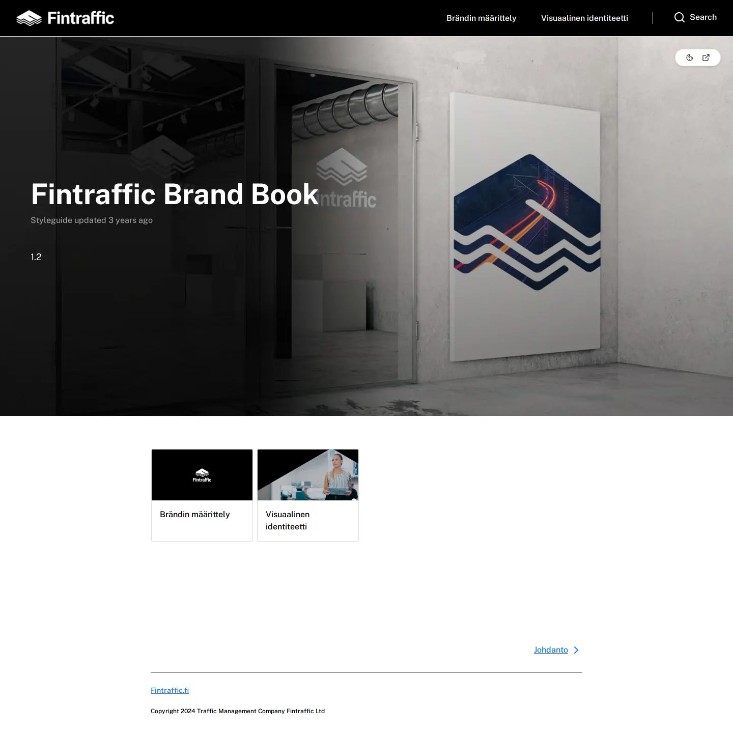
Fintraffic Brand Book homepage header featuring full-width environmental mockup imagery and site navigation.
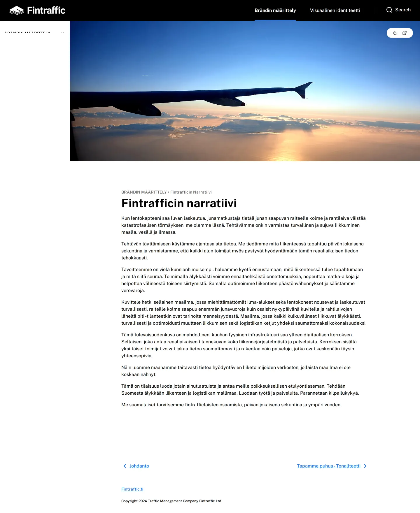
Brand definition page from the Fintraffic brand guidelines presenting the brand narrative with photography and Finnish copy.
Landing section for the visual identity guidelines of Fintraffic.
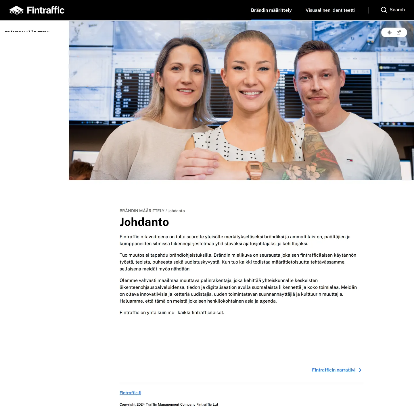
Introduction page of Fintraffic's brand guidelines portal.
Freedam's take
I like the clean split Fintraffic creates between strategic foundations and visual execution. Built on zeroheight, the site organizes its guidelines into two clear sections: brand definition and visual identity. I noticed how effectively they bring context to their narrative through large imagery, from control room operators to an airplane wing above sunset clouds. The Finnish-language documentation balances operational scope with dedicated sections for tone of voice, naming conventions, signage, and digital service naming, keeping the focus squarely on practical brand consistency.
At a glance
- Sections
- Brändin määrittely · Visuaalinen identiteetti
- Tone
- Structured and practical Finnish-language documentation balancing corporate brand strategy with applied visual rules.
What I noticed
- The documentation is divided into two primary top-level areas: Brändin määrittely and Visuaalinen identiteetti.123
- The portal runs on the zeroheight platform.45
- A dedicated search function is accessible from the top navigation bar across pages.6789
- The Brändin määrittely section includes guidance on naming conventions such as Viralliset nimet and Digipalveluiden nimeäminen.101112
Numbers refer to the screenshots above.
What I could not see
- No asset download links or file packages were visible in the captured screens.
- The full contents of individual visual identity subpages like Logo, Värit, and Typografia were not captured.
Ideas to borrow
Reviewed on 26 September 2026. Request a correction · I built this
Similar brand centers
All brand guidelines →Fintraffic splits its portal into brand definition and visual identity sections, whereas Copenhagen Metro structures its homepage around eight shortcut cards covering topics like layout and social media. In contrast to Entur's design system documentation featuring an interactive 413-icon library, Fintraffic provides narrative and visual guidance without an interactive component library in view.