Entur brand guidelines
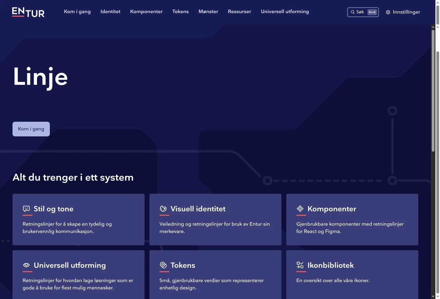
Linje is Entur's design system documentation covering core brand identity, tone of voice, tokens, and UI components.
Freedam's take — I really appreciate how Entur organizes their design system, Linje. It bridges high-level brand identity directly into everyday product engineering. While browsing the tone of voice section, I noticed how they frame their messaging along a personal and professional axis, giving writers clear grounding. Over on the icon documentation, they pair usage principles with concrete developer props for React Native and web layouts. Everything feels purposeful and straightforward, and they even surface dedicated Slack and email contact points in the footer so team members know exactly where to contribute and ask questions.
Details
- Type
- Guidelines
- Access
- Public
- Source
- linje.entur.no
- Industry
- Public sector, Transport & logistics
- Capabilities
- Guidelines, Partner resources
- Tags
- tone of voice, iconography, ui components, product design
- Added
- Last checked

What I noticed
- The site is built with Gatsby version 5.16.1.123
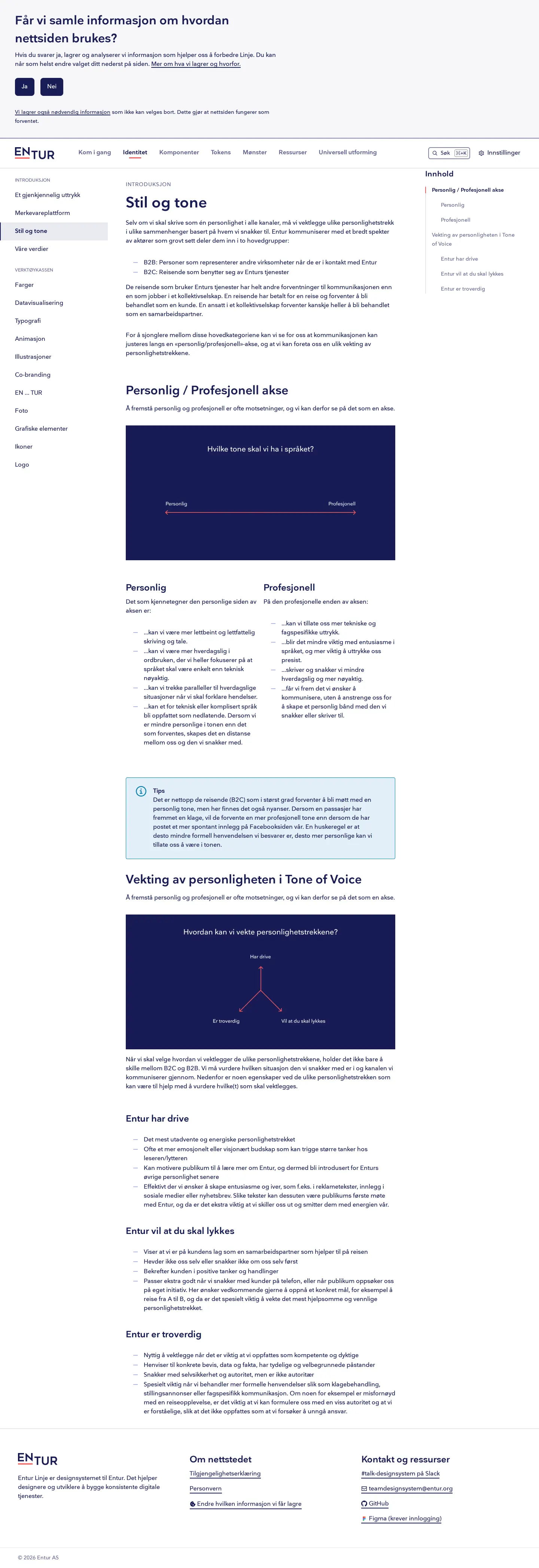
- The tone of voice guidance structures Entur's personality along a personal and professional axis.456
- The icon documentation includes implementation details for props, sizes, colors, and React Native.78910
- Footer links offer direct communication through an internal Slack channel and a design system team email.1112
Numbers refer to the screenshots above.
What I could not see
- Could not view full component source code or interactive storybook states.
- Could not inspect downloadable brand asset files without navigation beyond the captured pages.
Ideas to borrow
- Structuring brand voice across a distinct personal versus professional axis gives contributors an intuitive spectrum for calibrating written copy.4
Reviewed on 18 September 2026. Request a correction · I built this
Similar brand centers
All brand guidelines →