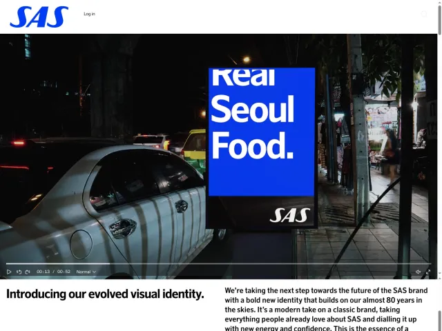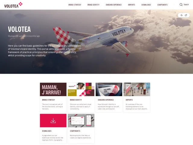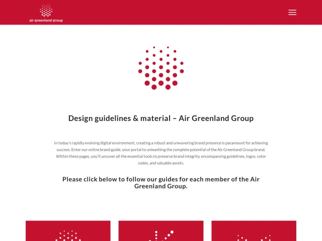
Lufthansa brand guidelines
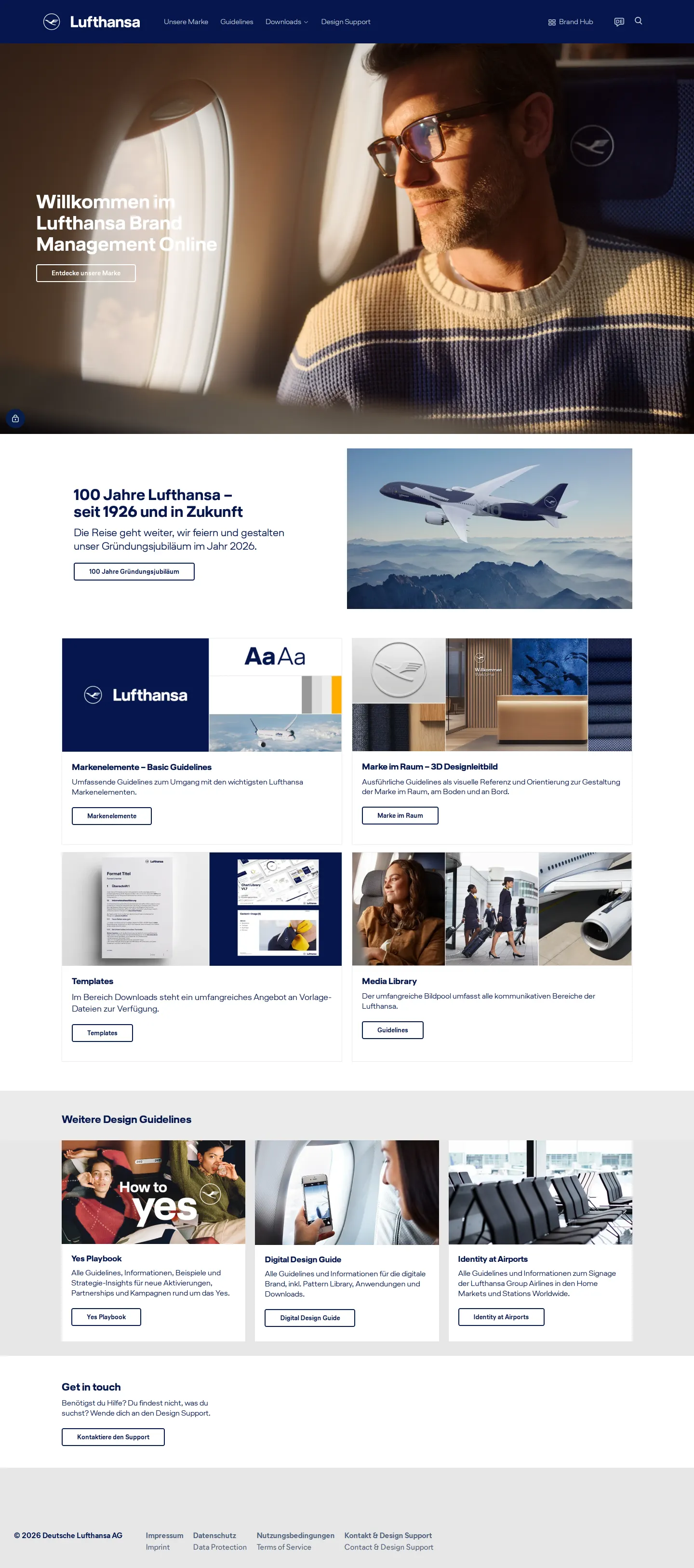
Lufthansa's brand portal presents comprehensive brand guidelines covering logo geometry, spatial airport design, typography, and downloadable assets.


Freedam's take
I spent time exploring Lufthansa's brand hub, and I appreciate how deeply it handles the iconic crane emblem. Beyond the core proportions and clear spaces, the guidelines distinguish flight position and flight direction, alongside a specialized small variant. The portal also groups work clearly across physical and digital environments, highlighting space guidelines for airports, basic mark elements, and dedicated web typography. It feels structured around real-world operational needs, giving teams clear rules on how the symbol should behave across different touchpoints.
What I noticed
- The portal is built on the Frontify platform.123
- The logo documentation includes specific sections for flight position (Fluglage), flight direction (Flugrichtung), and a small crane variant (Small-Kranich).4567
- The brand hub features sections for airport identity, 3D spatial design, and digital guidelines alongside core elements.8910
Numbers refer to the screenshots above.
What I could not see
- Internal downloadable files and media assets could not be viewed or tested without authentication.
Ideas to borrow
Reviewed on 26 September 2026. Request a correction · I built this
Similar brand centers
All brand guidelines →