PPDS brand guidelines
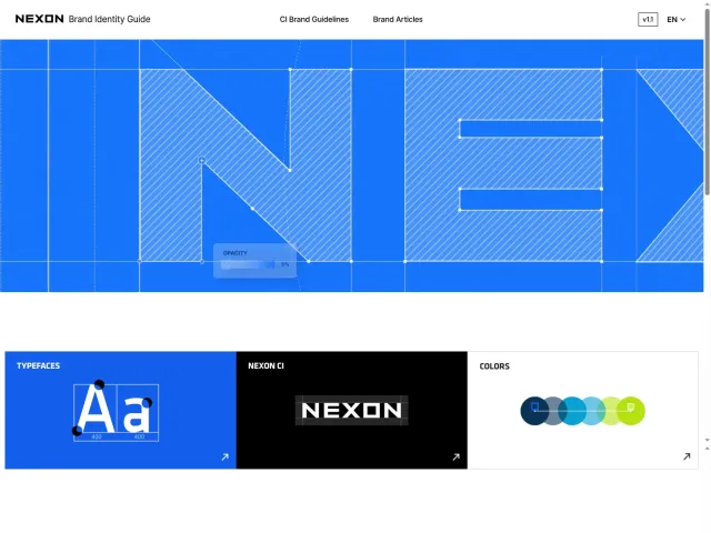
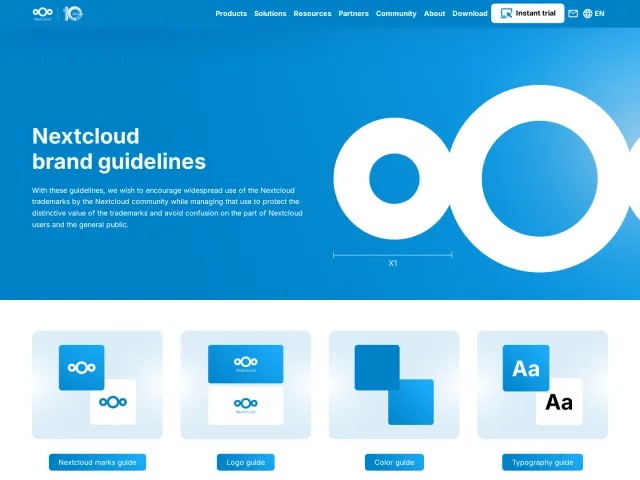
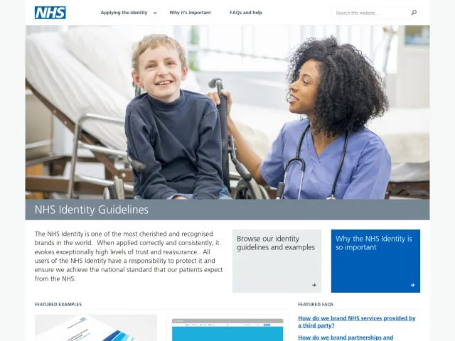
The PPDS brand guidelines site provides foundational brand voice direction, logo relationship guidance with Philips, and asset downloads.
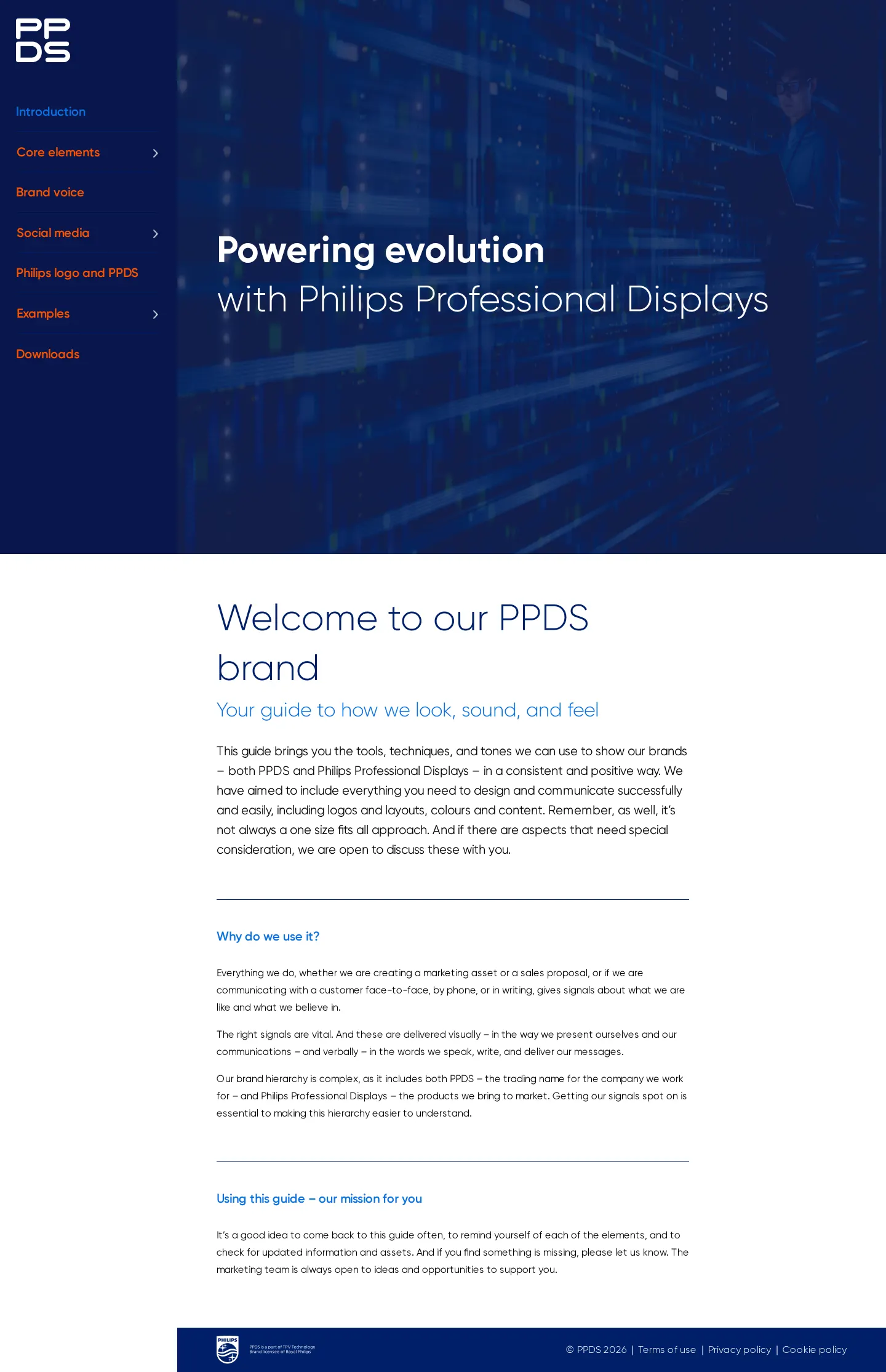
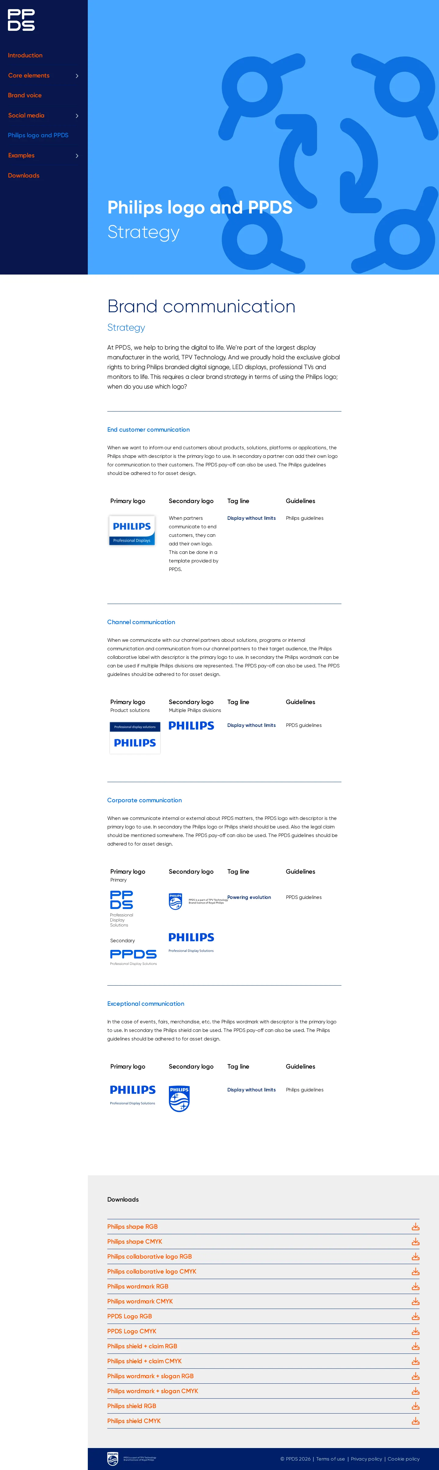
Freedam's take — I like how concise the PPDS portal keeps things. Rather than overwhelming visitors with dozens of sections, the structure focuses on four direct destinations: Introduction, Brand voice, Philips logo and PPDS, and Downloads. For an organization tied to Philips Professional Displays, outlining the exact relationship between the corporate shield and PPDS is essential, and dedicating a full section to that dynamic makes total sense. Everything feels straightforward and easy to parse, pairing basic strategic rationale with accessible files without overcomplicating the delivery.
Details
- Type
- Guidelines
- Access
- Public
- Source
- ourbrand.ppds.com
- Industry
- Technology
- Capabilities
- Guidelines, Asset browsing, Downloads
- Tags
- partner branding, tone of voice, logo usage, asset downloads, brand story
- Added
- Last checked
What I noticed
- The portal navigation consists of four primary sections: Introduction, Brand voice, Philips logo and PPDS, and Downloads.1234
- A dedicated section addresses the co-branding relationship and strategy between the Philips logo and PPDS.567
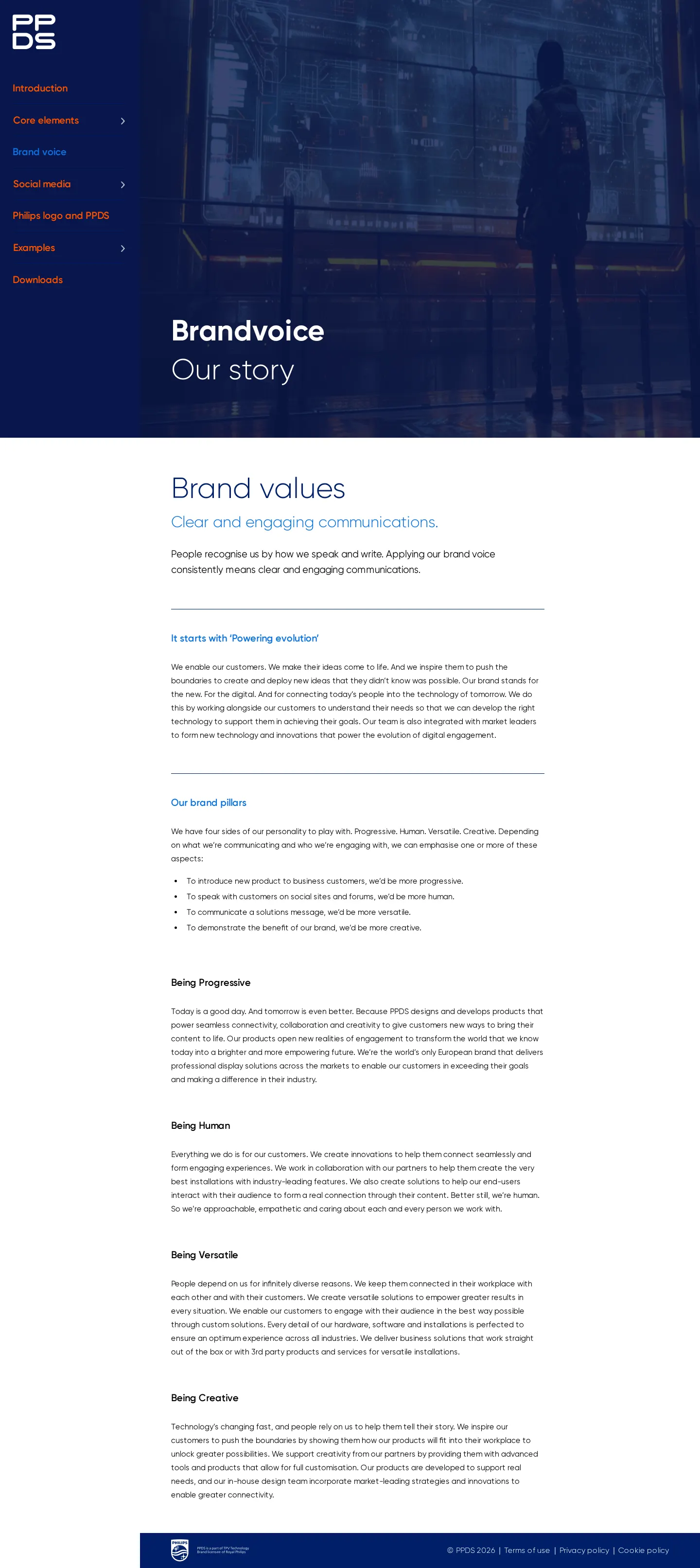
- The Brand voice section covers story principles, brand values, and communication clarity.891011
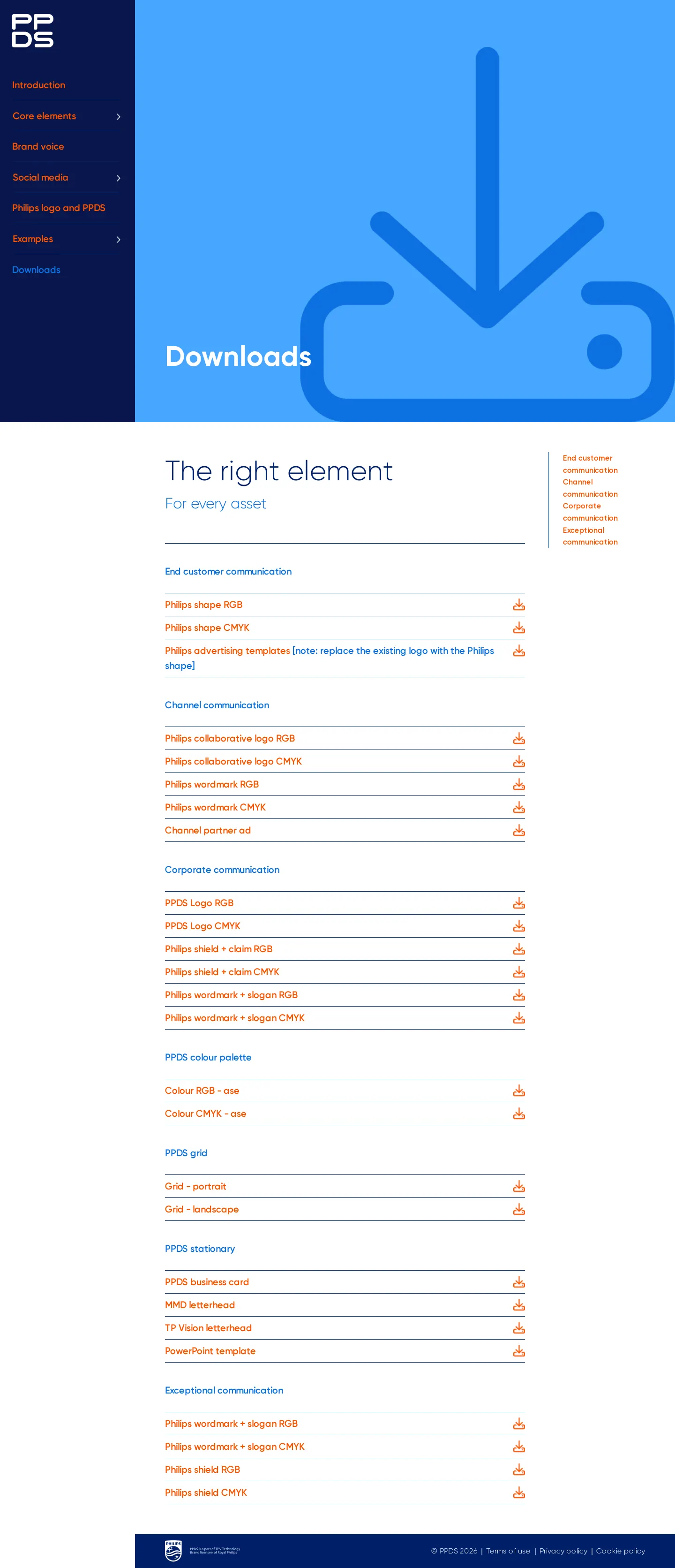
- The site provides a dedicated downloads area for accessing brand assets.1213
Numbers refer to the screenshots above.
What I could not see
- Specific asset file formats, color codes, and typographic specifications could not be confirmed from the visible headings.
- Search functionality and template libraries were not observed.
Ideas to borrow
Reviewed on 18 September 2026. Request a correction · I built this