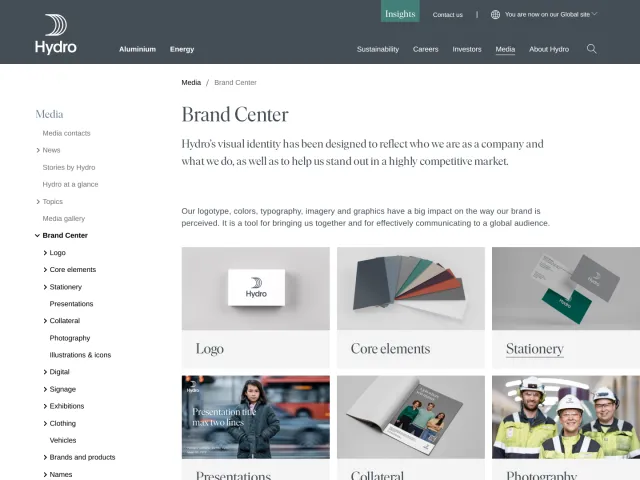
Plymouth brand guidelines
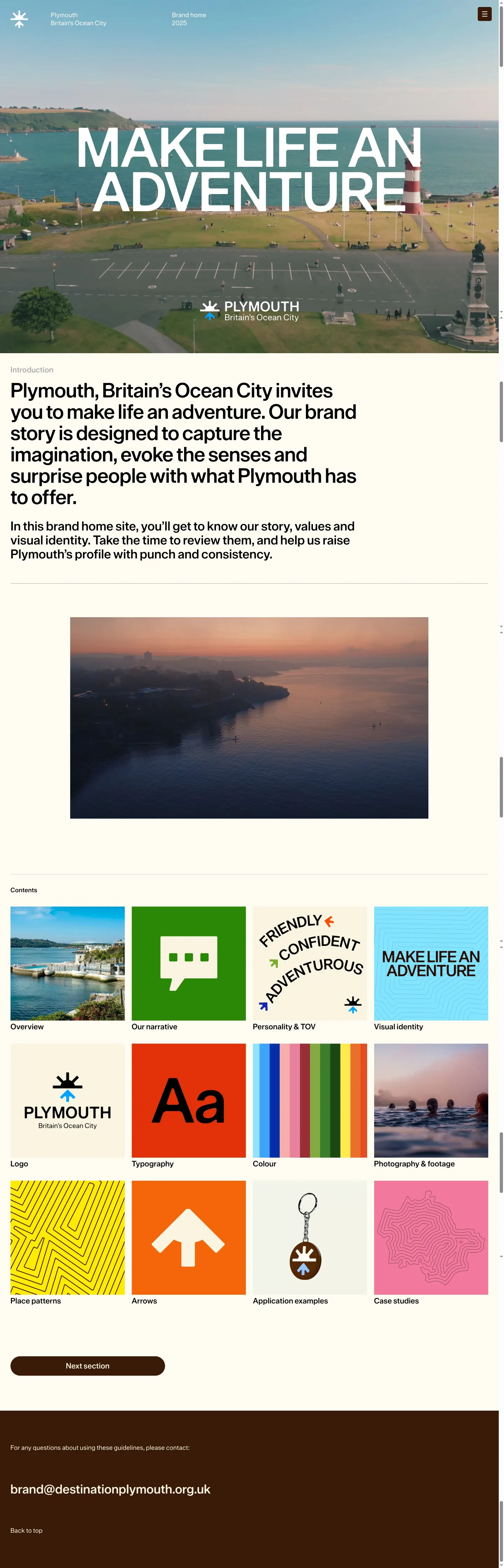
Plymouth's online brand portal documents foundational guidelines across dedicated sections for logo, colour, typography, and photography.
Freedam's take — I added Plymouth's online brand home to the gallery because it keeps core visual guidelines simple and direct. The site breaks down foundational identity elements across dedicated pages for their logo, colour palette, typography, and photography and footage. I appreciate how focused the layout feels, avoiding clutter and sticking to essential principles. Walking through these sections gives you a clean view of their core graphic system without extra complications.
Details
- Type
- Guidelines
- Access
- Public
- Source
- live.standards.site
- Industry
- Travel & hospitality, Public sector
- Capabilities
- None recorded
- Tags
- logo usage, color system, typography, photography, video library, minimal
- Added
- Last checked



What I noticed
- The brand portal includes a dedicated section for logo guidelines.1
- A standalone page is dedicated to colour specifications.2
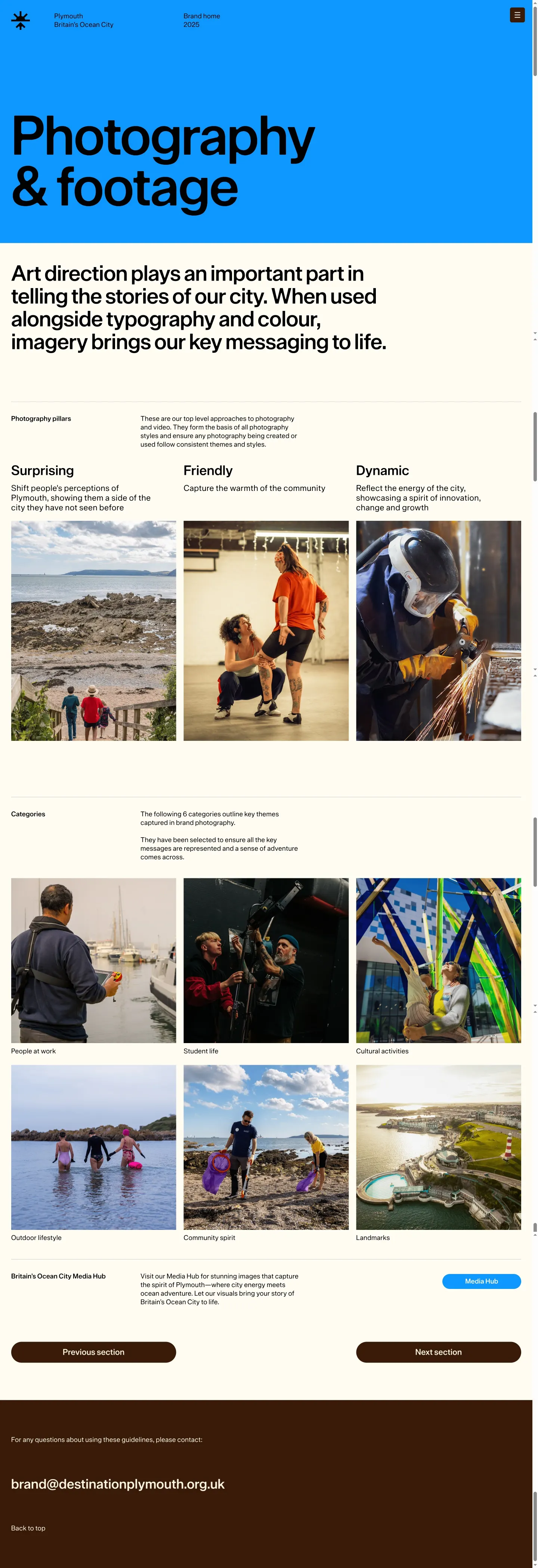
- The site provides specific sections for typography and photography.34
- The structure offers a straightforward navigational layout focused on core visual identity elements.
Numbers refer to the screenshots above.
What I could not see
- Search functionality was not observed.
- Direct asset download capabilities were not observed.
Ideas to borrow
- Organize core brand fundamentals into isolated, clearly titled pages for fast navigation.
Reviewed on 18 September 2026. Request a correction · I built this