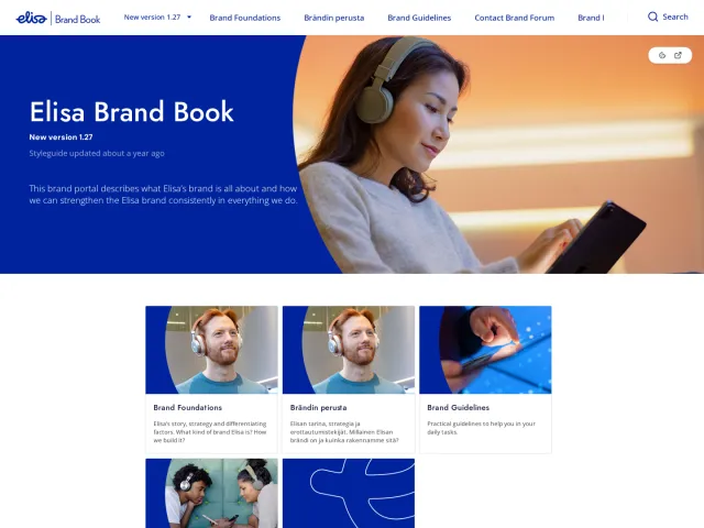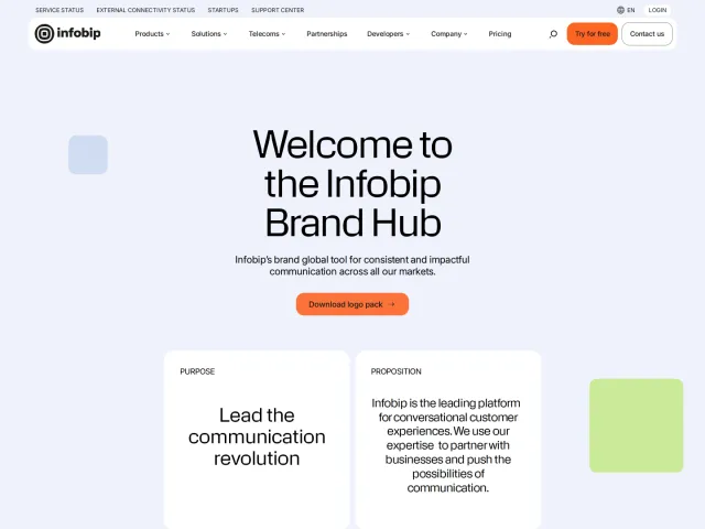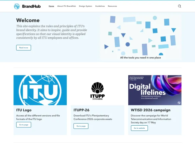
Odido brand guidelines
Odido presents an identity portal outlining core visual assets, custom typography, gradient Glow palettes, and touchpoint application levels.

Odido introduction page detailing brand story, concentric identity levels, and application mockups.

Logo guidelines showing geometric mark versions, placement rules, clearspace toggles, and photo usage.

Colour documentation displaying core Glow gradients, secondary swatches, and contrast pairings.

Typography standards highlighting the custom Otypical typeface, character set viewer, and typesetting ratios.
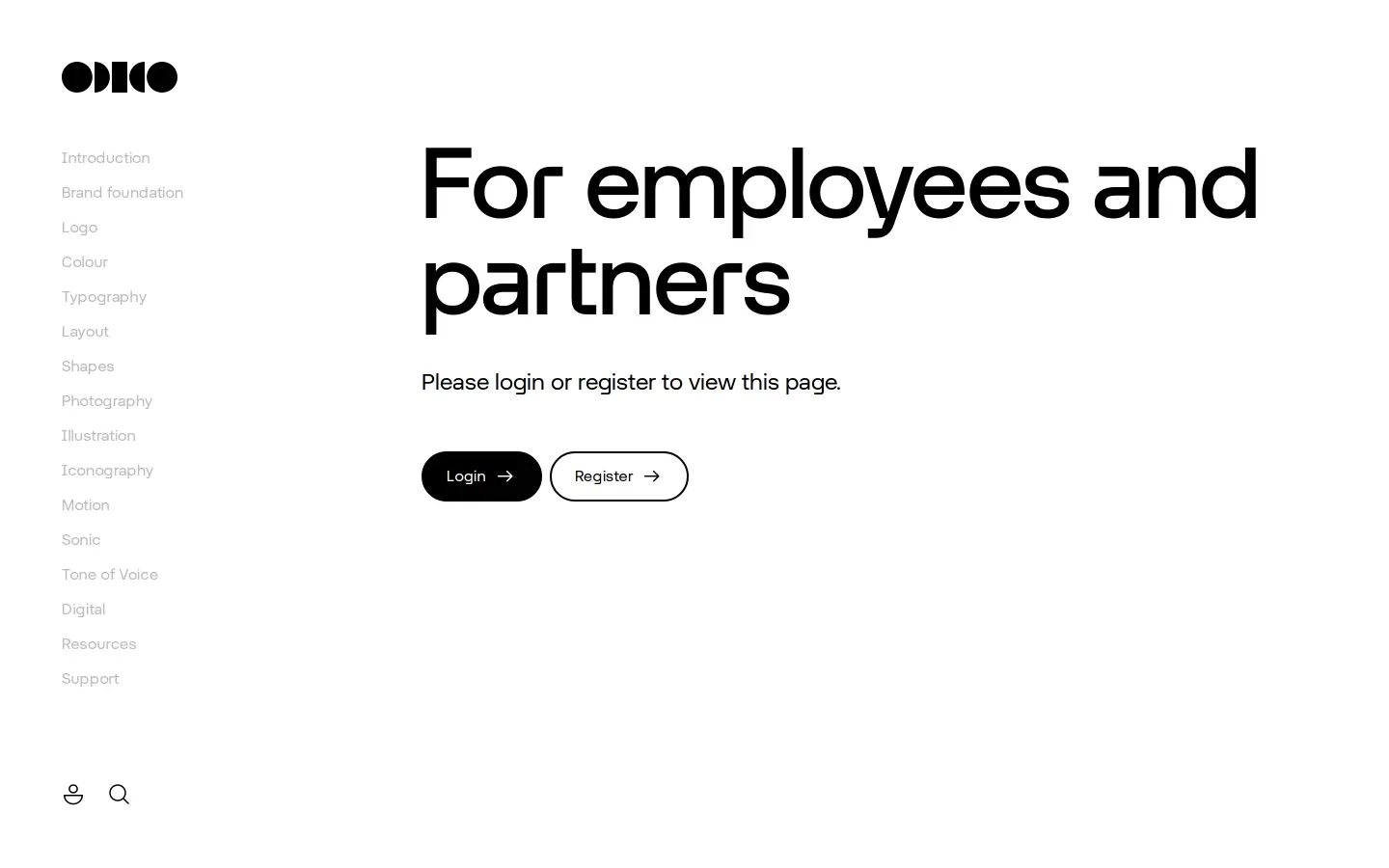
Restricted portal screen displaying a login and registration gate for employees and partners.

Photography direction outlining human-centered imagery attributes, composition types, and forbidden treatments.
Want a brand center like Odido’s?
Create your brand center with Freedam ↗Freedam's take
I like how Odido handles design levels right from the introduction, organizing applications across Entry, Participation, and Functional touchpoints. Exploring the logo rules, you see interactive grid toggles for clearspace and placement, which makes checking artwork simple. The typography section gives strict attention to detail for the bespoke Otypical sans serif, calling out tight eighty percent headline leading alongside custom half-circle quotation marks. The palette pairs core gradients named Glows with solid secondary tones, creating a vivid, energetic system throughout outdoor mockups and interface samples.
At a glance
- Sections
- Introduction · Brand foundation · Logo · Colour · Typography · Layout · Shapes · Photography · Illustration · Iconography · Motion · Sonic · Tone of Voice · Digital · Resources · Support
- Tone
- A playful, human telco identity structured around expressive gradients and precise geometric type rules.
What I noticed
- The core palette consists of Black, White, and four multi-color gradient swatches labeled Glow one through Glow four.1
- The custom typeface Otypical includes Headline and Text styles, specifying tight 80% leading for headlines and 120% for body copy.234
- Quote styling specifies custom half-circle quotation marks taken from Otypical Headline Medium.5
- Brand foundation documentation is restricted behind a login prompt reserved for employees and partners.67
Numbers refer to the screenshots above.
What I could not see
- Could not view the Brand foundation section because it requires employee or partner login credentials.
- Could not inspect downloads directly because the Resources page was not captured.
Ideas to borrow
Quick answers
What is Odido's primary brand typeface?
Odido uses a bespoke geometric and human sans serif called Otypical, available in Headline and Text styles.23
Can the multi-colour Odido logo be used on top of photos?
No, rules state that the colour logo cannot be placed on imagery; only solid black logos on lighter photos or solid white logos on darker photos are permitted.13
What are the core colours in the Odido palette?
The core palette consists of Black, White, and four multi-colour gradients referred to as Glow one through Glow four.1
Reviewed on 26 September 2026. Request a correction · I built this
Similar brand centers
All brand guidelines →