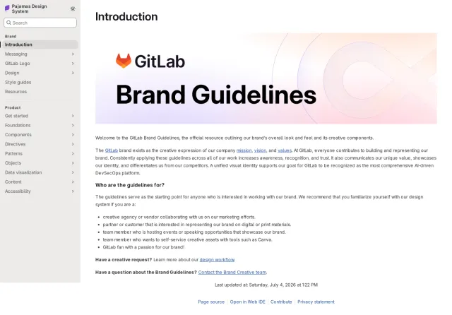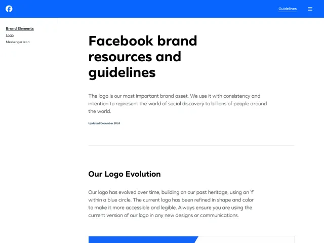
Nuxt brand guidelines
The Nuxt Design Kit provides logo history, downloadable icons, lockups, color palette swatches, and design token links on a single page.
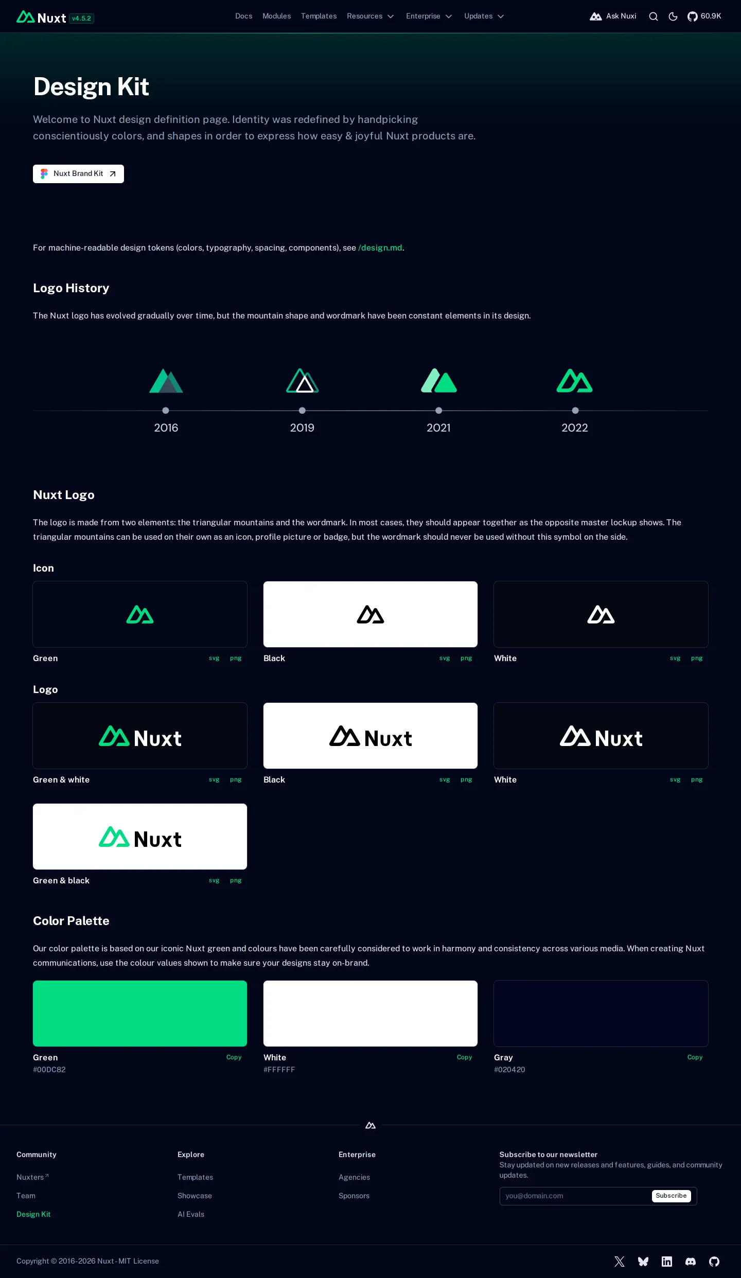
The Nuxt Design Kit page displays a logo history timeline, icon and logo variants with SVG and PNG downloads, and a color palette.
Want a brand center like Nuxt’s?
Create your brand center with Freedam ↗Freedam's take
I like how direct the Nuxt Design Kit is. It puts everything you need on a single page, starting with a clean timeline of how the logo evolved from 2016 through 2022. Below that, you get the icon and full lockups in green, black, and white, with simple links to grab SVG or PNG files right away. There is also a quick color palette where you can copy hex codes with one click, a link to their Figma file, and even a reference to a markdown file for tokens. It feels refreshingly practical for developers.
At a glance
- Sections
- Logo History · Nuxt Logo · Color Palette
- Downloads
- svg, png
- Tone
- A concise, developer-friendly brand page prioritizing quick asset access and clear color values.
What I noticed
- A timeline illustrates the evolution of the Nuxt logo mark across 2016, 2019, 2021, and 2022.1
- Direct download links for SVG and PNG files are provided under each logo and icon variant.234
- The color palette displays green, white, and gray swatches with hex values and a copy button.5
- The page references /design.md for machine-readable design tokens and includes a link to an external brand kit in Figma.67
Numbers refer to the screenshots above.
What I could not see
- No comprehensive usage rules or clearspace guidelines were visible on the captured page.
- Typography specimen details and font file downloads were not visible on screen.
Ideas to borrow
- Pairing visual asset downloads with a reference to a markdown file for design tokens makes brand integration simple for developers.7
Quick answers
Reviewed on 25 September 2026. Request a correction · I built this