Not Your Mother's brand guidelines
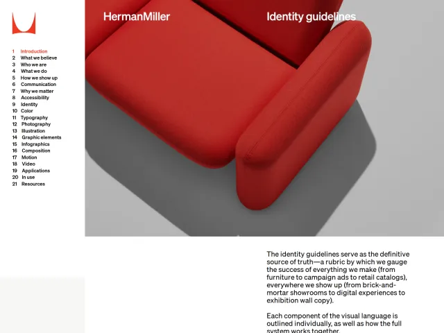
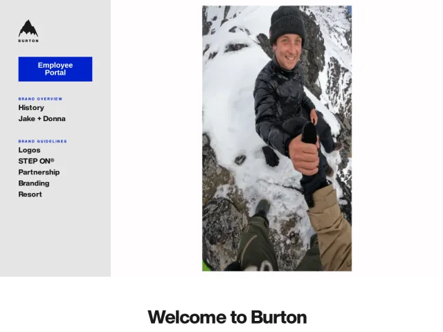
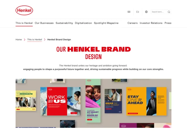
Not Your Mother's brand guidelines provide identity assets, logo rules, and product line color palettes using a clean Corebook portal.
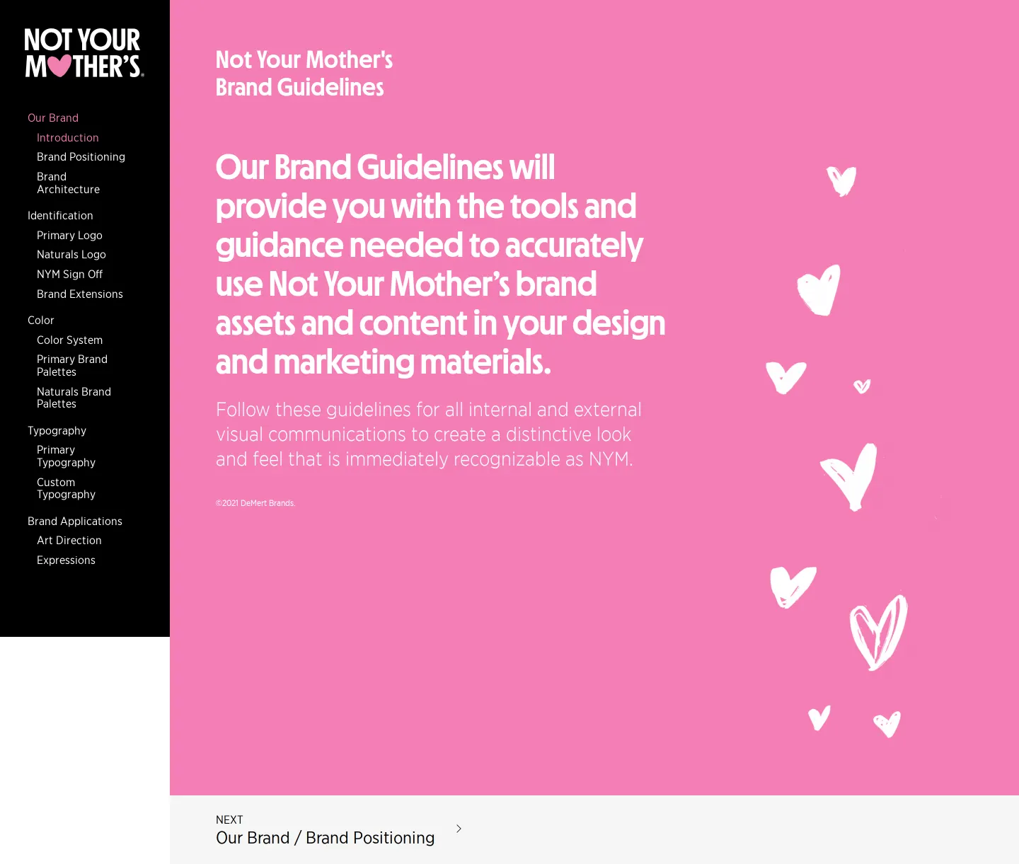
Introduction page of the Not Your Mother's brand guidelines featuring a bright pink backdrop with scattered hearts and left navigation.
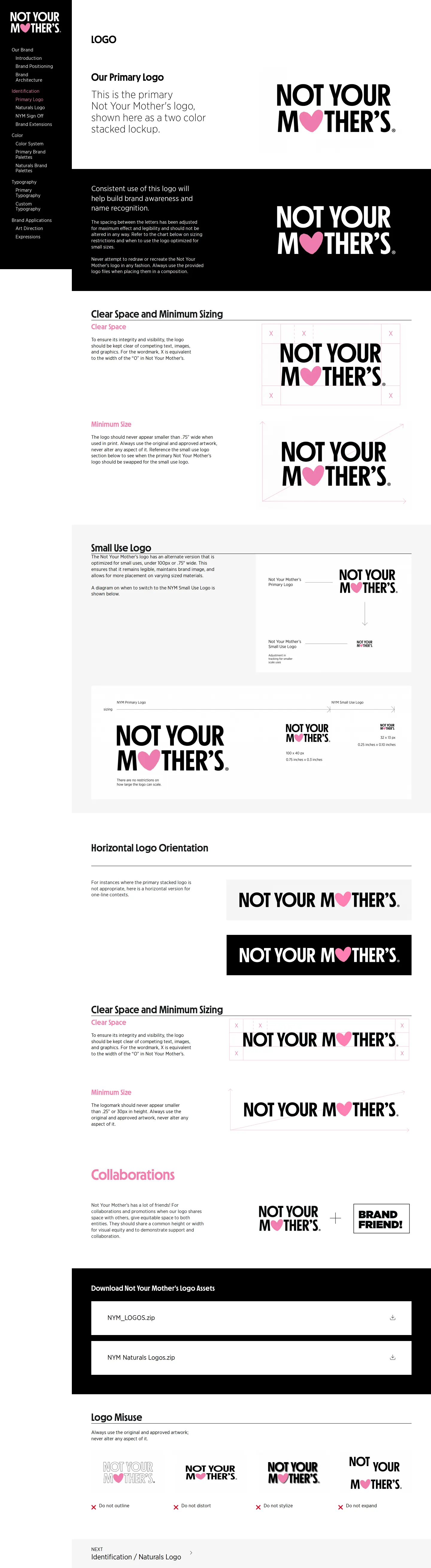
Primary logo specifications displaying stacked color marks on light and dark backgrounds with clear space rules.
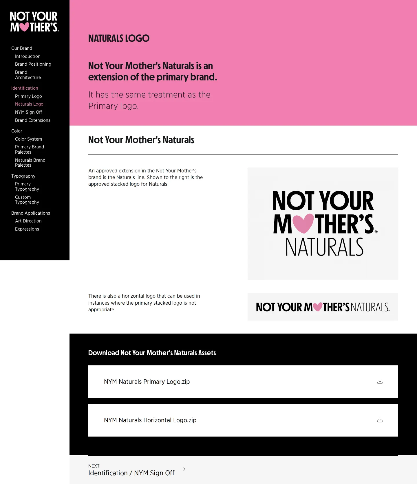
Overview of the Not Your Mother's Naturals sub-brand logo extension and layout guidelines.

The NYM Core 12 color system page detailing hues, tints, shades, and monochromatic pairing rules.

Primary brand color palettes page detailing assigned swatches and hex codes for product lines like Beach Babe.
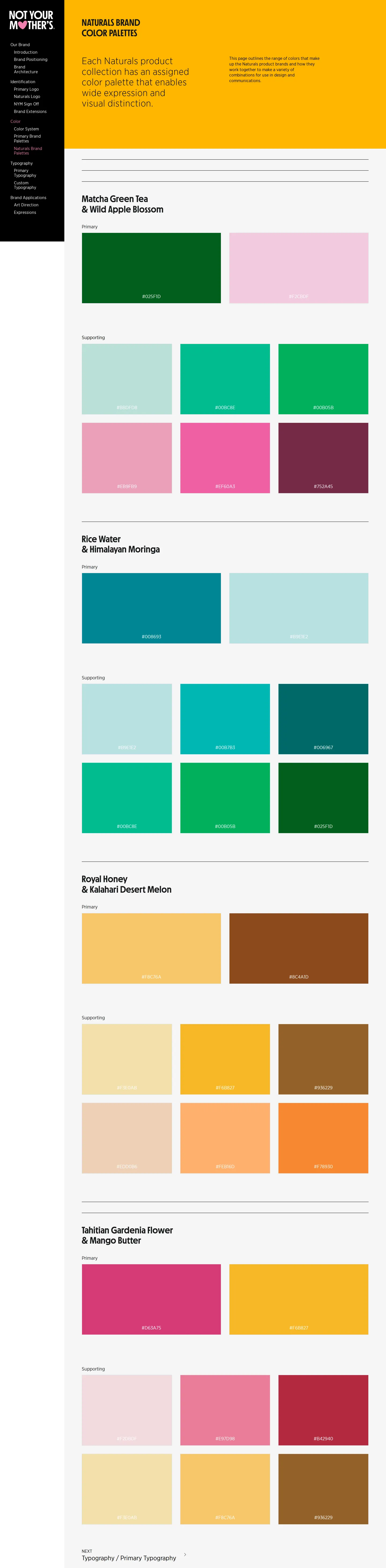
Naturals brand color palettes page showcasing specific schemes for collections like Matcha Green Tea & Wild Apple Blossom.
Want a brand center like Not Your Mother's’?
Create your brand center with Freedam ↗Freedam's take
I love seeing how Not Your Mother's translates playful retail packaging into a clear digital brand guideline. Built on Corebook, the portal opens with energetic pink layouts and hand-drawn hearts before getting down to business. What caught my eye is how they handle color. Rather than simply posting a single brand palette, they catalog distinct color sets for specific product lines like Beach Babe and Clean Freak, as well as their Naturals collections. It is practical and directly mirrors what customers encounter in aisles, making visual consistency across packaging lines very easy to navigate.
At a glance
- Sections
- Our Brand · Identification · Color · Typography · Brand Applications
- Tone
- Vibrant, friendly, and structured around product lines.
What I noticed
- The website structure is hosted on Corebook and organized with a persistent black left navigation bar.12
- The primary logo features black lettering with a pink heart replacing the letter 'O' in 'MOTHER'S', accompanied by reversed versions for dark backgrounds.34
- Dedicated color palettes are defined for specific product lines including Beach Babe, Clean Freak, and Curl Talk.567
- Naturals collections such as Matcha Green Tea & Wild Apple Blossom have their own dedicated palettes and logo treatments.8910
Numbers refer to the screenshots above.
What I could not see
- Could not inspect typography guidance, brand applications pages, or actual downloadable file formats from the captured screens.
Ideas to borrow
Quick answers
Can you alter the letter spacing of the primary logo?
No, the guidelines state that letter spacing should not be altered and the logo must not be redrawn or recreated.13
Reviewed on 25 September 2026. Request a correction · I built this