Herman Miller brand guidelines
Herman Miller offers a 21-chapter identity guidelines manual with color matrices, typography rules, photo usage proportions, and motion principles.
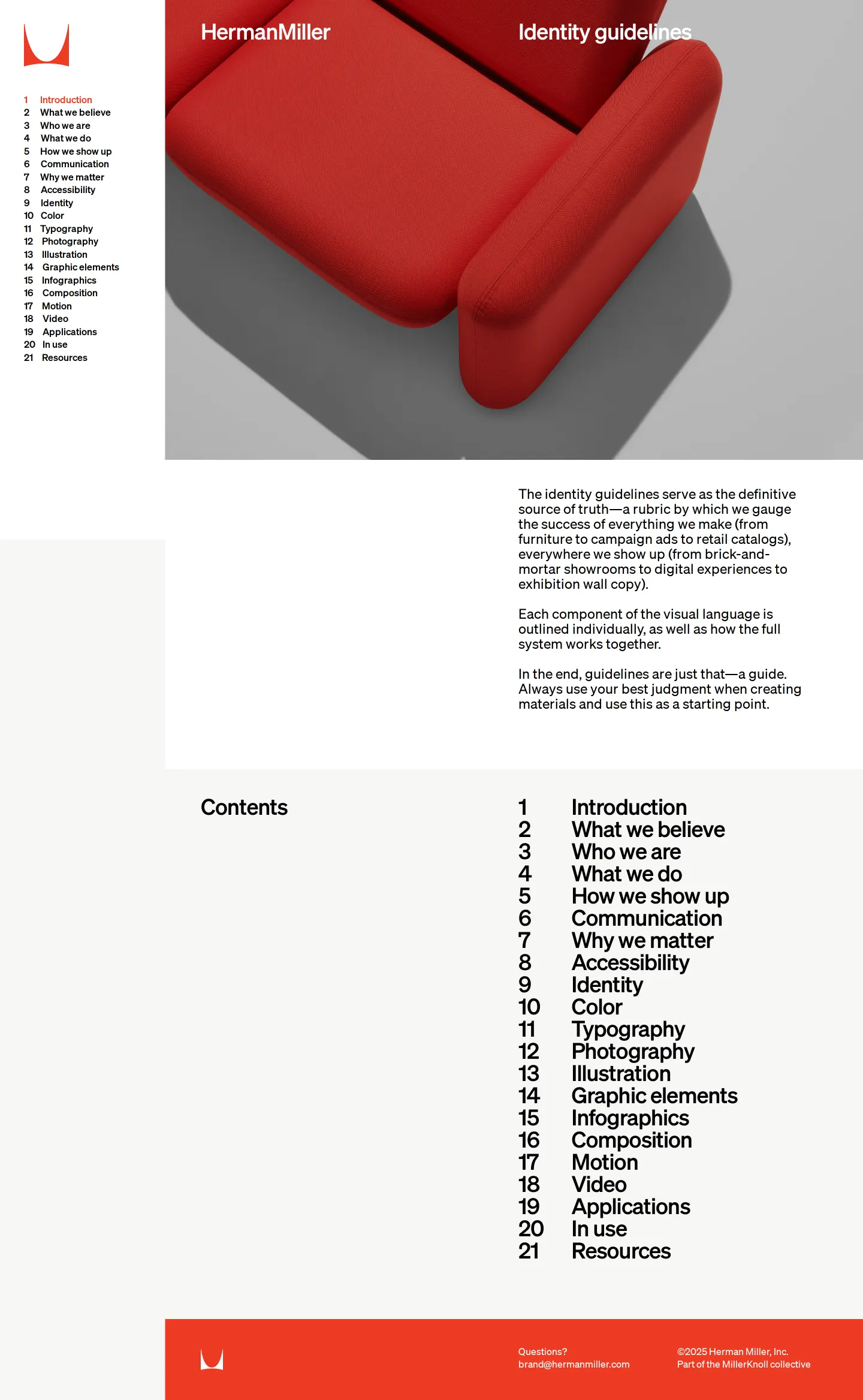
Introductory home page showing a red upholstered armchair and the 21-chapter navigation index.

Color standards page featuring usage proportions, archival posters, pairing swatches, and contrast matrices.

Typography standards presenting the Söhne font family, historical specimens, and leading rules.

Photography guidance showing category usage ratios, art direction principles, and cropping examples.

Motion principles page outlining curve dynamics, timing cautions, and typography animation behaviors.
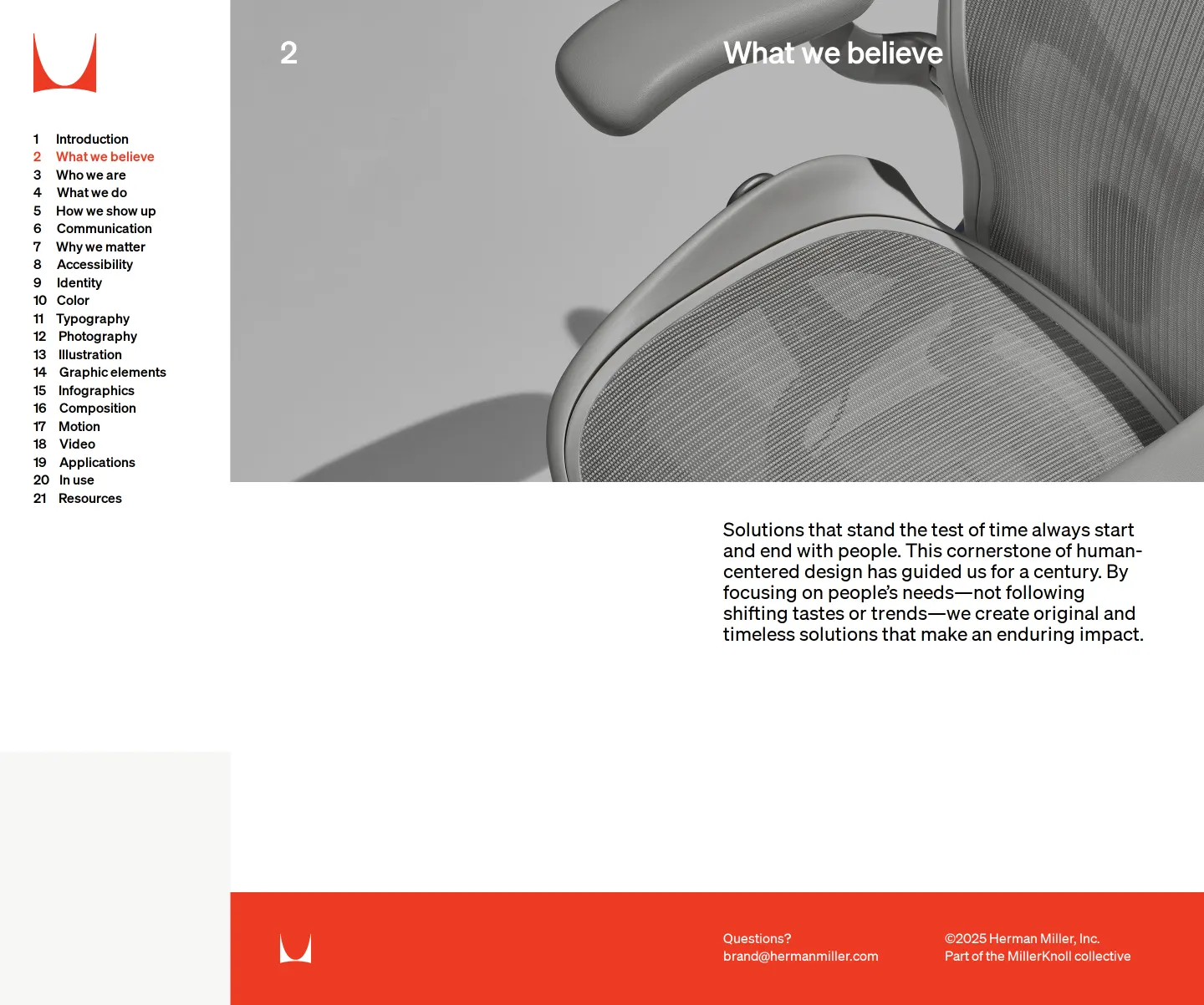
Brand philosophy page highlighting core human-centered design beliefs alongside an Aeron chair image.
Freedam's take
I love seeing a heritage brand embrace modern digital standards without losing its graphic design roots. Herman Miller structures its manual around twenty-one distinct chapters, seamlessly mixing archival artifacts by masters like George Nelson and Stephen Frykholm directly into contemporary guidelines. The treatment of color and type is remarkably meticulous. Instead of generic swatches, you get exact usage proportions, contrast matrices for digital readability, and specific leading multipliers across copy hierarchies. It feels grounded, academic, and deeply practical for anyone creating work within their ecosystem.
At a glance
- Sections
- 1 Introduction · 2 What we believe · 10 Color · 11 Typography · 12 Photography · 17 Motion · Resources
- Downloads
- ZIP
- Tone
- Rigorous, systematic, and respectful of modern graphic design heritage.
What I noticed
- The site organizes identity standards across 21 numbered chapters accessible from a persistent left-hand navigation menu.123
- Color guidelines define exact usage proportions, allocating red as a 30% primary color alongside fifteen supporting colors at 5% each.4
- Digital color combinations include matrices that mark disallowed pairings alongside pairings meeting an AA 4.5:1 ratio.5
- Typography documentation details the Söhne typeface family alongside leading multipliers for headlines, subheads, and body copy.67
- Historical archival artifacts, including posters by Stephen Frykholm and brochures by George Nelson & Associates, appear directly alongside contemporary rules.89
Numbers refer to the screenshots above.
What I could not see
- Could not inspect all 21 numbered chapters beyond the 6 captured pages.
- Could not test the font request workflow for external partners.
Ideas to borrow
Quick answers
Reviewed on 26 September 2026. Request a correction · I built this
Similar brand centers
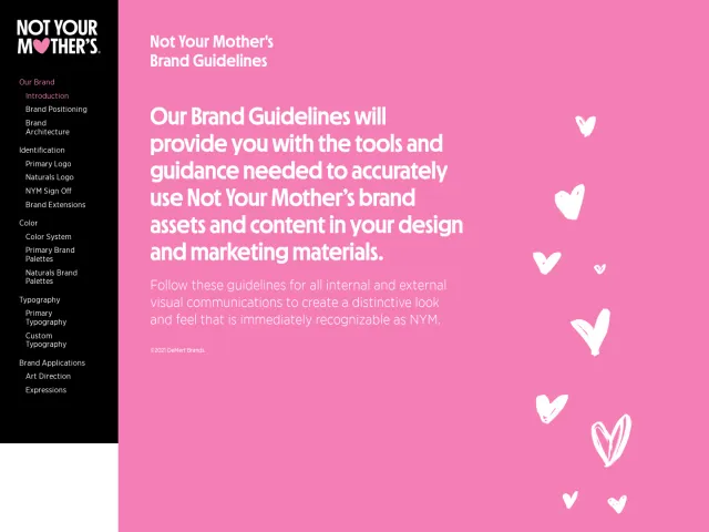
All brand guidelines →While Burton distributes its core logos and partnership guidelines using external Dropbox links, Herman Miller hosts direct zip archives for palettes and fonts right within its site. In contrast to Not Your Mother's product-line-focused Corebook site, Herman Miller emphasizes editorial and motion behavior rules alongside historical design context.