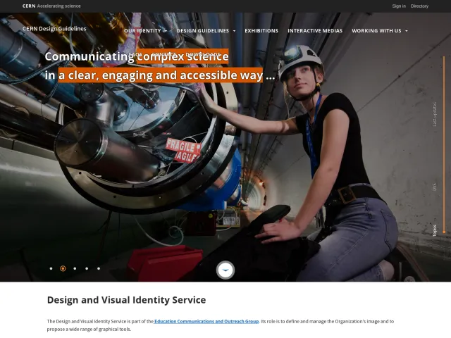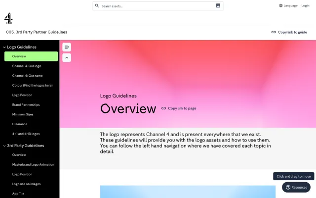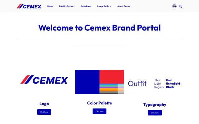
MENY brand guidelines
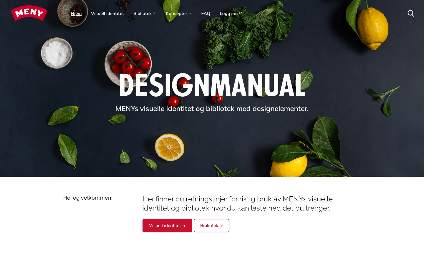
MENY provides a Frontify-powered design manual detailing visual identity standards, asset collections, and retail design elements.
Freedam's take — I spent some time exploring the MENY design manual, and it feels like a practical workspace for their team. Built on Frontify, the portal clearly separates brand identity standards from its asset library. I like how thorough the typography breakdown is, cataloging desktop headline typefaces alongside specific web fallbacks like Mulish. The navigation reveals dedicated sections for retail-specific elements like price points, stickers, and app icons, making the guidance feel grounded in the everyday needs of a grocery business.
Details
- Type
- Guidelines
- Access
- Public
- Source
- design.meny.no
- Industry
- Retail, Food & drink
- Capabilities
- Guidelines, Asset browsing, Search
- Tags
- typography, packaging, search, asset downloads, media library, frontify
- Added
- Last checked
What I noticed
- The portal is built on the Frontify platform.123
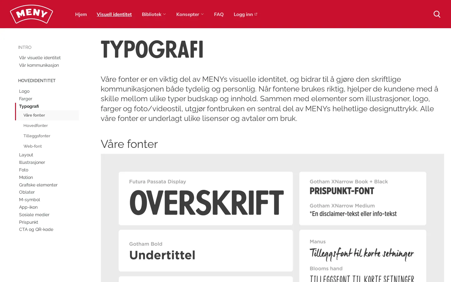
- The typography documentation lists primary desktop fonts like FuturaPassata and Gotham alongside Mulish for web use.45678
- The site provides dedicated guidance for retail and marketing components including price points, seals, and QR codes.91011
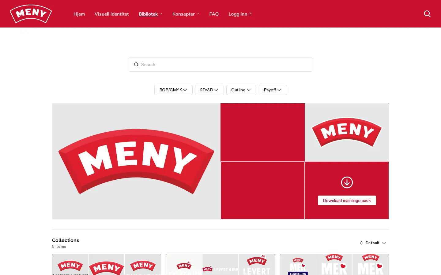
- The logo section integrates asset collections with an active search field.121314
Numbers refer to the screenshots above.
What I could not see
- Authenticated areas behind the login link were not accessible.
- Specific asset download mechanics and file formats could not be directly inspected.
Ideas to borrow
- Retail brands can organize their style guides to explicitly include operational elements like stickers, price marks, and app icons alongside core brand rules.
Reviewed on 18 September 2026. Request a correction · I built this
Similar brand centers
All brand guidelines →