McMaster University brand guidelines
McMaster University presents its Brighter World identity guidelines across dedicated sections covering visual standards, tone, accessibility, and media production.
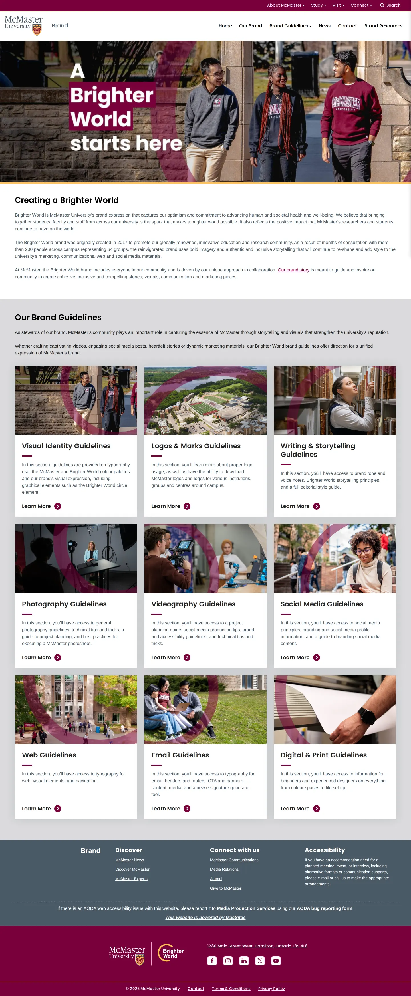
Home page introducing the Brighter World brand portal with a grid linking to nine core guideline areas.
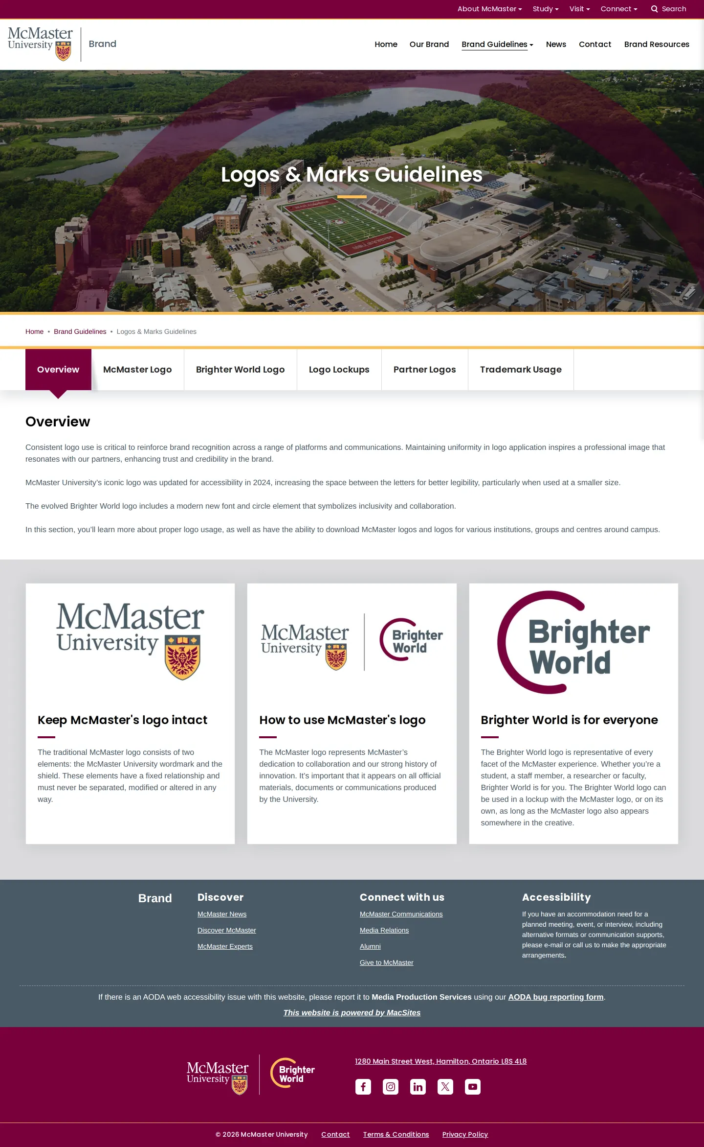
Logos and marks guidelines page featuring campus photography, navigation tabs, and principles on logo usage.
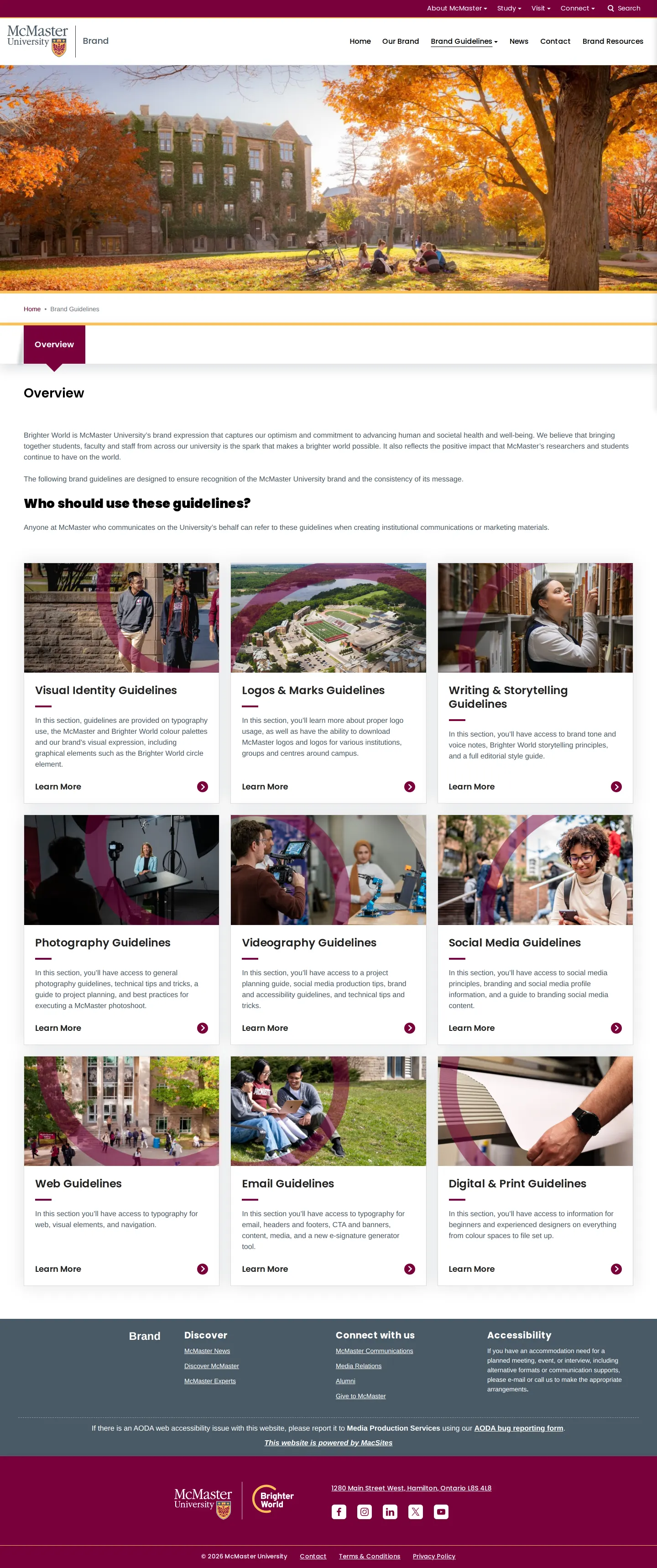
Overview of brand guidelines explaining the Brighter World expression and who should apply the standards.
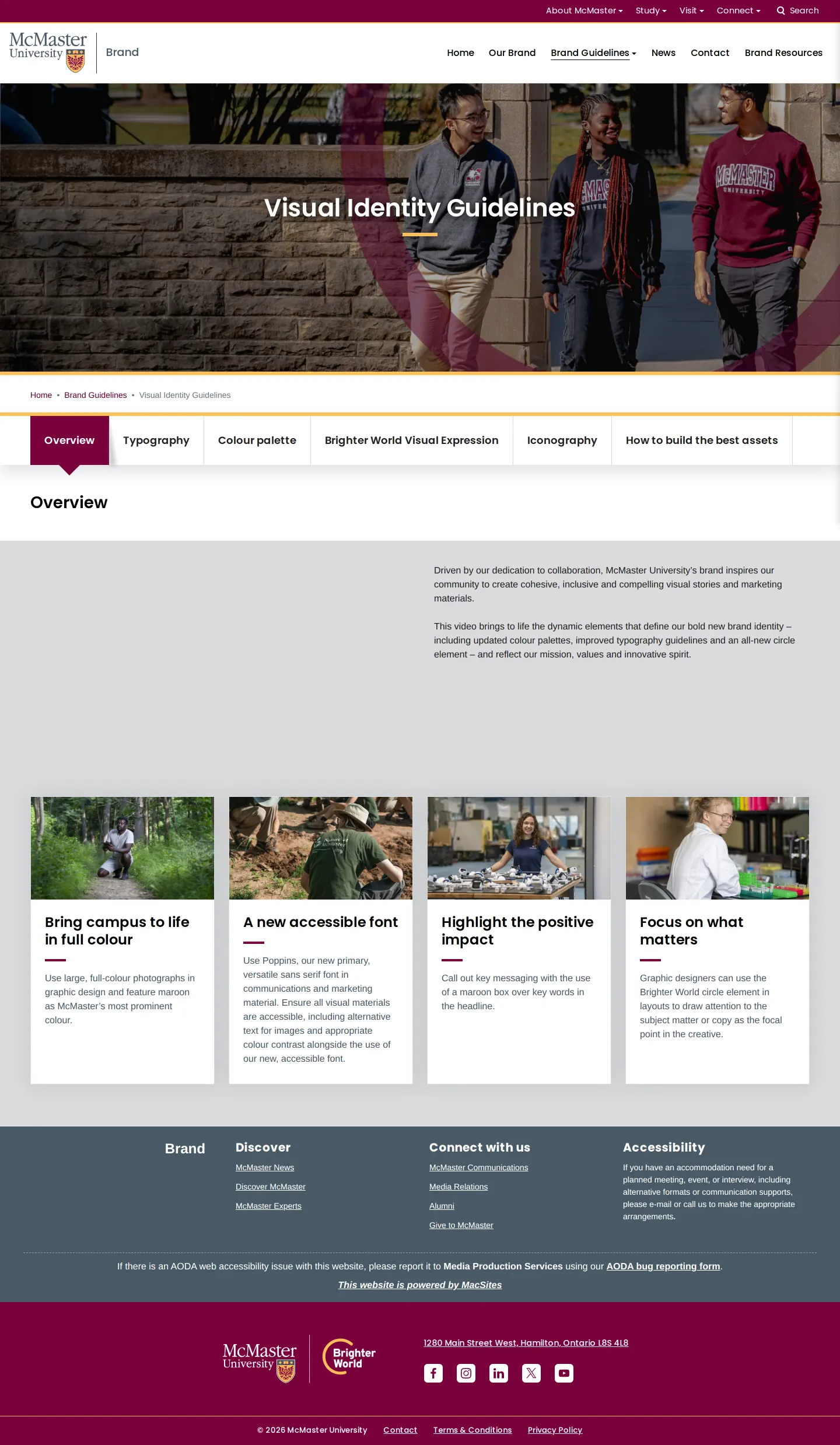
Visual identity guidelines page outlining typography rules, color palettes, and accessibility goals.
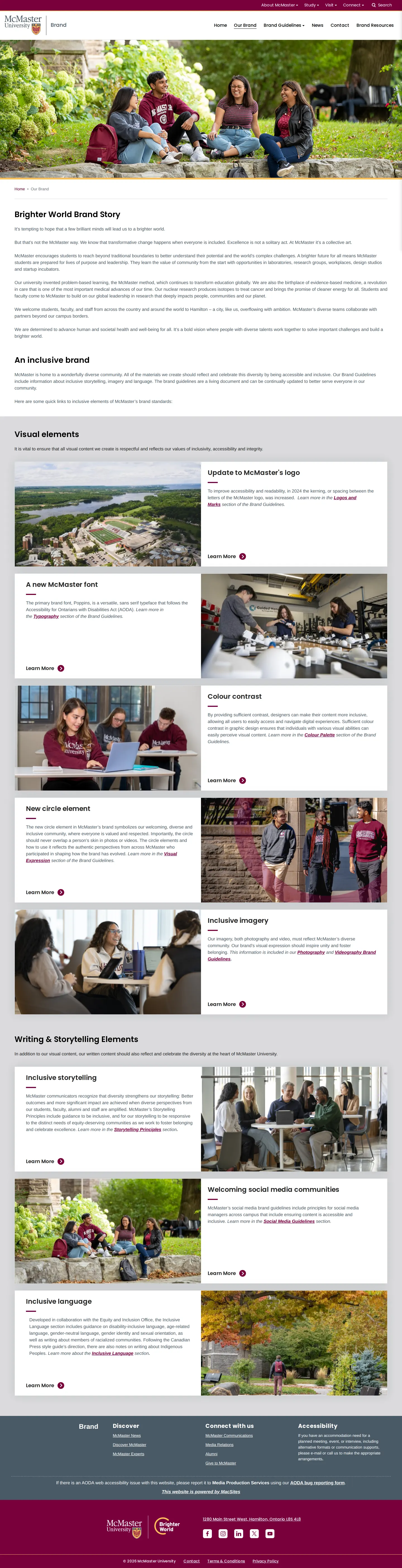
Our Brand overview page detailing the Brighter World story alongside visual and storytelling components.
Want a brand center like McMaster University’s?
Create your brand center with Freedam ↗Freedam's take
I like how McMaster University organizes its brand guidelines around clear, accessible communication. The portal is divided into neat thematic modules, spanning everything from typography to storytelling and videography. You can see how practical considerations lead the design, such as an explicit logo spacing adjustment made in 2024 to improve legibility and the selection of Poppins as the primary sans-serif font. The layout feels grounded and approachable, relying on clean navigation cards framed by a signature circular graphic element that keeps the overarching Brighter World expression present across pages.
At a glance
- Sections
- Visual Identity · Logos & Marks · Writing & Storytelling · Photography · Videography · Social Media · Web · Email · Digital & Print
- Tone
- Structured, informative, and focused on accessibility across university communications.
What I noticed
- The website provides a 3x3 card grid linking directly to nine guideline sections including Visual Identity, Logos & Marks, Writing & Storytelling, Photography, Videography, Social Media, Web, Email, and Digital & Print.123
- Poppins is selected as the primary accessible sans-serif font for brand communications and marketing.45
- The university adjusted its logo in 2024 by increasing letter spacing specifically to improve accessibility.6
- Maroon serves as the primary brand color alongside a distinctive circular graphic overlay element across campus imagery.789
Numbers refer to the screenshots above.
What I could not see
- Direct download packages or file links for fonts and logos were not visible on the captured pages.
- Specific color hex values and download asset formats could not be viewed without accessing secondary tabs.
Ideas to borrow
Quick answers
What is the primary brand typeface for McMaster University?
Poppins is designated as the primary accessible sans-serif font for McMaster's communications and marketing.45
What updates were made to the McMaster logo?
The logo was updated in 2024 to increase letter spacing to improve accessibility.6
Reviewed on 25 September 2026. Request a correction · I built this
Similar brand centers
All brand guidelines →