Linear brand guidelines
Linear provides a concise, dark-themed brand guidelines page outlining core mark usage, naming rules, colors, and a direct asset bundle download.
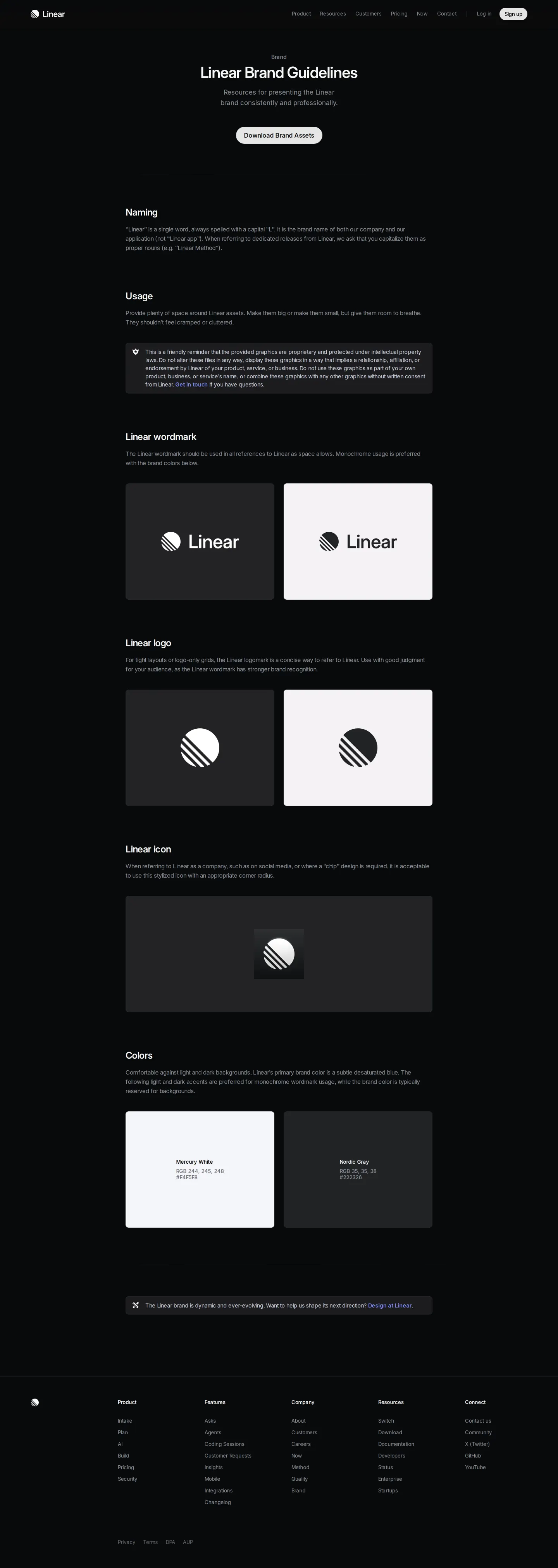
Linear brand guidelines page featuring a dark theme, asset download button, and sections for naming and usage.
Want a brand center like Linear’s?
Create your brand center with Freedam ↗Freedam's take
I really appreciate when brand pages keep things clean and concise. Linear presents its brand guidelines on a dark-themed single page that cuts straight to what partners and press need. You get an immediate download link for the bundled brand assets, followed by tidy rules for naming, asset spacing, and core marks like the wordmark, logo, and icon. There is no endless prose or unnecessary complexity to wade through, just focused guidance on colors and mark usage that feels completely true to their refined product ethos.
At a glance
- Sections
- Naming · Usage · Linear wordmark · Linear logo · Linear icon · Colors
- Downloads
- ZIP
- Tone
- Direct, minimal, and refined technical documentation.
What I noticed
- The page uses a dark visual theme titled 'Linear Brand Guidelines' with a direct button to 'Download Brand Assets'.12
- The documentation includes distinct sections for Naming rules as well as asset Usage outlining spacing requirements.34
- Headings cover specific brand marks including the Linear wordmark, Linear logo, and Linear icon, alongside Colors.5678
Numbers refer to the screenshots above.
What I could not see
- Could not inspect the internal contents of the downloaded ZIP archive.
- Could not see specific color hex codes or detailed font specifications without interacting with the page.
Ideas to borrow
Quick answers
Reviewed on 25 September 2026. Request a correction · I built this