Kuwait University brand guidelines
Kuwait University presents a bilingual brand identity portal outlining core logo anatomy, stakeholder color palettes, typography standards, and downloadable identity assets.
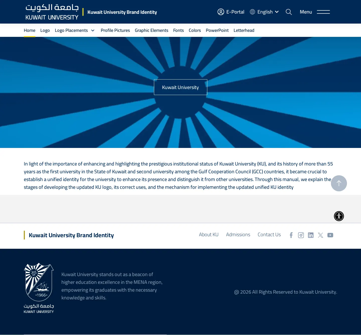
Kuwait University Brand Identity homepage showing institutional context, header navigation, and a central blue radial graphic.
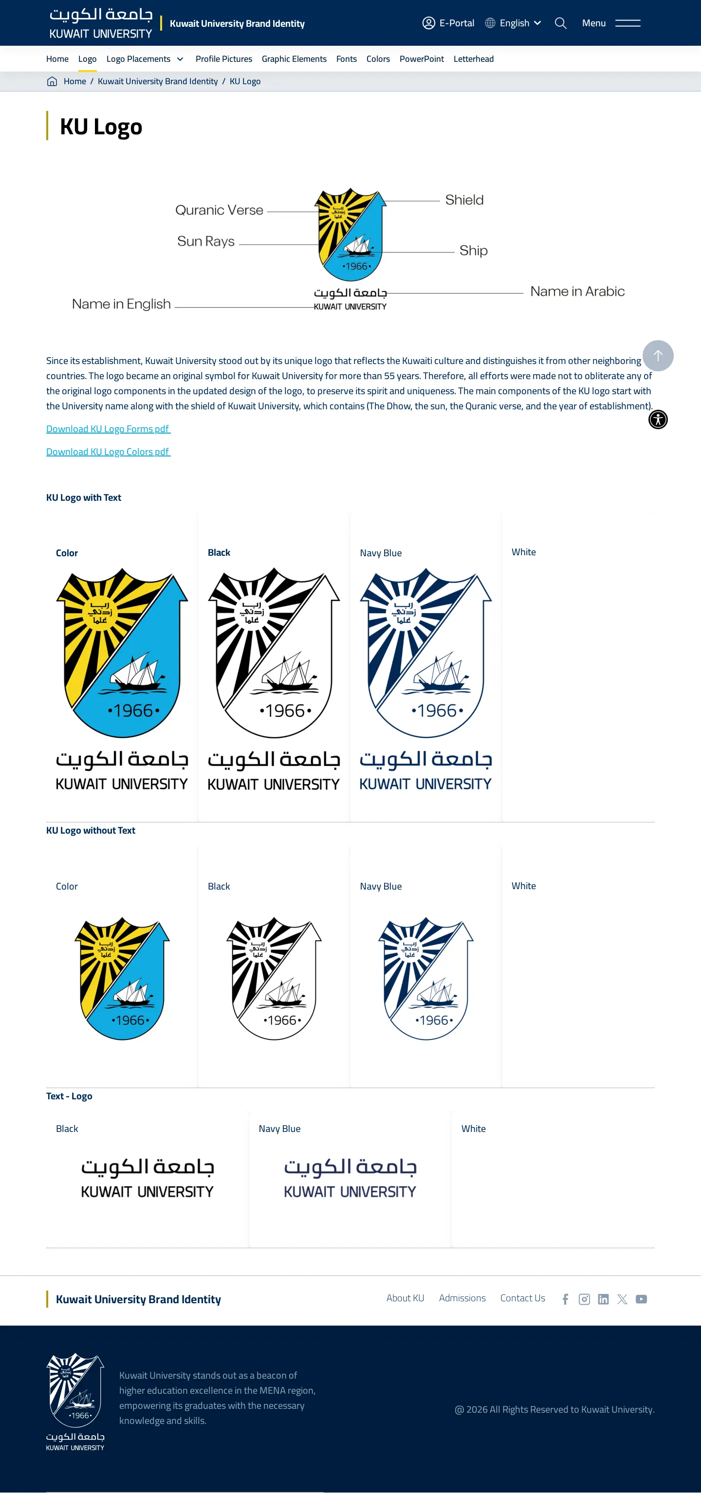
KU Logo page breaking down crest anatomy and providing colorway variants alongside PDF download links.
Logo Placement section outlining background contrast rules, sub-brand policies, and department logo downloads.
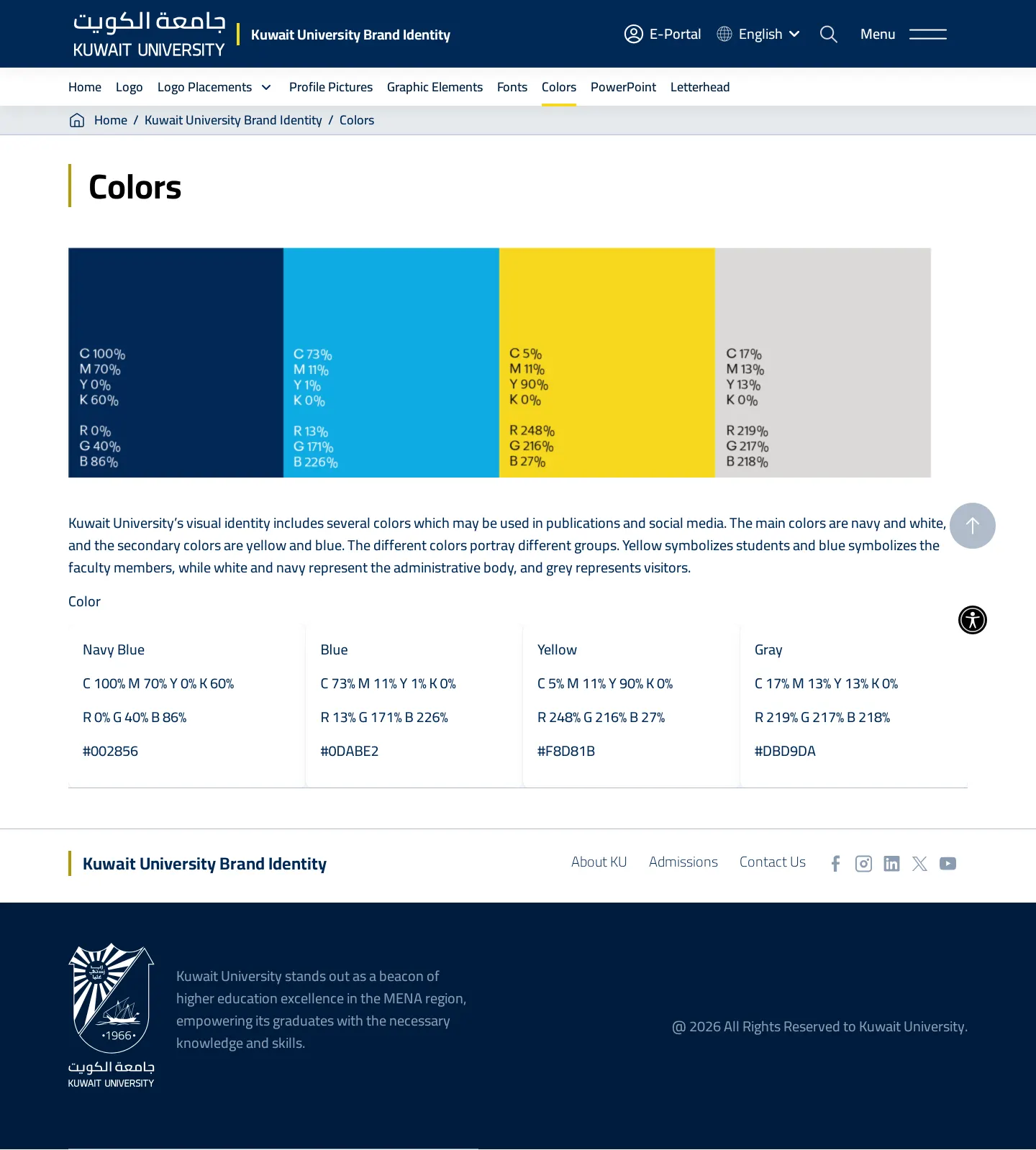
Colors page illustrating primary navy and secondary swatches with CMYK and RGB values mapped to campus stakeholder groups.
Fonts section presenting approved typography rules for Cairo, Somar, and Times New Roman alongside a SharePoint download link.
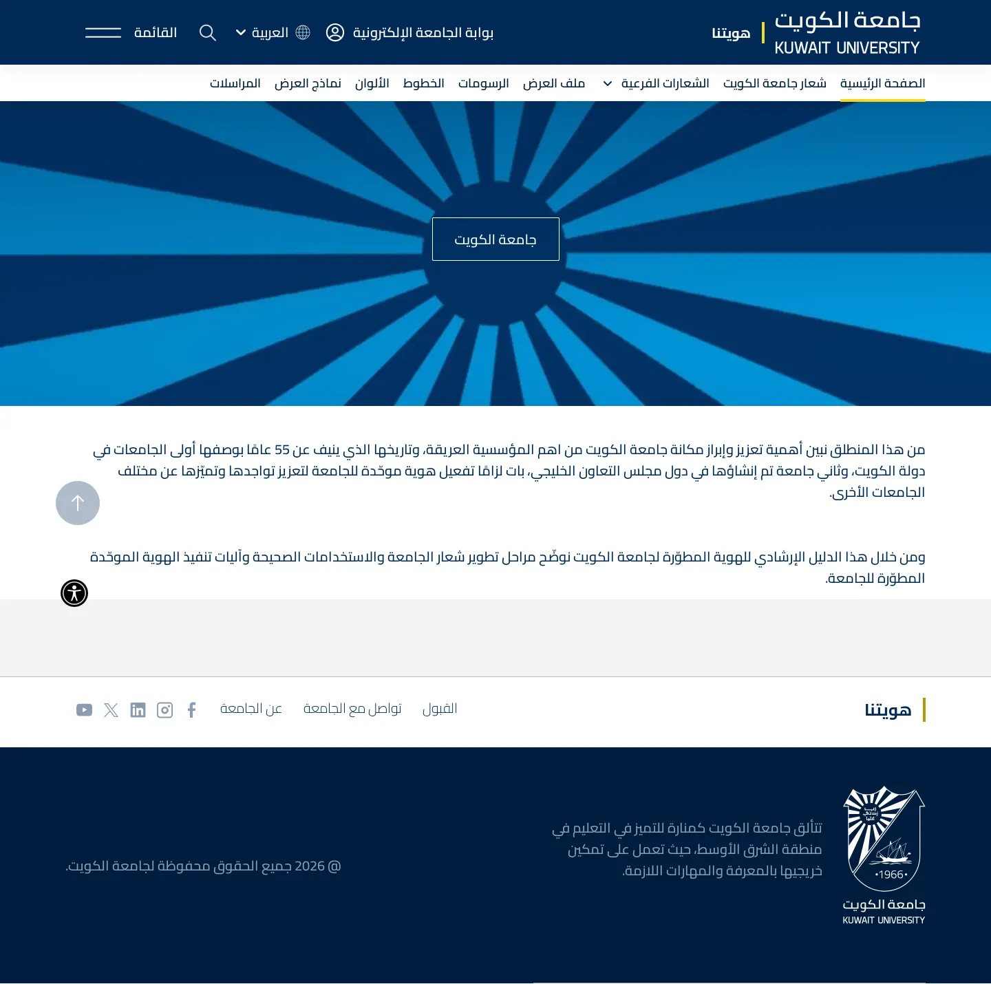
Kuwait University brand guidelines homepage rendered in Arabic with mirrored navigation and institutional introductory text.
Want a brand center like Kuwait University’s?
Create your brand center with Freedam ↗Freedam's take
I spent time reading Kuwait University's identity portal, which offers an accessible bilingual manual in English and Arabic. The logo documentation stands out for its detailed anatomical breakdown of the crest, honoring elements like the ship, sun rays, and Quranic verse. I also appreciate how color assignments reflect institutional roles, giving dedicated tones to students, faculty, administration, and visitors. The typography rules are straightforward, pairing Cairo and Somar with Times New Roman for everyday documentation. It feels functional and grounded, connecting institutional heritage with clear digital guidance for the university community.
At a glance
- Sections
- Home · Logo · Logo Placements · Profile Pictures · Graphic Elements · Fonts · Colors · PowerPoint · Letterhead
- Downloads
- Tone
- Formal, institutional, and rule-oriented guidance designed to maintain uniformity across university colleges and departments.
What I noticed
- The logo anatomy is broken down into specific symbolic parts including the Quranic Verse, Sun Rays, Shield, Ship, 1966, and bilingual names in English and Arabic.1
- The color system assigns symbolic roles across audiences, designating yellow for students, blue for faculty, navy and white for the administrative body, and grey for visitors.2
- Three specific typefaces are specified: Cairo for logos, Somar for digital applications and templates, and Times New Roman for correspondence and reports.3
- Colleges and internal work centers are explicitly prohibited from creating independent logos and must use standardized sub-logos.45
Numbers refer to the screenshots above.
What I could not see
- The internal contents of the downloadable PDF asset packs and SharePoint-hosted font packages could not be inspected directly.
- The PowerPoint, Letterhead, Profile Pictures, and Graphic Elements pages were not captured in this evidence bundle.
Ideas to borrow
- Assign specific secondary colors to distinct campus stakeholder groups, such as students, faculty, and administration, to organize communications intuitively.2
Quick answers
Reviewed on 25 September 2026. Request a correction · I built this
Similar brand centers
All brand guidelines →