Instituto Ayrton Senna brand guidelines
Instituto Ayrton Senna offers an accessible digital brand guide covering its logo, proportions, tone of voice, typography, and downloadable assets.

Hero landing page showing the brand emblem, purpose statement, and photography.

Logo guidelines page explaining the Ayrton Senna helmet mark, clear space, and background swatches.
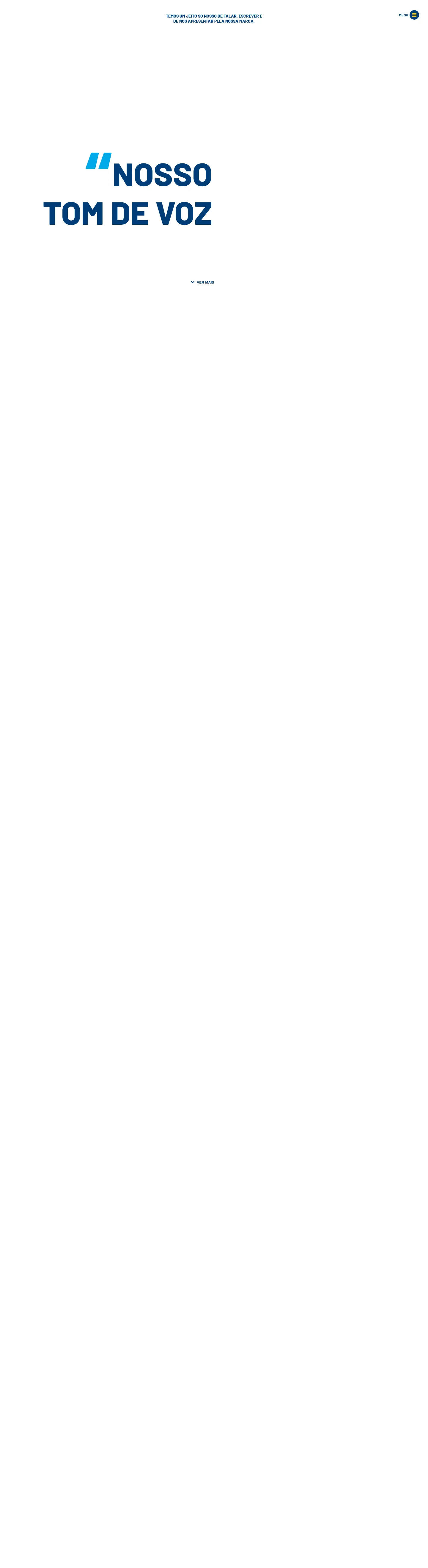
Tone of voice section outlining communication values, do's and don'ts, and language recommendations.
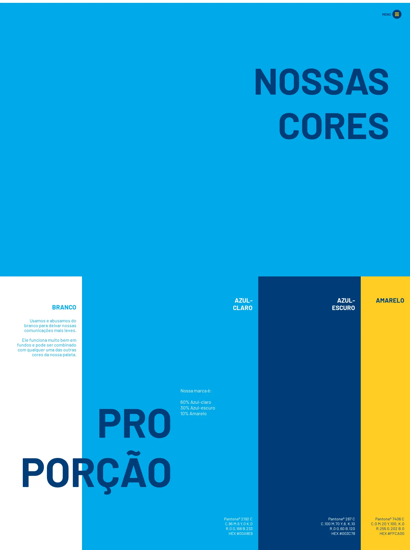
Color specifications presenting color swatches and the 60-30-10 palette proportion rule.
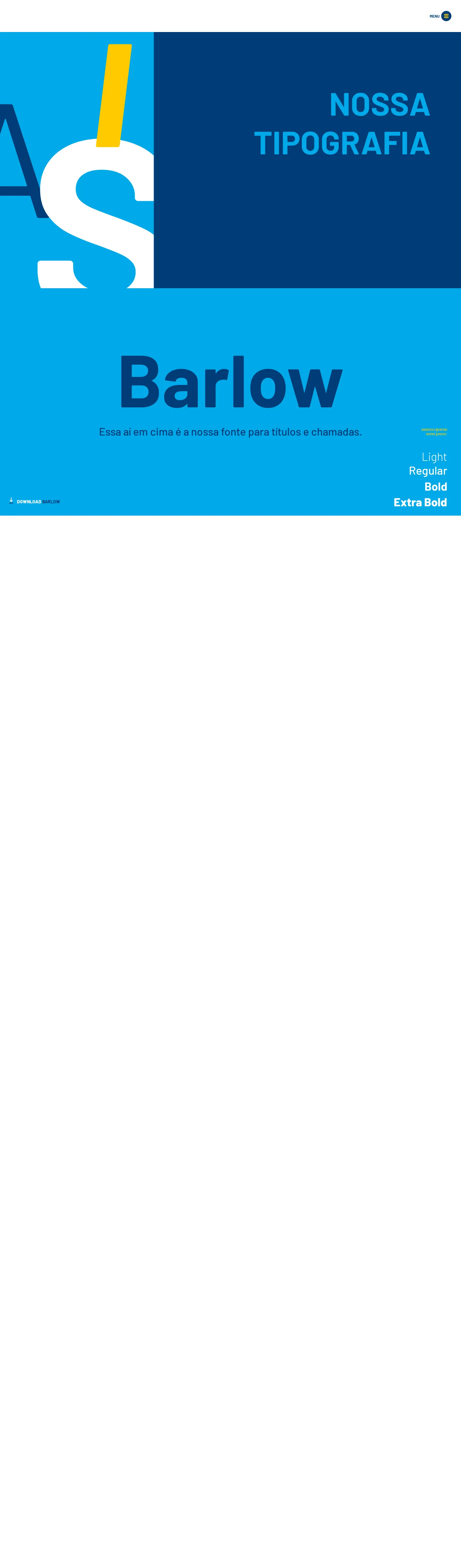
Typography page detailing Barlow for headlines with download links and Arial for everyday systems.
Want a brand center like Instituto Ayrton Senna’s?
Create your brand center with Freedam ↗Freedam's take
Browsing the Instituto Ayrton Senna guidelines, I appreciated the clear storytelling right from the start. Connecting the brand emblem directly to Ayrton Senna creates an immediate sense of identity, and the accompanying instructions are straightforward. I like that the palette guidelines specify precise ratios like sixty percent light blue and thirty percent dark blue, giving teams exact guidance for layout balance. Including direct download packages for presentations, stationery, and video assets directly on the documentation pages makes it easy for collaborators to grab what they need.
At a glance
- Sections
- Logo · Cores · Tipografia · Ícones · Fotografia · Ilustração · Selos · Tom de Voz · Regras para Eventos · Inspirações · Composições
- Downloads
- ZIP
- Tone
- Warm, mission-driven, and clear Portuguese identity guidelines focused on human education and social impact.
What I noticed
- The logo section connects the mark to the memory of Ayrton Senna and features the stylized helmet icon alongside clear space and color guidelines.123
- The color system specifies precise distribution proportions consisting of 60% light blue, 30% dark blue, and 10% yellow, alongside white.456
- The typography documentation defines Barlow for headings across four weights and specifies Arial as the standard system font for day-to-day documents and presentations.78910111213141516
Numbers refer to the screenshots above.
What I could not see
- The full contents of the hamburger navigation menu were not captured open.
- Guidelines on photography, illustrations, icons, seals, and event rules were not captured in detail.
Ideas to borrow
Quick answers
Where can the brand fonts be downloaded?
A zip archive containing the Barlow font family is available directly from the typography page.1718
Reviewed on 18 October 2026. Request a correction · I built this
Similar brand centers
All brand guidelines →