
European Molecular Biology Laboratory brand guidelines
EMBL provides clear corporate design guidelines detailing logo rules, IBM Plex Sans typography, color palettes, and organic graphical elements.
Freedam's take — I really appreciate how straightforward the European Molecular Biology Laboratory keeps its corporate guidelines. Built right on WordPress, the documentation covers essentials like their core logo rules, color palettes, and IBM Plex Sans typography without getting lost in excess complexity. I like the thoughtful inclusion of graphic assets like the organic shape and roundel, which give scientific communicators distinct visual elements to work with. Grounding the identity in practical design principles—such as simplicity, sustainability, and presenting as one unified institute—gives the entire toolkit an approachable, grounded feel for everyday institutional applications.
Details
- Type
- Guidelines
- Access
- Public
- Source
- embl.org
- Industry
- Science & research
- Capabilities
- Guidelines, Downloads
- Tags
- color system, typography, logo usage, font downloads, wordpress
- Added
- Last checked
What I noticed
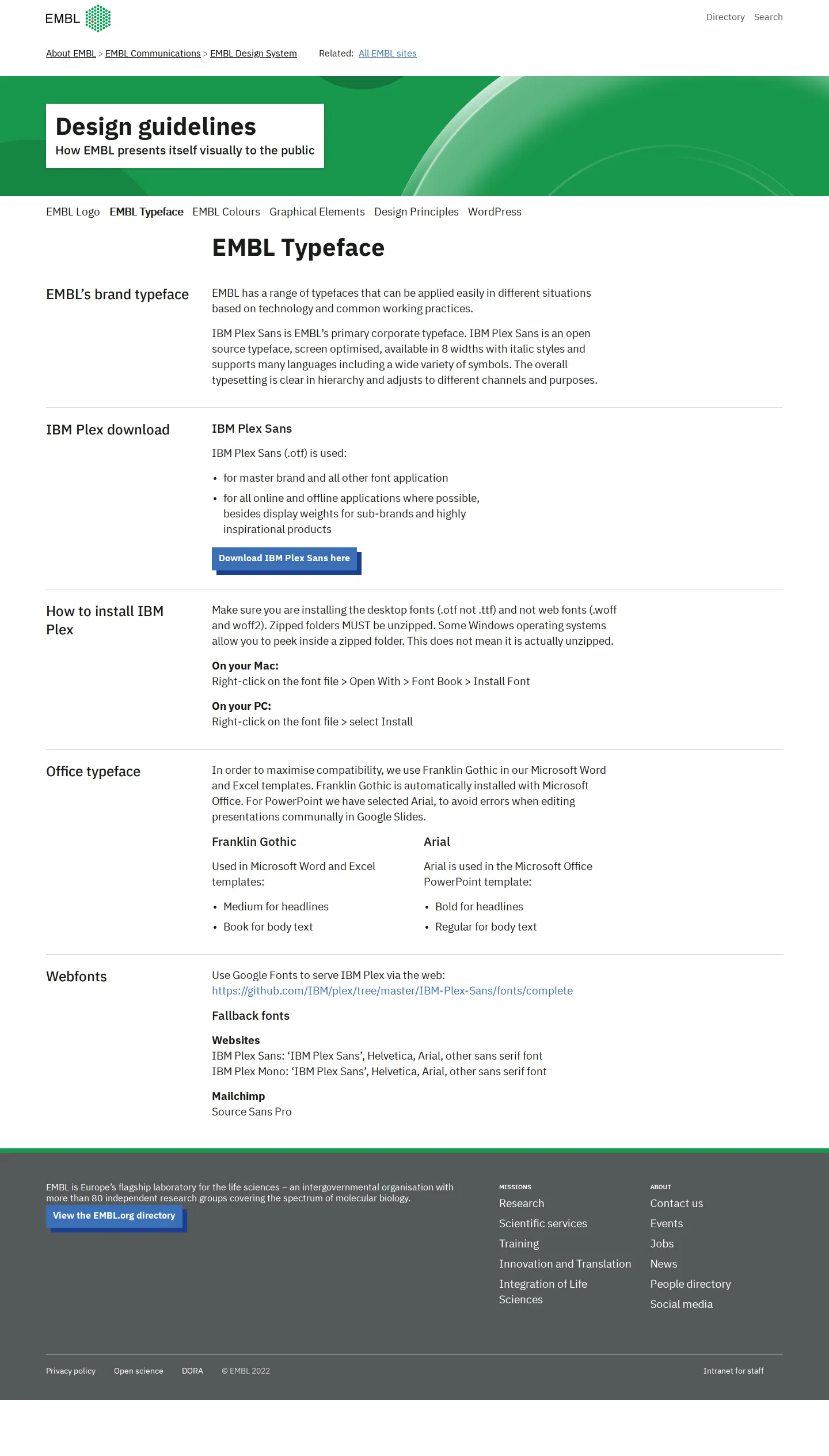
- The guidelines specify IBM Plex Sans as EMBL's brand typeface and provide direct download links for the font files.123
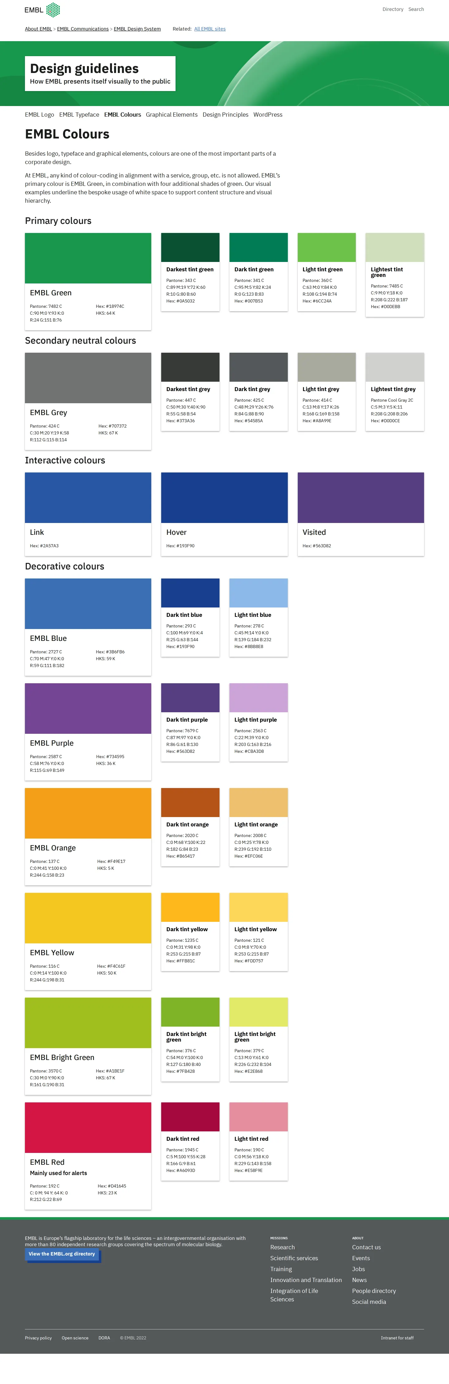
- The color system outlines primary greens, secondary neutral greys, interactive link states, and decorative colors.456789
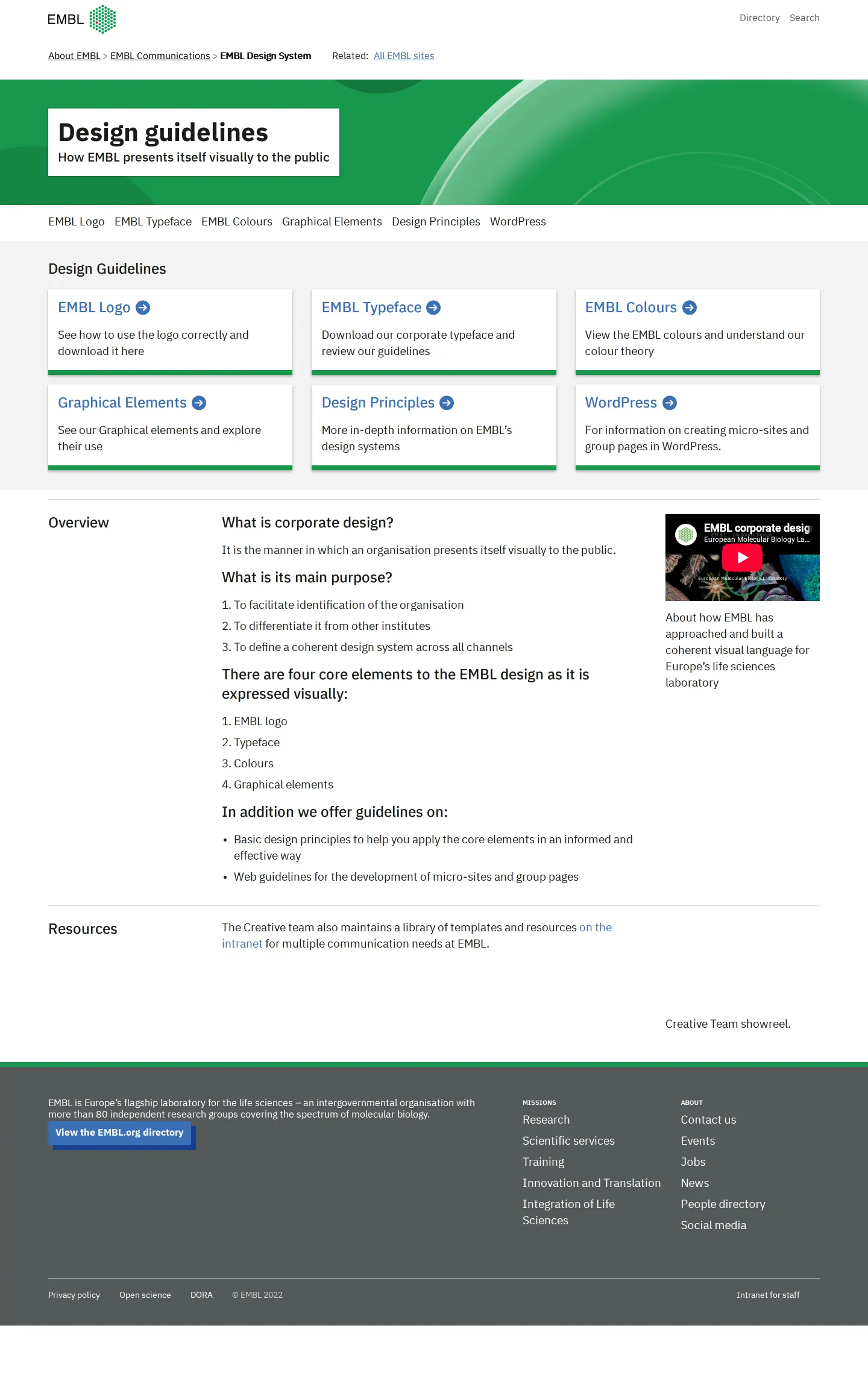
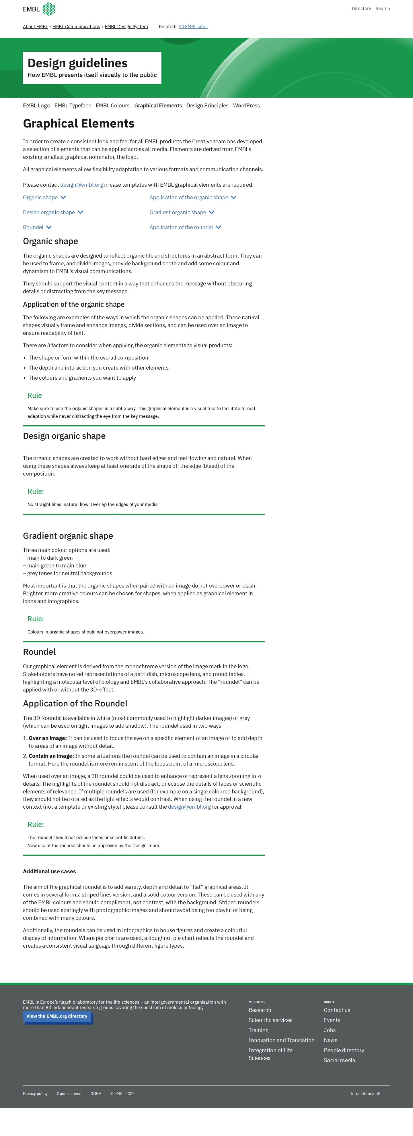
- Graphical elements documented include an organic shape, gradient organic shape, and a roundel.101112
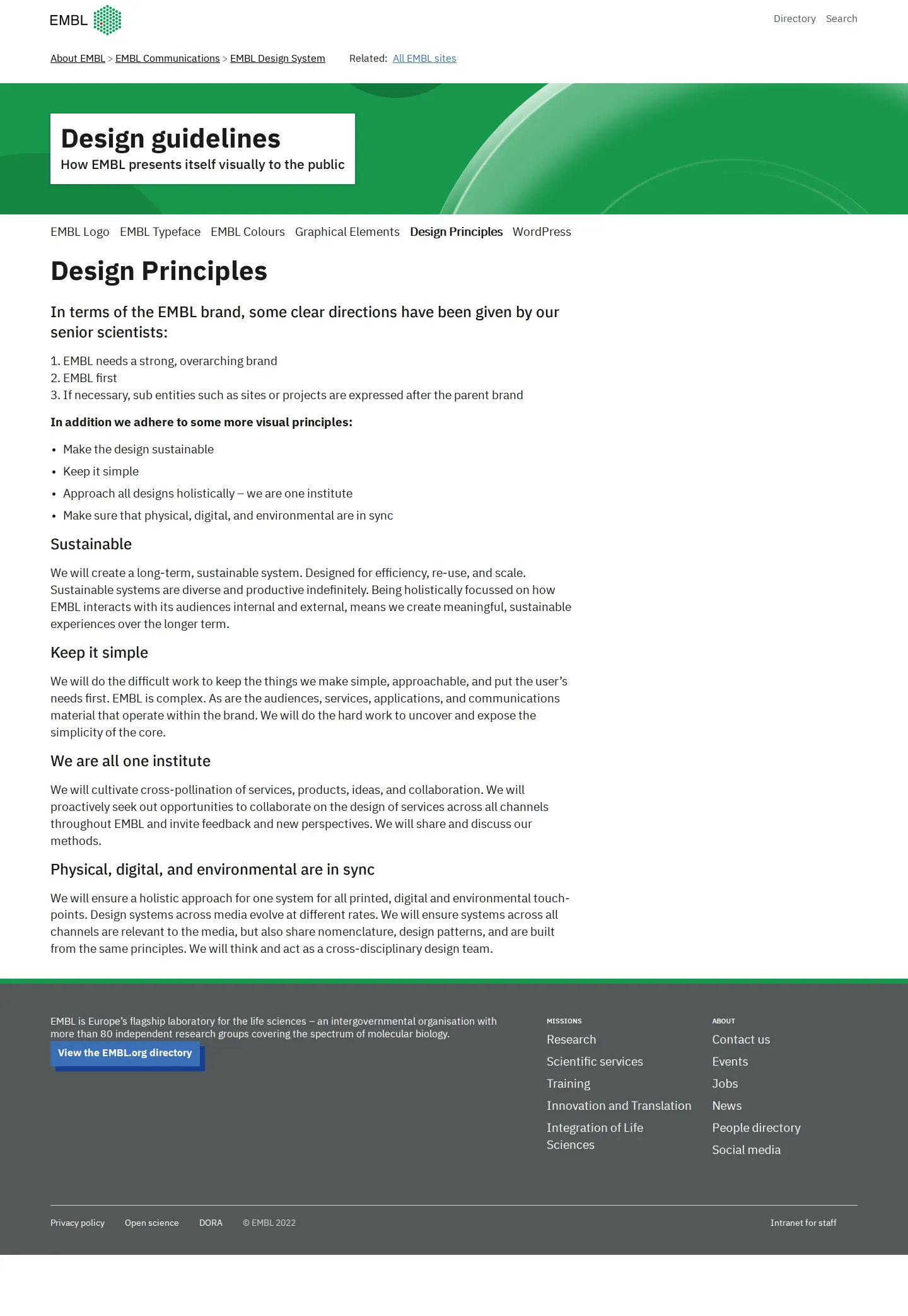
- The design principles explicitly reflect directions provided by senior scientists at the institute.13
Numbers refer to the screenshots above.
What I could not see
- Could not view the contents of the WordPress section or external template files.
Ideas to borrow
Reviewed on 18 September 2026. Request a correction · I built this

